
Top Related Projects

Create circular ProgressBar in Android ⭕

A powerful 🚀 Android chart view / graph view library, supporting line- bar- pie- radar- bubble- and candlestick charts as well as scaling, panning and animations.

[Android] Round Corner Progress Bar Library for Android
Quick Overview
CircleProgress is a lightweight Android library for creating customizable circular progress bars. It offers a simple and flexible way to add visually appealing progress indicators to Android applications, with support for various styles and animations.
Pros
- Easy to integrate and use in Android projects
- Highly customizable with numerous attributes for appearance and behavior
- Smooth animations and performance optimized for Android
- Supports both determinate and indeterminate progress styles
Cons
- Limited to circular progress indicators only
- May require additional customization for complex use cases
- Documentation could be more comprehensive
- No recent updates or maintenance (as of the last check)
Code Examples
- Basic usage:
// In your layout XML
<com.github.uknownothingsnow.circleprogress.CircleProgressView
    android:id="@+id/circleProgress"
    android:layout_width="200dp"
    android:layout_height="200dp"
    app:cpv_progress="75" />

// In your Activity or Fragment
val circleProgress = findViewById<CircleProgressView>(R.id.circleProgress)
circleProgress.setProgress(50)
- Customizing appearance:
circleProgress.apply {
    setProgressColor(Color.BLUE)
    setProgressBackgroundColor(Color.LTGRAY)
    setProgressWidth(20f)
    setTextSize(18f)
    setTextColor(Color.BLACK)
}
- Animating progress:
circleProgress.setProgressWithAnimation(75, 1000) // Animate to 75% over 1 second
Getting Started
- Add the JitPack repository to your project's
build.gradle:
allprojects {
    repositories {
        ...
        maven { url 'https://jitpack.io' }
    }
}
- Add the dependency to your app's
build.gradle:
dependencies {
    implementation 'com.github.uknownothingsnow:CircleProgress:1.0.0'
}
- Use the
CircleProgressViewin your layout XML:
<com.github.uknownothingsnow.circleprogress.CircleProgressView
    android:id="@+id/circleProgress"
    android:layout_width="200dp"
    android:layout_height="200dp"
    app:cpv_progress="0" />
- Customize and control the progress view in your Kotlin/Java code as shown in the code examples above.
Competitor Comparisons
Create circular ProgressBar in Android ⭕
Pros of CircularProgressBar
- More actively maintained with recent updates
- Offers a wider range of customization options
- Includes animation features for smoother transitions
Cons of CircularProgressBar
- Slightly larger library size
- May have a steeper learning curve due to more options
Code Comparison
CircleProgress:
CircleProgress(
    progress = 0.75f,
    strokeWidth = 8.dp,
    color = Color.Blue
)
CircularProgressBar:
CircularProgressBar(
    progress = 75,
    progressMax = 100,
    progressBarColor = Color.Blue,
    backgroundProgressBarColor = Color.Gray,
    strokeWidth = 8f,
    backgroundProgressBarWidth = 4f,
    roundBorder = true,
    startAngle = 0f,
    progressDirection = CircularProgressBar.ProgressDirection.TO_RIGHT
)
The code comparison shows that CircularProgressBar offers more parameters for customization, allowing for finer control over the appearance and behavior of the progress bar. CircleProgress, on the other hand, provides a simpler API with fewer options, which may be preferable for basic use cases or when rapid implementation is required.
Both libraries serve the purpose of creating circular progress indicators in Android applications, but CircularProgressBar appears to be more feature-rich and actively maintained, making it a potentially better choice for projects requiring advanced customization and ongoing support.
A powerful 🚀 Android chart view / graph view library, supporting line- bar- pie- radar- bubble- and candlestick charts as well as scaling, panning and animations.
Pros of MPAndroidChart
- Offers a wide variety of chart types (line, bar, pie, scatter, etc.)
- Highly customizable with extensive documentation
- Active development and large community support
Cons of MPAndroidChart
- Steeper learning curve due to its complexity
- Larger library size, which may impact app size
- May be overkill for simple chart requirements
Code Comparison
MPAndroidChart:
LineChart chart = findViewById(R.id.chart);
LineDataSet dataSet = new LineDataSet(entries, "Label");
LineData lineData = new LineData(dataSet);
chart.setData(lineData);
chart.invalidate();
CircleProgress:
CircleProgress circleProgress = findViewById(R.id.circle_progress);
circleProgress.setProgress(75);
circleProgress.setText("75%");
MPAndroidChart provides more comprehensive charting capabilities, suitable for complex data visualization needs. CircleProgress, on the other hand, focuses specifically on circular progress indicators, offering a simpler implementation for basic progress display. The code comparison illustrates the difference in complexity, with MPAndroidChart requiring more setup but providing greater flexibility, while CircleProgress offers a more straightforward approach for its specific use case.
[Android] Round Corner Progress Bar Library for Android
Pros of RoundCornerProgressBar
- Offers more customization options, including corner radius and background color
- Supports both horizontal and vertical progress bars
- Provides animation capabilities for smoother progress updates
Cons of RoundCornerProgressBar
- More complex implementation due to additional features
- Larger library size, potentially impacting app performance
- Steeper learning curve for developers new to the library
Code Comparison
CircleProgress:
val circleProgress = CircleProgress(context)
circleProgress.setProgress(75)
circleProgress.setMaxProgress(100)
RoundCornerProgressBar:
val progressBar = RoundCornerProgressBar(context)
progressBar.progress = 75f
progressBar.max = 100f
progressBar.radius = 30f
progressBar.progressColor = Color.BLUE
The code comparison shows that RoundCornerProgressBar offers more customization options directly in the initialization, while CircleProgress has a simpler setup. RoundCornerProgressBar allows for easy customization of the progress bar's appearance, such as setting the corner radius and progress color, which may require additional steps in CircleProgress.
Both libraries provide basic functionality for creating progress bars, but RoundCornerProgressBar offers more advanced features at the cost of increased complexity. Developers should consider their specific requirements and the level of customization needed when choosing between these two libraries.
Convert  designs to code with AI

Introducing Visual Copilot: A new AI model to turn Figma designs to high quality code using your components.
Try Visual CopilotREADME
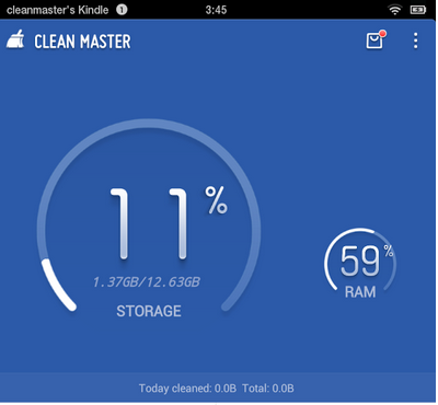
inspired from https://github.com/daimajia/NumberProgressBar
and CleanMaster
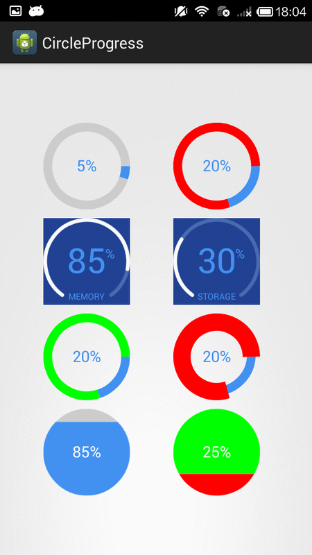
###Demo
###Demo download link
###3 kinds of progress view are provided, DonutProgress (supports inner drawables and VectorDrawables, CircleProgress, ArcProgress
##Usage
please use jitpack
    allprojects {
		repositories {
			...
			maven { url "https://jitpack.io" }
		}
	}
###Gradle
dependencies {
    compile 'com.github.lzyzsd:circleprogress:1.2.4'
}
###Notice
please always use same width and height for progress views
DonutProgress
    <com.github.lzyzsd.circleprogress.DonutProgress
        android:layout_marginLeft="50dp"
        android:id="@+id/donut_progress"
        android:layout_width="wrap_content"
        android:layout_height="wrap_content"
        custom:donut_progress="30"/>
    <com.github.lzyzsd.circleprogress.DonutProgress
        android:layout_marginLeft="50dp"
        android:id="@+id/donut_progress"
        android:layout_width="wrap_content"
        android:layout_height="wrap_content"
        custom:donut_finished_color="#0066FF"
        custom:donut_finished_stroke_width="15dp"
        custom:donut_inner_drawable="@drawable/ic_vector_star_black_48dp"
        custom:donut_show_text="false"
        custom:donut_unfinished_color="#f5f5f5"
        custom:donut_unfinished_stroke_width="15dp"/>
attrs for DonutProgress
    <declare-styleable name="DonutProgress">
        <attr name="donut_progress" format="integer"/>
        <attr name="donut_max" format="integer"/>
        <attr name="donut_unfinished_color" format="color"/>
        <attr name="donut_finished_color" format="color"/>
        <attr name="donut_finished_stroke_width" format="dimension"/>
        <attr name="donut_unfinished_stroke_width" format="dimension"/>
        <attr name="donut_text_size" format="dimension"/>
        <attr name="donut_text_color" format="color"/>
        <attr name="donut_text" format="string"/>
        <attr name="donut_prefix_text" format="string"/>
        <attr name="donut_suffix_text" format="string"/>
        <attr name="donut_background_color" format="color"/>
    </declare-styleable>
CircleProgress
    <com.github.lzyzsd.circleprogress.CircleProgress
        android:id="@+id/circle_progress"
        android:layout_marginLeft="50dp"
        android:layout_width="100dp"
        android:layout_height="100dp"
        custom:circle_progress="20"/>
attrs for CircleProgress
    <declare-styleable name="CircleProgress">
        <attr name="circle_progress" format="integer"/>
        <attr name="circle_max" format="integer"/>
        <attr name="circle_unfinished_color" format="color"/>
        <attr name="circle_finished_color" format="color"/>
        <attr name="circle_text_size" format="dimension"/>
        <attr name="circle_text_color" format="color"/>
        <attr name="circle_prefix_text" format="string"/>
        <attr name="circle_suffix_text" format="string"/>
    </declare-styleable>
ArcProgress
    <com.github.lzyzsd.circleprogress.ArcProgress
        android:id="@+id/arc_progress"
        android:background="#214193"
        android:layout_marginLeft="50dp"
        android:layout_width="100dp"
        android:layout_height="100dp"
        custom:arc_progress="55"
        custom:arc_bottom_text="MEMORY"/>

attrs for ArchProgress
    <declare-styleable name="ArcProgress">
        <attr name="arc_progress" format="integer"/>
        <attr name="arc_angle" format="float"/>
        <attr name="arc_stroke_width" format="dimension"/>
        <attr name="arc_max" format="integer"/>
        <attr name="arc_unfinished_color" format="color"/>
        <attr name="arc_finished_color" format="color"/>
        <attr name="arc_text_size" format="dimension"/>
        <attr name="arc_text_color" format="color"/>
        <attr name="arc_suffix_text" format="string"/>
        <attr name="arc_suffix_text_size" format="dimension"/>
        <attr name="arc_suffix_text_padding" format="dimension"/>
        <attr name="arc_bottom_text" format="string"/>
        <attr name="arc_bottom_text_size" format="dimension"/>
    </declare-styleable>
donut_inner_drawable
support add a drawable/vectorDrawable to the center
donut_show_text
show or hide bottom text
###Build
run ./gradlew assembleDebug (Mac/Linux)
or
run gradlew.bat assembleDebug (Windows)
###Changes
version 1.1.0: add bottom text to DonutProgressView
DO WHAT THE FUCK YOU WANT TO PUBLIC LICENSE Version 2, December 2004
Copyright (C) 2014 Bruce Lee <bruceinpeking#gmail.com>
Everyone is permitted to copy and distribute verbatim or modified copies of this license document, and changing it is allowed as long as the name is changed.
DO WHAT THE FUCK YOU WANT TO PUBLIC LICENSE
TERMS AND CONDITIONS FOR COPYING, DISTRIBUTION AND MODIFICATION
- You just DO WHAT THE FUCK YOU WANT TO.
Top Related Projects
Create circular ProgressBar in Android ⭕
A powerful 🚀 Android chart view / graph view library, supporting line- bar- pie- radar- bubble- and candlestick charts as well as scaling, panning and animations.
[Android] Round Corner Progress Bar Library for Android
Convert designs to code with AI
Introducing Visual Copilot: A new AI model to turn Figma designs to high quality code using your components.
Try Visual Copilot