 LovelyDialog
This library is a set of simple wrapper classes that are aimed to help you easily create fancy material dialogs.
Top Related Projects

😍 A beautiful, fluid, and extensible dialogs API for Kotlin & Android.

SweetAlert for Android, a beautiful and clever alert dialog

Advanced dialog solution for android

An Android Dialog Lib simplify customization.

Nifty Modal Dialog Effects
Quick Overview
LovelyDialog is an Android library that provides an easy way to create beautiful and customizable dialogs. It offers a fluent API for creating various types of dialogs, including standard alerts, custom views, and input dialogs, with a focus on enhancing the user experience through attractive designs and animations.
Pros
- Easy to use with a fluent API for quick dialog creation
- Highly customizable with options for colors, fonts, and animations
- Provides a consistent and modern look across different Android versions
- Includes pre-built dialog types for common use cases (e.g., loading, progress)
Cons
- May not be suitable for projects requiring highly specific or unique dialog designs
- Dependency on external libraries might increase app size
- Limited documentation and examples for advanced customization
- Not actively maintained (last update was in 2018)
Code Examples
Creating a simple alert dialog:
LovelyStandardDialog(context)
    .setTopColorRes(R.color.indigo)
    .setIcon(R.drawable.ic_star)
    .setTitle(R.string.rate_title)
    .setMessage(R.string.rate_message)
    .setPositiveButton(android.R.string.ok) { dialog -> dialog.dismiss() }
    .setNegativeButton(android.R.string.no) { dialog -> dialog.dismiss() }
    .show()
Creating an input dialog:
LovelyTextInputDialog(context)
    .setTopColorRes(R.color.blue)
    .setTitle(R.string.text_input_title)
    .setMessage(R.string.text_input_message)
    .setInputFilter(R.string.text_input_error) { text -> text.isNotBlank() }
    .setConfirmButton(android.R.string.ok) { text ->
        // Handle input text
    }
    .show()
Creating a custom view dialog:
LovelyCustomDialog(context)
    .setView(R.layout.custom_dialog_layout)
    .setTopColorRes(R.color.purple)
    .setTitle(R.string.custom_dialog_title)
    .setIcon(R.drawable.ic_custom)
    .configureView { view ->
        // Configure custom view elements
    }
    .setListener(R.id.confirm_button) { dialog -> dialog.dismiss() }
    .show()
Getting Started
- Add the JitPack repository to your project's
build.gradle:
allprojects {
    repositories {
        ...
        maven { url 'https://jitpack.io' }
    }
}
- Add the dependency to your app's
build.gradle:
dependencies {
    implementation 'com.github.yarolegovich:LovelyDialog:1.1.1'
}
- Sync your project and start using LovelyDialog in your Android app!
Competitor Comparisons
😍 A beautiful, fluid, and extensible dialogs API for Kotlin & Android.
Pros of material-dialogs
- More comprehensive and feature-rich library with a wider range of dialog types and customization options
- Better support for Material Design guidelines and theming
- Larger community and more frequent updates
Cons of material-dialogs
- Steeper learning curve due to its extensive API and options
- Larger library size, which may impact app size and performance
Code Comparison
LovelyDialog:
LovelyStandardDialog(context)
    .setTopColorRes(R.color.indigo)
    .setIcon(R.drawable.ic_star)
    .setTitle(R.string.rate_title)
    .setMessage(R.string.rate_message)
    .setPositiveButton(android.R.string.ok, {})
    .show()
material-dialogs:
MaterialDialog(this).show {
    title(R.string.rate_title)
    message(R.string.rate_message)
    icon(R.drawable.ic_star)
    positiveButton(android.R.string.ok)
}
Both libraries offer a fluent API for creating dialogs, but material-dialogs provides a more concise syntax using Kotlin DSL. LovelyDialog focuses on simplicity and ease of use, while material-dialogs offers more advanced features and customization options. The choice between the two depends on the specific requirements of your project and the level of control you need over dialog appearance and behavior.
SweetAlert for Android, a beautiful and clever alert dialog
Pros of Sweet Alert Dialog
- More customization options for dialog appearance and animations
- Supports progress dialogs and loading indicators
- Larger community and more frequent updates
Cons of Sweet Alert Dialog
- Larger library size, potentially impacting app performance
- Steeper learning curve due to more complex API
Code Comparison
Sweet Alert Dialog:
new SweetAlertDialog(this, SweetAlertDialog.WARNING_TYPE)
    .setTitleText("Are you sure?")
    .setContentText("Won't be able to recover this file!")
    .setConfirmText("Yes, delete it!")
    .setConfirmClickListener(sDialog -> sDialog.dismissWithAnimation())
    .show();
LovelyDialog:
new LovelyStandardDialog(this)
    .setTopColorRes(R.color.indigo)
    .setButtonsColorRes(R.color.darkDeepOrange)
    .setTitle("Are you sure?")
    .setMessage("Won't be able to recover this file!")
    .setPositiveButton("Yes, delete it!", v -> {})
    .show();
Both libraries offer similar functionality for creating custom dialogs in Android applications. Sweet Alert Dialog provides more advanced features and customization options, but comes with a larger footprint and potentially more complex implementation. LovelyDialog offers a simpler API and lighter weight, which may be preferable for smaller projects or those prioritizing ease of use.
Advanced dialog solution for android
Pros of DialogPlus
- More customizable layout options, including header and footer views
- Supports both ListView and GridView for content display
- Offers multiple animation styles for dialog appearance
Cons of DialogPlus
- Less focus on pre-designed, ready-to-use dialog styles
- Requires more manual configuration for complex dialogs
- Limited built-in theming options compared to LovelyDialog
Code Comparison
LovelyDialog:
LovelyStandardDialog(context)
    .setTopColorRes(R.color.indigo)
    .setIcon(R.drawable.ic_star)
    .setTitle(R.string.rate_title)
    .setMessage(R.string.rate_message)
    .setPositiveButton(android.R.string.ok, {})
    .show()
DialogPlus:
DialogPlus.newDialog(context)
    .setContentHolder(ViewHolder(R.layout.content))
    .setExpanded(true)
    .setGravity(Gravity.CENTER)
    .setContentBackgroundResource(R.drawable.corner_background)
    .setOnClickListener { dialog, view -> }
    .create().show()
Both libraries aim to simplify dialog creation in Android, but they take different approaches. LovelyDialog focuses on providing pre-designed, attractive dialogs with minimal setup, while DialogPlus offers more flexibility in terms of layout and content display. The choice between the two depends on the specific requirements of your project and the level of customization needed.
An Android Dialog Lib simplify customization.
Pros of FlycoDialog_Master
- More comprehensive set of dialog types and styles
- Supports custom animations for dialog entry/exit
- Includes additional UI components like popup windows and loading indicators
Cons of FlycoDialog_Master
- Less actively maintained (last update in 2017)
- Documentation primarily in Chinese, which may be challenging for non-Chinese speakers
- Steeper learning curve due to more complex API
Code Comparison
LovelyDialog:
new LovelyInfoDialog(this)
    .setTopColorRes(R.color.colorPrimary)
    .setIcon(R.drawable.ic_info)
    .setTitle("Info")
    .setMessage("This is an info dialog")
    .show();
FlycoDialog_Master:
new MaterialDialog.Builder(this)
    .title("Info")
    .content("This is an info dialog")
    .positiveText("OK")
    .show();
Both libraries offer simple ways to create dialogs, but FlycoDialog_Master provides more customization options at the cost of a slightly more complex API. LovelyDialog focuses on ease of use and a consistent material design look, while FlycoDialog_Master offers a wider range of dialog types and styles.
Nifty Modal Dialog Effects
Pros of NiftyDialogEffects
- Offers a wider variety of animation effects for dialogs
- Provides more customization options for dialog appearance
- Includes built-in support for custom layouts
Cons of NiftyDialogEffects
- Less actively maintained (last update was several years ago)
- Documentation is not as comprehensive
- May require more setup and configuration
Code Comparison
LovelyDialog:
new LovelyStandardDialog(this)
    .setTopColorRes(R.color.indigo)
    .setButtonsColorRes(R.color.darkDeepOrange)
    .setTitle(R.string.rate_title)
    .setMessage(R.string.rate_message)
    .setPositiveButton(android.R.string.ok, v -> {})
    .show();
NiftyDialogEffects:
NiftyDialogBuilder dialogBuilder = NiftyDialogBuilder.getInstance(this);
dialogBuilder
    .withTitle("Title")
    .withMessage("Message")
    .withEffect(Effectstype.Slidetop)
    .withButton1Text("OK")
    .withButton2Text("Cancel")
    .show();
Both libraries aim to simplify the creation of custom dialogs in Android applications. LovelyDialog focuses on providing a clean and straightforward API for creating dialogs with basic customization options. NiftyDialogEffects, on the other hand, emphasizes visual effects and animations, offering more advanced customization possibilities at the cost of a slightly more complex setup process.
Convert  designs to code with AI

Introducing Visual Copilot: A new AI model to turn Figma designs to high quality code using your components.
Try Visual CopilotREADME
LovelyDialog
This library is a set of simple wrapper classes that are aimed to help you easily create fancy material dialogs.
Gradle
Add this into your dependencies block.
compile 'com.yarolegovich:lovely-dialog:1.1.1'
Wiki
General
As advised in Effective Java
Favor composition over inheritance.
LovelyDialog doesn't subclass any Dialog related classes, it is just a lightweight extensible wrapper for Dialog and manipulations with custom view. If you would like to improve something - pull requests are appreciated.
Sample project that shows how to work with different dialogs and handle screen rotation is available under the sample module.
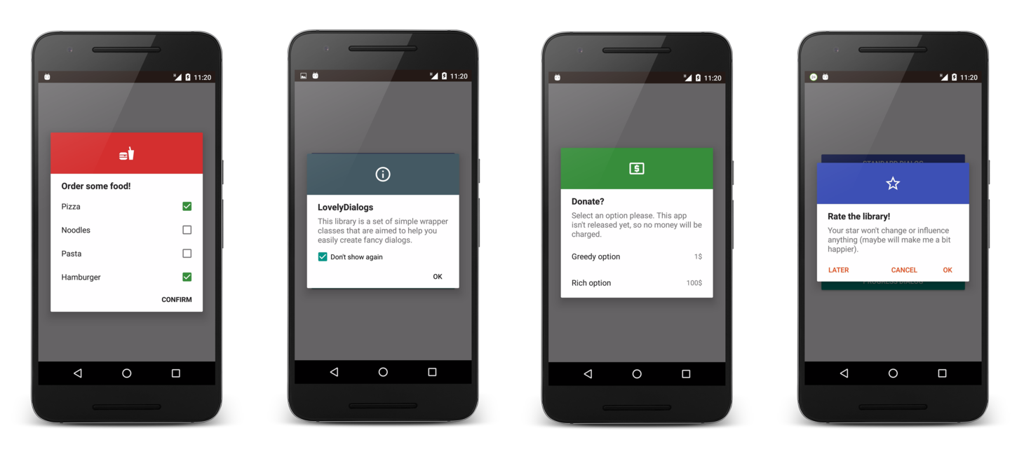
Dialog types
Each dialog has colored top, icon, title and message + its own features. There are 6 types of dialogs available:
- LovelyStandardDialog
- LovelyInfoDialog
- LovelyTextInputDialog
- LovelyChoiceDialog
- LovelyProgressDialog
- LovelyCustomDialog
Access to inner View objects
Starting from a version 1.1.0 of the library, you have an access to dialog's inner View objects via methods whose names are prefixed with configure. For example:
lovelyDialog
      .configureView(rootView -> /* you can find any view here, view ids are prefixed with ld_ */)
      .configureTitleView(title -> title.setTextSize(customTextSize))
      .configureMessageView(message -> message.getPaint().setShader(customShader))
      .show();
I advise not to overuse this feature. If you are doing it, think of creating a custom Dialog subclass. LovelyTextInpuDialog exposes its EditText via configureEditText.
LovelyStandardDialog
You can set positive, negative and neutral button here. Listeners can be set individually for each button, one for all three or not set at all (onClick on any button dialog will be just dismissed).
new LovelyStandardDialog(this, LovelyStandardDialog.ButtonLayout.VERTICAL)
      .setTopColorRes(R.color.indigo)
      .setButtonsColorRes(R.color.darkDeepOrange)
      .setIcon(R.drawable.ic_star_border_white_36dp)
      .setTitle(R.string.rate_title)
      .setMessage(R.string.rate_message)
      .setPositiveButton(android.R.string.ok, new View.OnClickListener() {
          @Override
          public void onClick(View v) {
              Toast.makeText(context, "positive clicked", Toast.LENGTH_SHORT).show();
          }
      })
      .setNegativeButton(android.R.string.no, null)
      .show();
LovelyInfoDialog
Dialog for displaying information to the user, content is scrollable. There is an option to show Don't show again checkbox. If checked - dialog won't be called next time. This can be useful when showing some tutorials, for example.
new LovelyInfoDialog(this)
      .setTopColorRes(R.color.darkBlueGrey)
      .setIcon(R.drawable.ic_info_outline_white_36dp)
      //This will add Don't show again checkbox to the dialog. You can pass any ID as argument
      .setNotShowAgainOptionEnabled(0)
      .setNotShowAgainOptionChecked(true)
      .setTitle(R.string.info_title)
      .setMessage(R.string.info_message)
      .show();
LovelyChoiceDialog
Here you can use either single choice or multi choice dialogs. In case of multi choice dialog - Confirm button will appear. You can pass items as array, List (.toString() will be used to display them as simple text items) or provide your custom adapter.
Single choice
ArrayAdapter<DonationOption> adapter = new DonationAdapter(this, loadDonationOptions());
new LovelyChoiceDialog(this)
      .setTopColorRes(R.color.darkGreen)
      .setTitle(R.string.donate_title)
      .setIcon(R.drawable.ic_local_atm_white_36dp)
      .setMessage(R.string.donate_message)
      .setItems(adapter, new LovelyChoiceDialog.OnItemSelectedListener<DonationOption>() {
           @Override
           public void onItemSelected(int position, DonationOption item) {
               Toast.makeText(context, getString(R.string.you_donated, item.amount),Toast.LENGTH_SHORT).show();
           }
      })
      .show();
Multi choice
String[] items = getResources().getStringArray(R.array.food);
new LovelyChoiceDialog(this, R.style.CheckBoxTintTheme)
      .setTopColorRes(R.color.darkRed)
      .setTitle(R.string.order_food_title)
      .setIcon(R.drawable.ic_food_white_36dp)
      .setItemsMultiChoice(items, new LovelyChoiceDialog.OnItemsSelectedListener<String>() {
          @Override
          public void onItemsSelected(List<Integer> positions, List<String> items) {
              Toast.makeText(MainActivity.this,
                      getString(R.string.you_ordered, TextUtils.join("\n", items)),
                      Toast.LENGTH_SHORT)
                      .show();
          }
      })
      .setConfirmButtonText(R.string.confirm)
      .show();
LovelyTextInputDialog
Dialog with EditText and Confirm button. You can set TextFilter object to specify acceptable input.
new LovelyTextInputDialog(this, R.style.EditTextTintTheme)
      .setTopColorRes(R.color.darkDeepOrange)
      .setTitle(R.string.text_input_title)
      .setMessage(R.string.text_input_message)
      .setIcon(R.drawable.ic_assignment_white_36dp)
      .setInputFilter(R.string.text_input_error_message, new LovelyTextInputDialog.TextFilter() {
          @Override
          public boolean check(String text) {
              return text.matches("\\w+");
          }
      })
      .setConfirmButton(android.R.string.ok, new LovelyTextInputDialog.OnTextInputConfirmListener() {
           @Override
           public void onTextInputConfirmed(String text) {
              Toast.makeText(MainActivity.this, text, Toast.LENGTH_SHORT).show();
           }
      })
      .show();
LovelyProgressDialog
Dialog with standard Android ProgressBar. Not cancelable by default.
new LovelyProgressDialog(this)
      .setIcon(R.drawable.ic_cast_connected_white_36dp)
      .setTitle(R.string.connecting_to_server)
      .setTopColorRes(R.color.teal)
      .show();
LovelyCustomDialog
Here you can pass your own view to be displayed. Title, message, color header and icon will still be available for use. You can provide configurators, click listeners and instance state save handlers.
new LovelyCustomDialog(this)
      .setView(R.layout.item_donate_option)
      .setTopColorRes(R.color.darkDeepOrange)
      .setTitle(R.string.text_input_title)
      .setMessage(R.string.text_input_message)
      .setIcon(R.drawable.ic_assignment_white_36dp)
      .configureView(/* ... */)
      .setListener(R.id.ld_btn_yes, /* ... */)
      .setInstanceStateManager(/* ... */)
      .show();
Configuration changes
There is a class LovelySaveStateHandler that helps you to persist information about which dialog was shown (if any) between configuration changes. Each dialog (except LovelyCustomDialog) knows how to save and restore its state. Refer to sample project for examples of how to deal with configuration changes.
Tinting controls
If you want CheckBoxes, EditTexts etc. to be of different color - what you need is to define theme in xml
<style name="TintTheme" parent="Theme.AppCompat.Light.Dialog.Alert">
      <item name="colorAccent">@color/colorToTintWith</item>
</style>
and pass it as a second argument to dialog's constructor
new LovelyTextInputDialog(this, R.style.TintTheme)
Standard dialogs compatibility
If you don't want to rewrite your
Dialog.OnClickListener
implementations, you can simply use
LovalyDialogCompat.wrap(yourImplementation)
to pass it to one of the
.setPositiveButton(...)
.setNegativeButton(...)
or the like.
License
Copyright 2016 Yaroslav Shevchuk

Licensed under the Apache License, Version 2.0 (the "License");
you may not use this file except in compliance with the License.
You may obtain a copy of the License at

http://www.apache.org/licenses/LICENSE-2.0

Unless required by applicable law or agreed to in writing, software
distributed under the License is distributed on an "AS IS" BASIS,
WITHOUT WARRANTIES OR CONDITIONS OF ANY KIND, either express or implied.
See the License for the specific language governing permissions and
limitations under the License.
Top Related Projects
😍 A beautiful, fluid, and extensible dialogs API for Kotlin & Android.
SweetAlert for Android, a beautiful and clever alert dialog
Advanced dialog solution for android
An Android Dialog Lib simplify customization.
Nifty Modal Dialog Effects
Convert designs to code with AI
Introducing Visual Copilot: A new AI model to turn Figma designs to high quality code using your components.
Try Visual Copilot