
Top Related Projects

The iconic SVG, font, and CSS toolkit

A curated list of awesome Android UI/UX libraries

😍 A beautiful, fluid, and extensible dialogs API for Kotlin & Android.

The flexible, easy to use, all in one drawer library for your Android project. Now brand new with material 2 design.

A circular ImageView for Android

Android Floating Action Button based on Material Design specification
Quick Overview
Android-Bootstrap is an open-source UI library for Android applications that provides Bootstrap-styled components. It allows developers to quickly create attractive and responsive user interfaces using pre-designed elements inspired by the popular Bootstrap framework for web development.
Pros
- Easy integration of Bootstrap-style UI components in Android apps
- Customizable themes and styles to match brand requirements
- Extensive set of pre-built UI elements, reducing development time
- Regular updates and active community support
Cons
- May not be suitable for highly custom designs that deviate from Bootstrap aesthetics
- Learning curve for developers unfamiliar with Bootstrap concepts
- Potential performance overhead due to additional styling layers
- Limited flexibility compared to building custom UI components from scratch
Code Examples
- Creating a Bootstrap Button:
BootstrapButton button = new BootstrapButton(context);
button.setBootstrapBrand(DefaultBootstrapBrand.PRIMARY);
button.setRounded(true);
button.setText("Click me!");
- Implementing a Bootstrap Progress Bar:
BootstrapProgressBar progressBar = new BootstrapProgressBar(context);
progressBar.setProgress(75);
progressBar.setStriped(true);
progressBar.setBootstrapBrand(DefaultBootstrapBrand.SUCCESS);
- Adding a Bootstrap Edit Text:
BootstrapEditText editText = new BootstrapEditText(context);
editText.setHint("Enter your name");
editText.setBootstrapBrand(DefaultBootstrapBrand.INFO);
Getting Started
To use Android-Bootstrap in your project, follow these steps:
- Add the dependency to your app's
build.gradlefile:
dependencies {
    implementation 'com.beardedhen:androidbootstrap:2.3.2'
}
- Initialize the library in your
Applicationclass:
public class MyApplication extends Application {
    @Override
    public void onCreate() {
        super.onCreate();
        TypefaceProvider.registerDefaultIconSets();
    }
}
- Use Bootstrap components in your layouts or create them programmatically:
<com.beardedhen.androidbootstrap.BootstrapButton
    android:layout_width="wrap_content"
    android:layout_height="wrap_content"
    android:text="Bootstrap Button"
    app:bootstrapBrand="primary"
    app:roundedCorners="true" />
Now you can start using Android-Bootstrap components in your Android application!
Competitor Comparisons
The iconic SVG, font, and CSS toolkit
Pros of Font-Awesome
- Larger icon set with over 2,000 icons compared to Android-Bootstrap's limited selection
- Regular updates and new icon additions
- Supports multiple file formats (SVG, webfonts) for versatile usage across platforms
Cons of Font-Awesome
- Not specifically designed for Android, requiring additional setup for mobile apps
- Larger file size due to extensive icon set, potentially impacting app performance
- May require additional CSS customization for optimal display in Android environments
Code Comparison
Android-Bootstrap:
<com.beardedhen.androidbootstrap.BootstrapButton
    android:layout_width="wrap_content"
    android:layout_height="wrap_content"
    app:bootstrapBrand="success"
    app:bootstrapText="Success" />
Font-Awesome (in HTML, as it's not Android-specific):
<i class="fas fa-check-circle"></i>
Font-Awesome provides a more straightforward implementation for web-based projects, while Android-Bootstrap offers native Android components with built-in styling. The choice between the two depends on the specific project requirements and target platform.
A curated list of awesome Android UI/UX libraries
Pros of awesome-android-ui
- Extensive collection of UI libraries and components
- Regularly updated with new and trending UI resources
- Categorized for easy navigation and discovery
Cons of awesome-android-ui
- Not a standalone library, requires integration of multiple dependencies
- May lead to inconsistent design if using components from different sources
- Potential for conflicts between different libraries
Code comparison
Android-Bootstrap:
@Override
protected void onCreate(Bundle savedInstanceState) {
    super.onCreate(savedInstanceState);
    setContentView(R.layout.activity_main);
    BootstrapButton button = findViewById(R.id.bootstrap_button);
    button.setBootstrapBrand(DefaultBootstrapBrand.SUCCESS);
}
awesome-android-ui (using Material Components):
@Override
protected void onCreate(Bundle savedInstanceState) {
    super.onCreate(savedInstanceState);
    setContentView(R.layout.activity_main);
    MaterialButton button = findViewById(R.id.material_button);
    button.setBackgroundTintList(ColorStateList.valueOf(getResources().getColor(R.color.colorPrimary)));
}
Android-Bootstrap provides a more straightforward approach to styling UI components with predefined themes, while awesome-android-ui offers a wider range of options but may require more setup and customization for each component.
😍 A beautiful, fluid, and extensible dialogs API for Kotlin & Android.
Pros of material-dialogs
- More comprehensive and feature-rich dialog library
- Actively maintained with frequent updates
- Supports both Kotlin and Java
Cons of material-dialogs
- Larger library size, potentially increasing app size
- Steeper learning curve due to more complex API
Code Comparison
material-dialogs:
MaterialDialog(this).show {
    title(R.string.dialog_title)
    message(R.string.dialog_message)
    positiveButton(R.string.agree)
    negativeButton(R.string.disagree)
}
Android-Bootstrap:
BootstrapButton button = new BootstrapButton(this);
button.setBootstrapBrand(DefaultBootstrapBrand.PRIMARY);
button.setBootstrapSize(DefaultBootstrapSize.LG);
button.setText("Hello World");
Summary
material-dialogs offers a more comprehensive solution for creating Material Design dialogs in Android applications. It provides a wide range of customization options and is actively maintained. However, it may increase app size and has a steeper learning curve.
Android-Bootstrap, on the other hand, focuses on providing Bootstrap-style UI components for Android. It's simpler to use but offers fewer features specifically for dialogs. The choice between the two depends on the project's specific needs and the desired UI style.
The flexible, easy to use, all in one drawer library for your Android project. Now brand new with material 2 design.
Pros of MaterialDrawer
- More comprehensive and feature-rich drawer implementation
- Actively maintained with frequent updates and bug fixes
- Extensive customization options for drawer items and styles
Cons of MaterialDrawer
- Steeper learning curve due to more complex API
- Larger library size, potentially increasing app size
- May require more setup and configuration for basic use cases
Code Comparison
MaterialDrawer:
DrawerBuilder()
    .withActivity(this)
    .withToolbar(toolbar)
    .addDrawerItems(
        PrimaryDrawerItem().withName("Home"),
        SecondaryDrawerItem().withName("Settings")
    )
    .build()
Android-Bootstrap:
BootstrapButton button = findViewById(R.id.button);
button.setBootstrapBrand(DefaultBootstrapBrand.SUCCESS);
button.setRounded(true);
button.setShowOutline(true);
Summary
MaterialDrawer offers a more comprehensive solution for implementing navigation drawers in Android apps, with extensive customization options and active maintenance. However, it may be overkill for simpler projects and has a steeper learning curve. Android-Bootstrap, on the other hand, provides a broader set of UI components beyond just drawers, focusing on Bootstrap-style elements. It's generally easier to use for basic implementations but may lack some advanced features found in MaterialDrawer.
A circular ImageView for Android
Pros of CircleImageView
- Focused on a single, specific functionality (circular image views)
- Lightweight and easy to integrate
- Actively maintained with regular updates
Cons of CircleImageView
- Limited in scope compared to Android-Bootstrap's comprehensive UI toolkit
- Lacks additional UI components and styling options
- May require combining with other libraries for a complete UI solution
Code Comparison
CircleImageView:
<de.hdodenhof.circleimageview.CircleImageView
    android:layout_width="96dp"
    android:layout_height="96dp"
    android:src="@drawable/profile"
    app:civ_border_width="2dp"
    app:civ_border_color="#FF000000"/>
Android-Bootstrap:
<com.beardedhen.androidbootstrap.BootstrapCircleThumbnail
    android:layout_width="wrap_content"
    android:layout_height="wrap_content"
    app:bootstrapBrand="primary"
    app:hasBorder="true"
    android:src="@drawable/profile"/>
CircleImageView provides a simpler implementation for circular images, while Android-Bootstrap offers a more comprehensive set of UI components with consistent styling across the app. The choice between the two depends on the project's specific needs and scope.
Android Floating Action Button based on Material Design specification
Pros of FloatingActionButton
- Focused specifically on implementing Material Design floating action buttons
- Offers more customization options for FABs, including shadows and animations
- Lighter weight library, concentrating on a single UI element
Cons of FloatingActionButton
- Limited to floating action buttons, while Android-Bootstrap offers a wider range of UI components
- May require additional libraries for other Material Design elements
- Less frequent updates and maintenance compared to Android-Bootstrap
Code Comparison
Android-Bootstrap:
BootstrapButton button = new BootstrapButton(context);
button.setBootstrapBrand(DefaultBootstrapBrand.PRIMARY);
button.setRounded(true);
button.setShowOutline(true);
button.setText("Bootstrap Button");
FloatingActionButton:
FloatingActionButton fab = new FloatingActionButton(context);
fab.setColorNormal(Color.BLUE);
fab.setColorPressed(Color.DARK_BLUE);
fab.setIcon(R.drawable.ic_add);
fab.setSize(FloatingActionButton.SIZE_NORMAL);
The code snippets demonstrate the different focus of each library. Android-Bootstrap provides a more general-purpose button with bootstrap styling, while FloatingActionButton offers specific customization for Material Design FABs.
Convert  designs to code with AI

Introducing Visual Copilot: A new AI model to turn Figma designs to high quality code using your components.
Try Visual CopilotREADME
Android-Bootstrap
Android Bootstrap is an Android library which provides custom views styled according to the Twitter Bootstrap Specification. This allows you to spend more time on development rather than trying to get a consistent theme across your app, especially if you are already familiar with the Bootstrap Framework.
Quick Start

Add the following dependency to your build.gradle, ensuring you replace 'X.X.X' with the latest version on the button above:
dependencies {
   compile 'com.beardedhen:androidbootstrap:{X.X.X}'
}
You should also override your application class with the following:
public class SampleApplication extends Application {
    @Override public void onCreate() {
        super.onCreate();
        TypefaceProvider.registerDefaultIconSets();
    }
}
You should then checkout the library and investigate the sample code, which covers most of the features. The sample app is also available on Google Play.
Support
If you have a question about how to use the project, please ask a question on StackOverflow, using the tag android-bootstrap-widgets.
If you think you have found a bug in the library, you should create a new issue instead.
Javadoc
The javadoc for the project is hosted on Github.
Examples
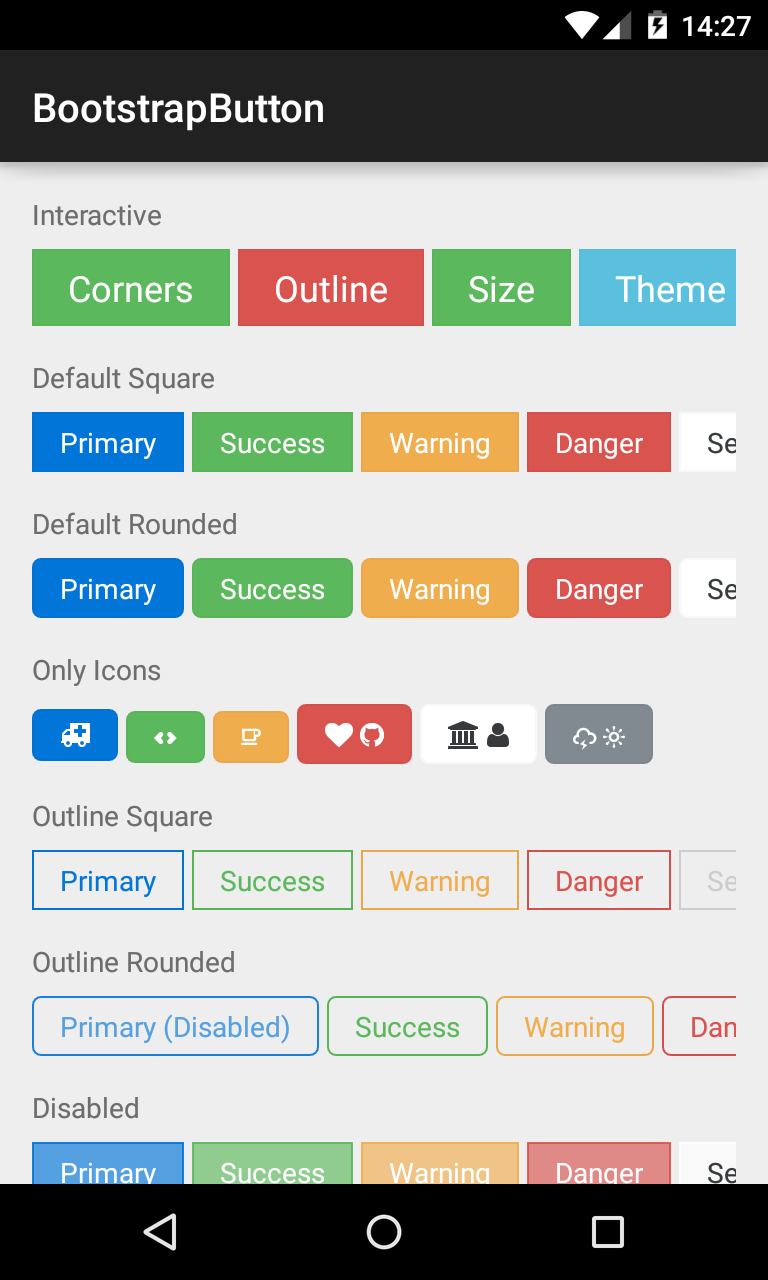
BootstrapButton
A button that supports Glyph icons, and is themeable using Bootstrap Brands.
<com.beardedhen.androidbootstrap.BootstrapButton
 android:layout_width="wrap_content"
 android:layout_height="wrap_content"
 android:text="BootstrapButton"
 app:bootstrapBrand="success"
 app:bootstrapSize="lg"
 app:buttonMode="regular"
 app:showOutline="false"
 app:roundedCorners="true"
 />
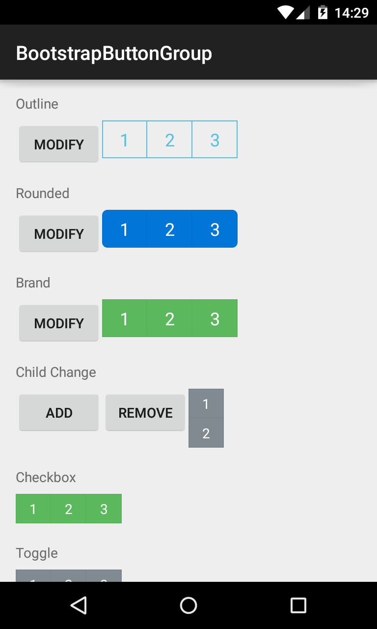
###BootstrapButtonGroup Allows BootstrapButtons to be grouped together and their attributes controlled en masse.
<com.beardedhen.androidbootstrap.BootstrapButtonGroup
 android:layout_width="wrap_content"
 android:layout_height="wrap_content"
 android:text="BootstrapButtonGroup"
 android:orientation="vertical"
 app:bootstrapBrand="success"
 app:bootstrapSize="lg"
 app:roundedCorners="true"
 >
 <com.beardedhen.androidbootstrap.BootstrapButton
    android:layout_width="wrap_content"
    android:layout_height="wrap_content"
    android:text="BootstrapButton 1"
    />
 <com.beardedhen.androidbootstrap.BootstrapButton
    android:layout_width="wrap_content"
    android:layout_height="wrap_content"
    android:text="BootstrapButton 2"
    />
</com.beardedhen.androidbootstrap.BootstrapButtonGroup>
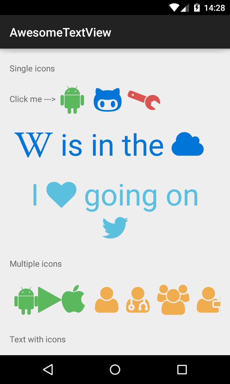
AwesomeTextView
A text widget that displays Glyph icons, and is themeable using Bootstrap Brands.
<com.beardedhen.androidbootstrap.AwesomeTextView
 android:layout_width="wrap_content"
 android:layout_height="wrap_content"
 app:bootstrapBrand="success"
 app:fontAwesomeIcon="fa_android"
 />
###BootstrapProgressBar Displays progress in a bar from 0-100, and animates updates to the current progress.
<com.beardedhen.androidbootstrap.BootstrapProgressBar
 android:layout_width="wrap_content"
 android:layout_height="wrap_content"
 app:animated="true"
 app:bootstrapBrand="warning"
 app:progress="78"
 app:striped="true"
 />
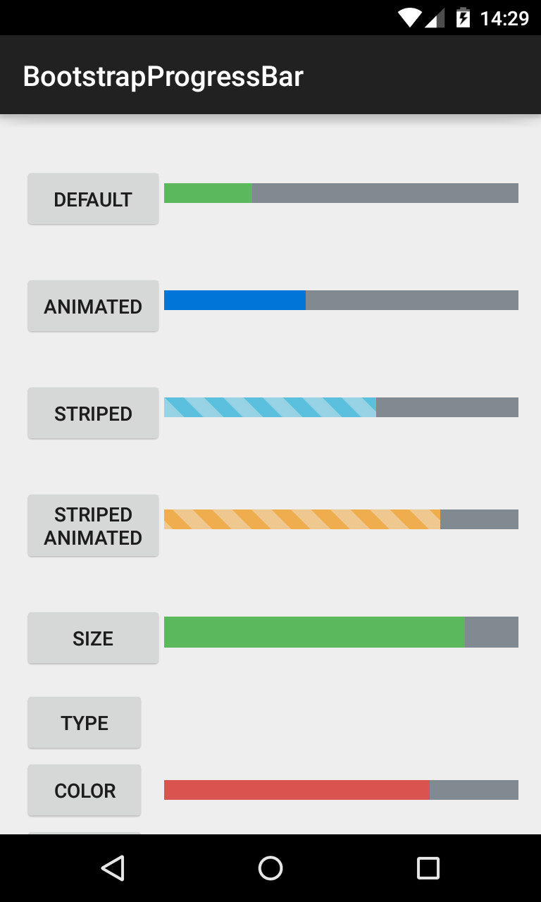
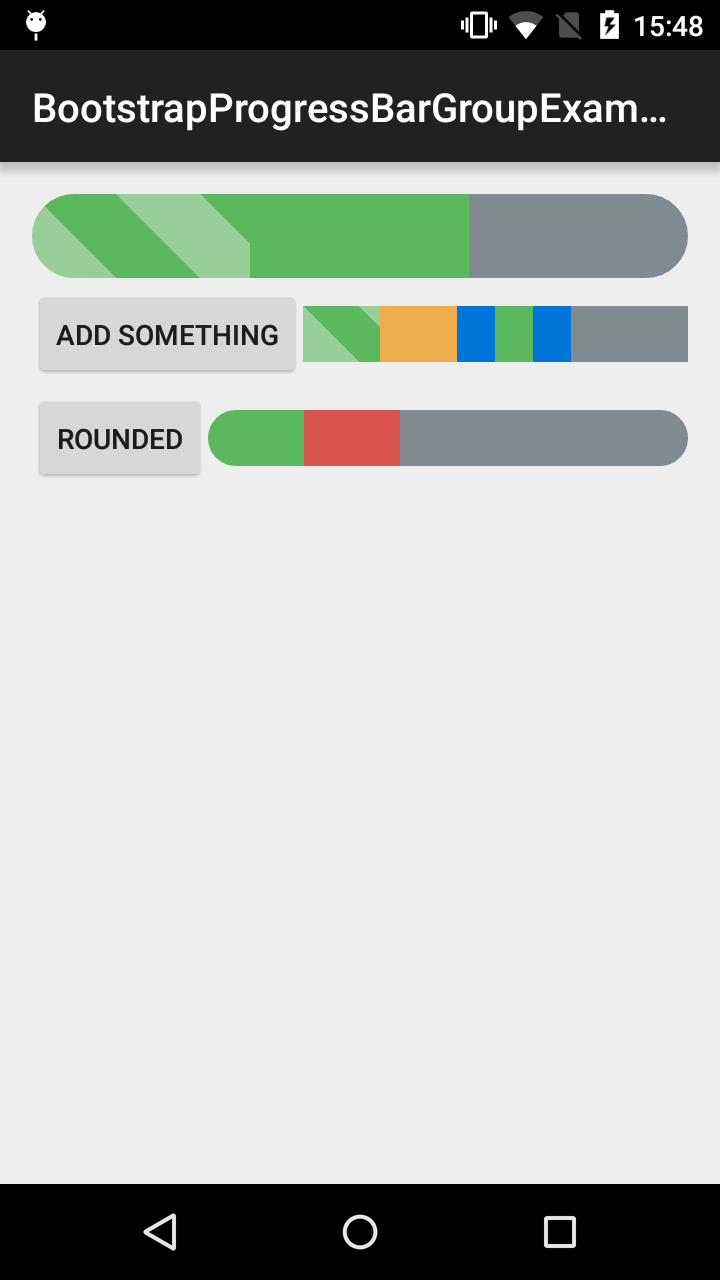
BootstrapProgressBarGroup
Allows BootstrapProgressBars to be group together to have the effect of stacked progress bar.
     <com.beardedhen.androidbootstrap.BootstrapProgressBarGroup
         android:id="@+id/example_progress_bar_group_round_group"
         android:layout_width="match_parent"
         android:layout_height="wrap_content"
         android:layout_gravity="center_vertical"
         app:bootstrapSize="md"
         app:bootstrapMaxProgress="100">

         <com.beardedhen.androidbootstrap.BootstrapProgressBar
             android:layout_width="0dp"
             android:layout_height="wrap_content"
             app:bootstrapBrand="success"
             app:bootstrapProgress="20"
             />

         <com.beardedhen.androidbootstrap.BootstrapProgressBar
             android:layout_width="0dp"
             android:layout_height="wrap_content"
             app:bootstrapBrand="danger"
             app:bootstrapProgress="20"
             />

         </com.beardedhen.androidbootstrap.BootstrapProgressBarGroup>
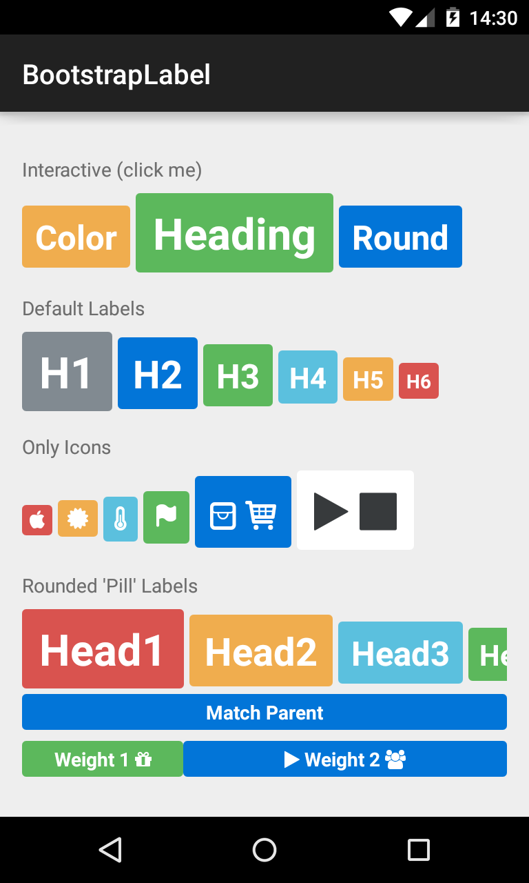
###BootstrapLabel Displays non-clickable text in a widget similar to the BootstrapButton, sizable using H1-H6 elements.
<com.beardedhen.androidbootstrap.BootstrapLabel
 android:layout_width="wrap_content"
 android:layout_height="wrap_content"
 app:bootstrapBrand="primary"
 app:bootstrapHeading="h3"
 app:roundedCorners="true"
 android:text="Bootstrap Label"
 />
BootstrapEditText
Allows editing of text in a widget themed using BootstrapBrand.
<com.beardedhen.androidbootstrap.BootstrapEditText
 android:layout_width="wrap_content"
 android:layout_height="wrap_content"
 app:bootstrapSize="md"
 app:bootstrapBrand="info"
 />

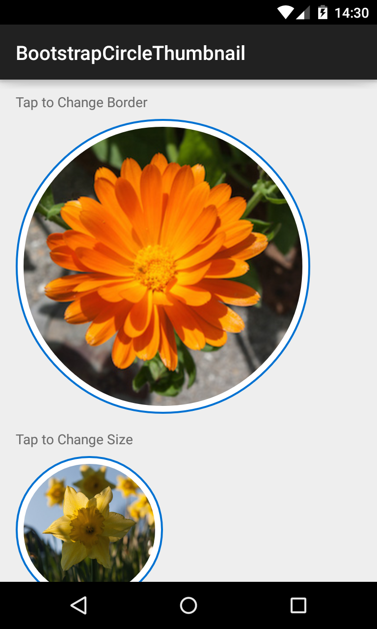
###BootstrapCircleThumbnail Displays images in a center-cropped Circular View, themed with BootstrapBrand.
<com.beardedhen.androidbootstrap.BootstrapCircleThumbnail
 android:layout_width="wrap_content"
 android:layout_height="wrap_content"
 android:src="@drawable/my_drawable"
 app:bootstrapBrand="danger"
 app:hasBorder="true"
 />
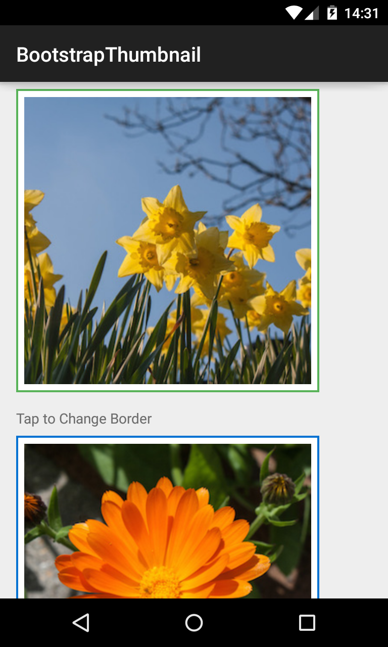
BootstrapThumbnail
Displays images in a rectangular View, themed with BootstrapBrand.
<com.beardedhen.androidbootstrap.BootstrapThumbnail
 android:layout_width="wrap_content"
 android:layout_height="wrap_content"
 android:src="@drawable/my_drawable"
 app:bootstrapBrand="info"
 app:hasBorder="true"
 />
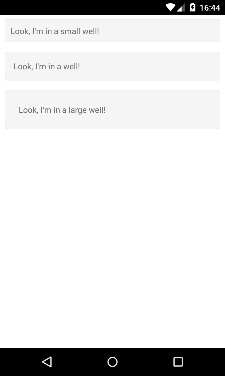
###BootstrapWell Displays a view in a themed container.
<com.beardedhen.androidbootstrap.BootstrapWell
        android:layout_width="match_parent"
        android:layout_height="wrap_content"
        android:layout_gravity="center"
        android:layout_margin="8dp"
        app:bootstrapSize="xl">

        <TextView
            android:layout_width="wrap_content"
            android:layout_height="wrap_content"
            android:gravity="right"
            android:text="Look, I'm in a large well!"
            />
    </com.beardedhen.androidbootstrap.BootstrapWell>
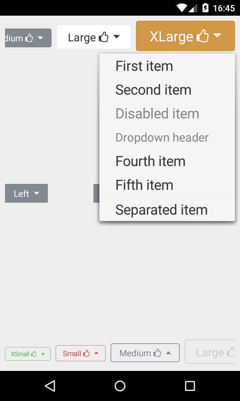
###BootstrapDropDown Displays a view with dropdown options, supplied by an array of strings.
<com.beardedhen.androidbootstrap.BootstrapDropDown
                android:layout_width="wrap_content"
                android:layout_height="wrap_content"
                android:layout_marginLeft="8dp"
                app:bootstrapText="Medium {fa_thumbs_o_up}"
                app:bootstrapBrand="regular"
                app:roundedCorners="true"
                app:bootstrapSize="md"
                app:dropdownResource="@array/bootstrap_dropdown_example_data"
                app:bootstrapExpandDirection="down"/>
Custom Styles
Custom styles can be applied to any of the views in this library by creating a class which implements BootstrapBrand, and setting it on the View. Please see the sample code of BootstrapButton for more detail.
    class CustomBootstrapStyle implements BootstrapBrand {
        // specify desired colors here
    }

    BootstrapButton btn = new BootstrapButton(context);
    btn.setBootstrapBrand(new CustomBootstrapStyle(this);
Contributing
Contributions are very welcome! There are 3 main ways you can help out:
- Add more Icon Typefaces, using the instructions here
- Help implement views which are present in the Twitter Bootstrap Specification but are not yet in this library.
- Raise an issue if you see a bug or are unsure on how something works, or even better - send a pull-request with a fix!
Versioning
This project uses Semantic Versioning. There are several breaking changes in V2.X of the library, including:
- AwesomeTextView replaces FontAwesomeText
- Various altered method signatures/attributes for views
- Global BootstrapBrand/BootstrapSize attributes replace view-specific enums
Please consider what effect these changes might have on your app before upgrading!
Contact
If you have any questions, issues, or just want to let us know where you're using Android Bootstrap tweet us at @BeardedHen, email support@beardedhen.com, or head over to our website to see more of our creations.
Hall of Fame
Checkout AppBrain to see some of the apps which use Android Bootstrap!
Top Related Projects
The iconic SVG, font, and CSS toolkit
A curated list of awesome Android UI/UX libraries
😍 A beautiful, fluid, and extensible dialogs API for Kotlin & Android.
The flexible, easy to use, all in one drawer library for your Android project. Now brand new with material 2 design.
A circular ImageView for Android
Android Floating Action Button based on Material Design specification
Convert designs to code with AI
Introducing Visual Copilot: A new AI model to turn Figma designs to high quality code using your components.
Try Visual Copilot