
Top Related Projects

All the controls missing in WPF. Over 1 million downloads.

Dragable and tearable tab control for WPF

Develop Desktop, Embedded, Mobile and WebAssembly apps with C# and XAML. The most popular .NET UI client technology

Google's Material Design in XAML & WPF, for C# & VB.Net.

Modern UI for WPF
Quick Overview
AvalonDock is a WPF docking library that provides a flexible and customizable docking system for Windows Presentation Foundation (WPF) applications. It allows developers to create applications with dockable windows, similar to those found in integrated development environments (IDEs) and other professional software tools.
Pros
- Highly customizable and flexible docking layout
- Supports multiple themes and styles
- Active development and maintenance
- Comprehensive documentation and examples
Cons
- Limited to WPF applications (not compatible with other UI frameworks)
- Learning curve for complex layouts and customizations
- Some users report occasional performance issues with large numbers of docked windows
- Limited cross-platform support (Windows-only)
Code Examples
- Basic docking layout setup:
<ad:DockingManager x:Name="dockManager">
    <ad:LayoutRoot>
        <ad:LayoutPanel Orientation="Horizontal">
            <ad:LayoutAnchorablePane DockWidth="200">
                <ad:LayoutAnchorable Title="Tool Window">
                    <TextBlock Text="This is a tool window"/>
                </ad:LayoutAnchorable>
            </ad:LayoutAnchorablePane>
            <ad:LayoutDocumentPane>
                <ad:LayoutDocument Title="Document">
                    <TextBlock Text="This is a document"/>
                </ad:LayoutDocument>
            </ad:LayoutDocumentPane>
        </ad:LayoutPanel>
    </ad:LayoutRoot>
</ad:DockingManager>
- Adding a new document programmatically:
var newDocument = new LayoutDocument
{
    Title = "New Document",
    Content = new TextBlock { Text = "This is a new document" }
};
dockManager.Layout.RootPanel.Children[1].AddChild(newDocument);
- Saving and loading layout:
// Saving layout
var layoutSerializer = new XmlLayoutSerializer(dockManager);
using (var stream = new StreamWriter("layout.xml"))
{
    layoutSerializer.Serialize(stream);
}

// Loading layout
using (var stream = new StreamReader("layout.xml"))
{
    layoutSerializer.Deserialize(stream);
}
Getting Started
-
Install the AvalonDock NuGet package:
Install-Package Dirkster.AvalonDock -
Add the AvalonDock namespace to your XAML:
xmlns:ad="https://github.com/Dirkster99/AvalonDock" -
Create a basic docking layout in your XAML:
<ad:DockingManager> <ad:LayoutRoot> <ad:LayoutPanel> <ad:LayoutDocumentPane> <ad:LayoutDocument Title="Welcome"> <TextBlock Text="Welcome to AvalonDock!"/> </ad:LayoutDocument> </ad:LayoutDocumentPane> </ad:LayoutPanel> </ad:LayoutRoot> </ad:DockingManager> -
Customize and expand the layout as needed for your application.
Competitor Comparisons
All the controls missing in WPF. Over 1 million downloads.
Pros of wpftoolkit
- More comprehensive set of controls and features
- Regularly updated with new controls and improvements
- Extensive documentation and community support
Cons of wpftoolkit
- Commercial license required for some features
- Larger footprint and potential performance impact
- Steeper learning curve due to extensive feature set
Code Comparison
AvalonDock:
<ad:DockingManager>
    <ad:LayoutRoot>
        <ad:LayoutPanel>
            <ad:LayoutDocumentPane/>
        </ad:LayoutPanel>
    </ad:LayoutRoot>
</ad:DockingManager>
wpftoolkit:
<xctk:DockingManager>
    <xctk:LayoutRoot>
        <xctk:LayoutPanel>
            <xctk:LayoutDocumentPane/>
        </xctk:LayoutPanel>
    </xctk:LayoutRoot>
</xctk:DockingManager>
Both libraries provide similar docking functionality, but wpftoolkit offers a wider range of controls beyond docking. AvalonDock focuses specifically on docking and layout management, making it potentially more lightweight for projects that only require these features. The code structure is similar, with minor differences in namespace prefixes and potentially available properties or methods.
Dragable and tearable tab control for WPF
Pros of Dragablz
- Lightweight and focused on drag-and-drop functionality for tabs
- Easier to integrate into existing projects due to its simplicity
- More active development and recent updates
Cons of Dragablz
- Less comprehensive docking functionality compared to AvalonDock
- Limited built-in layout management features
- Smaller community and fewer resources available
Code Comparison
AvalonDock:
<DockingManager x:Name="dockManager">
    <LayoutRoot>
        <LayoutPanel Orientation="Horizontal">
            <LayoutAnchorablePane DockWidth="200">
                <LayoutAnchorable Title="Tool Window">
                    <!-- Content -->
                </LayoutAnchorable>
            </LayoutAnchorablePane>
        </LayoutPanel>
    </LayoutRoot>
</DockingManager>
Dragablz:
<dragablz:TabablzControl>
    <dragablz:TabablzControl.InterTabController>
        <dragablz:InterTabController />
    </dragablz:TabablzControl.InterTabController>
    <TabItem Header="Tab 1">
        <!-- Content -->
    </TabItem>
</dragablz:TabablzControl>
AvalonDock provides a more complex docking system with built-in layout management, while Dragablz focuses on simple, draggable tabs. AvalonDock is better suited for applications requiring advanced docking capabilities, whereas Dragablz is ideal for projects needing lightweight, customizable tab controls with drag-and-drop functionality.
Develop Desktop, Embedded, Mobile and WebAssembly apps with C# and XAML. The most popular .NET UI client technology
Pros of Avalonia
- Cross-platform UI framework supporting Windows, macOS, Linux, iOS, Android, and WebAssembly
- Modern, flexible architecture with XAML-based UI design
- Active development and growing community support
Cons of Avalonia
- Steeper learning curve for developers new to XAML-based frameworks
- Smaller ecosystem compared to more established frameworks like WPF
Code Comparison
Avalonia XAML:
<Window xmlns="https://github.com/avaloniaui"
        xmlns:x="http://schemas.microsoft.com/winfx/2006/xaml"
        Title="Avalonia Window">
    <Button Content="Click me!" />
</Window>
AvalonDock XAML:
<ad:DockingManager x:Name="dockManager">
    <ad:LayoutRoot>
        <ad:LayoutPanel>
            <ad:LayoutDocumentPane/>
        </ad:LayoutPanel>
    </ad:LayoutRoot>
</ad:DockingManager>
Avalonia is a comprehensive UI framework for building cross-platform applications, while AvalonDock focuses specifically on providing docking functionality for WPF applications. Avalonia offers broader capabilities and platform support, but AvalonDock may be more suitable for developers specifically seeking docking features in WPF projects.
Google's Material Design in XAML & WPF, for C# & VB.Net.
Pros of MaterialDesignInXamlToolkit
- Offers a comprehensive Material Design implementation for WPF
- Provides a wide range of UI controls and components
- Actively maintained with frequent updates and community support
Cons of MaterialDesignInXamlToolkit
- Larger library size, potentially impacting application performance
- Steeper learning curve due to extensive features and customization options
- May require more effort to integrate with existing non-Material Design UI
Code Comparison
AvalonDock:
<ad:DockingManager>
    <ad:LayoutRoot>
        <ad:LayoutPanel>
            <ad:LayoutDocumentPane/>
        </ad:LayoutPanel>
    </ad:LayoutRoot>
</ad:DockingManager>
MaterialDesignInXamlToolkit:
<materialDesign:Card>
    <StackPanel>
        <TextBlock Text="Hello World" Style="{StaticResource MaterialDesignHeadline6TextBlock}"/>
        <Button Content="CLICK ME" Style="{StaticResource MaterialDesignRaisedButton}"/>
    </StackPanel>
</materialDesign:Card>
AvalonDock focuses on docking functionality, while MaterialDesignInXamlToolkit provides a broader set of UI components with Material Design styling. AvalonDock is more specialized for creating dockable layouts, whereas MaterialDesignInXamlToolkit offers a complete design system for WPF applications.
Modern UI for WPF
Pros of MUI
- More comprehensive UI framework with a wider range of components
- Better documentation and community support
- Actively maintained with frequent updates
Cons of MUI
- Steeper learning curve due to its extensive feature set
- Potentially larger bundle size for smaller projects
- May require more configuration for custom styling
Code Comparison
AvalonDock (XAML):
<ad:DockingManager>
    <ad:LayoutRoot>
        <ad:LayoutPanel>
            <ad:LayoutDocumentPane/>
        </ad:LayoutPanel>
    </ad:LayoutRoot>
</ad:DockingManager>
MUI (React):
<Box sx={{ display: 'flex' }}>
  <Drawer variant="permanent" open={open}>
    {/* Drawer content */}
  </Drawer>
  <Box component="main" sx={{ flexGrow: 1, p: 3 }}>
    {/* Main content */}
  </Box>
</Box>
While AvalonDock focuses on docking functionality for WPF applications, MUI provides a more general-purpose UI framework for React applications. AvalonDock offers a simpler API for creating dockable layouts, while MUI requires more setup but provides greater flexibility for overall application design.
Convert  designs to code with AI

Introducing Visual Copilot: A new AI model to turn Figma designs to high quality code using your components.
Try Visual CopilotREADME


Master Branch


AvalonDock
Support this project with a :star: -report an issue, or even better, place a pull request :mailbox: :blush:
My projects Edi, Aehnlich, and many others (open source or commercial) are powered by this project.
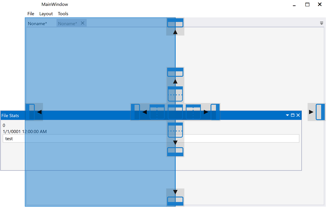
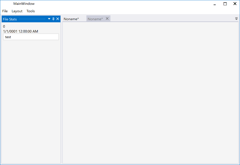
AvalonDock is a WPF Document and Tool Window layout container that is used to arrange documents and tool windows in similar ways than many well known IDEs, such as, Eclipse, Visual Studio, PhotoShop and so forth. Here are some CodeProject articles:
- AvalonDock [2.0] Tutorial Part 1 - Adding a Tool Window
- AvalonDock [2.0] Tutorial Part 2 - Adding a Start Page
- AvalonDock [2.0] Tutorial Part 3 - AvalonEdit in AvalonDock
- AvalonDock [2.0] Tutorial Part 4 - Integrating AvalonEdit Options
- AvalonDock [2.0] Tutorial Part 5 - Load/Save Layout with De-Referenced DockingManager
This repository contains additional bug fixes and a feature added fork for: xceedsoftware/wpftoolkit version 3.2-3.6. Version 4.0 and later are developed indepentently, which is why this library (version 4.0 and later) uses the namespaces and library names that were used in AvalonDock 2.0 and earlier versions. But most importantly, the usage of this AvalonDock project remains free for both, commercial and open source users.
There is also an open source repository https://github.com/dotnetprojects/WpfExtendedToolkit with a fixed and stable version of all other (other than AvalonDock) components from the WPFToolKit.
Be sure to checkout the Wiki for more details.
Building AvalonDock from Source
This project supports multitargeting frameworks (NetCore 3 and .Net 4). This means that it requires Visual Studio Community 2019 or better to build.
Feature Added - Dark and Light VS 2013 Theme
Please review the Project Wiki to see more demo screenshots. All screenshots below are from the MLib based VS 2013 Dark (Accent Color Gold)/Light (Accent Color Blue) theme on Windows 10. Similar theming results should be possible with other theming libraries since the implementation follow these guidelines.
The Docking Buttons are defined in XAML, which ensures a good looking image on all resolutions, even 4K or 8K, and enables us to color theme consistently with the Window 10 Accent Color.
| Description | Dark | Light |
| Dock Document | 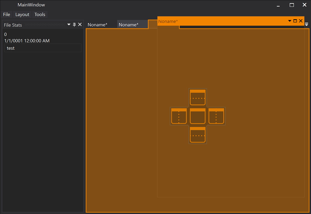 |
 |
| Dock Document | 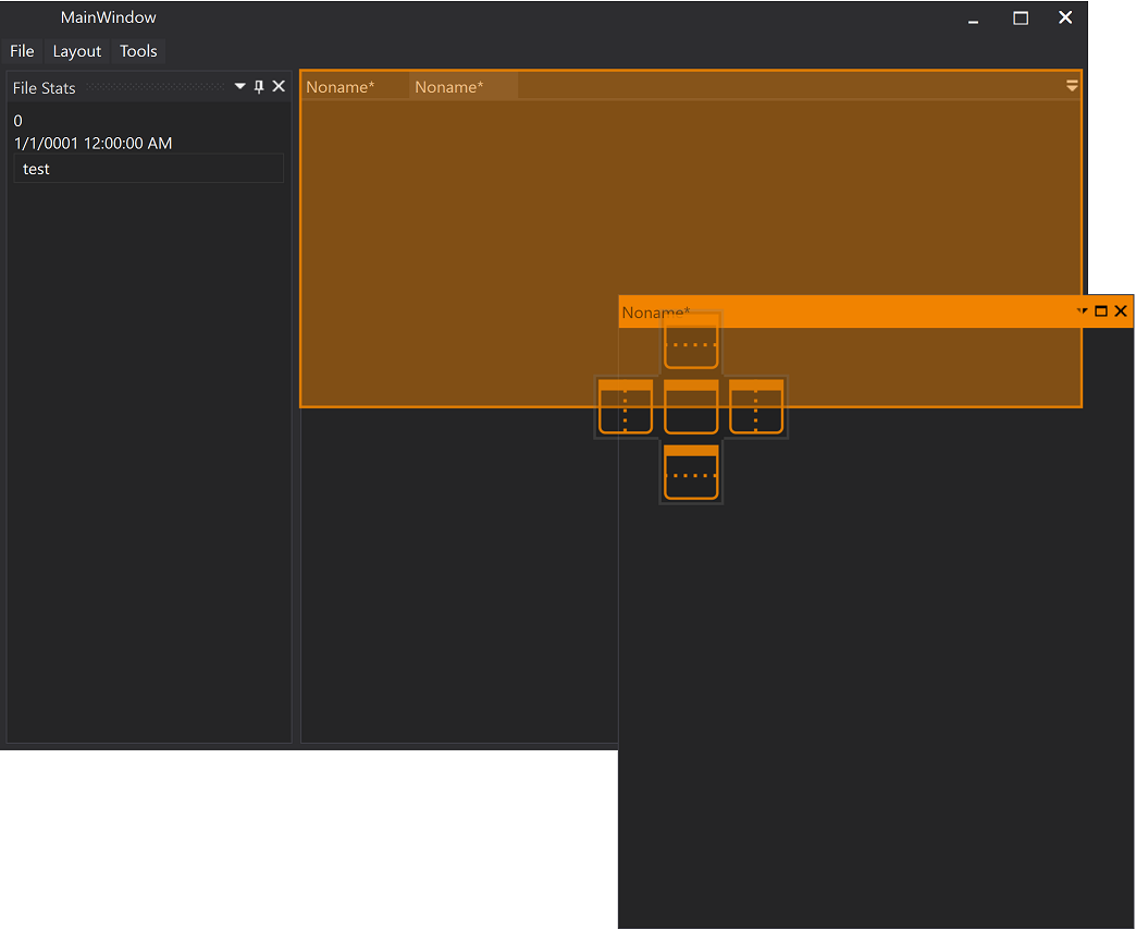 |
 |
| Dock Tool Window | 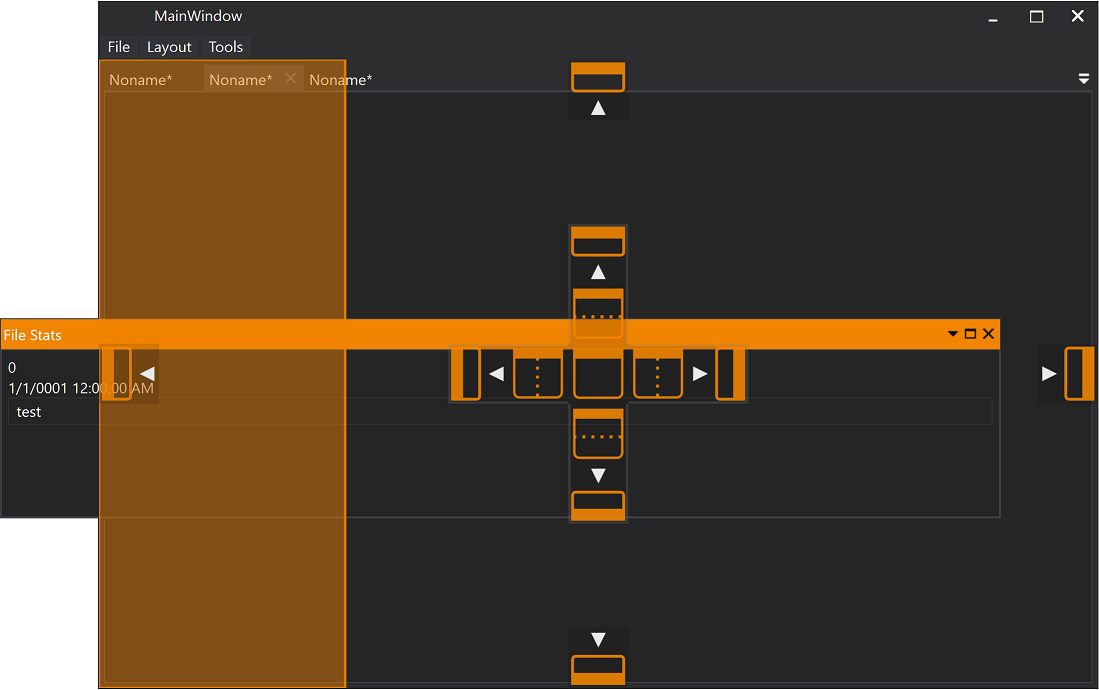 |
 |
| Document | 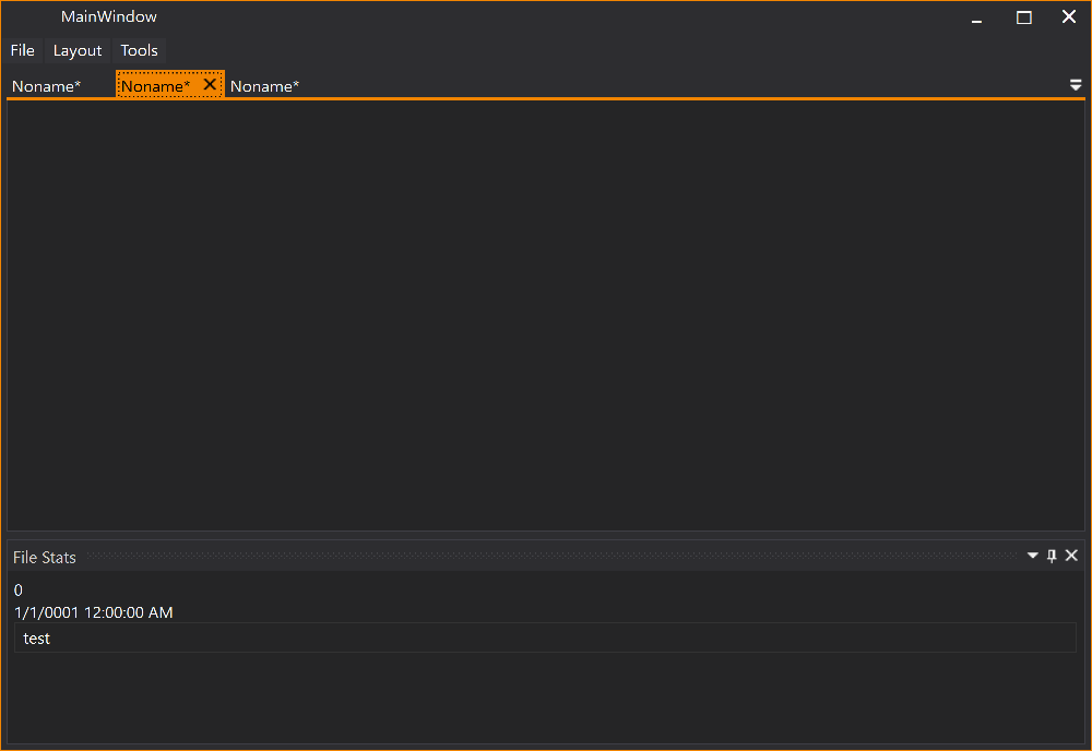 |
 |
| Tool Window |  |
 |
Theming
Using the AvalonDock.Themes.VS2013 theme is very easy with Dark and Light themes. Just load Light or Dark brush resources in you resource dictionary to take advantage of existing definitions.
    <ResourceDictionary.MergedDictionaries>
        <ResourceDictionary Source="/AvalonDock.Themes.VS2013;component/DarkBrushs.xaml" />
    </ResourceDictionary.MergedDictionaries>
    <ResourceDictionary.MergedDictionaries>
        <ResourceDictionary Source="/AvalonDock.Themes.VS2013;component/LightBrushs.xaml" />
    </ResourceDictionary.MergedDictionaries>
These definitions do not theme all controls used within this library. You should use a standard theming library, such as:
- MahApps.Metro,
- MLib, or
- MUI
to also theme standard elements, such as, button and textblock etc.
Mile Stone History
Fixes and Features Added in Version 4.72.0
- #436 Changed how the next active document is picked on document close. (thanx to FredrikS fredriks123)
- #438 NullCheck for DragPoint (thanx to Ben bbuerger)
Fixes and Features Added in Version 4.72.0
-
#423 issue #422 DockingManager.LayoutItemTemplateSelector is applied twice because... (thanx to Mona04)
-
#425 Fix: Potential NRE on app close (thanx to Khaos66)
-
#427 Fix floating windows still created twice (thanx to Khaos66)
-
Add DockingManager.ShowNavigator (thanx to Calum Robinson)
-
#431 Fix unwanted group orientation change when using mixed orientation (thanx to KuroiRoy)
Fixes Added in Version 4.71.2
-
#416 Fix Issue #226: Restore floating windows to maximized state (thanx to Michael Möller)
-
#417 Close and active selected item when NavigatorWindow is inactive (thanx to EQOH Noisrev)
-
#418 Add active content handler to LayoutAnchorableFloatingWindow and improve the active content handlers (thanx to EQOH Noisrev)
Fixes Added in Version 4.71.1
-
#413 Fix the binding error in AnchorGroupTemplate (thanx to EQOH Noisrev)
-
#414 When apply new template, add back collection change event handler (thanx to EQOH Noisrev)
-
#415 Improved and fix floating window activation and activation pane (thanx to EQOH Noisrev)
Fixes Added in Version 4.71.0
-
#399 add open/close LayoutFlayoutingWindowsControl events (thanx to Denis Smirnov)
-
#400 set ResizeOverlay's owner always null (thanx to Denis Smirnov)
-
#401 remove unused variable from DocumentPaneTabPanel (thanx to Denis Smirnov)
-
#403 Add XmlSerializer cache to fix memory leaks. (thanx to Pavel Kindruk)
-
#404 Fix deserialized layout document close. (thanx to Pavel Kindruk)
-
#409 Restore previously activated document after closing active document (thanx to L45eMy)
-
#410 Improved activation of floating Windows (thanx to EQOH Noisrev)
-
#411 Add anchorable hide and close notifications to DockingManager (thanx to John Stewien)
-
#412 Fix a issue where the dragged window still appeared above the overlay window (thanx to EQOH Noisrev)
Fixes Added in Version 4.70.3
-
#394 Fix the get owner DockingManagerWindow and Update drag and drop (thanx to EQOH Noisrev)
-
#393 Add Null check for GetWindowChrome (thanx to EQOH Noisrev)
-
#376 Prevents a known bug in WPF (thanx to Ben Buerger)
Fixes Added in Version 4.70.2
- #338 Fixes #309 Anchorable Header not visible in generic theme (thanx to Darren Gosbell)
- #346 fix crash if some assembly not allow GetTypes() (thanx to Trivalik)
- #347 #345 fix refresh when moving floating windows (thanx to Norberto Magni)
- #357 LayoutAutoHideWindowControl: UI automation name (thanx to Ben)
- #363 Fixes #362 DockingManager with a Viewbox ancestor does not properly render auto-hidden LayoutAnchorables (thanx to Tim Cooke)
- #367 Fix for #306 StartDraggingFloatingWindow (thanx to Muhahe)
Fixes Added in Version 4.70.1
- #336 Keep ActiveContent when switching RootPanel (thanx to Khaos66)
- #334 fix #333 x64-issue: x86-specific functions are used when project is compiled for x64-architecture (thanx to Jan cuellius)
Features and Fixes Added in Version 4.70.0
- #331 FixDockAsDocument fix bug with CanExecute and Execute for DockAsDocument (thanx to askgthb)
- #328 NullCheck for currentActiveContent (thanx to Ben bbuerger)
- #327 Add default width and height of LayoutAnchorable (thanx to Anders Chen)
- #326 A more complete fix to per-monitor DPI issues (thanx to Robin rwg0)
- #324 Navigator Window Accessibility fixes (thanx to Siegfried Pammer)
Features and Fixes Added in Version 4.60.1
- #314 Fix NavigatorWindow not working if there is only one document (thanx to Siegfried Pammer)
- #308 Code Clean-Up Serialization (thanx to RadvileSaveraiteFemtika)
- #317 Aded LayoutItem null check when processing mouseMiddleClickButton (thanx to JuanCar Orozco)
Features and Fixes Added in Version 4.60.0
- #278 Rename pt-BR to pt (make Brazilian Portuguese default to Portuguese) (thanx to mpondo)
- #272 Fix Mismatched ResourceKey on VS2013 Theme (thanx to Reisen Usagi)
- #274 Support custom styles for LayoutGridResizerControl (thanx to mpondo)
- #276 Support minimizing floating windows independently of main window (thanx to mpondo)
- #284 Vs2013 theme improvement (thanx to oktrue)
- #288 Fix close from taskbar for floating window (thanx to mpondo)
- #291 Fix Issue #281 floating window host: UI automation name (thanx to rmadsen-ks)
Features and Fixes Added in Version 4.51.1
-
#262 Contextmenus on dpi-aware application have a wrong scaling (thanx to moby42)
-
#259 Fixing problems with tests running with XUnit StaFact (thanx to Erik Ovegård)
-
#266 Adding a key for AnchorablePaneTitle (thanx to Zachary Canann)
-
#267 Optional show hidden LayoutAnchorable on hover (thanx to Cory Todd)
Features Added in PRE-VIEW Version 4.51.0
Fixes added in Version 4.50.3
-
#163 IsSelected vs IsActive behavior changed from 3.x to 4.1/4.2? (thanx to triman)
-
#244 Right click on tab header closes tab unexpectedly (thanx to Olly Atkins)
-
#208 Maximized floating windows sit under the task bar (thanx to Flynn1179)
-
#255 Don't create FloatingWindows twice (thanx to Khaos66)
Fixes added in Version 4.50.2
-
#221 Default window style interfere with resizer window (thanx to Magnus Lindhe)
-
#224 Reverted Fixed a bug that freezed when changing DocumentPane Orientation (thanx to sukamoni)
See pull request for issues with this PR -
#240 NullReferenceException in LayoutDocumentControl.OnModelChanged (thanx to Khaos66)
-
#225 Keyboard up/down in textbox in floating anchorable focusing DropDownControlArea (thanx to Muhahe LyonJack bdachev)
-
#229 Ensure DocumentPaneGroup (fix crash when documentpane on layoutGroup) (thanx to sukamoni)
Fixes added in Version 4.50.1
- #210 LayoutAnchorable with CanDockAsTabbedDocument="False" docks to LayoutDocumentPane when Pane is empty (thanx to Åukasz Holetzke)
- #195 DocumentClosed event issue (thanx to Skaptor)
- #205 Fix issue where the ActiveContent binding doesn't update two ways when removing a document. (thanx to PatrickHofman)
Fixes added in Version 4.5
- #199 Add to LayoutDocument CanHide property returning false (thanx to bdachev)
- #138 Trying dock a floating window inside a document pane leads to its disappearing of window's content. (thanx to cuellius)
- #197 [Bug] Tabs start getting dragged around if visual tree load times are too high (thanx to X39)
- Bug fix for issue #194 App doesn't close after LayoutAnchorable AutoHide and docking it again (thanx to sphet)
Fixes & Features added in Version 4.4
-
#182 CanClose property of new LayoutAnchorableItem is different from its LayoutAnchorable (thanx to skyneps)
-
#184 All documents disappear if document stops close application in Caliburn.Micro (thanx to ryanvs)
-
Thanx to bdachev:
- #186 Raise PropertyChanged notification when LayoutContent.IsFloating changes (ensure change of the IsFloating property when the Documents state changes)
- #187 Allow to serialize CanClose if set to true for LayoutAnchorable instance
- #188 Handle CanClose and CanHide in XAML
- #190 Added additional check in LayoutGridControl.UpdateRowColDefinitions to avoid exception.
- #192 Default MenuItem style not changed by VS2013 Theme
-
Removed the additional ToolTip and ContextMenu styles from the Generic.xaml in VS2013 more details here
-
#189 Removal of DictionaryTheme breaks my application (thanx to hamohn)
Fixes & Features added in Version 4.3
-
Localized labels in NavigatorWindow
-
#170 Several Improvements (thanx to åæé LyonJack)
- Improved VS 2013 Theme and ease of reusing controls
- Fix Issue #85 Floating Window Title Flashing
- Fix Issue #71 Hiding and showing anchorable in document's pane throws an exception
- Fix Issue #135 ActiveContent not switching correctly for floating window
- Fix Issue #165 ActiveContent not stable
- Fix Issue #171 LayoutDocument leaks on close
- Breaking Change
Fix Issue #174 The SetWindowSizeWhenOpened Feature is broken - Fix Issue #177 ToolBar TabItem color error
-
#136 Layout "locking" method for Anchorables (tool windows) Part III Added CanDock for LayoutAnchorable and LayoutDocument commit 6b611fa7fdce4f6dcfed1cf00c3b9193000ffe16
Fixes & Features added in Version 4.2
-
# 159 Docking manager in TabControl can cause InvalidOperationException
-
# 151 Model.Root.Manager may be null in LayoutDocumentTabItem Thanx to scdmitryvodich
Fixes & Features added in Version 4.1
-
Feature Added: Auto resizing floating window to content thanx to Erik Ovegård
-
Feature Added: Virtualizing Tabbed Documents and/or LayoutAnchorables PR #143 + Virtualization Options thanx to matko238
- See
DockingManager.IsVirtualizingAnchorable,DockingManager.IsVirtualizingDocument, andIsVirtualizingproperty onLayoutAnchorablePaneControlandLayoutDocumentPaneControl.
- See
-
Fixed Issue #149 Flicker/Lag when restoring floating window from Maximized state thanx to skyneps
-
Fixed Issue #150 Restoring floating window position on multiple monitors uses wrong Point for Virtual Screen location thanx to charles-roberts
Fixes and Features added in Version 4.0
-
Fix #98 with floating window without a content #99 Thanx to scdmitryvodich
-
Changed coding style to using TABS as indentation
-
Breaking Change Changed namespaces to AvalonDock (as authored originally in version 2.0 and earlier) See also Issue #108
-
Fix #101 and new fix for #81 with docked pane becomes not visible. Thanx to scdmitryvodich
-
Feature added: allow documents to be docked in a floating window Thanx to amolf-se https://github.com/mkonijnenburg @ http://www.amolf.nl
-
Feature added: AutoHideDelay property to control the time until an AutoHide window is reduced back to its anchored representation Thanx to Alexei Stukov
-
Fix #111 AvalonDock.LayoutRoot doesn't know how to deserialize... Thanx to scdmitryvodich
-
Fix #117 Dragging LayoutAnchoreable into outer docking buttons of floating document result in Exception Thanx to scdmitryvodich
More Patch History
Please review the Path History for more more information on patches and feaures in previously released versions of AvalonDock.
Top Related Projects
All the controls missing in WPF. Over 1 million downloads.
Dragable and tearable tab control for WPF
Develop Desktop, Embedded, Mobile and WebAssembly apps with C# and XAML. The most popular .NET UI client technology
Google's Material Design in XAML & WPF, for C# & VB.Net.
Modern UI for WPF
Convert designs to code with AI
Introducing Visual Copilot: A new AI model to turn Figma designs to high quality code using your components.
Try Visual Copilot