 cardslider
:octocat: 🃏 Cardslider is a design UI controller that allows you to swipe through cards with pictures and accompanying descriptions.
Top Related Projects
UIKit a-là SwiftUI.framework [min deployment target iOS10]
KolodaView is a class designed to simplify the implementation of Tinder like cards on iOS.
This component implements transition animation to crumble view-controller into tiny pieces.
:octocat: ExpandingCollection is an animated material design UI card peek/pop controller. iOS library made by @Ramotion
:octocat: 📃 FoldingCell is an expanding content cell with animation made by @Ramotion
:octocat: RAMAnimatedTabBarController is a Swift UI module library for adding animation to iOS tabbar items and icons. iOS library made by @Ramotion
Quick Overview
Cardslider is an iOS library developed by Ramotion that provides a customizable card slider interface. It allows developers to create interactive and visually appealing card-based UI components for iOS applications, offering smooth animations and gesture-based interactions.
Pros
- Easy to integrate and customize
- Smooth animations and gesture support
- Visually appealing design that enhances user experience
- Compatible with Swift and Objective-C
Cons
- Limited to iOS platform only
- May require additional customization for complex use cases
- Documentation could be more comprehensive
- Potential performance impact on older devices with many cards
Code Examples
- Basic setup of CardSliderViewController:
import CardSlider

let dataSource = CardSliderDataSource(
    cards: [
        CardItem(title: "Card 1", description: "Description 1", image: UIImage(named: "image1")),
        CardItem(title: "Card 2", description: "Description 2", image: UIImage(named: "image2")),
        CardItem(title: "Card 3", description: "Description 3", image: UIImage(named: "image3"))
    ]
)

let cardSlider = CardSliderViewController(dataSource: dataSource)
present(cardSlider, animated: true, completion: nil)
- Customizing card appearance:
let options = CardSliderOptions(
    cardSize: CGSize(width: 300, height: 400),
    visibleCardsCount: 3,
    spacing: 15,
    cardCornerRadius: 10
)

let cardSlider = CardSliderViewController(dataSource: dataSource, options: options)
- Implementing CardSliderDelegate methods:
class MyViewController: UIViewController, CardSliderDelegate {
    func cardSlider(_ cardSlider: CardSliderViewController, didSelectItemAt index: Int) {
        print("Selected card at index: \(index)")
    }

    func cardSlider(_ cardSlider: CardSliderViewController, didScrollToItemAt index: Int) {
        print("Scrolled to card at index: \(index)")
    }
}

// Set the delegate
cardSlider.delegate = self
Getting Started
-
Install CardSlider using CocoaPods by adding the following to your Podfile:
pod 'CardSlider' -
Import the library in your Swift file:
import CardSlider -
Create a data source and initialize the CardSliderViewController:
let dataSource = CardSliderDataSource(cards: [/* Your card items */]) let cardSlider = CardSliderViewController(dataSource: dataSource) -
Present the CardSliderViewController:
present(cardSlider, animated: true, completion: nil)
Competitor Comparisons
UIKit a-là SwiftUI.framework [min deployment target iOS10]
Pros of Render
- More versatile, supporting various UI components beyond card sliders
- Declarative approach to UI design, potentially simplifying complex layouts
- Actively maintained with recent updates
Cons of Render
- Steeper learning curve due to its custom DSL and architecture
- Less focused on specific UI elements like card sliders
- May require more setup and integration effort for simple use cases
Code Comparison
Render:
class Component: ComponentNode {
  override func render() -> NodeType {
    return View(
      style: { $0.backgroundColor = .white },
      Button(title: "Hello")
    )
  }
}
CardSlider:
let cardSlider = CardSliderView(frame: view.bounds)
cardSlider.dataSource = self
cardSlider.delegate = self
view.addSubview(cardSlider)
Summary
Render offers a more comprehensive UI framework with a declarative approach, while CardSlider provides a simpler, more focused solution for card-based interfaces. Render's flexibility comes at the cost of increased complexity, whereas CardSlider is easier to implement for its specific use case but less adaptable to other UI patterns.
KolodaView is a class designed to simplify the implementation of Tinder like cards on iOS.
Pros of Koloda
- More customizable with extensive delegate methods and properties
- Supports both left and right swiping with different actions
- Includes built-in undo functionality for accidental swipes
Cons of Koloda
- Steeper learning curve due to more complex API
- May require more setup code for basic functionality
- Limited to card-style swiping, less versatile for other UI patterns
Code Comparison
Koloda implementation:
let kolodaView = KolodaView()
kolodaView.dataSource = self
kolodaView.delegate = self

func kolodaNumberOfCards(_ koloda: KolodaView) -> Int {
    return images.count
}
CardSlider implementation:
let cardSlider = CardSliderViewController.with(dataSource: self)
cardSlider.title = "Card Slider"

func item(for index: Int) -> CardSliderItem {
    return CardSliderItem(image: images[index])
}
Both libraries offer card-based UI components, but Koloda focuses on Tinder-like swiping interactions, while CardSlider provides a more general-purpose card carousel. Koloda offers more granular control over swipe behaviors and animations, making it suitable for dating or decision-making apps. CardSlider, on the other hand, is simpler to implement and better suited for showcasing content in a visually appealing manner, such as in e-commerce or media apps.
This component implements transition animation to crumble view-controller into tiny pieces.
Pros of StarWars.iOS
- Offers a unique and visually appealing Star Wars-themed UI experience
- Includes custom animations and transitions specific to the Star Wars universe
- Provides a complete, themed app structure rather than just a UI component
Cons of StarWars.iOS
- Less versatile and more specialized compared to the general-purpose CardSlider
- May require more customization effort to adapt to non-Star Wars themed projects
- Potentially steeper learning curve due to its specific theming and animations
Code Comparison
StarWars.iOS:
override func viewDidAppear(_ animated: Bool) {
    super.viewDidAppear(animated)
    performAnimations()
}
CardSlider:
override func viewDidLoad() {
    super.viewDidLoad()
    view.addSubview(cardSlider)
}
The StarWars.iOS code snippet shows a focus on custom animations, while the CardSlider code demonstrates a simpler integration of the UI component. StarWars.iOS likely requires more setup and customization, whereas CardSlider appears to be more plug-and-play in nature.
:octocat: ExpandingCollection is an animated material design UI card peek/pop controller. iOS library made by @Ramotion
Pros of expanding-collection
- More visually appealing with its expanding card animation
- Offers a unique and interactive user experience
- Supports both portrait and landscape orientations
Cons of expanding-collection
- More complex implementation compared to cardslider
- May require more system resources due to animations
- Limited customization options for card content
Code Comparison
expanding-collection:
let viewController = ExpandingViewController(style: .fill)
viewController.itemSize = CGSize(width: 256, height: 335)
viewController.collectionView?.contentInset = UIEdgeInsets(top: 20, left: 0, bottom: 0, right: 0)
cardslider:
let cardSlider = CardSliderViewController.with(dataSource: self)
cardSlider.title = "Card Slider"
self.present(cardSlider, animated: true, completion: nil)
Both repositories provide iOS UI components for displaying card-based interfaces. expanding-collection offers a more visually striking experience with its expanding animation, while cardslider provides a simpler, more straightforward implementation. expanding-collection may be better suited for showcasing visual content, while cardslider is more appropriate for applications requiring a quick and easy card-based interface.
:octocat: 📃 FoldingCell is an expanding content cell with animation made by @Ramotion
Pros of folding-cell
- More versatile UI component, suitable for various use cases
- Provides a unique and engaging expanding cell animation
- Offers both Swift and Objective-C implementations
Cons of folding-cell
- More complex to implement and customize compared to cardslider
- May require more development time to integrate into existing projects
- Limited to iOS platform, while cardslider supports both iOS and Android
Code Comparison
folding-cell (Swift):
let cell = FoldingCell()
cell.itemCount = 2
cell.backgroundColor = .clear

cell.foregroundView = foregroundView
cell.containerView = containerView
cardslider (Swift):
let cardSlider = CardSliderViewController.with(dataSource: self)
cardSlider.title = "Card Slider"
navigationController?.pushViewController(cardSlider, animated: true)
Both repositories offer unique UI components for iOS applications. folding-cell provides a more complex and versatile expanding cell animation, while cardslider focuses on a simpler card-based interface. The choice between the two depends on the specific project requirements, desired user experience, and development timeline. folding-cell may be better suited for projects requiring a more distinctive and interactive UI element, while cardslider offers a straightforward implementation for showcasing content in a card format.
:octocat: RAMAnimatedTabBarController is a Swift UI module library for adding animation to iOS tabbar items and icons. iOS library made by @Ramotion
Pros of animated-tab-bar
- Focuses on tab bar animations, providing a more specialized and polished experience for this specific UI element
- Offers a wider variety of animation styles for tab bar items
- Easier to implement for projects that specifically need an animated tab bar
Cons of animated-tab-bar
- Limited to tab bar functionality, less versatile than cardslider
- May require more customization to fit into existing app designs
- Potentially higher performance impact due to continuous animations
Code Comparison
animated-tab-bar:
let tabBar = RAMAnimatedTabBarController()
let item1 = RAMAnimatedTabBarItem(title: "Home", image: UIImage(named: "home"), tag: 1)
item1.animation = RAMBounceAnimation()
tabBar.viewControllers = [vc1, vc2, vc3]
tabBar.setViewControllers([vc1, vc2, vc3], animated: true)
cardslider:
let cardSlider = CardSliderViewController.with(cards: cards)
cardSlider.title = "Cards"
cardSlider.modalPresentationStyle = .fullScreen
present(cardSlider, animated: true, completion: nil)
The code snippets demonstrate that animated-tab-bar is specifically designed for creating animated tab bars, while cardslider is more focused on presenting a series of card-like views in a slider format. The implementation approaches differ significantly due to their distinct purposes.
Convert  designs to code with AI

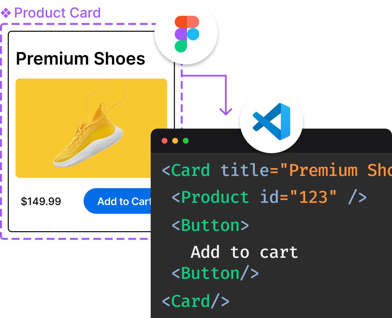
Introducing Visual Copilot: A new AI model to turn Figma designs to high quality code using your components.
Try Visual CopilotREADME

CARD SLIDER
UI controller that allows you to swipe through cards with pictures.
We specialize in the designing and coding of custom UI for Mobile Apps and Websites.
Stay tuned for the latest updates:
Inspired by Charles Patterson shot
Requirements
- iOS 11.0+
- Xcode 10.0+
Installation
Use CocoaPods with Podfile:
pod 'CardSlider'
or Carthage users can simply add CardSlider to their Cartfile:
github "Ramotion/CardSlider"
Then import the module in your code:
import CardSlider
Usage
- Declare a card model, implementing
CardSliderItemprotocol:
public protocol CardSliderItem {
	var image: UIImage { get }
	var rating: Int? { get }
	var title: String { get }
	var subtitle: String? { get }
	var description: String? { get }
}
- Implement
CardSliderDataSourcemethods in your class:
public protocol CardSliderDataSource: class {
	func item(for index: Int) -> CardSliderItem
	func numberOfItems() -> Int
}
- Create an instance of
CardSliderViewControllerwith the data source:
guard let dataSource = someObject as? CardSliderDataSource else { return }
let cardSlider = CardSliderViewController.with(dataSource: dataSource)
- Set the title and present:
cardSlider.title = "Movies"
present(cardSlider, animated: true, completion: nil)
ð License
Card Slider is released under the MIT license. See LICENSE for details.
This library is a part of a selection of our best UI open-source projects.
If you use the open-source library in your project, please make sure to credit and backlink to www.ramotion.com
ð± Get the Showroom App for iOS to give it a try
Try this UI component and more like this in our iOS app. Contact us if interested.
Top Related Projects
UIKit a-là SwiftUI.framework [min deployment target iOS10]
KolodaView is a class designed to simplify the implementation of Tinder like cards on iOS.
This component implements transition animation to crumble view-controller into tiny pieces.
:octocat: ExpandingCollection is an animated material design UI card peek/pop controller. iOS library made by @Ramotion
:octocat: 📃 FoldingCell is an expanding content cell with animation made by @Ramotion
:octocat: RAMAnimatedTabBarController is a Swift UI module library for adding animation to iOS tabbar items and icons. iOS library made by @Ramotion
Convert  designs to code with AI

Introducing Visual Copilot: A new AI model to turn Figma designs to high quality code using your components.
Try Visual Copilot

