 folding-cell
:octocat: 📃 FoldingCell is an expanding content cell with animation made by @Ramotion
Top Related Projects

Animated side menu with customizable UI
:octocat: ExpandingCollection is an animated material design UI card peek/pop controller. iOS library made by @Ramotion
:octocat: RAMAnimatedTabBarController is a Swift UI module library for adding animation to iOS tabbar items and icons. iOS library made by @Ramotion
:octocat: PaperOnboarding is a material design UI slider. Swift UI library by @Ramotion
:octocat: ⭕️ CircleMenu is a simple, elegant UI menu with a circular layout and material design animations. Swift UI library made by @Ramotion
:octocat: 🃏 Cardslider is a design UI controller that allows you to swipe through cards with pictures and accompanying descriptions.
Quick Overview
Folding Cell is an expanding content cell animation library for iOS, created by Ramotion. It provides a unique and visually appealing way to present additional information by unfolding a cell, similar to opening a paper card. This library is designed to enhance the user interface of iOS applications with smooth and engaging animations.
Pros
- Visually appealing and unique animation effect
- Easy to integrate into existing iOS projects
- Customizable appearance and animation duration
- Supports both Swift and Objective-C
Cons
- Limited to iOS platform only
- May not be suitable for all types of content or app designs
- Requires careful consideration of layout and content to avoid overwhelming users
- Performance impact on devices with lower processing power
Code Examples
- Creating a basic folding cell:
let cell = FoldingCell()
cell.itemCount = 4
cell.backViewColor = .lightGray
cell.foregroundView = createForegroundView()
cell.containerView = createContainerView()
- Customizing animation duration:
cell.animationDuration = 1.0 // Set animation duration to 1 second
- Handling cell opening and closing:
cell.delegate = self

// In your delegate method
func foldingCell(_ cell: FoldingCell, willOpenAnimationCompleted animated: Bool) {
    print("Cell opened")
}

func foldingCell(_ cell: FoldingCell, willCloseAnimationCompleted animated: Bool) {
    print("Cell closed")
}
Getting Started
- Install the library using CocoaPods by adding the following to your Podfile:
pod 'FoldingCell'
- Import the library in your Swift file:
import FoldingCell
- Create a custom UITableViewCell subclass that inherits from FoldingCell:
class MyFoldingCell: FoldingCell {
    override func awakeFromNib() {
        super.awakeFromNib()
        foregroundView = createForegroundView()
        containerView = createContainerView()
        itemCount = 3
    }

    // Implement createForegroundView() and createContainerView() methods
}
- Use the custom cell in your UITableView:
func tableView(_ tableView: UITableView, cellForRowAt indexPath: IndexPath) -> UITableViewCell {
    let cell = tableView.dequeueReusableCell(withIdentifier: "FoldingCell", for: indexPath) as! MyFoldingCell
    return cell
}
Competitor Comparisons
Animated side menu with customizable UI
Pros of Side-Menu.iOS
- Focuses specifically on side menu functionality, providing a more specialized solution
- Offers smooth animations and customizable transitions for the side menu
- Lightweight and easy to integrate into existing iOS projects
Cons of Side-Menu.iOS
- Limited to side menu functionality, whereas Folding-cell offers a more versatile UI component
- Less actively maintained, with fewer recent updates compared to Folding-cell
- May require additional customization for complex menu structures
Code Comparison
Side-Menu.iOS:
let menuLeftNavigationController = UISideMenuNavigationController(rootViewController: YourViewController)
SideMenuManager.default.leftMenuNavigationController = menuLeftNavigationController
SideMenuManager.default.addPanGestureToPresent(toView: self.navigationController!.navigationBar)
Folding-cell:
let cell = FoldingCell(style: .default, reuseIdentifier: "cell")
cell.backgroundColor = .clear
cell.delegate = self
cell.configure(with: yourData)
Both repositories provide easy-to-use implementations for their respective functionalities. Side-Menu.iOS focuses on creating and managing side menus, while Folding-cell offers a unique folding animation for table view cells. The choice between the two depends on the specific UI requirements of your project.
:octocat: ExpandingCollection is an animated material design UI card peek/pop controller. iOS library made by @Ramotion
Pros of expanding-collection
- More visually appealing with its card-based UI and smooth animations
- Offers a broader range of customization options for the collection view
- Better suited for showcasing multiple items in a grid-like layout
Cons of expanding-collection
- More complex implementation compared to the simpler folding-cell
- Potentially higher performance overhead due to more intricate animations
- May require more effort to integrate into existing projects
Code Comparison
expanding-collection:
let expandingCollection = ExpandingCollection(collectionViewLayout: layout)
expandingCollection.itemSize = CGSize(width: 256, height: 335)
expandingCollection.frontViewFrame = CGRect(x: 0, y: 0, width: 256, height: 335)
expandingCollection.backViewFrame = CGRect(x: 0, y: 0, width: 256, height: 335)
folding-cell:
let cell = FoldingCell()
cell.itemCount = 2
cell.backViewColor = .blue
cell.foregroundView = UIView()
cell.containerView = UIView()
Both repositories provide unique UI components for iOS applications, with expanding-collection offering a more elaborate and visually rich experience, while folding-cell provides a simpler, focused animation effect. The choice between the two depends on the specific requirements of the project and the desired user experience.
:octocat: RAMAnimatedTabBarController is a Swift UI module library for adding animation to iOS tabbar items and icons. iOS library made by @Ramotion
Pros of animated-tab-bar
- More focused on a specific UI component (tab bar), making it easier to implement for developers who need this particular feature
- Offers a variety of animation styles for tab bar items, providing more customization options
- Lightweight and easy to integrate into existing iOS projects
Cons of animated-tab-bar
- Limited to tab bar functionality, whereas folding-cell can be used for various cell types in table views
- Less versatile in terms of overall UI design possibilities compared to the expandable nature of folding-cell
Code Comparison
animated-tab-bar:
let tabBarController = RAMAnimatedTabBarController()
let item1 = RAMAnimatedTabBarItem(title: "Home", image: UIImage(named: "home"), tag: 1)
item1.animation = RAMBounceAnimation()
tabBarController.viewControllers = [vc1, vc2, vc3]
folding-cell:
let cell = FoldingCell()
cell.itemCount = 4
cell.setup(name: "Cell", duration: 0.8, backViewColor: .blue)
cell.delegate = self
tableView.reloadData()
Both repositories are maintained by Ramotion and focus on enhancing iOS UI components. animated-tab-bar is more specialized for creating animated tab bars, while folding-cell offers a unique expandable cell design for table views. The choice between them depends on the specific UI requirements of your project.
:octocat: PaperOnboarding is a material design UI slider. Swift UI library by @Ramotion
Pros of paper-onboarding
- Specifically designed for onboarding experiences, providing a smooth introduction to apps
- Offers customizable animation options for a more engaging user experience
- Lightweight and easy to implement in iOS projects
Cons of paper-onboarding
- Limited to onboarding scenarios, less versatile than folding-cell
- May require more setup time for complex onboarding flows
- Less suitable for displaying detailed content within each step
Code Comparison
paper-onboarding:
let onboarding = PaperOnboarding()
onboarding.dataSource = self
onboarding.delegate = self
view.addSubview(onboarding)
folding-cell:
let cell = FoldingCell()
cell.delegate = self
cell.itemCount = 2
tableView.register(FoldingCell.self, forCellReuseIdentifier: "cell")
Both libraries offer simple implementation, but paper-onboarding focuses on creating onboarding experiences, while folding-cell provides a unique cell animation for various use cases. paper-onboarding requires setting up data source and delegate methods for each onboarding step, whereas folding-cell is more flexible and can be easily integrated into existing table views or collection views.
:octocat: ⭕️ CircleMenu is a simple, elegant UI menu with a circular layout and material design animations. Swift UI library made by @Ramotion
Pros of circle-menu
- More visually appealing and interactive UI element
- Easier to implement for circular menu layouts
- Supports customizable animations and transitions
Cons of circle-menu
- Limited to circular menu layouts, less versatile than folding-cell
- May not be suitable for displaying large amounts of content
- Potentially less intuitive for users accustomed to traditional menu structures
Code Comparison
circle-menu:
let circleMenu = CircleMenu(
    frame: view.bounds,
    normalIcon:"icon_menu",
    selectedIcon:"icon_close",
    buttonsCount: 4,
    duration: 4,
    distance: 120)
view.addSubview(circleMenu)
folding-cell:
let cell = FoldingCell(style: .default, reuseIdentifier: "cell")
cell.backgroundColor = .clear

let foregroundView = UIView(frame: CGRect(x: 0, y: 0, width: screenWidth, height: 200))
let containerView = UIView(frame: CGRect(x: 0, y: 0, width: screenWidth, height: 200))
Both repositories offer unique UI components for iOS applications. circle-menu provides an elegant circular menu solution with smooth animations, while folding-cell offers a versatile expandable cell design. The choice between the two depends on the specific UI requirements and overall design aesthetic of the application.
:octocat: 🃏 Cardslider is a design UI controller that allows you to swipe through cards with pictures and accompanying descriptions.
Pros of cardslider
- Offers a sleek, horizontal card-swiping interface
- Provides smooth animations and transitions between cards
- Easier to implement for simple card-based UIs
Cons of cardslider
- Limited to horizontal scrolling, less versatile than folding-cell
- Lacks the expandable content feature of folding-cell
- May not be suitable for displaying detailed information within cards
Code Comparison
folding-cell:
let cell = FoldingCell()
cell.itemCount = 2
cell.setup(frame: CGRect(x: 20, y: 20, width: 300, height: 100))
contentView.addSubview(cell)
cardslider:
let cardSlider = CardSliderViewController.with(dataSource: self)
cardSlider.title = "Card Slider"
navigationController?.pushViewController(cardSlider, animated: true)
Both libraries offer unique UI components for iOS applications. folding-cell provides a more versatile and information-rich expandable cell, while cardslider focuses on a simpler, swipeable card interface. The choice between the two depends on the specific requirements of your app's user interface and the complexity of information you need to display.
Convert  designs to code with AI

Introducing Visual Copilot: A new AI model to turn Figma designs to high quality code using your components.
Try Visual CopilotREADME


FOLDING CELL
Expanding content cell with animation inspired by folding paper card material design.
We specialize in the designing and coding of custom UI for Mobile Apps and Websites.
Stay tuned for the latest updates:


Requirements
- iOS 8.0+
- Xcode 10.2
Installation
Just add the FoldingCell.swift file to your project.
or use CocoaPods with Podfile:
pod 'FoldingCell'
or Carthage users can simply add Mantle to their Cartfile:
github "Ramotion/folding-cell"
or Swift Package Manager by adding:
dependencies: [
.package(url: "https://github.com/Ramotion/folding-cell.git", from: "5.0.2")
]
to Package.swift
or just drag and drop FoldingCell.swift file to your project
Solution

Usage
-
Create a new cell inheriting from
FoldingCell -
Add a UIView to your cell in your storyboard or nib file, inheriting from
RotatedView. Connect the outlet from this view to the cell propertyforegroundView. Add constraints from this view to the superview, as in this picture:
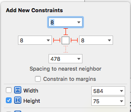
(constants of constraints may be different). Connect the outlet from this top constraint to the cell property foregroundViewTop
. (This view will be shown when the cell is in its normal state).
- Add other UIViews to your cell, connect the outlet from this view to the cell
property
containerView. Add constraints from this view to the superview like in the picture:
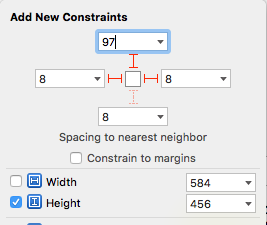
(constants of constraints may be different). Connect the outlet from this top constraint to the cell property containerViewTop.
(This view will be shown when the cell is opened)
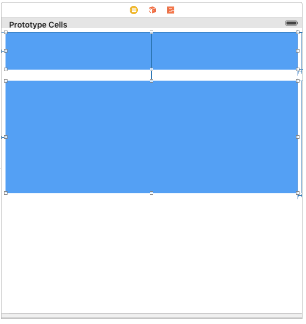
Your result should be something like this picture:
- Set
@IBInspectable var itemCount: NSIntegerproperty is a count of folding (it IBInspectable you can set in storyboard). range 2 or greater. Default value is 2
Ok, we've finished configuring the cell.
- Adding code to your UITableViewController
5.1) Add constants:
fileprivate struct C {
  struct CellHeight {
    static let close: CGFloat = *** // equal or greater foregroundView height
    static let open: CGFloat = *** // equal or greater containerView height
  }
}
5.2) Add property for calculate cells height
var cellHeights = (0..<CELLCOUNT).map { _ in C.CellHeight.close }
5.3) Override method:
    override func tableView(tableView: UITableView, heightForRowAtIndexPath indexPath: NSIndexPath) -> CGFloat {
        return cellHeights[indexPath.row]
    }
5.4) Added code to method:
    override func tableView(tableView: UITableView, didSelectRowAtIndexPath indexPath: NSIndexPath) {
        guard case let cell as FoldingCell = tableView.cellForRowAtIndexPath(indexPath) else {
          return
        }

        var duration = 0.0
        if cellIsCollapsed {
            cellHeights[indexPath.row] = Const.openCellHeight
            cell.unfold(true, animated: true, completion: nil)
            duration = 0.5
        } else {
            cellHeights[indexPath.row] = Const.closeCellHeight
            cell.unfold(false, animated: true, completion: nil)
            duration = 0.8
        }

        UIView.animateWithDuration(duration, delay: 0, options: .CurveEaseOut, animations: { _ in
            tableView.beginUpdates()
            tableView.endUpdates()
        }, completion: nil)
    }
5.5) Control if the cell is open or closed
  override func tableView(tableView: UITableView, willDisplayCell cell: UITableViewCell, forRowAtIndexPath indexPath: NSIndexPath) {

        if case let cell as FoldingCell = cell {
            if cellHeights![indexPath.row] == C.cellHeights.close {
                foldingCell.selectedAnimation(false, animated: false, completion:nil)
            } else {
                foldingCell.selectedAnimation(true, animated: false, completion: nil)
            }
        }
    }
- Add this code to your new cell class
    override func animationDuration(itemIndex:NSInteger, type:AnimationType)-> NSTimeInterval {

        // durations count equal it itemCount
        let durations = [0.33, 0.26, 0.26] // timing animation for each view
        return durations[itemIndex]
    }
if don't use storyboard and xib files
Create foregroundView and containerView from code (steps 2 - 3) look example: Folding-cell-programmatically
ð Check this library on other language:

ð License
Folding cell is released under the MIT license. See LICENSE for details.
This library is a part of a selection of our best UI open-source projects.
If you use the open-source library in your project, please make sure to credit and backlink to https://www.ramotion.com/
ð± Get the Showroom App for iOS to give it a try
Try this UI component and more like this in our iOS app. Contact us if interested.
Top Related Projects
Animated side menu with customizable UI
:octocat: ExpandingCollection is an animated material design UI card peek/pop controller. iOS library made by @Ramotion
:octocat: RAMAnimatedTabBarController is a Swift UI module library for adding animation to iOS tabbar items and icons. iOS library made by @Ramotion
:octocat: PaperOnboarding is a material design UI slider. Swift UI library by @Ramotion
:octocat: ⭕️ CircleMenu is a simple, elegant UI menu with a circular layout and material design animations. Swift UI library made by @Ramotion
:octocat: 🃏 Cardslider is a design UI controller that allows you to swipe through cards with pictures and accompanying descriptions.
Convert designs to code with AI
Introducing Visual Copilot: A new AI model to turn Figma designs to high quality code using your components.
Try Visual Copilot