 fluid-slider
:octocat:💧 A slider widget with a popup bubble displaying the precise value selected. Swift UI library made by @Ramotion
Top Related Projects
Swift UI libraries, iOS components and animations by @Ramotion
:octocat: 📃 FoldingCell is an expanding content cell with animation made by @Ramotion
:octocat: ExpandingCollection is an animated material design UI card peek/pop controller. iOS library made by @Ramotion
:octocat: ⭕️ CircleMenu is a simple, elegant UI menu with a circular layout and material design animations. Swift UI library made by @Ramotion
:octocat: PaperOnboarding is a material design UI slider. Swift UI library by @Ramotion
Quick Overview
Fluid Slider is an iOS UI component created by Ramotion that provides a customizable slider with a floating bubble indicator. It offers a visually appealing and interactive way for users to select values within a range, making it ideal for settings screens or any interface requiring value selection.
Pros
- Visually appealing and modern design
- Smooth animations and fluid interactions
- Highly customizable appearance and behavior
- Easy integration into existing iOS projects
Cons
- Limited to iOS platform only
- May require additional setup for complex use cases
- Potential performance impact on older devices due to animations
- Learning curve for advanced customizations
Code Examples
- Basic setup of a Fluid Slider:
import fluid_slider

let slider = Slider()
slider.attributedTextForFraction = { fraction in
    let formatter = NumberFormatter()
    formatter.maximumIntegerDigits = 3
    formatter.maximumFractionDigits = 0
    let string = formatter.string(from: (fraction * 500) as NSNumber) ?? ""
    return NSAttributedString(string: string)
}
slider.setMinimumLabelAttributedText(NSAttributedString(string: "0"))
slider.setMaximumLabelAttributedText(NSAttributedString(string: "500"))
slider.fraction = 0.5
view.addSubview(slider)
- Customizing the appearance:
slider.contentViewColor = .white
slider.valueViewColor = .black
slider.shadowOffset = CGSize(width: 0, height: 10)
slider.shadowBlur = 5
slider.shadowColor = UIColor(white: 0, alpha: 0.1)
- Adding a value change listener:
slider.didBeginTracking = { [weak self] _ in
    print("Did begin tracking")
}
slider.didEndTracking = { [weak self] _ in
    print("Did end tracking")
}
slider.valueDidChange = { [weak self] value in
    print("Value changed: \(value)")
}
Getting Started
-
Install the library using CocoaPods by adding the following to your Podfile:
pod 'fluid-slider' -
Run
pod installin your project directory. -
Import the module in your Swift file:
import fluid_slider -
Create and configure a Slider instance as shown in the code examples above.
-
Add the slider to your view hierarchy and set up constraints as needed.
Competitor Comparisons
Swift UI libraries, iOS components and animations by @Ramotion
Pros of swift-ui-animation-components-and-libraries
- Offers a wider range of animation components and libraries for SwiftUI
- Provides more comprehensive documentation and examples
- Regularly updated with new features and improvements
Cons of swift-ui-animation-components-and-libraries
- May have a steeper learning curve due to its broader scope
- Potentially larger file size and resource footprint
- Could be overwhelming for developers seeking a simple, specific solution
Code Comparison
fluid-slider:
let slider = FluidSlider()
slider.attributedTextForFraction = { fraction in
    NSAttributedString(string: String(format: "%.2f", fraction))
}
slider.setMinimumLabelAttributedText(NSAttributedString(string: "0"))
slider.setMaximumLabelAttributedText(NSAttributedString(string: "1"))
swift-ui-animation-components-and-libraries:
struct ContentView: View {
    @State private var progress: CGFloat = 0.5

    var body: some View {
        VStack {
            ProgressBar(progress: $progress)
            Slider(value: $progress)
        }
    }
}
The code comparison shows that fluid-slider focuses specifically on a customizable slider component, while swift-ui-animation-components-and-libraries offers a broader range of animation components that can be easily integrated into SwiftUI views.
:octocat: 📃 FoldingCell is an expanding content cell with animation made by @Ramotion
Pros of folding-cell
- More visually appealing and interactive UI element
- Versatile for displaying additional content or details
- Customizable animation and folding styles
Cons of folding-cell
- More complex implementation compared to fluid-slider
- Potentially less intuitive for users unfamiliar with the concept
- May require more screen space when expanded
Code Comparison
folding-cell:
let cell = FoldingCell()
cell.itemCount = 2
cell.backgroundColor = .clear

cell.foregroundView = foregroundView
cell.containerView = containerView
fluid-slider:
let slider = Slider()
slider.attributedTextForFraction = { fraction in
    NSAttributedString(string: String(format: "%.2f", fraction))
}
slider.setMinimumLabelAttributedText(NSAttributedString(string: "0"))
slider.setMaximumLabelAttributedText(NSAttributedString(string: "1"))
Both repositories offer unique UI components for iOS applications. folding-cell provides an expandable cell with a folding animation, suitable for displaying additional content in a visually appealing manner. fluid-slider, on the other hand, offers a customizable slider with a bubble indicator, ideal for precise value selection.
While folding-cell may require more implementation effort and screen space, it offers greater visual impact and versatility. fluid-slider is simpler to implement and more familiar to users but may lack the wow factor of folding-cell.
Choose folding-cell for rich, interactive content displays, and fluid-slider for streamlined value selection interfaces.
:octocat: ExpandingCollection is an animated material design UI card peek/pop controller. iOS library made by @Ramotion
Pros of expanding-collection
- More visually appealing and interactive UI for displaying collections
- Supports both vertical and horizontal scrolling
- Provides a unique card-based layout with expanding details
Cons of expanding-collection
- More complex implementation compared to fluid-slider
- May require more customization for specific use cases
- Potentially higher performance overhead due to animations
Code Comparison
expanding-collection:
let expandingCollection = ExpandingCollection(collectionViewLayout: layout)
expandingCollection.itemSize = CGSize(width: 256, height: 335)
expandingCollection.frontItemShadowOffset = CGSize(width: 0, height: 2)
expandingCollection.backItemShadowOffset = CGSize(width: 0, height: 0)
fluid-slider:
let slider = Slider()
slider.attributedTextForFraction = { fraction in
    NSAttributedString(string: String(format: "%.2f", fraction))
}
slider.setMinimumLabelAttributedText(NSAttributedString(string: "0"))
slider.setMaximumLabelAttributedText(NSAttributedString(string: "1"))
Both repositories are UI components for iOS applications, but they serve different purposes. expanding-collection is a more complex and visually rich solution for displaying collections of items, while fluid-slider focuses on providing a customizable slider control. The choice between the two depends on the specific requirements of your project and the desired user experience.
:octocat: ⭕️ CircleMenu is a simple, elegant UI menu with a circular layout and material design animations. Swift UI library made by @Ramotion
Pros of circle-menu
- More visually appealing and interactive UI element
- Offers a unique circular layout for menu options
- Customizable animation and appearance
Cons of circle-menu
- Limited to a specific number of menu items (typically 3-8)
- May not be suitable for all types of applications or user interfaces
- Requires more screen space compared to a traditional slider
Code Comparison
circle-menu:
let circleMenu = CircleMenu(
    frame: view.bounds,
    normalIcon:"icon_menu",
    selectedIcon:"icon_close",
    buttonsCount: 4,
    duration: 4,
    distance: 120)
view.addSubview(circleMenu)
fluid-slider:
let slider = Slider()
slider.attributedTextForFraction = { fraction in
    let formatter = NumberFormatter()
    formatter.maximumIntegerDigits = 3
    formatter.maximumFractionDigits = 0
    let string = formatter.string(from: (fraction * 500) as NSNumber) ?? ""
    return NSAttributedString(string: string)
}
view.addSubview(slider)
Both repositories offer unique UI components for iOS applications. circle-menu provides an interactive circular menu with customizable animations, while fluid-slider offers a sleek and modern slider control. The choice between the two depends on the specific needs of your application and the desired user experience.
:octocat: PaperOnboarding is a material design UI slider. Swift UI library by @Ramotion
Pros of paper-onboarding
- Provides a more comprehensive onboarding experience with multiple screens
- Offers customizable animations and transitions between onboarding steps
- Supports both Swift and Objective-C
Cons of paper-onboarding
- More complex implementation compared to fluid-slider
- Requires more setup and configuration for multiple onboarding screens
- May have a steeper learning curve for developers new to iOS animations
Code Comparison
paper-onboarding:
let onboarding = PaperOnboarding()
onboarding.dataSource = self
onboarding.delegate = self
view.addSubview(onboarding)
fluid-slider:
let slider = Slider()
slider.attributedTextForFraction = { fraction in
    NSAttributedString(string: String(format: "%.2f", fraction))
}
view.addSubview(slider)
Both repositories are maintained by Ramotion and focus on enhancing UI elements in iOS applications. paper-onboarding is designed for creating engaging onboarding experiences with multiple screens, while fluid-slider provides a customizable slider component. paper-onboarding offers more flexibility for complex onboarding flows but requires more setup. fluid-slider is simpler to implement but is limited to a single UI element. Developers should choose based on their specific needs and the complexity of their onboarding process.
Convert  designs to code with AI

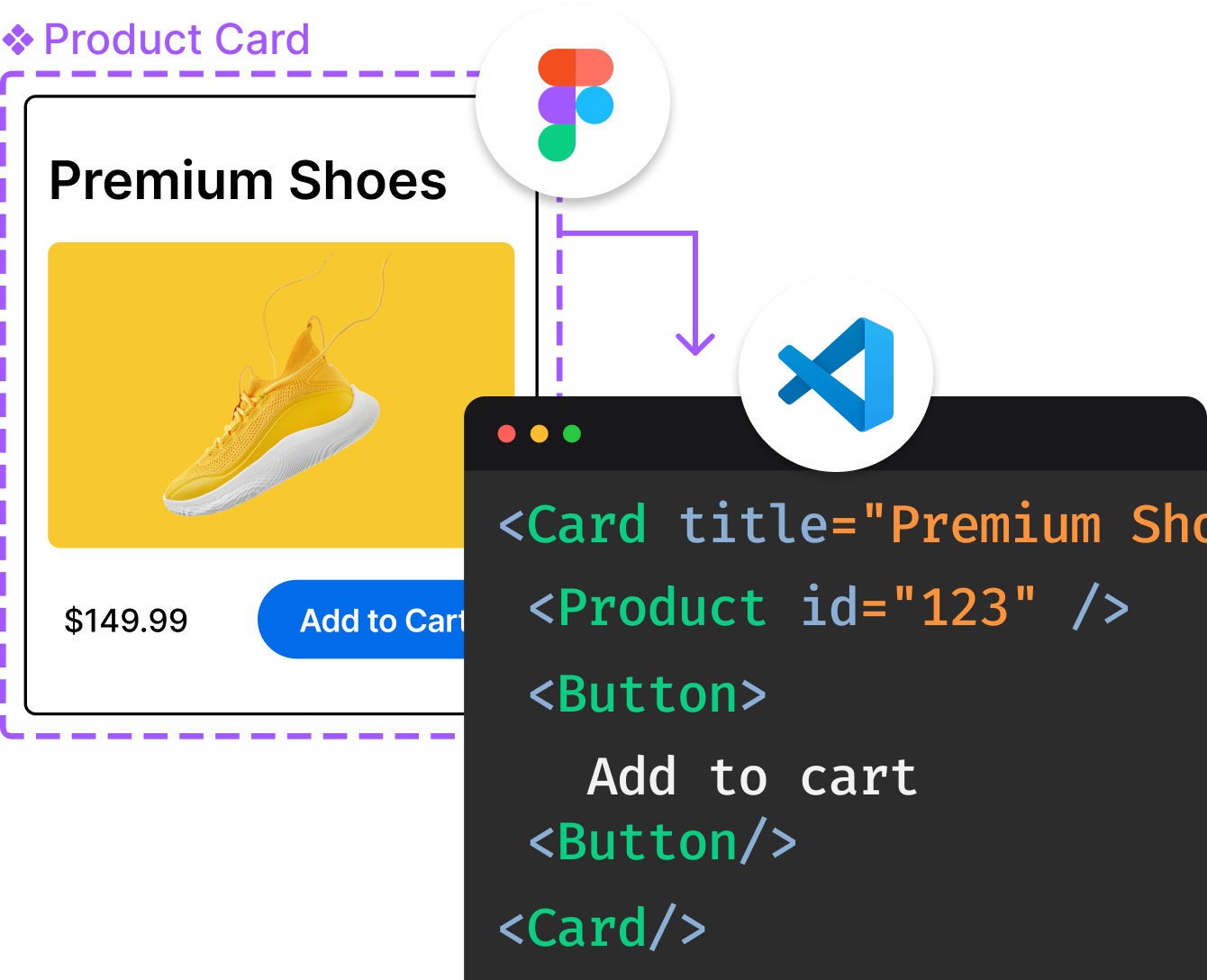
Introducing Visual Copilot: A new AI model to turn Figma designs to high quality code using your components.
Try Visual CopilotREADME

FLUID SLIDER
A slider widget with a popup bubble displaying the precise value selected written on Swift.
We specialize in the designing and coding of custom UI for Mobile Apps and Websites.
Stay tuned for the latest updates:
Inspired by Virgil Pana shot
Requirements
- iOS 10.0
- Xcode 9
- Swift 4.0
Installation
You can install fluid-slider in several ways:
- Add source files to your project.
- Use CocoaPods:
pod 'fluid-slider'
- Use Carthage:
github "Ramotion/fluid-slider"
Usage
Slider
import fluid_slider
The slider can be inserted in a view hierarchy as a subview. Appearance can be configured with a number of public attributes:
let slider = Slider()
slider.attributedTextForFraction = { fraction in
    let formatter = NumberFormatter()
    formatter.maximumIntegerDigits = 3
    formatter.maximumFractionDigits = 0
    let string = formatter.string(from: (fraction * 500) as NSNumber) ?? ""
    return NSAttributedString(string: string)
}
slider.setMinimumLabelAttributedText(NSAttributedString(string: "0"))
slider.setMaximumLabelAttributedText(NSAttributedString(string: "500"))
slider.fraction = 0.5
slider.shadowOffset = CGSize(width: 0, height: 10)
slider.shadowBlur = 5
slider.shadowColor = UIColor(white: 0, alpha: 0.1)
slider.contentViewColor = UIColor(red: 78/255.0, green: 77/255.0, blue: 224/255.0, alpha: 1)
slider.valueViewColor = .white
view.addSubview(slider)
Take a look at the Example project for an integration example.
Since Slider is a subclass of UIControl, it inherits target-action mechanics and it's possible to listen for user-triggered value changes:
slider.addTarget(self, action: #selector(sliderValueChanged), for: .valueChanged)
Tracking Behavior
There are a couple of callbacks which allow you to listen to the slider's tracking events:
    var didBeginTracking: ((Slider) -> ())?
    var didEndTracking: ((Slider) -> ())?
Animation Performance
This control is designed to use device CPU resources with care. The fluid-style animation will be disabled when low power mode is enabled or the system is under heavy load.
This library is a part of a selection of our best UI open-source projects.
ð Check this library on other language:

ð License
Fluid Slider is released under the MIT license. See LICENSE for details.
This library is a part of a selection of our best UI open-source projects.
If you use the open-source library in your project, please make sure to credit and backlink to https://www.ramotion.com/
ð± Get the Showroom App for iOS to give it a try
Try this UI component and more like this in our iOS app. Contact us if interested.
Top Related Projects
Swift UI libraries, iOS components and animations by @Ramotion
:octocat: 📃 FoldingCell is an expanding content cell with animation made by @Ramotion
:octocat: ExpandingCollection is an animated material design UI card peek/pop controller. iOS library made by @Ramotion
:octocat: ⭕️ CircleMenu is a simple, elegant UI menu with a circular layout and material design animations. Swift UI library made by @Ramotion
:octocat: PaperOnboarding is a material design UI slider. Swift UI library by @Ramotion
Convert  designs to code with AI

Introducing Visual Copilot: A new AI model to turn Figma designs to high quality code using your components.
Try Visual Copilot


