Top Related Projects
Modular and customizable Material Design UI components for Android
A declarative framework for building efficient UIs on Android.
Epoxy is an Android library for building complex screens in a RecyclerView
Flexbox for Android
A curated list of awesome Android UI/UX libraries
A Material Design ViewPager easy to use library
Quick Overview
QMUI_Android is an open-source UI component library for Android developed by Tencent. It provides a comprehensive set of UI components and utilities to help developers create high-quality Android applications with consistent design and improved efficiency.
Pros
- Extensive collection of customizable UI components
- Consistent design language across different Android versions
- Regular updates and active community support
- Comprehensive documentation and examples
Cons
- Learning curve for developers new to the library
- May increase app size due to the comprehensive nature of the library
- Some components might not fit all design requirements
- Potential dependency conflicts with other libraries
Code Examples
- Customizing QMUITopBar:
QMUITopBar topBar = findViewById(R.id.topbar);
topBar.setTitle("QMUI Demo");
topBar.addLeftBackImageButton().setOnClickListener(new View.OnClickListener() {
    @Override
    public void onClick(View v) {
        finish();
    }
});
- Using QMUIDialog:
new QMUIDialog.MessageDialogBuilder(context)
    .setTitle("Title")
    .setMessage("This is a message")
    .addAction("OK", new QMUIDialogAction.ActionListener() {
        @Override
        public void onClick(QMUIDialog dialog, int index) {
            dialog.dismiss();
        }
    })
    .show();
- Implementing QMUIRoundButton:
<com.qmuiteam.qmui.widget.roundwidget.QMUIRoundButton
    android:layout_width="wrap_content"
    android:layout_height="wrap_content"
    android:padding="10dp"
    android:text="Round Button"
    app:qmui_backgroundColor="@color/qmui_config_color_blue"
    app:qmui_borderColor="@color/qmui_config_color_gray_9"
    app:qmui_borderWidth="1px"
    app:qmui_radius="4dp" />
Getting Started
- Add the QMUI dependency to your app's build.gradle file:
dependencies {
    implementation 'com.qmuiteam:qmui:2.0.0-alpha10'
}
- Initialize QMUI in your Application class:
public class MyApplication extends Application {
    @Override
    public void onCreate() {
        super.onCreate();
        QMUISwipeBackActivityManager.init(this);
    }
}
- Use QMUI components in your layouts and activities:
<com.qmuiteam.qmui.widget.QMUITopBarLayout
    android:id="@+id/topbar"
    android:layout_width="match_parent"
    android:layout_height="wrap_content" />
Competitor Comparisons
Modular and customizable Material Design UI components for Android
Pros of material-components-android
- Official implementation of Material Design, ensuring consistency with Google's design guidelines
- Extensive documentation and support from Google and the community
- Regular updates and maintenance, keeping pace with Android platform changes
Cons of material-components-android
- Larger library size compared to QMUI_Android
- Steeper learning curve for developers new to Material Design principles
- Less flexibility for custom UI components outside of Material Design specifications
Code Comparison
QMUI_Android:
QMUIRoundButton button = new QMUIRoundButton(context);
button.setText("QMUI Button");
button.setChangeAlphaWhenPress(true);
material-components-android:
MaterialButton button = new MaterialButton(context);
button.setText("Material Button");
button.setIcon(ContextCompat.getDrawable(context, R.drawable.ic_add));
Both libraries offer easy-to-use UI components, but QMUI_Android focuses on quick implementation of common UI patterns, while material-components-android adheres strictly to Material Design guidelines. QMUI_Android provides more customization options out-of-the-box, whereas material-components-android requires additional configuration for extensive customization. The choice between the two depends on project requirements, design preferences, and the need for Material Design compliance.
A declarative framework for building efficient UIs on Android.
Pros of Litho
- Declarative UI framework optimized for performance and smooth scrolling
- Asynchronous layout calculation and rendering for improved responsiveness
- Extensive component reusability and composition
Cons of Litho
- Steeper learning curve due to its unique programming model
- Limited compatibility with existing Android views and layouts
- Requires more setup and configuration compared to traditional Android development
Code Comparison
QMUI_Android (XML-based layout):
<com.qmuiteam.qmui.widget.QMUITopBar
    android:id="@+id/topbar"
    android:layout_width="match_parent"
    android:layout_height="wrap_content"
    app:qmui_topbar_title="QMUI TopBar" />
Litho (Java-based component):
@OnCreateLayout
static Component onCreateLayout(ComponentContext c) {
  return Text.create(c)
      .text("Hello, Litho!")
      .textSizeDip(18)
      .build();
}
QMUI_Android focuses on providing pre-built UI components and utilities for rapid development, while Litho emphasizes a component-based approach with performance optimizations. QMUI_Android is more accessible for developers familiar with traditional Android development, whereas Litho introduces a new paradigm that may require more time to master but offers potential performance benefits for complex UIs.
Epoxy is an Android library for building complex screens in a RecyclerView
Pros of Epoxy
- Powerful and flexible system for building complex RecyclerView layouts
- Supports data binding and view binding out of the box
- Automatic diffing and efficient updates for better performance
Cons of Epoxy
- Steeper learning curve due to its more complex architecture
- Requires more boilerplate code for simple layouts
- May be overkill for smaller projects or simpler UI requirements
Code Comparison
QMUI_Android:
QMUIGroupListView groupListView = findViewById(R.id.groupListView);
QMUIGroupListView.newSection(this)
    .addItemView(groupListView.createItemView("Item 1"), v -> {})
    .addItemView(groupListView.createItemView("Item 2"), v -> {})
    .addTo(groupListView);
Epoxy:
class MyEpoxyController : EpoxyController() {
    override fun buildModels() {
        header {
            id("header")
            title("My List")
        }
        item {
            id("item1")
            title("Item 1")
        }
        item {
            id("item2")
            title("Item 2")
        }
    }
}
Both libraries offer solutions for building complex UIs, but Epoxy provides more flexibility and power at the cost of increased complexity, while QMUI_Android offers a simpler approach with a focus on pre-built UI components.
Flexbox for Android
Pros of flexbox-layout
- Focused on flexible box layout, providing more advanced and customizable layout options
- Directly supported by Google, ensuring compatibility with Android's design principles
- Lightweight and easy to integrate into existing projects
Cons of flexbox-layout
- Limited to layout functionality, lacking comprehensive UI components
- May require additional libraries for complete UI development
- Less frequent updates compared to QMUI_Android
Code Comparison
QMUI_Android example:
<com.qmuiteam.qmui.widget.QMUITopBar
    android:id="@+id/topbar"
    android:layout_width="match_parent"
    android:layout_height="?attr/qmui_topbar_height"
    app:qmui_topbar_title="Title" />
flexbox-layout example:
<com.google.android.flexbox.FlexboxLayout
    android:layout_width="match_parent"
    android:layout_height="wrap_content"
    app:flexDirection="row"
    app:flexWrap="wrap">
    <!-- Child views -->
</com.google.android.flexbox.FlexboxLayout>
Summary
While QMUI_Android offers a comprehensive UI toolkit with various components, flexbox-layout focuses specifically on flexible layouts. QMUI_Android provides a wider range of UI elements and utilities, making it suitable for rapid development of complete interfaces. On the other hand, flexbox-layout excels in creating complex, responsive layouts with its flexible box model implementation. The choice between the two depends on project requirements and whether a full UI toolkit or advanced layout capabilities are needed.
A curated list of awesome Android UI/UX libraries
Pros of awesome-android-ui
- Extensive collection of UI libraries and components
- Regularly updated with new contributions from the community
- Categorized list makes it easy to find specific UI elements
Cons of awesome-android-ui
- Not a standalone library, requires integration of multiple dependencies
- May lead to inconsistencies in design and implementation across different components
- Requires more effort to maintain and update individual libraries
Code Comparison
While a direct code comparison is not applicable due to the nature of these repositories, here's a brief example of how they might be used:
QMUI_Android:
QMUIRoundButton button = new QMUIRoundButton(context);
button.setText("QMUI Button");
awesome-android-ui (using a library from the list):
MaterialButton button = new MaterialButton(context);
button.setText("Material Button");
QMUI_Android provides a cohesive set of UI components, while awesome-android-ui offers a curated list of various UI libraries. QMUI_Android may be more suitable for projects requiring a consistent design language, whereas awesome-android-ui allows developers to cherry-pick specific UI components from different libraries based on their needs.
A Material Design ViewPager easy to use library
Pros of MaterialViewPager
- Focused specifically on creating material design view pagers
- Simpler implementation for projects primarily needing view pager functionality
- Lightweight and easy to integrate into existing projects
Cons of MaterialViewPager
- Limited scope compared to QMUI_Android's comprehensive UI toolkit
- Less active development and community support
- Fewer customization options for other UI elements
Code Comparison
MaterialViewPager:
MaterialViewPager materialViewPager = (MaterialViewPager) findViewById(R.id.materialViewPager);
ViewPagerAdapter adapter = new ViewPagerAdapter(getSupportFragmentManager());
materialViewPager.getViewPager().setAdapter(adapter);
QMUI_Android:
QMUITopBar mTopBar = findViewById(R.id.topbar);
mTopBar.setTitle("QMUI Demo");
mTopBar.addLeftBackImageButton().setOnClickListener(new View.OnClickListener() {
    @Override
    public void onClick(View v) {
        finish();
    }
});
MaterialViewPager provides a more straightforward implementation for creating material design view pagers, while QMUI_Android offers a wider range of UI components and customization options. QMUI_Android is better suited for projects requiring a comprehensive UI toolkit, whereas MaterialViewPager is ideal for simpler implementations focused on view pager functionality. QMUI_Android has more active development and community support, potentially leading to better long-term maintenance and updates.
Convert  designs to code with AI

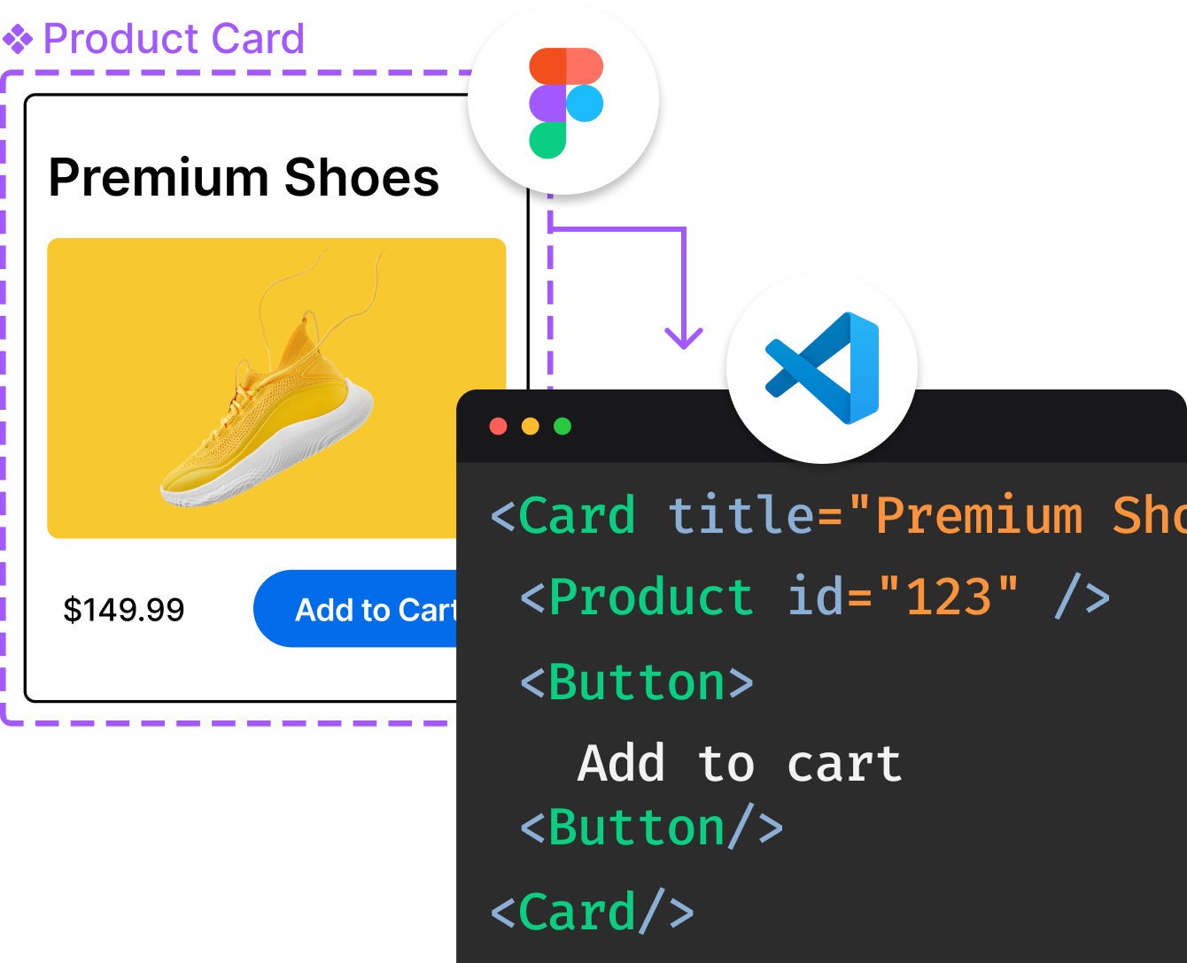
Introducing Visual Copilot: A new AI model to turn Figma designs to high quality code using your components.
Try Visual CopilotREADME

QMUI_Android
QMUI Android ç设计ç®çæ¯ç¨äºè¾ å©å¿«éæ建ä¸ä¸ªå ·å¤åºæ¬è®¾è®¡è¿åææç Android 项ç®ï¼åæ¶å©ç¨èªèº«æä¾ç丰å¯æ§ä»¶åå ¼å®¹å¤çï¼è®©å¼åè è½ä¸æ³¨äºä¸å¡éæ±èæ éè费精åå¨åºç¡ä»£ç ç设计ä¸ãä¸ç®¡æ¯æ°é¡¹ç®çå建ï¼ææ¯å·²æ项ç®çç»´æ¤ï¼åå¯ä½¿å¼åæçå项ç®è´¨éå¾å°å¤§å¹ 度æåã
åè½ç¹æ§
å ¨å± UI é ç½®
åªéè¦ä¿®æ¹ä¸ä»½é 置表就å¯ä»¥è°æ´ App çå ¨å±æ ·å¼ï¼å æ¬ç»ä»¶é¢è²ã导èªæ ã对è¯æ¡ãå表çãä¸å¤ä¿®æ¹ï¼å ¨å±çæã
丰å¯ç UI æ§ä»¶
æä¾ä¸°å¯å¸¸ç¨ç UI æ§ä»¶ï¼ä¾å¦ BottomSheetãTabãåè§ ImageViewãä¸æå·æ°çï¼ä½¿ç¨æ¹ä¾¿çµæ´»ï¼å¹¶ä¸æ¯æèªå®ä¹æ§ä»¶çæ ·å¼ã
é«æçå·¥å ·æ¹æ³
æä¾é«æçå·¥å ·æ¹æ³ï¼å æ¬è®¾å¤ä¿¡æ¯ãå±å¹ä¿¡æ¯ãé®ç管çãç¶ææ 管ççï¼å¯ä»¥è§£å³åç§å¸¸è§åºæ¯å¹¶å¤§å¹ 度æåå¼åæçã
æ¯æ Android çæ¬
QMUI Android æ¯æ API Level 21+ã
使ç¨æ¹æ³
å¯ä»¥å¨å·¥ç¨ä¸ç qmuidemo 项ç®ä¸æ¥çåç»ä»¶ç使ç¨ã
éç§ä¸å®å ¨
- æ¡æ¶ä¼è°ç¨ android.os.Build ä¸çå段读å brandãmodel çä¿¡æ¯ï¼ç¨äºåºåä¸åç设å¤ã
- æ¡æ¶ä¼å°è¯è¯»åç³»ç»è®¾ç½®è·åæ¯å¦æ¯å ¨é¢å±æå¿
Top Related Projects
Modular and customizable Material Design UI components for Android
A declarative framework for building efficient UIs on Android.
Epoxy is an Android library for building complex screens in a RecyclerView
Flexbox for Android
A curated list of awesome Android UI/UX libraries
A Material Design ViewPager easy to use library
Convert  designs to code with AI

Introducing Visual Copilot: A new AI model to turn Figma designs to high quality code using your components.
Try Visual Copilot
