
Top Related Projects

Demos the new Android Design library.

Infinite cycle ViewPager with two-way orientation and interactive effect.

Side menu with some categories to choose.

:octocat: 📃 FoldingCell is a material design expanding content cell inspired by folding paper material made by @Ramotion
You can easily add awesome animated context menu to your app.

Android Floating Action Button based on Material Design specification
Quick Overview
MaterialViewPager is an Android library that provides a Material Design-inspired ViewPager with header animations. It offers a sleek and modern user interface component that combines a ViewPager with a header that can be an image, a color, or any other view, along with tabs and a logo.
Pros
- Implements Material Design principles for a polished look
- Highly customizable with various header options and animations
- Seamless integration with existing Android projects
- Supports both Java and Kotlin
Cons
- May require additional setup for complex layouts
- Performance might be affected with heavy content or many pages
- Limited documentation for advanced use cases
- Dependency on other libraries may increase app size
Code Examples
- Basic setup of MaterialViewPager:
val materialViewPager = findViewById<MaterialViewPager>(R.id.materialViewPager)
materialViewPager.viewPager.adapter = MyPagerAdapter(supportFragmentManager)
materialViewPager.viewPagerHeaderHeight = 200
- Customizing the header:
materialViewPager.setImageUrl("https://example.com/image.jpg", fadeIn = true)
// or
materialViewPager.setMaterialViewPagerListener(object : MaterialViewPager.Listener {
    override fun HeaderDesign(page: Int): HeaderDesign {
        return HeaderDesign.fromColorResAndUrl(
            R.color.colorPrimary,
            "https://example.com/image.jpg"
        )
    }
})
- Adding a logo:
materialViewPager.logo = findViewById(R.id.logo_white)
materialViewPager.setLogoMarginTop(50)
Getting Started
-
Add the dependency to your
build.gradle:implementation 'com.github.florent37:materialviewpager:2.1.6' -
Add MaterialViewPager to your layout:
<com.github.florent37.materialviewpager.MaterialViewPager android:id="@+id/materialViewPager" android:layout_width="match_parent" android:layout_height="match_parent" app:viewpager_logo="@layout/header_logo" app:viewpager_logoMarginTop="100dp" app:viewpager_color="@color/colorPrimary" app:viewpager_headerHeight="200dp" app:viewpager_headerAlpha="1.0" app:viewpager_hideLogoWithFade="false" app:viewpager_hideToolbarAndTitle="true" app:viewpager_enableToolbarElevation="true" app:viewpager_parallaxHeaderFactor="1.5" app:viewpager_headerAdditionalHeight="20dp" app:viewpager_displayToolbarWhenSwipe="true" app:viewpager_transparentToolbar="true" app:viewpager_animatedHeaderImage="true" app:viewpager_disableToolbar="false"/> -
Initialize the MaterialViewPager in your activity:
override fun onCreate(savedInstanceState: Bundle?) {
    super.onCreate(savedInstanceState)
    setContentView(R.layout.activity_main)

    val materialViewPager = findViewById<MaterialViewPager>(R.id.materialViewPager)
    setSupportActionBar(materialViewPager.toolbar)

    materialViewPager.viewPager.adapter = MyPagerAdapter(supportFragmentManager)
    materialViewPager.setMaterialViewPagerListener(/* Your listener implementation */)
}
Competitor Comparisons
Demos the new Android Design library.
Pros of Cheesesquare
- More comprehensive demonstration of Material Design components
- Includes examples of CoordinatorLayout and custom behaviors
- Better documentation and code comments
Cons of Cheesesquare
- Less focused on ViewPager implementation
- Older project with fewer recent updates
- May require more setup and configuration for specific use cases
Code Comparison
MaterialViewPager:
mViewPager = (MaterialViewPager) findViewById(R.id.materialViewPager);
mViewPager.getViewPager().setAdapter(new FragmentStatePagerAdapter(getSupportFragmentManager()) {
    @Override
    public Fragment getItem(int position) {
        return RecyclerViewFragment.newInstance();
    }
    // ...
});
Cheesesquare:
ViewPager viewPager = (ViewPager) findViewById(R.id.viewpager);
if (viewPager != null) {
    setupViewPager(viewPager);
}
TabLayout tabLayout = (TabLayout) findViewById(R.id.tabs);
tabLayout.setupWithViewPager(viewPager);
MaterialViewPager focuses on providing a customized ViewPager with material design elements, while Cheesesquare demonstrates a broader range of Material Design components and patterns. MaterialViewPager offers a more specialized solution for creating material-style view pagers, whereas Cheesesquare provides a more comprehensive showcase of various Material Design elements and their interactions.
Infinite cycle ViewPager with two-way orientation and interactive effect.
Pros of InfiniteCycleViewPager
- Supports infinite scrolling, allowing users to continuously swipe through items
- Provides smooth animations and transitions between pages
- Offers customizable page scaling and transformation effects
Cons of InfiniteCycleViewPager
- Less integrated with Material Design principles compared to MaterialViewPager
- May require more setup and configuration for complex layouts
- Limited built-in support for header images or parallax effects
Code Comparison
MaterialViewPager:
mViewPager = (MaterialViewPager) findViewById(R.id.materialViewPager);
mViewPager.getViewPager().setAdapter(new FragmentStatePagerAdapter(getSupportFragmentManager()) {
    // Adapter implementation
});
mViewPager.setMaterialViewPagerListener(new MaterialViewPager.Listener() {
    // Listener implementation
});
InfiniteCycleViewPager:
InfiniteCycleViewPager infiniteCycleViewPager = (InfiniteCycleViewPager) findViewById(R.id.infinite_cycle_view_pager);
infiniteCycleViewPager.setAdapter(new MyPagerAdapter(getSupportFragmentManager()));
infiniteCycleViewPager.setScrollDuration(500);
infiniteCycleViewPager.setInterpolator(new AccelerateDecelerateInterpolator());
infiniteCycleViewPager.setMediumScaled(true);
Both libraries offer unique features for creating engaging ViewPager experiences. MaterialViewPager focuses on Material Design integration and header customization, while InfiniteCycleViewPager excels in providing infinite scrolling and page transformation effects. The choice between them depends on the specific requirements of your project and the desired user experience.
Side menu with some categories to choose.
Pros of Side-Menu.Android
- Focuses specifically on side menu implementation, providing a more specialized solution
- Offers smooth animations and transitions for the side menu
- Easier to integrate if you only need a side menu component
Cons of Side-Menu.Android
- Limited to side menu functionality, lacking the comprehensive features of MaterialViewPager
- May require additional libraries or components for a complete UI solution
- Less actively maintained, with fewer recent updates
Code Comparison
Side-Menu.Android:
ResideMenu resideMenu = new ResideMenu(this);
resideMenu.setBackground(R.drawable.menu_background);
resideMenu.attachToActivity(this);
resideMenu.addMenuItem(menuItem, ResideMenu.DIRECTION_LEFT);
MaterialViewPager:
mViewPager = (MaterialViewPager) findViewById(R.id.materialViewPager);
mViewPager.getViewPager().setAdapter(new FragmentStatePagerAdapter(getSupportFragmentManager()) {
    // Adapter implementation
});
mViewPager.setMaterialViewPagerListener(new MaterialViewPager.Listener() {
    // Listener implementation
});
Side-Menu.Android provides a simpler implementation for adding a side menu, while MaterialViewPager offers a more comprehensive solution for creating a material design-inspired view pager with additional features. The choice between the two depends on the specific requirements of your project and the desired UI components.
:octocat: 📃 FoldingCell is a material design expanding content cell inspired by folding paper material made by @Ramotion
Pros of folding-cell-android
- Unique folding animation effect for expanding/collapsing cells
- Customizable folding animation parameters
- Lightweight library focused on a single UI component
Cons of folding-cell-android
- Limited to folding cell functionality, less versatile than MaterialViewPager
- May require more custom implementation for complex layouts
- Less actively maintained (last update 3 years ago vs. 1 year for MaterialViewPager)
Code Comparison
folding-cell-android:
val foldingCell = findViewById<FoldingCell>(R.id.folding_cell)
foldingCell.setOnClickListener {
    foldingCell.toggle(false)
}
MaterialViewPager:
mViewPager = (MaterialViewPager) findViewById(R.id.materialViewPager);
mViewPager.getViewPager().setAdapter(new FragmentStatePagerAdapter(getSupportFragmentManager()) {
    // Adapter implementation
});
mViewPager.setMaterialViewPagerListener(new MaterialViewPager.Listener() {
    // Listener implementation
});
The folding-cell-android code focuses on toggling a single cell, while MaterialViewPager involves setting up a more complex pager with fragments and listeners. MaterialViewPager offers more comprehensive functionality for creating material design-inspired layouts, whereas folding-cell-android provides a specific animation effect for individual view cells.
You can easily add awesome animated context menu to your app.
Pros of Context-Menu.Android
- Focuses specifically on context menus, providing a more specialized and polished solution for this UI element
- Offers a visually appealing and customizable circular menu design
- Easier to implement for developers who only need a context menu feature
Cons of Context-Menu.Android
- Limited in scope compared to MaterialViewPager, which offers a broader range of Material Design components
- May require additional libraries or custom implementations for other UI elements in a project
Code Comparison
Context-Menu.Android:
MenuParams menuParams = new MenuParams();
menuParams.setActionBarSize((int) getResources().getDimension(R.dimen.tool_bar_height));
menuParams.setMenuObjects(getMenuObjects());
menuParams.setClosableOutside(false);
mMenuDialogFragment = ContextMenuDialogFragment.newInstance(menuParams);
MaterialViewPager:
mViewPager = (MaterialViewPager) findViewById(R.id.materialViewPager);
mViewPager.getViewPager().setAdapter(new FragmentStatePagerAdapter(getSupportFragmentManager()) {
    @Override
    public Fragment getItem(int position) {
        return RecyclerViewFragment.newInstance();
    }
    @Override
    public int getCount() {
        return 4;
    }
});
The code snippets demonstrate the primary focus of each library: Context-Menu.Android on creating a context menu, and MaterialViewPager on implementing a view pager with material design elements.
Android Floating Action Button based on Material Design specification
Pros of FloatingActionButton
- Focused on a single UI component, making it lightweight and easy to integrate
- Offers more customization options specifically for floating action buttons
- Actively maintained with regular updates and bug fixes
Cons of FloatingActionButton
- Limited to floating action button functionality, unlike MaterialViewPager's comprehensive material design components
- Requires additional libraries or custom implementation for more complex material design patterns
- May not provide the same level of visual cohesion as MaterialViewPager's integrated approach
Code Comparison
MaterialViewPager:
MaterialViewPager materialViewPager = (MaterialViewPager) findViewById(R.id.materialViewPager);
materialViewPager.getViewPager().setAdapter(new FragmentStatePagerAdapter(getSupportFragmentManager()) {
    // Adapter implementation
});
materialViewPager.setMaterialViewPagerListener(new MaterialViewPager.Listener() {
    // Listener implementation
});
FloatingActionButton:
FloatingActionButton fab = (FloatingActionButton) findViewById(R.id.fab);
fab.setOnClickListener(new View.OnClickListener() {
    @Override
    public void onClick(View view) {
        // Click handler implementation
    }
});
The code comparison shows that MaterialViewPager requires more setup for its comprehensive functionality, while FloatingActionButton offers a simpler implementation focused on a single UI element.
Convert  designs to code with AI

Introducing Visual Copilot: A new AI model to turn Figma designs to high quality code using your components.
Try Visual CopilotREADME
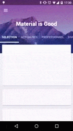
MaterialViewPager

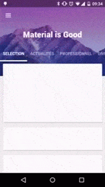
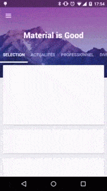
Material Design ViewPager easy to use library

Sample
And have a look on a sample Youtube Video : Youtube Link
Download
In your module 
compile 'com.github.florent37:materialviewpager:1.2.3'

//dependencies
compile 'com.flaviofaria:kenburnsview:1.0.7'
compile 'com.jpardogo.materialtabstrip:library:1.1.0'
compile 'com.github.bumptech.glide:glide:4.0.0'
Usage
Add MaterialViewPager to your activity's layout
<com.github.florent37.materialviewpager.MaterialViewPager
    android:id="@+id/materialViewPager"
    android:layout_width="match_parent"
    android:layout_height="match_parent"
    app:viewpager_logo="@layout/header_logo"
    app:viewpager_logoMarginTop="100dp"
    app:viewpager_color="@color/colorPrimary"
    app:viewpager_headerHeight="200dp"
    app:viewpager_headerAlpha="1.0"
    app:viewpager_hideLogoWithFade="false"
    app:viewpager_hideToolbarAndTitle="true"
    app:viewpager_enableToolbarElevation="true"
    app:viewpager_parallaxHeaderFactor="1.5"
    app:viewpager_headerAdditionalHeight="20dp"
    app:viewpager_displayToolbarWhenSwipe="true"
    app:viewpager_transparentToolbar="true"
    app:viewpager_animatedHeaderImage="true"
    app:viewpager_disableToolbar="false"

    />
with header_logo.xml
<?xml version="1.0" encoding="utf-8"?>
<TextView xmlns:android="http://schemas.android.com/apk/res/android"
android:id="@+id/logo_white"
android:layout_width="wrap_content"
android:layout_height="@dimen/materialviewpager_logoHeight"
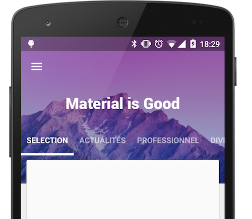
android:text="Material is Good"
android:textSize="30sp"
android:textColor="@android:color/white"/>
You will see on Android Studio Preview :
To get a beautiful screen and enable preview, you theme may follow
<style name="AppBaseTheme" parent="@style/Theme.AppCompat.Light">
</style>

<style name="AppTheme" parent="AppBaseTheme">

   <item name="android:textColorPrimary">@android:color/white</item>
   <item name="drawerArrowStyle">@style/DrawerArrowStyle</item>
   <item name="android:windowTranslucentStatus" tools:targetApi="21">true</item>

   <item name="android:windowContentOverlay">@null</item>
   <item name="windowActionBar">false</item>
   <item name="windowNoTitle">true</item>

   <!-- Toolbar Theme / Apply white arrow -->
   <item name="colorControlNormal">@android:color/white</item>
   <item name="actionBarTheme">@style/AppTheme.ActionBarTheme</item>

   <!-- Material Theme -->
   <item name="colorPrimary">@color/colorPrimary</item>
   <item name="colorPrimaryDark">@color/colorPrimaryDark</item>
   <item name="colorAccent">@color/accent_color</item>

   <item name="android:navigationBarColor" tools:targetApi="21">@color/navigationBarColor</item>
   <item name="android:windowDrawsSystemBarBackgrounds" tools:targetApi="21">true</item>

</style>

<style name="AppTheme.ActionBarTheme" parent="@style/ThemeOverlay.AppCompat.ActionBar">
    <!-- White arrow -->
    <item name="colorControlNormal">@android:color/white</item>
</style>

<style name="DrawerArrowStyle" parent="Widget.AppCompat.DrawerArrowToggle">
    <item name="spinBars">true</item>
    <item name="color">@color/drawerArrowColor</item>
</style>
Retrieve the MaterialViewPager
You can use MaterialViewPager as an usual Android View, and get it by findViewById
public class MainActivity extends ActionBarActivity {

    private MaterialViewPager mViewPager;

    @Override
    protected void onCreate(Bundle savedInstanceState) {
        super.onCreate(savedInstanceState);
        setContentView(R.layout.activity_main);

        mViewPager = (MaterialViewPager) findViewById(R.id.materialViewPager);
    }
}
Customisation
First choose your color and height
<com.github.florent37.materialviewpager.MaterialViewPager
        android:id="@+id/materialViewPager"
        android:layout_width="match_parent"
        android:layout_height="match_parent"
        ...
        app:viewpager_color="@color/colorPrimary"
        app:viewpager_headerHeight="200dp"
        ...
        />
Set your logo
<com.github.florent37.materialviewpager.MaterialViewPager
        ...
        app:viewpager_logo="@layout/header_logo" <-- look custom logo layout
        app:viewpager_logoMarginTop="100dp" <-- look at the preview
        ...
        />
Titlebar Logo
Your logo's layout must
- layout_height="@dimen/materialviewpager_logoHeight"
header_logo.xml
<ImageView xmlns:android="http://schemas.android.com/apk/res/android"
    android:id="@+id/logo_white"
    android:layout_width="200dp"
    android:layout_height="@dimen/materialviewpager_logoHeight"
    android:fitsSystemWindows="true"
    android:adjustViewBounds="true"
    android:layout_centerHorizontal="true"
    android:src="@drawable/logo_white" />
<com.github.florent37.materialviewpager.MaterialViewPager`
        ...
        app:viewpager_hideLogoWithFade="false"
        ...
        />
Fading Logo
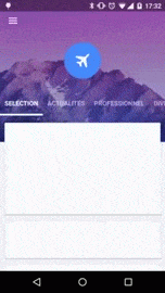
header_logo.xml
<FrameLayout xmlns:android="http://schemas.android.com/apk/res/android"
    android:layout_width="80dp"
    android:layout_height="80dp"
    android:layout_centerHorizontal="true"
    android:background="@drawable/circle">

    <ImageView
        android:layout_width="30dp"
        android:layout_height="30dp"
        android:fitsSystemWindows="true"
        android:adjustViewBounds="true"
        android:layout_gravity="center"
        android:src="@drawable/flying" />
</FrameLayout>
<com.github.florent37.materialviewpager.MaterialViewPager`
        ...
        app:viewpager_hideLogoWithFade="true"
        ...
        />
Toolbar Animation
Hide Logo and Toolbar
<com.github.florent37.materialviewpager.MaterialViewPager`
        ...
        app:viewpager_hideToolbarAndTitle="true"
        ...
        />
Sticky Toolbar

<com.github.florent37.materialviewpager.MaterialViewPager`
        ...
        app:viewpager_hideToolbarAndTitle="false"
        ...
        />
Transparent Toolbar

<com.github.florent37.materialviewpager.MaterialViewPager`
        ...
        app:viewpager_transparentToolbar="true"
        ...
        />
Header Layout
You can replace the header
<com.github.florent37.materialviewpager.MaterialViewPager`
        ...
        app:viewpager_header="@layout/myHeader"
        ...
        />
Moving Header
Or use the default header, with a KenBurns animation
<com.github.florent37.materialviewpager.MaterialViewPager`
        ...
        app:viewpager_animatedHeaderImage="true"
        ...
        />
Static Header
Or simply use an ImageView as header
<com.github.florent37.materialviewpager.MaterialViewPager`
        ...
        app:viewpager_animatedHeaderImage="false"
        ...
        />
Custom Tab Bar
You can set you own tab bar, by default I provided 2 implementations
Standard

<com.github.florent37.materialviewpager.MaterialViewPager`
        ...
        app:viewpager_pagerTitleStrip="@layout/material_view_pager_pagertitlestrip_standard"
        ...
        />
News Stand

<com.github.florent37.materialviewpager.MaterialViewPager`
        ...
        app:viewpager_pagerTitleStrip="@layout/material_view_pager_pagertitlestrip_newstand"
        ...
        />
Or create your own tab bar
Create your own layout using a PagerSlidingTabStrip
my_tabs.xml
<com.astuetz.PagerSlidingTabStrip
    xmlns:android="http://schemas.android.com/apk/res/android"
    xmlns:app="http://schemas.android.com/apk/res-auto"
    xmlns:tools="http://schemas.android.com/tools"
    android:id="@id/materialviewpager_pagerTitleStrip"
    android:layout_width="match_parent"
    android:layout_height="match_parent"
    app:pstsPaddingMiddle="true"
    app:pstsDividerPadding="20dp"
    app:pstsIndicatorColor="#FFF"
    app:pstsIndicatorHeight="2dp"
    app:pstsShouldExpand="true"
    app:pstsTabPaddingLeftRight="10dp"
    app:pstsTabTextAllCaps="true"
    tools:background="#A333"
     />
Don't forget to give it id="@id/materialviewpager_pagerTitleStrip"
<com.github.florent37.materialviewpager.MaterialViewPager
        ...
        app:viewpager_pagerTitleStrip="@layout/my_tabs"
        ...
        />
Animate Header
Simply add a listen to the ViewPager
mViewPager.setMaterialViewPagerListener(new MaterialViewPager.Listener() {
            @Override
            public HeaderDesign getHeaderDesign(int page) {
                switch (page) {
                    case 0:
                        return HeaderDesign.fromColorResAndUrl(
                                R.color.blue,
                                "http://cdn1.tnwcdn.com/wp-content/blogs.dir/1/files/2014/06/wallpaper_51.jpg");
                    case 1:
                        return HeaderDesign.fromColorResAndUrl(
                                R.color.green,
                                "https://fs01.androidpit.info/a/63/0e/android-l-wallpapers-630ea6-h900.jpg");
                    case 2:
                        return HeaderDesign.fromColorResAndUrl(
                                R.color.cyan,
                                "http://www.droid-life.com/wp-content/uploads/2014/10/lollipop-wallpapers10.jpg");
                    case 3:
                        return HeaderDesign.fromColorResAndUrl(
                                R.color.red,
                                "http://www.tothemobile.com/wp-content/uploads/2014/07/original.jpg");
                }

                //execute others actions if needed (ex : modify your header logo)

                return null;
            }
        });
Available
HeaderDesign.fromColorAndUrl(Color.BLUE,"http:...);
HeaderDesign.fromColorResAndUrl(R.color.blue,"http:...);
HeaderDesign.fromColorAndDrawable(Color.BLUE,myDrawable);
HeaderDesign.fromColorResAndDrawable(R.color.blue,myDrawable);
Toolbar
Toolbar toolbar = mViewPager.getToolbar();

if (toolbar != null) {
     setSupportActionBar(toolbar);

     ActionBar actionBar = getSupportActionBar();
     actionBar.setDisplayHomeAsUpEnabled(true);
     actionBar.setDisplayShowHomeEnabled(true);
     actionBar.setDisplayShowTitleEnabled(true);
     actionBar.setDisplayUseLogoEnabled(false);
     actionBar.setHomeButtonEnabled(true);
}
ViewPager
ViewPager viewPager = mViewPager.getViewPager();
viewPage.setAdapter(...);

//After set an adapter to the ViewPager
mViewPager.getPagerTitleStrip().setViewPager(mViewPager.getViewPager());
RecyclerView
mRecyclerView.addItemDecoration(new MaterialViewPagerHeaderDecorator());
mRecyclerView.setAdapter(yourAdapter);
ScrollView
The ScrollView must be an NestedScrollView`
MaterialViewPagerHelper.registerScrollView(getActivity(), mScrollView, null);
And include @layout/material_view_pager_placeholder` as first child
<android.support.v4.widget.NestedScrollView
    xmlns:android="http://schemas.android.com/apk/res/android"
    android:id="@+id/scrollView"
    android:layout_width="match_parent"
    android:layout_height="match_parent">

    <LinearLayout
        android:layout_width="match_parent"
        android:layout_height="wrap_content"
        android:orientation="vertical">

        <include layout="@layout/material_view_pager_placeholder"/>

        ...your content...

    </LinearLayout>
</android.support.v4.widget.NestedScrollView>
CHANGELOG
1.2.0
- header decorator instead of Adapter
1.1.3
- header is now clickable
- fixed some scrolling issues
1.1.2
- quick scroll fix
- can set a custom viewpager with app:viewpager_viewpager (the viewpager id must be id/materialviewpager_viewpager)
1.1.0
- orientation change fix
- header image display fix
- elements on header are now clickable
- notifyHeaderChanged
1.0.8
- added attribute viewpager_disableToolbar
1.0.7
- fix bug on low resolutions
1.0.6
- added attribute transparentToolbar
- added attribute animatedHeaderImage
- fixed bug when page is too small to scroll
- modified HeaderDesign implementation
1.0.5
- smoother toolbar scrolling
- fixed bug with fitSystemWindow
- added HeaderDesign to modify the header color & image
- added displayToolbarWhenSwipe attribute
1.0.4
Fixed :
- Orientation changed
- Memory Leak
- Android >2.3 with NineOldAndroid
- Removed ListView usage
1.0.3
Fixed : Rapid scrolling results in varying Toolbar height
RecyclerViewMaterialAdapter can handle a custom placeholder cells count (usefull for GridLayoutManager)
public RecyclerViewMaterialAdapter(RecyclerView.Adapter adapter, int placeholderSize)
1.0.2
Added attributes
app:viewpager_parallaxHeaderFactor="1.5"
app:viewpager_headerAdditionalHeight="20dp"
parallaxHeaderFactor Modify the speed of parallax header scroll (not the speed of KenBurns effect) parallaxHeaderFactor Set up the height of the header's layout displayed behind the first cards view
Fixed issue when scroll down & scroll up multiples time while hideToolbarAndTitle="true"
1.0.1
Added attributes
viewpager_headerAlpha="0.6"
Community
Looking for contributors, feel free to fork !
Tell me if you're using my library in your application, I'll share it in this README
Dependencies
- Glide (from Bumptech)
- KenBurnsView (from flavioarfaria)
- Material PagerSlidingTabStrip (from jpardogo, forked from astuetz)
Credits
Author: Florent Champigny http://www.florentchampigny.com/
Blog : http://www.tutos-android-france.com/
Fiches Plateau Moto : https://www.fiches-plateau-moto.fr/


License
Copyright 2015 florent37, Inc.

Licensed under the Apache License, Version 2.0 (the "License");
you may not use this file except in compliance with the License.
You may obtain a copy of the License at

   http://www.apache.org/licenses/LICENSE-2.0

Unless required by applicable law or agreed to in writing, software
distributed under the License is distributed on an "AS IS" BASIS,
WITHOUT WARRANTIES OR CONDITIONS OF ANY KIND, either express or implied.
See the License for the specific language governing permissions and
limitations under the License.
Top Related Projects
Demos the new Android Design library.
Infinite cycle ViewPager with two-way orientation and interactive effect.
Side menu with some categories to choose.
:octocat: 📃 FoldingCell is a material design expanding content cell inspired by folding paper material made by @Ramotion
You can easily add awesome animated context menu to your app.
Android Floating Action Button based on Material Design specification
Convert designs to code with AI
Introducing Visual Copilot: A new AI model to turn Figma designs to high quality code using your components.
Try Visual Copilot