 BubbleTransition
A custom modal transition that presents and dismiss a controller with an expanding bubble effect.
Top Related Projects

A custom reusable circular / progress slider control for iOS application.

:octocat: ExpandingCollection is an animated material design UI card peek/pop controller. iOS library made by @Ramotion
:octocat: 📃 FoldingCell is an expanding content cell with animation made by @Ramotion

This component implements transition animation to crumble view-controller into tiny pieces.
:octocat: RAMAnimatedTabBarController is a Swift UI module library for adding animation to iOS tabbar items and icons. iOS library made by @Ramotion
:octocat: PaperOnboarding is a material design UI slider. Swift UI library by @Ramotion
Quick Overview
BubbleTransition is a custom modal transition for iOS that creates a bubble-like animation effect when presenting and dismissing view controllers. It provides a unique and visually appealing way to transition between screens in iOS applications, enhancing the user experience with smooth and engaging animations.
Pros
- Easy to implement and integrate into existing iOS projects
- Customizable animation properties (e.g., duration, color, start point)
- Supports both presenting and dismissing transitions
- Compatible with both Swift and Objective-C
Cons
- Limited to circular transition animations
- May not be suitable for all types of app designs or user interfaces
- Requires additional setup compared to standard iOS transitions
- Not actively maintained (last update was in 2019)
Code Examples
- Setting up the transition:
let transition = BubbleTransition()
viewController.transitioningDelegate = self
viewController.modalPresentationStyle = .custom
- Implementing the transitioning delegate methods:
func animationController(forPresented presented: UIViewController, presenting: UIViewController, source: UIViewController) -> UIViewControllerAnimatedTransitioning? {
    transition.transitionMode = .present
    transition.startingPoint = bubbleButton.center
    transition.bubbleColor = bubbleButton.backgroundColor!
    return transition
}

func animationController(forDismissed dismissed: UIViewController) -> UIViewControllerAnimatedTransitioning? {
    transition.transitionMode = .dismiss
    transition.startingPoint = bubbleButton.center
    transition.bubbleColor = bubbleButton.backgroundColor!
    return transition
}
- Customizing the transition:
transition.duration = 0.5
transition.transitionColor = .red
transition.startingPoint = CGPoint(x: view.frame.width / 2, y: view.frame.height)
Getting Started
-
Install BubbleTransition using CocoaPods by adding the following to your Podfile:
pod 'BubbleTransition' -
Import the library in your Swift file:
import BubbleTransition -
Create an instance of BubbleTransition and set it as the transitioning delegate for your view controller:
let transition = BubbleTransition() viewController.transitioningDelegate = self viewController.modalPresentationStyle = .custom -
Implement the
UIViewControllerTransitioningDelegatemethods in your presenting view controller to use the BubbleTransition for both presenting and dismissing animations.
Competitor Comparisons
A custom reusable circular / progress slider control for iOS application.
Pros of HGCircularSlider
- Offers a customizable circular slider control for iOS applications
- Provides smooth animations and user interactions
- Supports both clockwise and counterclockwise rotations
Cons of HGCircularSlider
- Limited to circular slider functionality, less versatile than BubbleTransition
- May require more complex setup for specific use cases
- Potentially higher learning curve for developers unfamiliar with circular controls
Code Comparison
HGCircularSlider:
let circularSlider = HGCircularSlider(frame: CGRect(x: 0, y: 0, width: 300, height: 300))
circularSlider.minimumValue = 0.0
circularSlider.maximumValue = 100.0
view.addSubview(circularSlider)
BubbleTransition:
let transition = BubbleTransition()
transitioningDelegate = transition
transition.startingPoint = button.center
transition.duration = 0.5
HGCircularSlider focuses on creating a circular slider control, while BubbleTransition provides a unique transition animation between view controllers. HGCircularSlider offers more customization options for its specific functionality, whereas BubbleTransition is simpler to implement for its intended purpose. The code examples demonstrate the different setup processes, with HGCircularSlider requiring more configuration for the slider properties and BubbleTransition focusing on transition parameters.
:octocat: ExpandingCollection is an animated material design UI card peek/pop controller. iOS library made by @Ramotion
Pros of expanding-collection
- More comprehensive UI component with expandable cards and collection view
- Offers a richer, more interactive user experience
- Includes additional features like card animations and custom layouts
Cons of expanding-collection
- More complex implementation and setup compared to BubbleTransition
- Potentially higher learning curve for developers
- May require more resources and impact app performance due to its complexity
Code Comparison
expanding-collection:
let expandingCollection = ExpandingCollection(collectionViewLayout: layout)
expandingCollection.collectionView?.register(DemoCell.self, forCellWithReuseIdentifier: String(describing: DemoCell.self))
expandingCollection.delegate = self
expandingCollection.dataSource = self
BubbleTransition:
let transition = BubbleTransition()
transitioningDelegate = transition
transition.startingPoint = button.center
transition.bubbleColor = button.backgroundColor!
Both libraries offer unique transition effects for iOS applications. BubbleTransition focuses on a simple, bubble-like transition between view controllers, while expanding-collection provides a more feature-rich collection view with expandable cards and animations. BubbleTransition is easier to implement and lighter-weight, making it suitable for simpler transition needs. expanding-collection offers more customization options and interactive elements, but requires more setup and may have a steeper learning curve.
:octocat: 📃 FoldingCell is an expanding content cell with animation made by @Ramotion
Pros of folding-cell
- More complex and visually appealing animation
- Supports both Swift and Objective-C
- Highly customizable with multiple configuration options
Cons of folding-cell
- Steeper learning curve due to its complexity
- May require more processing power for smooth animations
- Limited to table view cells, less versatile for general transitions
Code Comparison
folding-cell:
let cell = FoldingCell()
cell.itemCount = 4
cell.backViewColor = .blue
cell.foregroundView = customView
cell.setup(frame: frame)
BubbleTransition:
let transition = BubbleTransition()
transition.startingPoint = buttonFrame.origin
transition.transitionMode = .present
transition.bubbleColor = .red
viewController.transitioningDelegate = self
Summary
folding-cell offers a more elaborate animation specifically for table view cells, with support for both Swift and Objective-C. It provides extensive customization options but may be more challenging to implement and potentially resource-intensive.
BubbleTransition, on the other hand, is a simpler and more versatile transition effect that can be applied to various UI elements. It's easier to implement but offers less visual complexity compared to folding-cell.
The choice between the two depends on the specific requirements of your project, such as the desired visual effect, performance considerations, and the context in which the animation will be used.
This component implements transition animation to crumble view-controller into tiny pieces.
Pros of StarWars.iOS
- More complex and visually appealing animations, specifically tailored for a Star Wars theme
- Includes additional UI elements like custom buttons and progress indicators
- Offers a complete, ready-to-use animated interface
Cons of StarWars.iOS
- Less versatile and more difficult to adapt to other projects or themes
- Larger codebase and potentially higher resource usage due to complex animations
- May require more setup and customization for integration into existing projects
Code Comparison
StarWars.iOS (Animation setup):
override func viewDidAppear(_ animated: Bool) {
    super.viewDidAppear(animated)
    animationView.play { (finished) in
        // Handle animation completion
    }
}
BubbleTransition (Transition setup):
let transition = BubbleTransition()
interactive.wireToViewController(viewController)
viewController.transitioningDelegate = self
viewController.modalPresentationStyle = .custom
Both repositories provide iOS animations, but StarWars.iOS offers a more specific, themed experience with complex animations, while BubbleTransition focuses on a single, versatile transition effect that can be easily integrated into various projects.
:octocat: RAMAnimatedTabBarController is a Swift UI module library for adding animation to iOS tabbar items and icons. iOS library made by @Ramotion
Pros of animated-tab-bar
- More comprehensive animation options for tab bar items
- Supports both Swift and Objective-C
- Actively maintained with recent updates
Cons of animated-tab-bar
- Larger codebase, potentially more complex to implement
- Focused solely on tab bar animations, less versatile for other UI transitions
Code Comparison
BubbleTransition:
let transition = BubbleTransition()
viewController.transitioningDelegate = transition
viewController.modalPresentationStyle = .custom
present(viewController, animated: true, completion: nil)
animated-tab-bar:
let animationTabBarController = RAMAnimatedTabBarController()
let item1 = RAMAnimatedTabBarItem(title: "Home", image: UIImage(named: "home"), tag: 1)
item1.animation = RAMBounceAnimation()
animationTabBarController.viewControllers = [vc1, vc2, vc3]
animationTabBarController.setViewControllers([vc1, vc2, vc3], animated: true)
Both libraries offer unique animation capabilities for iOS applications. BubbleTransition provides a simple, focused solution for view controller transitions, while animated-tab-bar offers a more comprehensive set of animations specifically for tab bar items. The choice between the two depends on the specific requirements of your project and the desired UI interactions.
:octocat: PaperOnboarding is a material design UI slider. Swift UI library by @Ramotion
Pros of paper-onboarding
- More comprehensive onboarding solution with multiple screens and animations
- Highly customizable with various configuration options
- Includes built-in progress indicator for multi-step onboarding
Cons of paper-onboarding
- More complex implementation due to its feature-rich nature
- Potentially higher learning curve for developers
- May be overkill for simple onboarding needs
Code Comparison
paper-onboarding:
let onboarding = PaperOnboarding()
onboarding.dataSource = self
onboarding.delegate = self
view.addSubview(onboarding)
BubbleTransition:
let transition = BubbleTransition()
transitioningDelegate = transition
modalPresentationStyle = .custom
paper-onboarding offers a more comprehensive onboarding experience with multiple screens and customizable animations, while BubbleTransition focuses on a single transition effect between view controllers. paper-onboarding requires more setup and configuration but provides a richer feature set for creating engaging onboarding flows. BubbleTransition, on the other hand, is simpler to implement and more suitable for basic transition needs between views or view controllers.
Convert  designs to code with AI

Introducing Visual Copilot: A new AI model to turn Figma designs to high quality code using your components.
Try Visual CopilotREADME
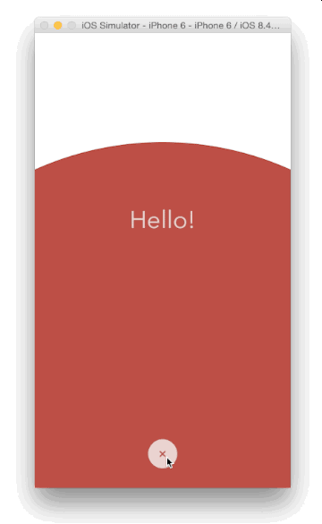
A custom modal transition that presents and dismiss a controller inside an expanding and shrinking bubble.

Screenshot
Usage
Install through CocoaPods:
pod 'BubbleTransition', '~> 3.2.0'

use_frameworks!
Install through Carthage:
github "andreamazz/BubbleTransition"
Install through Swift Package Manager:
To integrate using Xcode:
File -> Swift Packages -> Add Package Dependency...
Enter package URL: https://github.com/andreamazz/BubbleTransition, and select the latest release.
Setup
Have your view controller conform to UIViewControllerTransitioningDelegate. Set the transitionMode, the startingPoint, the bubbleColor and the duration.
let transition = BubbleTransition()

public override func prepare(for segue: UIStoryboardSegue, sender: Any?) {
  let controller = segue.destination
  controller.transitioningDelegate = self
  controller.modalPresentationCapturesStatusBarAppearance = true
  controller.modalPresentationStyle = .custom
}

// MARK: UIViewControllerTransitioningDelegate

public func animationController(forPresented presented: UIViewController, presenting: UIViewController, source: UIViewController) -> UIViewControllerAnimatedTransitioning? {
  transition.transitionMode = .present
  transition.startingPoint = someButton.center
  transition.bubbleColor = someButton.backgroundColor!
  return transition
}

public func animationController(forDismissed dismissed: UIViewController) -> UIViewControllerAnimatedTransitioning? {
  transition.transitionMode = .dismiss
  transition.startingPoint = someButton.center
  transition.bubbleColor = someButton.backgroundColor!
  return transition
}
You can find the Objective-C equivalent here.
Swipe to dismiss
You can use an interactive gesture to dismiss the presented controller. To enable this gesture, prepare the interactive transition:
let interactiveTransition = BubbleInteractiveTransition()

override func prepare(for segue: UIStoryboardSegue, sender: Any?) {
  if let controller = segue.destination as? ModalViewController {
    controller.transitioningDelegate = self
    controller.modalPresentationStyle = .custom
    controller.modalPresentationCapturesStatusBarAppearance = true
    controller.interactiveTransition = interactiveTransition
    interactiveTransition.attach(to: controller)
  }
}
and implement interactionControllerForDismissal in your presenting controller:
func interactionControllerForDismissal(using animator: UIViewControllerAnimatedTransitioning) -> UIViewControllerInteractiveTransitioning? {
  return interactiveTransition
}
In the presented controller make sure to call finish() on the interactive gesture if you need to quickly dismiss from a button press instead. Check the sample code for more info.
You can decide the gesture threshold and the swipe direction:
interactiveTransition.interactionThreshold = 0.5
interactionThreshold.swipeDirection = .up
Properties
var startingPoint = CGPointZero
The point that originates the bubble.
var duration = 0.5
The transition duration.
var transitionMode: BubbleTranisionMode = .present
The transition direction. Either .present, .dismiss or .pop.
var bubbleColor: UIColor = .white
The color of the bubble. Make sure that it matches the destination controller's background color.
Checkout the sample project for the full implementation.
Author
Andrea Mazzini. I'm available for freelance work, feel free to contact me.
Want to support the development of these free libraries? Buy me a coffee âï¸ via Paypal.
Contributors
Thanks to everyone kind enough to submit a pull request.
MIT License
Copyright (c) 2018-2020 Andrea Mazzini. All rights reserved.

Permission is hereby granted, free of charge, to any person obtaining a
copy of this software and associated documentation files (the "Software"),
to deal in the Software without restriction, including
without limitation the rights to use, copy, modify, merge, publish,
distribute, sublicense, and/or sell copies of the Software, and to
permit persons to whom the Software is furnished to do so, subject to
the following conditions:

The above copyright notice and this permission notice shall be included
in all copies or substantial portions of the Software.

THE SOFTWARE IS PROVIDED "AS IS", WITHOUT WARRANTY OF ANY KIND, EXPRESS
OR IMPLIED, INCLUDING BUT NOT LIMITED TO THE WARRANTIES OF
MERCHANTABILITY, FITNESS FOR A PARTICULAR PURPOSE AND NONINFRINGEMENT.
IN NO EVENT SHALL THE AUTHORS OR COPYRIGHT HOLDERS BE LIABLE FOR ANY
CLAIM, DAMAGES OR OTHER LIABILITY, WHETHER IN AN ACTION OF CONTRACT,
TORT OR OTHERWISE, ARISING FROM, OUT OF OR IN CONNECTION WITH THE
SOFTWARE OR THE USE OR OTHER DEALINGS IN THE SOFTWARE.
Top Related Projects
A custom reusable circular / progress slider control for iOS application.
:octocat: ExpandingCollection is an animated material design UI card peek/pop controller. iOS library made by @Ramotion
:octocat: 📃 FoldingCell is an expanding content cell with animation made by @Ramotion
This component implements transition animation to crumble view-controller into tiny pieces.
:octocat: RAMAnimatedTabBarController is a Swift UI module library for adding animation to iOS tabbar items and icons. iOS library made by @Ramotion
:octocat: PaperOnboarding is a material design UI slider. Swift UI library by @Ramotion
Convert designs to code with AI
Introducing Visual Copilot: A new AI model to turn Figma designs to high quality code using your components.
Try Visual Copilot