 material-menu
[deprecated] Animations for Android L drawer, back, dismiss and check icons
Top Related Projects

This is a library with components of Android L to you use in android 2.2

Implementation of Ripple effect from Material Design for Android API 9+

A library to bring fully animated Material Design components to pre-Lolipop Android.

😍 A beautiful, fluid, and extensible dialogs API for Kotlin & Android.

The flexible, easy to use, all in one drawer library for your Android project. Now brand new with material 2 design.

Navigation Drawer Activity with material design style and simplified methods
Quick Overview
Material Menu is an Android library that provides animated menu icons for use in Android applications. It offers various transformations and animations for menu icons, following the Material Design guidelines, to enhance the user interface and provide visual feedback for user interactions.
Pros
- Easy integration with existing Android projects
- Supports multiple icon types and transformations
- Smooth and customizable animations
- Follows Material Design principles
Cons
- Limited to menu icon animations only
- May require additional setup for complex custom animations
- Potential performance impact on older devices with many animations
Code Examples
- Creating a MaterialMenuView:
MaterialMenuView materialMenu = new MaterialMenuView(this);
materialMenu.setState(MaterialMenuDrawable.IconState.BURGER);
- Animating the icon:
materialMenu.animateState(MaterialMenuDrawable.IconState.ARROW);
- Customizing the icon appearance:
MaterialMenuDrawable materialMenu = new MaterialMenuDrawable(this, Color.WHITE, MaterialMenuDrawable.Stroke.THIN);
actionBar.setHomeAsUpIndicator(materialMenu);
- Using the icon with ActionBarDrawerToggle:
MaterialMenuIconToolbar materialMenu = new MaterialMenuIconToolbar(this, Color.WHITE, MaterialMenuDrawable.Stroke.THIN) {
    @Override
    public int getToolbarViewId() {
        return R.id.toolbar;
    }
};
ActionBarDrawerToggle toggle = new ActionBarDrawerToggle(this, drawer, R.string.open, R.string.close) {
    @Override
    public void onDrawerSlide(View drawerView, float slideOffset) {
        materialMenu.setTransformationOffset(
            MaterialMenuDrawable.AnimationState.BURGER_ARROW,
            isDrawerOpen ? 2 - slideOffset : slideOffset
        );
    }
};
Getting Started
- Add the dependency to your
build.gradlefile:
dependencies {
    implementation 'com.balysv:material-menu:2.0.0'
}
- Add the MaterialMenuView to your layout:
<com.balysv.materialmenu.MaterialMenuView
    android:id="@+id/material_menu_button"
    android:layout_width="wrap_content"
    android:layout_height="wrap_content"
    app:mm_color="@android:color/white"
    app:mm_transformDuration="300"
    app:mm_scale="1"
    app:mm_strokeWidth="2"
    app:mm_rtlEnabled="true" />
- Initialize and use the MaterialMenuView in your Activity or Fragment:
MaterialMenuView materialMenu = findViewById(R.id.material_menu_button);
materialMenu.animateState(MaterialMenuDrawable.IconState.ARROW);
Competitor Comparisons
This is a library with components of Android L to you use in android 2.2
Pros of MaterialDesignLibrary
- Offers a wider range of Material Design components and widgets
- Provides more comprehensive implementation of Material Design principles
- Includes custom views like SnackBar, Dialog, and FloatingActionButton
Cons of MaterialDesignLibrary
- Less focused on specific menu animations
- May have a steeper learning curve due to its broader scope
- Potentially larger library size, which could impact app performance
Code Comparison
MaterialDesignLibrary:
Button button = new Button(this);
button.setBackgroundColor(Color.parseColor("#1E88E5"));
button.setText("BUTTON");
material-menu:
MaterialMenuDrawable materialMenu = new MaterialMenuDrawable(this, Color.WHITE, Stroke.THIN);
toolbar.setNavigationIcon(materialMenu);
materialMenu.animateIconState(IconState.BURGER);
Summary
MaterialDesignLibrary offers a more comprehensive set of Material Design components, while material-menu focuses specifically on menu animations. The choice between the two depends on the project's requirements and the desired level of Material Design implementation.
Implementation of Ripple effect from Material Design for Android API 9+
Pros of RippleEffect
- Focuses specifically on the ripple effect animation, providing a more specialized and potentially refined implementation
- Offers customization options for ripple color, duration, and fade-out time
- Can be applied to various UI elements beyond just menus
Cons of RippleEffect
- Limited to ripple effect functionality, lacking other material design animations or transitions
- May require additional libraries or implementations for a complete material design experience
- Less actively maintained, with fewer recent updates compared to material-menu
Code Comparison
material-menu:
MaterialMenuDrawable materialMenu = new MaterialMenuDrawable(this, Color.WHITE, Stroke.THIN);
actionBar.setHomeAsUpIndicator(materialMenu);
RippleEffect:
RippleView rippleView = (RippleView) findViewById(R.id.ripple_view);
rippleView.setRippleColor(Color.parseColor("#FF0000"));
rippleView.setRippleDuration(300);
Both libraries offer simple implementation, but material-menu focuses on menu animations while RippleEffect provides ripple animations for various views. material-menu integrates more closely with the action bar, while RippleEffect requires wrapping views with its custom RippleView.
A library to bring fully animated Material Design components to pre-Lolipop Android.
Pros of Material
- More comprehensive library with a wider range of Material Design components
- Actively maintained with regular updates and bug fixes
- Larger community and more extensive documentation
Cons of Material
- Larger library size, potentially increasing app size
- Steeper learning curve due to more complex API
- May require more setup and configuration
Code Comparison
Material-Menu:
MaterialMenuDrawable materialMenu = new MaterialMenuDrawable(this, Color.WHITE, Stroke.THIN);
actionBar.setHomeAsUpIndicator(materialMenu);
Material:
MaterialButton button = new MaterialButton(context);
button.setText("Click me");
button.setOnClickListener(v -> {
    // Handle click event
});
Summary
Material is a more comprehensive library offering a wide range of Material Design components, while Material-Menu focuses specifically on animated menu icons. Material provides more options and flexibility but may increase app size and complexity. Material-Menu is simpler and more focused, ideal for projects that only need menu animations. The choice between the two depends on the specific requirements of your project and the level of Material Design implementation needed.
😍 A beautiful, fluid, and extensible dialogs API for Kotlin & Android.
Pros of material-dialogs
- More comprehensive library, offering a wide range of dialog types and customization options
- Actively maintained with frequent updates and bug fixes
- Extensive documentation and examples available
Cons of material-dialogs
- Larger library size, which may impact app size and performance
- Steeper learning curve due to more complex API and numerous options
Code Comparison
material-menu:
val materialMenu = MaterialMenuDrawable(this, Color.WHITE, MaterialMenuDrawable.Stroke.THIN)
actionBarDrawerToggle.setDrawerArrowDrawable(materialMenu)
material-dialogs:
MaterialDialog(this).show {
    title(R.string.dialog_title)
    message(R.string.dialog_message)
    positiveButton(R.string.agree)
    negativeButton(R.string.disagree)
}
Summary
material-dialogs is a more feature-rich library for creating Material Design dialogs, offering extensive customization options and a wide range of dialog types. It's actively maintained and well-documented, making it suitable for complex dialog requirements. However, its larger size and more complex API may be overkill for simpler use cases.
material-menu, on the other hand, focuses specifically on creating animated menu icons for navigation drawers and action bars. It's a lightweight solution for this specific use case but lacks the broader dialog functionality offered by material-dialogs.
Choose material-dialogs for comprehensive dialog needs and material-menu for simple, animated menu icons.
The flexible, easy to use, all in one drawer library for your Android project. Now brand new with material 2 design.
Pros of MaterialDrawer
- More comprehensive drawer solution with extensive customization options
- Actively maintained with frequent updates and bug fixes
- Larger community and better documentation
Cons of MaterialDrawer
- Steeper learning curve due to more complex API
- Larger library size, potentially increasing app size
Code Comparison
material-menu:
MaterialMenuDrawable materialMenu = new MaterialMenuDrawable(this, Color.WHITE, MaterialMenuDrawable.Stroke.THIN);
actionBar.setHomeAsUpIndicator(materialMenu);
MaterialDrawer:
new DrawerBuilder()
    .withActivity(this)
    .withToolbar(toolbar)
    .addDrawerItems(
        new PrimaryDrawerItem().withName("Home"),
        new SecondaryDrawerItem().withName("Settings")
    )
    .build();
Key Differences
- material-menu focuses solely on animating the drawer icon, while MaterialDrawer provides a complete drawer implementation
- MaterialDrawer offers more built-in components and styling options
- material-menu is lighter and easier to integrate for simple icon animations
Use Cases
- Choose material-menu for basic drawer icon animations with minimal overhead
- Opt for MaterialDrawer when building feature-rich navigation drawers with multiple items and custom layouts
Navigation Drawer Activity with material design style and simplified methods
Pros of MaterialNavigationDrawer
- Provides a complete navigation drawer implementation
- Offers more customization options for drawer items and sections
- Includes support for multiple accounts and custom views
Cons of MaterialNavigationDrawer
- Less frequently updated compared to material-menu
- May have a steeper learning curve due to more complex implementation
- Potentially larger library size due to additional features
Code Comparison
material-menu:
MaterialMenuIcon materialMenu = new MaterialMenuIcon(this, Color.WHITE, Stroke.THIN);
materialMenu.animateState(MaterialMenuDrawable.IconState.BURGER);
MaterialNavigationDrawer:
public class MainActivity extends MaterialNavigationDrawer {
    @Override
    public void init(Bundle savedInstanceState) {
        addSection(newSection("Section 1", new Fragment1()));
        addSection(newSection("Section 2", new Fragment2()));
    }
}
Summary
MaterialNavigationDrawer offers a more comprehensive solution for implementing a navigation drawer, with additional features and customization options. However, it may be more complex to implement and has less frequent updates. material-menu, on the other hand, focuses specifically on the menu icon animation, providing a simpler and more lightweight solution for that particular aspect of material design.
Convert  designs to code with AI

Introducing Visual Copilot: A new AI model to turn Figma designs to high quality code using your components.
Try Visual CopilotREADME
â ï¸ The project is deprecated â ï¸
Any issues or pull requests will not be addressed. Please consider forking your own version if changes are needed.
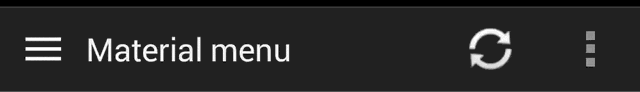
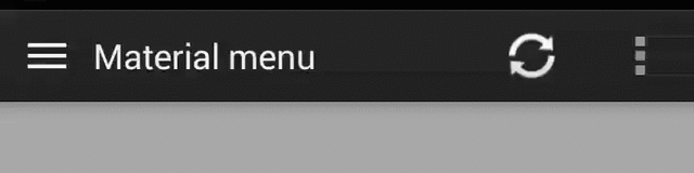
Material Menu
Morphing Android menu, back, dismiss and check buttons
Have full control of the animation:
Including in your project
compile 'com.balysv.materialmenu:material-menu:2.0.0'
Versions up to 2.0 (deprecated)
See README for setting up older versions of the library.
Usage
MaterialMenuDrawable
Use it as a standalone drawable in your Toolbar:
private MaterialMenuDrawable materialMenu;

protected void onCreate(Bundle savedInstanceState) {
    super.onCreate(savedInstanceState);
    setContentView(R.layout.toolbar);
    Toolbar toolbar = (Toolbar) findViewById(R.id.toolbar);
    setSupportActionBar(toolbar);
    toolbar.setNavigationOnClickListener(new View.OnClickListener() {
        @Override public void onClick(View v) {
        // Handle your drawable state here
        materialMenu.animateState(newState);
      }
    });
    materialMenu = new MaterialMenuDrawable(this, Color.WHITE, Stroke.THIN);
    toolbar.setNavigationIcon(materialMenu);
}
MaterialMenuView
A plain old View that draws the icon and provides an API to manipulate its state. You can embed it
in any layout including a Toolbar.
Customisation is also available through xml attributes:
app:mm_color="color"               // Color of drawable
app:mm_visible="boolean"           // Visible
app:mm_transformDuration="integer" // Transformation animation duration
app:mm_scale="integer"             // Scale factor of drawable
app:mm_strokeWidth="integer"       // Stroke width of icons (can only be 1, 2 or 3)
app:mm_rtlEnabled="boolean"        // Enabled RTL layout support (flips all drawables)
app:mm_iconState="enum"            // Set the intial state of the drawable (burger, arrow, x or check)
API
There are four icon states:
BURGER, ARROW, X, CHECK
To morph the drawable state
MaterialMenu.animateIconState(IconState state)
To change the drawable state without animation
MaterialMenu.setIconState(IconState state)
To animate the drawable manually (i.e. on navigation drawer slide):
MaterialMenu.setTransformationOffset(AnimationState state, float value)
To hide or show the drawable:
MaterialMenu.setVisible(boolean visible)
where AnimationState is one of BURGER_ARROW, BURGER_X, ARROW_X, ARROW_CHECK, BURGER_CHECK, X_CHECK
and value is between 0 and 2
Note: The icon state is resolved by current offset value. Make sure you use offset between 0 and 1 for forward animation and 1 and 2 for backwards to correctly save icon state on activity recreation.
NavigationDrawer slide interaction
Implement MaterialMenu into your ActionBar as described above and add a custom DrawerListener:
private DrawerLayout drawerLayout;
private boolean isDrawerOpened;
private MaterialMenuDrawable materialMenu;

@Override
protected void onCreate(Bundle savedInstanceState) {
    super.onCreate(savedInstanceState);
    toolbar = (Toolbar) findViewById(R.id.toolbar);
    setSupportActionBar(toolbar);
    materialMenu = new MaterialMenuDrawable(this, Color.WHITE, Stroke.THIN);
    toolbar.setNavigationIcon(materialMenu);

    drawerLayout = (DrawerLayout) findViewById(R.id.drawer_layout);
    drawerLayout.setDrawerListener(new DrawerLayout.SimpleDrawerListener() {
        @Override
        public void onDrawerSlide(View drawerView, float slideOffset) {
            materialMenu.setTransformationOffset(
                MaterialMenuDrawable.AnimationState.BURGER_ARROW,
                isDrawerOpened ? 2 - slideOffset : slideOffset
            );
        }

        @Override
        public void onDrawerOpened(View drawerView) {
            isDrawerOpened = true;
        }

        @Override
        public void onDrawerClosed(View drawerView) {
            isDrawerOpened = false;
        }

        @Override
        public void onDrawerStateChanged(int newState) {
            if(newState == DrawerLayout.STATE_IDLE) {
                if(isDrawerOpened) {
                   menu.setIconState(MaterialMenuDrawable.IconState.ARROW);
                } else {
                   menu.setIconState(MaterialMenuDrawable.IconState.BURGER);
                }
            }
        }
    });
}
Developed By
Balys Valentukevicius
License
Copyright 2016 Balys Valentukevicius

Licensed under the Apache License, Version 2.0 (the "License");
you may not use this file except in compliance with the License.
You may obtain a copy of the License at

   http://www.apache.org/licenses/LICENSE-2.0

Unless required by applicable law or agreed to in writing, software
distributed under the License is distributed on an "AS IS" BASIS,
WITHOUT WARRANTIES OR CONDITIONS OF ANY KIND, either express or implied.
See the License for the specific language governing permissions and
limitations under the License.
Top Related Projects
This is a library with components of Android L to you use in android 2.2
Implementation of Ripple effect from Material Design for Android API 9+
A library to bring fully animated Material Design components to pre-Lolipop Android.
😍 A beautiful, fluid, and extensible dialogs API for Kotlin & Android.
The flexible, easy to use, all in one drawer library for your Android project. Now brand new with material 2 design.
Navigation Drawer Activity with material design style and simplified methods
Convert designs to code with AI
Introducing Visual Copilot: A new AI model to turn Figma designs to high quality code using your components.
Try Visual Copilot