 material
A library to bring fully animated Material Design components to pre-Lolipop Android.
Top Related Projects
This is a library with components of Android L to you use in android 2.2
���😍 A beautiful, fluid, and extensible dialogs API for Kotlin & Android.
A curated list of awesome Android UI/UX libraries
Implementation of Ripple effect from Material Design for Android API 9+
The flexible, easy to use, all in one drawer library for your Android project. Now brand new with material 2 design.
A circular ImageView for Android
Quick Overview
Material is an Android library that provides a set of UI components and utilities following Google's Material Design guidelines. It aims to simplify the implementation of Material Design in Android applications, offering a wide range of customizable widgets and animations.
Pros
- Comprehensive set of Material Design components
- Easy integration with existing Android projects
- Highly customizable UI elements
- Regular updates and active maintenance
Cons
- Learning curve for developers new to Material Design
- May increase app size due to additional resources
- Some components might not perfectly match the latest Material Design specifications
- Limited documentation compared to official Android components
Code Examples
- Creating a Material Button:
val button = MaterialButton(context)
button.text = "Click me"
button.setOnClickListener { /* Handle click */ }
layout.addView(button)
- Implementing a Material Dialog:
val dialog = Dialog(context)
    .title("Dialog Title")
    .content("This is the dialog content.")
    .positiveAction("OK") { /* Handle positive action */ }
    .negativeAction("Cancel") { /* Handle negative action */ }
dialog.show()
- Using a Material Progress Bar:
val progressBar = ProgressView(context)
progressBar.mode = ProgressView.MODE_DETERMINATE
progressBar.progress = 75
layout.addView(progressBar)
Getting Started
To use Material in your Android project, add the following dependency to your app's build.gradle file:
dependencies {
    implementation 'com.github.rey5137:material:1.3.1'
}
Then, apply the Material theme in your AndroidManifest.xml:
<application
    android:theme="@style/Theme.Material">
    <!-- Your activities and other components -->
</application>
Now you can start using Material components in your layouts and code. For example, to use a Material Button in your XML layout:
<com.rey.material.widget.Button
    android:layout_width="wrap_content"
    android:layout_height="wrap_content"
    android:text="Material Button" />
Competitor Comparisons
This is a library with components of Android L to you use in android 2.2
Pros of MaterialDesignLibrary
- More comprehensive set of UI components, including floating action buttons and progress bars
- Includes custom views like TickerView for scrolling text animations
- Better documentation with detailed usage examples
Cons of MaterialDesignLibrary
- Less actively maintained, with fewer recent updates
- Larger library size, potentially impacting app performance
- Some components may not fully adhere to the latest Material Design guidelines
Code Comparison
MaterialDesignLibrary:
MaterialButton button = new MaterialButton(this)
    .setText("BUTTON")
    .setBackgroundColor(Color.BLUE)
    .setRippleColor(Color.WHITE);
layout.addView(button);
material:
Button button = new Button(this);
button.setText("BUTTON");
button.setBackgroundTintList(ColorStateList.valueOf(Color.BLUE));
layout.addView(button);
Both libraries offer Material Design components, but MaterialDesignLibrary provides more custom views and animations. However, material is more actively maintained and may be more suitable for long-term projects. The code comparison shows that MaterialDesignLibrary offers a more fluent API for creating UI elements, while material relies more on standard Android views with Material Design styling.
😍 A beautiful, fluid, and extensible dialogs API for Kotlin & Android.
Pros of material-dialogs
- More focused on dialog components, offering a wider range of customizable dialog options
- Actively maintained with frequent updates and bug fixes
- Extensive documentation and sample code available
Cons of material-dialogs
- Limited to dialog-related components, less comprehensive for overall Material Design implementation
- Larger library size due to its extensive dialog features
Code Comparison
material-dialogs:
MaterialDialog(this).show {
    title(R.string.your_title)
    message(R.string.your_message)
    positiveButton(R.string.agree)
    negativeButton(R.string.disagree)
}
material:
Dialog dialog = new Dialog(context)
    .title(R.string.your_title)
    .content(R.string.your_message)
    .positiveAction(R.string.agree)
    .negativeAction(R.string.disagree);
dialog.show();
Both libraries offer similar functionality for creating dialogs, but material-dialogs uses a more modern Kotlin-based approach with a DSL-like syntax. The material library uses a traditional Java builder pattern.
material-dialogs is ideal for projects requiring extensive dialog customization, while material provides a broader set of Material Design components beyond just dialogs. Choose based on your project's specific needs and the scope of Material Design implementation required.
A curated list of awesome Android UI/UX libraries
Pros of awesome-android-ui
- Comprehensive collection of UI libraries and components
- Regularly updated with new and trending UI resources
- Categorized for easy navigation and discovery
Cons of awesome-android-ui
- Not a standalone library, requires integration of multiple dependencies
- May lead to inconsistency in design if using components from different sources
- Potential for conflicts between different libraries
Code Comparison
material:
MaterialButton button = new MaterialButton(context);
button.setBackgroundTintList(ColorStateList.valueOf(Color.BLUE));
button.setTextColor(Color.WHITE);
button.setText("Click Me");
awesome-android-ui (using a library from the collection, e.g., Material Components):
MaterialButton button = new MaterialButton(context);
button.setBackgroundColor(ContextCompat.getColor(context, R.color.colorPrimary));
button.setTextColor(ContextCompat.getColor(context, R.color.white));
button.setText("Click Me");
Note: The code comparison is similar as both examples use Material Design components, but awesome-android-ui provides a curated list of various UI libraries, not a single implementation.
Implementation of Ripple effect from Material Design for Android API 9+
Pros of RippleEffect
- Focused specifically on ripple effect animations
- Lightweight and easy to integrate for simple ripple effects
- Customizable ripple color and duration
Cons of RippleEffect
- Limited to ripple animations only, not a comprehensive UI library
- Less actively maintained compared to Material
- Fewer customization options for complex UI components
Code Comparison
RippleEffect:
RippleView rippleView = (RippleView) findViewById(R.id.ripple);
rippleView.setRippleColor(Color.parseColor("#ff0000"));
rippleView.setRippleDuration(1000);
Material:
MaterialRippleLayout.on(view)
    .rippleColor(Color.parseColor("#ff0000"))
    .rippleDuration(1000)
    .create();
Summary
RippleEffect is a specialized library for adding ripple animations to Android views, offering a simple and lightweight solution for this specific effect. It's easy to implement but limited in scope.
Material, on the other hand, is a comprehensive Material Design library that includes ripple effects along with many other UI components and features. It provides more extensive customization options and is more actively maintained.
Choose RippleEffect for quick implementation of ripple animations in simple projects, and Material for a full-featured Material Design implementation with broader UI capabilities.
The flexible, easy to use, all in one drawer library for your Android project. Now brand new with material 2 design.
Pros of MaterialDrawer
- More focused on drawer functionality, providing extensive customization options for navigation drawers
- Actively maintained with frequent updates and a large community
- Includes additional features like AccountHeader and BadgeStyle
Cons of MaterialDrawer
- Limited to drawer-related components, less comprehensive for overall Material Design implementation
- May require additional libraries for other Material Design elements
- Steeper learning curve due to its extensive API
Code Comparison
MaterialDrawer:
DrawerBuilder()
    .withActivity(this)
    .withToolbar(toolbar)
    .addDrawerItems(
        PrimaryDrawerItem().withName("Home"),
        SecondaryDrawerItem().withName("Settings")
    )
    .build()
Material:
NavigationDrawerView navigationDrawer = (NavigationDrawerView)findViewById(R.id.navigation_drawer);
navigationDrawer.addItem(new NavigationDrawerView.Item("Home"));
navigationDrawer.addItem(new NavigationDrawerView.Item("Settings"));
Summary
MaterialDrawer excels in creating feature-rich navigation drawers but is limited to that specific component. Material offers a broader range of Material Design components but may not provide as much depth for drawer functionality. The choice between the two depends on the project's specific needs and the developer's preference for API complexity versus overall Material Design implementation.
A circular ImageView for Android
Pros of CircleImageView
- Focused solely on circular image views, providing a lightweight and specialized solution
- Simple to implement with minimal configuration required
- Actively maintained with regular updates and bug fixes
Cons of CircleImageView
- Limited to circular image views, lacking the comprehensive material design components offered by Material
- Doesn't provide additional styling options or animations beyond circular cropping
- May require additional libraries for more complex UI elements
Code Comparison
CircleImageView:
<de.hdodenhof.circleimageview.CircleImageView
    android:layout_width="96dp"
    android:layout_height="96dp"
    android:src="@drawable/profile"
    app:civ_border_width="2dp"
    app:civ_border_color="#FF000000"/>
Material:
<com.rey.material.widget.ImageView
    android:layout_width="96dp"
    android:layout_height="96dp"
    android:src="@drawable/profile"
    app:v_styleId="@style/Material.Drawable.CircularImage"
    app:v_strokeColor="#FF000000"
    app:v_strokeSize="2dp"/>
Both libraries offer simple implementation for circular images, but Material provides a wider range of UI components and styling options beyond just circular images. CircleImageView is more focused and lightweight, while Material offers a comprehensive material design solution for Android applications.
Convert  designs to code with AI

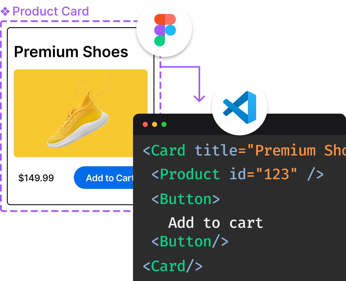
Introducing Visual Copilot: A new AI model to turn Figma designs to high quality code using your components.
Try Visual CopilotREADME
Material
MaterialLibrary is an Open Source Android library that back-port Material Design components to pre-Lolipop Android. MaterialLibrary's original author is Rey Pham.
Features
-
-
Circular


-
Linear


-
-


-


-


-

-

-

-

-


-

-

Demo

Or try it here.
Getting Started
Add Gradle dependency:
dependencies {
   implementation 'com.github.rey5137:material:1.3.1'
}
AppCompat, CardView, RecyclerView library is required by Material library.
dependencies {
   compile 'androidx.appcompat:appcompat:1.0.0'
   compile 'androidx.cardview:cardview:1.0.0'
   compile 'androidx.recyclerview:recyclerview:1.0.0'
}
Now you can use any widget in com.rey.material.widget package as you wish. For styling, please view Wiki. Note that default style of widgets depend on theme of AppCompat. Here is an example:
     <style name="AppTheme" parent="Theme.AppCompat.Light.DarkActionBar">
        <!-- Customize your theme here. -->

        <!-- colorPrimary is used for the default action bar background -->
        <item name="colorPrimary">@color/colorPrimary</item>

        <!-- colorPrimaryDark is used for the status bar -->
        <item name="colorPrimaryDark">@color/colorPrimaryDark</item>

        <!-- colorAccent is used as the default value for colorControlActivated
             which is used to tint widgets -->
        <item name="colorAccent">@color/colorAccent</item>

        <!-- You can also set colorControlNormal, colorControlActivated
             colorControlHighlight & colorSwitchThumbNormal. -->
    </style>
Donation
You can support the project and thank the author for his hard work.
PayPal
Contributing
Want to contribute? You are welcome!
Note that all pull request should go to dev branch.
Developed By
- Rey Pham - pea5137@gmail.com
License
Copyright 2015 Rey Pham.

Licensed under the Apache License, Version 2.0 (the "License");
you may not use this file except in compliance with the License.
You may obtain a copy of the License at

   http://www.apache.org/licenses/LICENSE-2.0

Unless required by applicable law or agreed to in writing, software
distributed under the License is distributed on an "AS IS" BASIS,
WITHOUT WARRANTIES OR CONDITIONS OF ANY KIND, either express or implied.
See the License for the specific language governing permissions and
limitations under the License.
Top Related Projects
This is a library with components of Android L to you use in android 2.2
😍 A beautiful, fluid, and extensible dialogs API for Kotlin & Android.
A curated list of awesome Android UI/UX libraries
Implementation of Ripple effect from Material Design for Android API 9+
The flexible, easy to use, all in one drawer library for your Android project. Now brand new with material 2 design.
A circular ImageView for Android
Convert  designs to code with AI

Introducing Visual Copilot: A new AI model to turn Figma designs to high quality code using your components.
Try Visual Copilot

