Top Related Projects
Redefined chart library built with React and D3
A collection of composable React components for building interactive data visualizations
nivo provides a rich set of dataviz components, built on top of the awesome d3 and React libraries
📊 Interactive JavaScript Charts built on SVG
Simple HTML5 Charts using the <canvas> tag
Bring data to life with SVG, Canvas and HTML. :bar_chart::chart_with_upwards_trend::tada:
Quick Overview
Rough Charts is a React-based charting library that creates hand-drawn, sketchy-style visualizations. It combines the power of D3.js for data manipulation with the Rough.js library to generate charts with a unique, hand-drawn aesthetic. This library is ideal for projects that require a more casual or artistic approach to data visualization.
Pros
- Unique hand-drawn style that stands out from traditional chart libraries
- Built on top of popular libraries (React, D3.js, Rough.js) for reliability and extensibility
- Supports various chart types including bar charts, line charts, and scatter plots
- Easy to customize and integrate into React projects
Cons
- Limited chart types compared to more comprehensive charting libraries
- May not be suitable for formal or professional presentations requiring precise visualizations
- Documentation could be more extensive and provide more examples
- Smaller community and fewer resources compared to mainstream charting libraries
Code Examples
Creating a simple bar chart:
import React from 'react';
import { Bar } from 'rough-charts';

const data = [
  { name: 'A', value: 5 },
  { name: 'B', value: 10 },
  { name: 'C', value: 15 },
];

const BarChart = () => (
  <Bar
    data={data}
    width={500}
    height={300}
    dataKey="name"
    barKey="value"
  />
);
Creating a line chart with custom options:
import React from 'react';
import { Line } from 'rough-charts';

const data = [
  { x: 0, y: 10 },
  { x: 1, y: 20 },
  { x: 2, y: 15 },
];

const LineChart = () => (
  <Line
    data={data}
    width={500}
    height={300}
    xKey="x"
    yKey="y"
    options={{
      roughness: 2,
      bowing: 1,
      fillStyle: 'zigzag',
    }}
  />
);
Adding interactivity with tooltips:
import React from 'react';
import { Scatter, Tooltip } from 'rough-charts';

const data = [
  { x: 1, y: 5, size: 20 },
  { x: 2, y: 10, size: 30 },
  { x: 3, y: 7, size: 25 },
];

const ScatterPlot = () => (
  <Scatter
    data={data}
    width={500}
    height={300}
    xKey="x"
    yKey="y"
    sizeKey="size"
  >
    <Tooltip />
  </Scatter>
);
Getting Started
To use Rough Charts in your React project, follow these steps:
-
Install the library:
npm install rough-charts -
Import and use the desired chart component in your React code:
import React from 'react'; import { Bar } from 'rough-charts'; const MyChart = () => ( <Bar data={[{ name: 'A', value: 5 }, { name: 'B', value: 10 }]} width={500} height={300} dataKey="name" barKey="value" /> ); export default MyChart; -
Customize the chart as needed using props and options.
Competitor Comparisons
Redefined chart library built with React and D3
Pros of recharts
- More comprehensive and feature-rich library with a wider variety of chart types
- Larger community and better documentation, making it easier to find solutions and support
- Higher performance and optimization for rendering large datasets
Cons of recharts
- Steeper learning curve due to its extensive API and configuration options
- Larger bundle size, which may impact load times for smaller projects
- Less customizable in terms of visual style and aesthetics
Code Comparison
recharts:
import { LineChart, Line, XAxis, YAxis, CartesianGrid, Tooltip, Legend } from 'recharts';

<LineChart width={600} height={300} data={data}>
  <Line type="monotone" dataKey="value" stroke="#8884d8" />
  <CartesianGrid stroke="#ccc" />
  <XAxis dataKey="name" />
  <YAxis />
</LineChart>
rough-charts:
import { Chart, Line, Point, Axis } from 'rough-charts';

<Chart width={600} height={300} data={data}>
  <Line dataKey="value" />
  <Point dataKey="value" />
  <Axis dataKey="name" />
  <Axis dependentAxis />
</Chart>
The code comparison shows that recharts offers more built-in components and configuration options, while rough-charts provides a simpler API with a focus on the hand-drawn aesthetic. recharts requires more setup but offers greater flexibility, whereas rough-charts aims for ease of use and a unique visual style.
A collection of composable React components for building interactive data visualizations
Pros of Victory
- More comprehensive and feature-rich charting library
- Extensive documentation and examples
- Larger community and better long-term support
Cons of Victory
- Larger bundle size and potentially slower performance
- Steeper learning curve due to more complex API
- Less unique visual style compared to Rough Charts
Code Comparison
Victory:
import { VictoryBar, VictoryChart, VictoryAxis } from 'victory';

<VictoryChart>
  <VictoryAxis tickValues={[1, 2, 3, 4]} />
  <VictoryAxis dependentAxis />
  <VictoryBar data={data} x="quarter" y="earnings" />
</VictoryChart>
Rough Charts:
import { Bar, BarChart, XAxis, YAxis } from 'rough-charts';

<BarChart data={data} width={600} height={400}>
  <XAxis dataKey="name" />
  <YAxis />
  <Bar dataKey="value" />
</BarChart>
Victory offers a more modular approach with separate components for chart, axes, and bars. Rough Charts has a simpler API with fewer components, making it easier to get started but potentially limiting for complex visualizations. Victory's code is more verbose but offers greater flexibility, while Rough Charts provides a more concise and straightforward implementation.
nivo provides a rich set of dataviz components, built on top of the awesome d3 and React libraries
Pros of nivo
- More comprehensive and feature-rich, offering a wide variety of chart types and customization options
- Better documentation and examples, making it easier for developers to implement and customize charts
- Active development and larger community support, ensuring regular updates and bug fixes
Cons of nivo
- Larger bundle size due to its extensive feature set, which may impact performance for smaller projects
- Steeper learning curve compared to rough-charts, especially for developers new to data visualization
Code Comparison
nivo:
import { ResponsiveLine } from '@nivo/line'

<ResponsiveLine
  data={data}
  margin={{ top: 50, right: 110, bottom: 50, left: 60 }}
  xScale={{ type: 'point' }}
  yScale={{ type: 'linear', min: 'auto', max: 'auto', stacked: true, reverse: false }}
/>
rough-charts:
import { LineChart } from 'rough-charts'

<LineChart
  data={data}
  x={d => d.x}
  y={d => d.y}
  width={600}
  height={400}
/>
rough-charts offers a simpler API with a focus on creating charts with a hand-drawn aesthetic, while nivo provides a more powerful and flexible charting solution with a wide range of customization options. The choice between the two depends on the specific project requirements, desired visual style, and the level of complexity needed in the charts.
📊 Interactive JavaScript Charts built on SVG
Pros of ApexCharts.js
- More comprehensive and feature-rich charting library
- Extensive documentation and examples
- Supports a wider range of chart types and customization options
Cons of ApexCharts.js
- Larger file size and potentially heavier performance impact
- Steeper learning curve due to more complex API
- Less unique visual style compared to Rough Charts' hand-drawn aesthetic
Code Comparison
ApexCharts.js:
var options = {
  chart: { type: 'line' },
  series: [{ data: [30, 40, 35, 50, 49, 60, 70] }],
  xaxis: { categories: [1991, 1992, 1993, 1994, 1995, 1996, 1997] }
};
var chart = new ApexCharts(document.querySelector("#chart"), options);
chart.render();
Rough Charts:
import { LineChart } from 'rough-charts';

<LineChart
  data={[{ x: 1, y: 30 }, { x: 2, y: 40 }, { x: 3, y: 35 }]}
  xKey="x"
  yKey="y"
/>
ApexCharts.js offers more configuration options but requires more setup code, while Rough Charts provides a simpler API for basic charts with its unique hand-drawn style.
Simple HTML5 Charts using the <canvas> tag
Pros of Chart.js
- More comprehensive and feature-rich, offering a wide range of chart types and customization options
- Larger community and ecosystem, resulting in better documentation and support
- Better performance for handling large datasets and complex visualizations
Cons of Chart.js
- Steeper learning curve due to its extensive API and configuration options
- Larger file size, which may impact page load times for simpler projects
- Less unique visual style compared to Rough Charts' hand-drawn aesthetic
Code Comparison
Chart.js:
new Chart(ctx, {
    type: 'bar',
    data: {
        labels: ['Red', 'Blue', 'Yellow'],
        datasets: [{
            label: 'My Dataset',
            data: [12, 19, 3]
        }]
    }
});
Rough Charts:
<BarChart
  data={[
    { name: 'Red', value: 12 },
    { name: 'Blue', value: 19 },
    { name: 'Yellow', value: 3 }
  ]}
  x={d => d.name}
  y={d => d.value}
/>
Chart.js provides a more traditional approach with extensive configuration options, while Rough Charts offers a simpler, declarative API with a focus on creating charts with a hand-drawn appearance. Chart.js is better suited for complex, data-heavy applications, while Rough Charts excels in creating visually unique, sketch-like charts for more casual or creative projects.
Bring data to life with SVG, Canvas and HTML. :bar_chart::chart_with_upwards_trend::tada:
Pros of d3
- Extremely powerful and flexible, capable of creating a wide range of complex visualizations
- Large and active community, extensive documentation, and numerous examples available
- Offers fine-grained control over every aspect of the visualization
Cons of d3
- Steeper learning curve, especially for those new to data visualization
- Requires more code to create basic charts compared to higher-level libraries
- Lower-level API can be verbose for simple visualizations
Code Comparison
d3:
const svg = d3.select("body").append("svg")
    .attr("width", 400)
    .attr("height", 300);

svg.selectAll("rect")
    .data(data)
    .enter()
    .append("rect")
    .attr("x", (d, i) => i * 40)
    .attr("y", d => 300 - d * 10)
    .attr("width", 35)
    .attr("height", d => d * 10);
rough-charts:
<BarChart
  data={data}
  x={d => d.name}
  y={d => d.value}
  width={400}
  height={300}
/>
Summary
d3 is a powerful, low-level library offering extensive control and flexibility, but with a steeper learning curve. rough-charts provides a higher-level API for creating hand-drawn style charts with less code, making it easier to use for simple visualizations but potentially less flexible for complex custom charts.
Convert  designs to code with AI

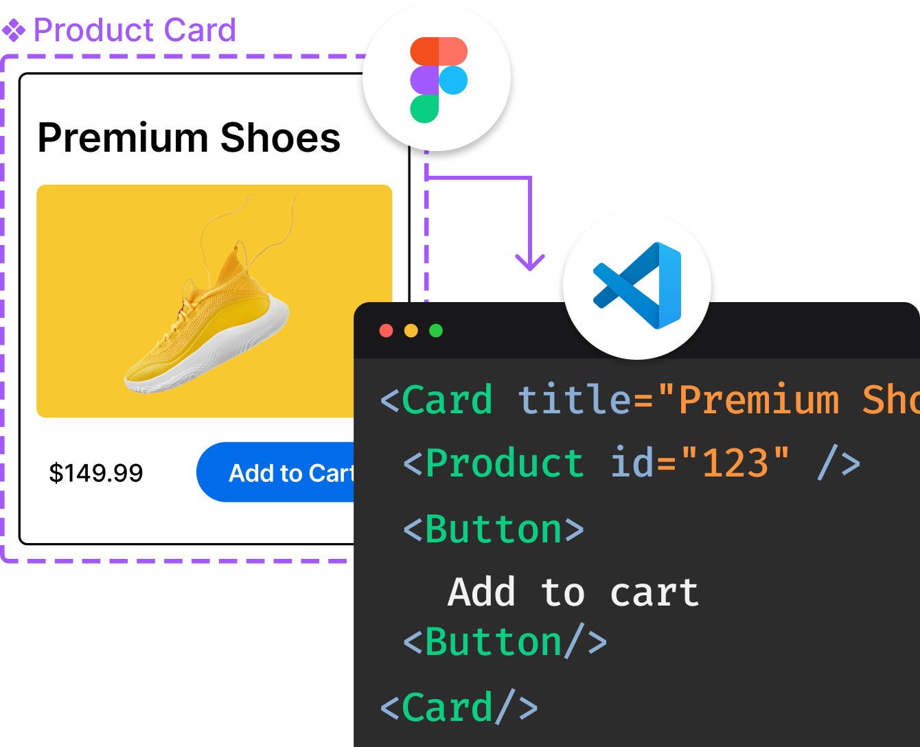
Introducing Visual Copilot: A new AI model to turn Figma designs to high quality code using your components.
Try Visual CopilotREADME
Rough Charts · 

A responsive, composable react charting library with a hand-drawn style.
See Examples From StoryBooks.
Overview


Features
- It's responsive.
- It's flexible and easy to compose. You can compose all available ChartSeries Components and render any shapes you like.
- It's lovely.
- It's written in TypeScript.
Installation
# NPM
npm install rough-charts

# Yarn
yarn add rough-charts
This project contains a package called
react-roughjs. It has a lot of basic rough shapes, you may need it.
Usage
import * as React from 'react'
import {
  LineSeries, Tooltip,
  ChartProvider, XAxis, YAxis,
} from 'rough-charts'
import { colors } from './colors'

const data = [
  { name: 'A', value1: 30, value2: 35 },
  { name: 'B', value1: 90, value2: 17 },
  { name: 'C', value1: 50, value2: 23 },
  { name: 'D', value1: 40, value2: 15 },
  { name: 'E', value1: 70, value2: 39 },
  { name: 'G', value1: 30, value2: 25 },
  { name: 'H', value1: 100, value2: 31 },
  { name: 'I', value1: 110, value2: 32 },
]

const App = props => (
  <ChartProvider
    height={400}
    data={data}
  >
    <XAxis dataKey="name" />
    <YAxis />
    <LineSeries
      dataKey="value1"
      options={{
        stroke: colors[0],
        strokeWidth: 2,
      }}
    />
    <LineSeries
      dataKey="value2"
      options={{
        stroke: colors[3],
        strokeWidth: 2,
      }}
    />
    <Tooltip />
  </ChartProvider>
)
Fonts
Add your favorite hand-drawn style fonts:
<link href="https://fonts.googleapis.com/css?family=Patrick+Hand&display=swap" rel="stylesheet">
<style>
  * {
    font-family: 'Patrick Hand', cursive;
    font-size: 16px;
  }
</style>
Credits
Top Related Projects
Redefined chart library built with React and D3
A collection of composable React components for building interactive data visualizations
nivo provides a rich set of dataviz components, built on top of the awesome d3 and React libraries
📊 Interactive JavaScript Charts built on SVG
Simple HTML5 Charts using the <canvas> tag
Bring data to life with SVG, Canvas and HTML. :bar_chart::chart_with_upwards_trend::tada:
Convert  designs to code with AI

Introducing Visual Copilot: A new AI model to turn Figma designs to high quality code using your components.
Try Visual Copilot