
Top Related Projects

Pick a date or time on Android in style

[NO LONGER MAINTAINED] Android library for better Picker DialogFragments

Photopicker and document picker for android

Simple and fantastic wheel view in realistic effect for android.
Quick Overview
SingleDateAndTimePicker is an Android library that provides a customizable date and time picker in a single dialog. It offers a sleek, user-friendly interface for selecting both date and time simultaneously, making it ideal for scheduling and event-based applications.
Pros
- Easy integration with minimal setup required
- Customizable appearance to match app themes
- Supports both date and time selection in a single view
- Smooth scrolling and intuitive user interaction
Cons
- Limited to Android platform only
- May require additional customization for complex date/time scenarios
- Documentation could be more comprehensive
- Dependency on external libraries may increase app size
Code Examples
- Basic implementation:
SingleDateAndTimePicker.Builder(context)
    .build()
    .display()
- Customizing the picker:
SingleDateAndTimePicker.Builder(context)
    .backgroundColor(Color.WHITE)
    .mainColor(Color.GREEN)
    .titleTextColor(Color.GREEN)
    .build()
    .display()
- Setting a default date and time:
val calendar = Calendar.getInstance()
SingleDateAndTimePicker.Builder(context)
    .defaultDate(calendar.time)
    .build()
    .display()
- Adding a listener for date/time selection:
SingleDateAndTimePicker.Builder(context)
    .listener { date ->
        // Handle the selected date
    }
    .build()
    .display()
Getting Started
- Add the JitPack repository to your project's build.gradle file:
allprojects {
    repositories {
        ...
        maven { url 'https://jitpack.io' }
    }
}
- Add the dependency to your app's build.gradle file:
dependencies {
    implementation 'com.github.florent37:singledateandtimepicker:2.2.7'
}
- Use the SingleDateAndTimePicker in your activity or fragment:
import com.github.florent37.singledateandtimepicker.SingleDateAndTimePicker

class MainActivity : AppCompatActivity() {
    override fun onCreate(savedInstanceState: Bundle?) {
        super.onCreate(savedInstanceState)
        setContentView(R.layout.activity_main)

        SingleDateAndTimePicker.Builder(this)
            .build()
            .display()
    }
}
Competitor Comparisons
Pick a date or time on Android in style
Pros of MaterialDateTimePicker
- More comprehensive date and time selection options, including separate date and time pickers
- Follows Material Design guidelines more closely, providing a familiar look for Android users
- Offers more customization options for themes and styles
Cons of MaterialDateTimePicker
- Larger library size due to more features, which may impact app size
- Potentially more complex to implement for simple use cases
- Less suitable for iOS-like designs or cross-platform consistency
Code Comparison
SingleDateAndTimePicker:
new SingleDateAndTimePickerDialog.Builder(context)
    .bottomSheet()
    .curved()
    .displayListener(new SingleDateAndTimePickerDialog.DisplayListener() {
        @Override
        public void onDisplayed(SingleDateAndTimePicker picker) {
            // Do something when the picker is displayed
        }
    })
    .title("Select date and time")
    .listener(new SingleDateAndTimePickerDialog.Listener() {
        @Override
        public void onDateSelected(Date date) {
            // Handle the selected date
        }
    })
    .display();
MaterialDateTimePicker:
Calendar now = Calendar.getInstance();
DatePickerDialog dpd = DatePickerDialog.newInstance(
    new DatePickerDialog.OnDateSetListener() {
        @Override
        public void onDateSet(DatePickerDialog view, int year, int monthOfYear, int dayOfMonth) {
            // Handle the selected date
        }
    },
    now.get(Calendar.YEAR),
    now.get(Calendar.MONTH),
    now.get(Calendar.DAY_OF_MONTH)
);
dpd.show(getFragmentManager(), "DatePickerDialog");
[NO LONGER MAINTAINED] Android library for better Picker DialogFragments
Pros of android-betterpickers
- Offers a wider variety of picker types (date, time, number, recurrence, etc.)
- Provides more customization options for appearance and behavior
- Supports both dialog and inline picker modes
Cons of android-betterpickers
- More complex implementation due to multiple picker types
- Larger library size and potential impact on app size
- Less modern design compared to SingleDateAndTimePicker
Code Comparison
SingleDateAndTimePicker:
new SingleDateAndTimePicker.Builder(context)
    .bottomSheet()
    .curved()
    .displayMinutes(true)
    .displayHours(true)
    .displayDays(false)
    .build()
    .display();
android-betterpickers:
Calendar now = Calendar.getInstance();
DatePickerBuilder dpb = new DatePickerBuilder()
    .setFragmentManager(getSupportFragmentManager())
    .setStyleResId(R.style.BetterPickersDialogFragment)
    .setYear(now.get(Calendar.YEAR))
    .setMonthOfYear(now.get(Calendar.MONTH))
    .setDayOfMonth(now.get(Calendar.DAY_OF_MONTH));
dpb.show();
The code comparison shows that SingleDateAndTimePicker offers a more concise and fluent API for creating and displaying a date and time picker. android-betterpickers requires more setup code and separate builders for different picker types, but provides more granular control over the picker's initial state and appearance.
Photopicker and document picker for android
Pros of Android-FilePicker
- Supports multiple file types (images, videos, documents)
- Offers customizable UI themes and colors
- Provides both single and multiple file selection options
Cons of Android-FilePicker
- More complex setup and integration process
- Larger library size due to additional features
- May require more permissions for accessing different file types
Code Comparison
SingleDateAndTimePicker:
new SingleDateAndTimePicker.Builder(context)
    .bottomSheet()
    .curved()
    .displayMinutes(false)
    .displayHours(false)
    .build()
    .display()
Android-FilePicker:
val intent = Intent(this, FilePickerActivity::class.java)
intent.putExtra(FilePickerActivity.CONFIGS, Configurations.Builder()
    .setCheckPermission(true)
    .setShowImages(true)
    .setShowVideos(false)
    .enableImageCapture(true)
    .setMaxSelection(10)
    .setSkipZeroSizeFiles(true)
    .build())
startActivityForResult(intent, FILE_REQUEST_CODE)
The code comparison shows that Android-FilePicker requires more configuration options and setup, while SingleDateAndTimePicker offers a simpler, more focused implementation for date and time selection. Android-FilePicker provides greater flexibility for file selection, but at the cost of increased complexity.
Simple and fantastic wheel view in realistic effect for android.
Pros of WheelPicker
- More customizable with options for curved, horizontal, and vertical layouts
- Supports a wider range of data types, including custom objects
- Lighter weight and potentially more performant for simple use cases
Cons of WheelPicker
- Less focused on date and time picking specifically
- May require more setup and configuration for complex date/time scenarios
- Lacks some built-in features like dialog display and default styling
Code Comparison
SingleDateAndTimePicker:
new SingleDateAndTimePickerDialog.Builder(context)
    .bottomSheet()
    .curved()
    .displayMinutes(false)
    .displayHours(false)
    .displayDays(false)
    .displayMonth(true)
    .displayYears(true)
    .displayDaysOfMonth(true)
    .listener(new SingleDateAndTimePickerDialog.Listener() {
        @Override
        public void onDateSelected(Date date) {
            // Handle date selection
        }
    })
    .display();
WheelPicker:
WheelPicker wheelPicker = new WheelPicker(this);
wheelPicker.setData(Arrays.asList("Item 1", "Item 2", "Item 3"));
wheelPicker.setOnItemSelectedListener(new WheelPicker.OnItemSelectedListener() {
    @Override
    public void onItemSelected(WheelPicker picker, Object data, int position) {
        // Handle item selection
    }
});
Both libraries offer wheel-based picking functionality, but SingleDateAndTimePicker is more specialized for date and time selection, while WheelPicker provides a more general-purpose solution with greater flexibility for various data types and layouts.
Convert  designs to code with AI

Introducing Visual Copilot: A new AI model to turn Figma designs to high quality code using your components.
Try Visual CopilotREADME
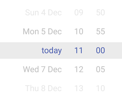
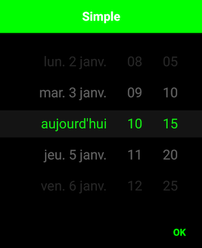
SingleDateAndTimePicker
You can now select a date and a time with only one widget !


Usage
new SingleDateAndTimePickerDialog.Builder(context)
            //.bottomSheet()
            //.curved()
            //.stepSizeMinutes(15)
            //.displayHours(false)
            //.displayMinutes(false)
            //.todayText("aujourd'hui")
            .displayListener(new SingleDateAndTimePickerDialog.DisplayListener() {
                @Override
                public void onDisplayed(SingleDateAndTimePicker picker) {
                    // Retrieve the SingleDateAndTimePicker
                }

                @Override
                public void onClosed(SingleDateAndTimePicker picker) {
                    // On dialog closed
                }
            })
            .title("Simple")
            .listener(new SingleDateAndTimePickerDialog.Listener() {
                @Override
                public void onDateSelected(Date date) {

                }
            }).display();
Select 2 dates
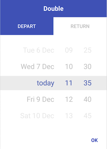
new DoubleDateAndTimePickerDialog.Builder(context)
            //.bottomSheet()
            //.curved()
            //.stepSizeMinutes(15)
            .title("Double")
            .tab0Text("Depart")
            .tab1Text("Return")
            .listener(new DoubleDateAndTimePickerDialog.Listener() {
                @Override
                public void onDateSelected(List<Date> dates) {

                }
        }).display();
Display days, months and years

new SingleDateAndTimePickerDialog.Builder(this)
            .bottomSheet()
            .curved()
            .displayMinutes(false)
            .displayHours(false)
            .displayDays(false)
            .displayMonth(true)
            .displayYears(true)
            .displayDaysOfMonth(true)
            .display();
Include in a layout
<com.github.florent37.singledateandtimepicker.SingleDateAndTimePicker
        android:layout_width="wrap_content"
        android:layout_height="230dp"
        app:picker_curved="true"
        app:picker_cyclic="true"
        app:picker_visibleItemCount="7"
        />
iOS like :P
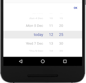
new SingleDateAndTimePickerDialog.Builder(context)
                                    .bottomSheet()
                                    .curved()
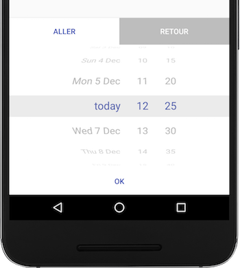
new DoubleDateAndTimePickerDialog.Builder(context)
                                    .bottomSheet()
                                    .curved()
Customisation
You can change the minutes steps (default : 5min)
new SingleDateAndTimePickerDialog.Builder(context)
            .stepSizeMinutes(15)
            .display();
And change some colors
new SingleDateAndTimePickerDialog.Builder(context)
            .backgroundColor(Color.BLACK)
            .mainColor(Color.GREEN)
            .titleColor(Color.WHITE)
            .display();
Date range
Require user to select a date between a range
new SingleDateAndTimePickerDialog.Builder(context)
            .defaultDate(defaultDate)
            .minDateRange(minDate)
            .maxDateRange(maxDate)
            .display();
Or simply require user to select a future date
new SingleDateAndTimePickerDialog.Builder(context)
            .mustBeOnFuture()
            .display();
Changing typeface
final SingleDateAndTimePicker singleDateAndTimePicker2 = findViewById(R.id.single_day_picker2);
singleDateAndTimePicker2.setTypeface(ResourcesCompat.getFont(this, R.font.dinot_regular));
Or pass it as an attribute in the XML layout. (See XML section on how to use it.)
XML
Some/most options are also available via XML:
    <com.github.florent37.singledateandtimepicker.SingleDateAndTimePicker
        android:id="@+id/single_day_picker"
        android:layout_width="wrap_content"
        android:layout_height="wrap_content"
        app:picker_itemSpacing="6dp"
        app:picker_curvedMaxAngle="45"
        app:picker_curved="true"
        app:picker_selectorColor="@android:color/transparent"
        app:picker_stepSizeHours="2"
        app:picker_stepSizeMinutes="5"
        app:picker_cyclic="false"
        app:picker_dayCount="31"
        app:picker_mustBeOnFuture="true"
        app:picker_visibleItemCount="7"
        app:fontFamily="@font/dinot_bold"
        />
- picker_itemSpacing: Margin between items. Only has effect with height=wrap-content
- picker_curvedMaxAngle sets the max angle of top/bottom items. If 45 then the visible 'window' of the wheel is a 'quarter' of the circle. If 90 (default) its rolling on a half-circle
app:fontFamilyorandroid:fontFamilysets the typeface/font to be used with the date picker. Note - For api below v-16 useapp:fontFamily
Get divider lines around selected by overwriting one or more of
    <color name="picker_default_divider_color">@android:color/transparent</color>
    <dimen name="picker_default_divider_height">1dp</dimen>
    <drawable name="picker_default_divider">@drawable/picker_divider</drawable>
Use in conjuction with
app:picker_selectorColor="@android:color/transparent" on layout.
Download
In your module 
implementation 'com.github.florent37:singledateandtimepicker:2.2.7'
//compatible with androidX
Credits
Author: Florent Champigny
Blog : http://www.tutos-android-france.com/
Fiches Plateau Moto : https://www.fiches-plateau-moto.fr/


License
Copyright 2016 florent37, Inc.

Licensed under the Apache License, Version 2.0 (the "License");
you may not use this file except in compliance with the License.
You may obtain a copy of the License at

   http://www.apache.org/licenses/LICENSE-2.0

Unless required by applicable law or agreed to in writing, software
distributed under the License is distributed on an "AS IS" BASIS,
WITHOUT WARRANTIES OR CONDITIONS OF ANY KIND, either express or implied.
See the License for the specific language governing permissions and
limitations under the License.
Top Related Projects
Pick a date or time on Android in style
[NO LONGER MAINTAINED] Android library for better Picker DialogFragments
Photopicker and document picker for android
Simple and fantastic wheel view in realistic effect for android.
Convert designs to code with AI
Introducing Visual Copilot: A new AI model to turn Figma designs to high quality code using your components.
Try Visual Copilot