 android-betterpickers
[NO LONGER MAINTAINED] Android library for better Picker DialogFragments
Top Related Projects

Pick a date or time on Android in style

😍 A beautiful, fluid, and extensible dialogs API for Kotlin & Android.

An adaptation of the JSR-310 backport for Android.

Useful and powerful date picker for android

You can now select a date and a time with only one widget !

A highly customizable calendar view and compose library for Android and Kotlin Multiplatform.
Quick Overview
Android BetterPickers is a library that provides enhanced date and time picker dialogs for Android applications. It offers a more user-friendly and customizable alternative to the standard Android pickers, with a focus on improved design and functionality.
Pros
- Improved user interface and design compared to standard Android pickers
- Highly customizable appearance and behavior
- Supports various picker types (date, time, number, recurrence, etc.)
- Easy integration into existing Android projects
Cons
- May not perfectly match the latest Material Design guidelines
- Requires additional dependencies and increases app size
- Limited documentation and examples for some advanced use cases
- Not actively maintained (last update was in 2018)
Code Examples
- Creating a Date Picker:
DatePickerBuilder dpb = new DatePickerBuilder()
    .setFragmentManager(getSupportFragmentManager())
    .setStyleResId(R.style.BetterPickersDialogFragment)
    .setReference(1)
    .setOnDateSetListener(this);
dpb.show();
- Creating a Time Picker:
TimePickerBuilder tpb = new TimePickerBuilder()
    .setFragmentManager(getSupportFragmentManager())
    .setStyleResId(R.style.BetterPickersDialogFragment)
    .setReference(2)
    .setOnTimeSetListener(this);
tpb.show();
- Creating a Number Picker:
NumberPickerBuilder npb = new NumberPickerBuilder()
    .setFragmentManager(getSupportFragmentManager())
    .setStyleResId(R.style.BetterPickersDialogFragment)
    .setReference(3)
    .setMinNumber(0)
    .setMaxNumber(100)
    .setOnNumberSetListener(this);
npb.show();
Getting Started
- Add the JitPack repository to your project's
build.gradle:
allprojects {
    repositories {
        ...
        maven { url 'https://jitpack.io' }
    }
}
- Add the dependency to your app's
build.gradle:
dependencies {
    implementation 'com.github.code-troopers:android-betterpickers:3.1.0'
}
- Sync your project and start using BetterPickers in your Android application.
Competitor Comparisons
Pick a date or time on Android in style
Pros of MaterialDateTimePicker
- More modern Material Design aesthetics
- Supports both date and time picker in a single dialog
- Actively maintained with regular updates
Cons of MaterialDateTimePicker
- Limited customization options compared to BetterPickers
- Lacks some specialized pickers (e.g., number, expiration date)
Code Comparison
MaterialDateTimePicker:
MaterialDatePicker<Long> datePicker = MaterialDatePicker.Builder.datePicker()
    .setTitleText("Select date")
    .setSelection(MaterialDatePicker.todayInUtcMilliseconds())
    .build();
datePicker.show(getSupportFragmentManager(), "DATE_PICKER");
BetterPickers:
Calendar now = Calendar.getInstance();
DatePickerBuilder dpb = new DatePickerBuilder()
    .setFragmentManager(getSupportFragmentManager())
    .setStyleResId(R.style.BetterPickersDialogFragment)
    .setYear(now.get(Calendar.YEAR))
    .setMonthOfYear(now.get(Calendar.MONTH))
    .setDayOfMonth(now.get(Calendar.DAY_OF_MONTH));
dpb.show();
MaterialDateTimePicker offers a more streamlined API with Material Design aesthetics, while BetterPickers provides more customization options and specialized pickers. The choice between the two depends on the specific requirements of your project, such as design preferences and the need for particular picker types.
😍 A beautiful, fluid, and extensible dialogs API for Kotlin & Android.
Pros of material-dialogs
- More comprehensive and feature-rich, offering a wider range of dialog types and customization options
- Actively maintained with frequent updates and bug fixes
- Better support for Material Design guidelines and theming
Cons of material-dialogs
- Larger library size, which may impact app size and performance
- Steeper learning curve due to more complex API and extensive features
- May require more setup and configuration for basic use cases
Code Comparison
material-dialogs:
MaterialDialog(this).show {
    title(R.string.your_title)
    message(R.string.your_message)
    positiveButton(R.string.agree)
    negativeButton(R.string.disagree)
}
android-betterpickers:
new DatePickerBuilder()
    .setFragmentManager(getSupportFragmentManager())
    .setStyleResId(R.style.BetterPickersDialogFragment)
    .show();
material-dialogs offers a more concise and Kotlin-friendly API, while android-betterpickers uses a builder pattern in Java. material-dialogs provides more flexibility in a single call, whereas android-betterpickers focuses on specific picker types with dedicated builders.
An adaptation of the JSR-310 backport for Android.
Pros of ThreeTenABP
- Focuses specifically on backporting Java 8's date and time API to Android
- Lightweight and efficient implementation
- Maintained by a well-known Android developer (Jake Wharton)
Cons of ThreeTenABP
- Limited to date and time functionality
- Requires additional setup and initialization in the application
Code Comparison
ThreeTenABP:
AndroidThreeTen.init(this);
LocalDate date = LocalDate.now();
ZonedDateTime zonedDateTime = ZonedDateTime.now();
BetterPickers:
DatePickerBuilder dpb = new DatePickerBuilder()
    .setFragmentManager(getSupportFragmentManager())
    .setStyleResId(R.style.BetterPickersDialogFragment);
dpb.show();
ThreeTenABP provides a more programmatic approach to working with dates and times, while BetterPickers focuses on UI components for user input. ThreeTenABP is better suited for developers who need to perform date and time calculations, while BetterPickers is ideal for creating user-friendly date and time selection interfaces.
ThreeTenABP requires less code for basic date and time operations, but BetterPickers offers more customization options for UI elements. The choice between the two libraries depends on the specific needs of the project, whether it's backend date processing or frontend user interaction.
Useful and powerful date picker for android
Pros of DatePicker
- Simpler and more lightweight implementation
- Easier to customize and integrate into existing projects
- More modern UI design, aligning with current Android design trends
Cons of DatePicker
- Less comprehensive feature set compared to android-betterpickers
- Limited documentation and community support
- Fewer options for different picker types (e.g., time, number)
Code Comparison
DatePicker:
val datePicker = DatePicker(this)
datePicker.setOnDateChangedListener { view, year, monthOfYear, dayOfMonth ->
    // Handle date selection
}
android-betterpickers:
Calendar now = Calendar.getInstance();
DatePickerBuilder dpb = new DatePickerBuilder()
    .setFragmentManager(getSupportFragmentManager())
    .setStyleResId(R.style.BetterPickersDialogFragment)
    .setReference(REFERENCE_DATE)
    .setCurrentDate(now.getTimeInMillis());
dpb.show();
The DatePicker implementation is more concise and uses Kotlin, while android-betterpickers offers more customization options but requires more setup code.
You can now select a date and a time with only one widget !
Pros of SingleDateAndTimePicker
- More modern and visually appealing UI design
- Simpler implementation with a single picker for both date and time
- Supports landscape mode out of the box
Cons of SingleDateAndTimePicker
- Less customization options compared to BetterPickers
- Limited to a single date and time selection, whereas BetterPickers offers separate pickers for various inputs
- Fewer localization options available
Code Comparison
SingleDateAndTimePicker:
new SingleDateAndTimePickerDialog.Builder(context)
    .bottomSheet()
    .curved()
    .displayListener(new SingleDateAndTimePickerDialog.DisplayListener() {
        @Override
        public void onDisplayed(SingleDateAndTimePicker picker) {
            // Do something when the picker is displayed
        }
    })
    .title("Select date and time")
    .listener(new SingleDateAndTimePickerDialog.Listener() {
        @Override
        public void onDateSelected(Date date) {
            // Handle the selected date and time
        }
    })
    .display();
BetterPickers:
Calendar now = Calendar.getInstance();
DatePickerBuilder dpb = new DatePickerBuilder()
    .setFragmentManager(getSupportFragmentManager())
    .setStyleResId(R.style.BetterPickersDialogFragment)
    .setYear(now.get(Calendar.YEAR))
    .setMonthOfYear(now.get(Calendar.MONTH))
    .setDayOfMonth(now.get(Calendar.DAY_OF_MONTH))
    .setCallBack(this)
    .addDatePickerDialogHandler(new MyCustomHandler());
dpb.show();
Both libraries offer easy-to-use APIs for implementing date and time pickers in Android applications. SingleDateAndTimePicker provides a more streamlined approach with a single picker for both date and time, while BetterPickers offers more flexibility with separate pickers for different input types.
A highly customizable calendar view and compose library for Android and Kotlin Multiplatform.
Pros of Calendar
- More modern and actively maintained, with recent updates and Kotlin support
- Offers a wider range of customization options for calendar views
- Provides better support for custom date ranges and selection modes
Cons of Calendar
- Steeper learning curve due to more complex API and features
- May be overkill for simple date picking scenarios
- Requires more setup and configuration compared to BetterPickers
Code Comparison
BetterPickers:
DatePickerBuilder dpb = new DatePickerBuilder()
    .setFragmentManager(getSupportFragmentManager())
    .setStyleResId(R.style.BetterPickersDialogFragment);
dpb.show();
Calendar:
val calendarView = CalendarView(this)
calendarView.dayBinder = object : DayBinder<DayViewContainer> {
    override fun create(view: View) = DayViewContainer(view)
    override fun bind(container: DayViewContainer, day: CalendarDay) {
        // Bind day data to the container
    }
}
The Calendar library offers more flexibility but requires more code for setup, while BetterPickers provides a simpler API for basic date picking functionality.
Convert  designs to code with AI

Introducing Visual Copilot: A new AI model to turn Figma designs to high quality code using your components.
Try Visual CopilotREADME
/!\Â This Project is no longer maintained /!\Â


DialogFragments modeled after the AOSP Clock and Calendar apps to improve UX for picking time, date, numbers, and other things.
Try out the sample application on Google Play.
Including in Your Project
Gradle
compile 'com.code-troopers.betterpickers:library:3.1.0'
Maven
<dependency>
  <groupId>com.code-troopers.betterpickers</groupId>
  <artifactId>library</artifactId>
  <version>3.1.0</version>
  <type>aar</type>
</dependency>
Usage
For a working implementation of this project see the sample/ folder.
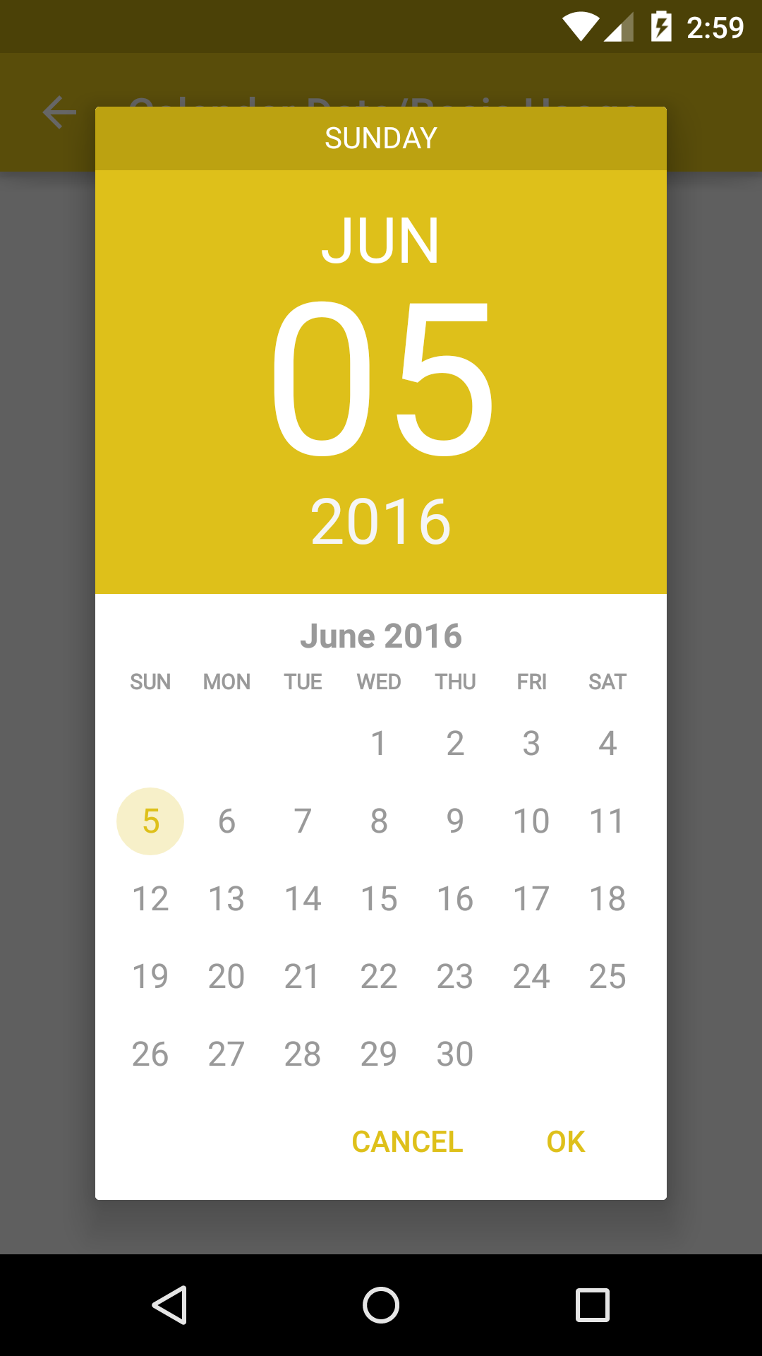
Calendar Date Picker
button.setOnClickListener(new View.OnClickListener() {
    @Override
    public void onClick(View v) {
        CalendarDatePickerDialogFragment cdp = new CalendarDatePickerDialogFragment()
                .setOnDateSetListener(SampleCalendarDateBasicUsage.this)
                .setFirstDayOfWeek(Calendar.SUNDAY)
                .setPreselectedDate(towDaysAgo.getYear(), towDaysAgo.getMonthOfYear() - 1, towDaysAgo.getDayOfMonth())
                .setDateRange(minDate, null)
                .setDoneText("Yay")
                .setCancelText("Nop")
                .setThemeDark(true);
        cdp.show(getSupportFragmentManager(), FRAG_TAG_DATE_PICKER);
    }
});
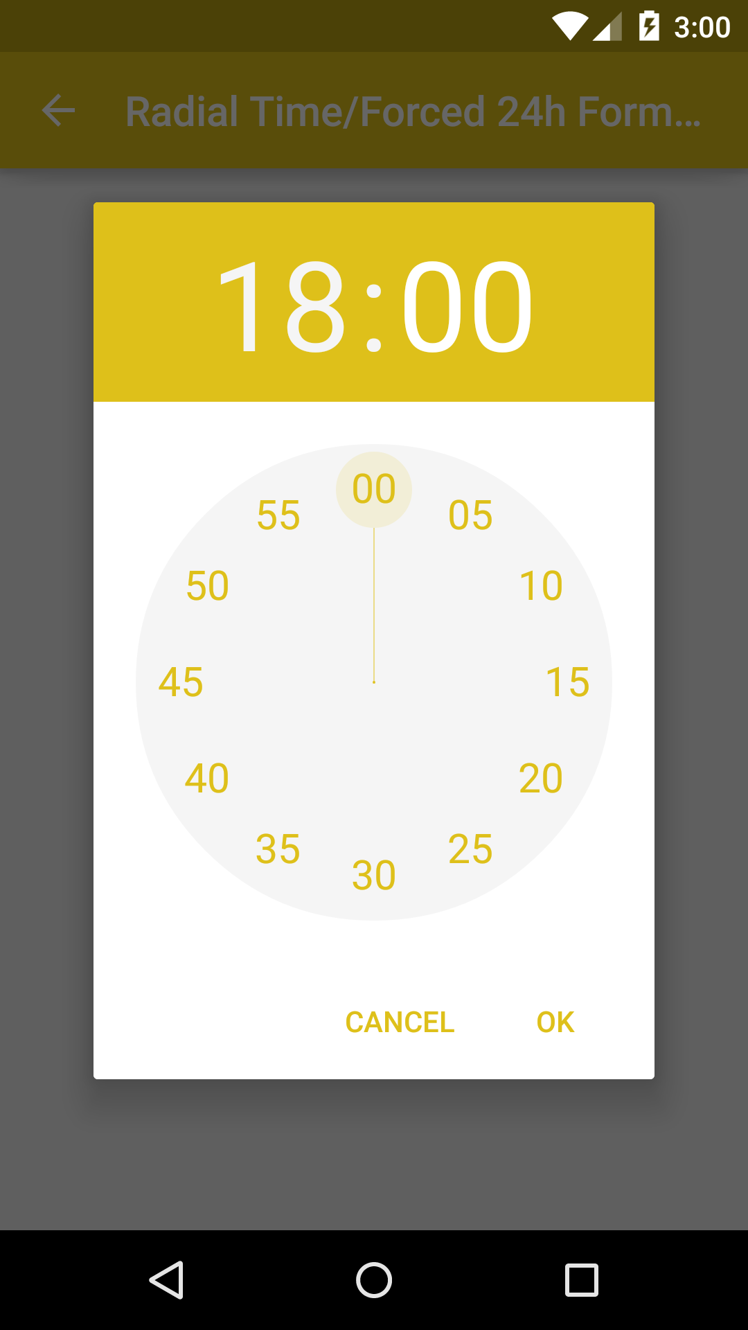
Radial Time Picker
button.setOnClickListener(new View.OnClickListener() {
    @Override
    public void onClick(View v) {
        RadialTimePickerDialogFragment rtpd = new RadialTimePickerDialogFragment()
                .setOnTimeSetListener(SampleRadialTimeBasicUsage.this)
                .setStartTime(10, 10)
                .setDoneText("Yay")
                .setCancelText("Nop")
                .setThemeDark(true);
        rtpd.show(getSupportFragmentManager(), FRAG_TAG_TIME_PICKER);
    }
});
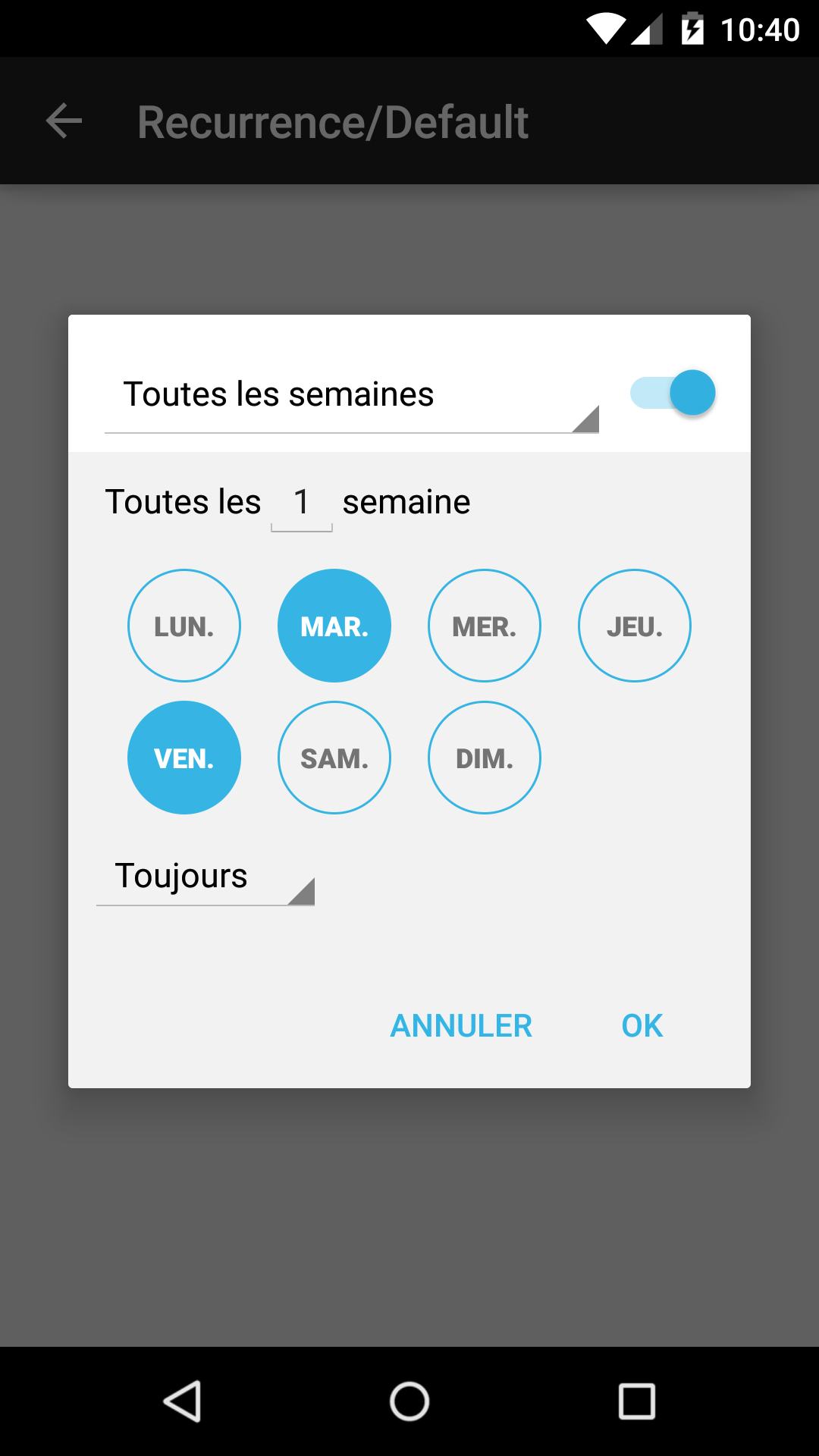
Recurrence Picker
button.setOnClickListener(new View.OnClickListener() {
    @Override
    public void onClick(View v) {
        FragmentManager fm = getSupportFragmentManager();
        Bundle bundle = new Bundle();
        Time time = new Time();
        time.setToNow();
        bundle.putLong(RecurrencePickerDialogFragment.BUNDLE_START_TIME_MILLIS, time.toMillis(false));
        bundle.putString(RecurrencePickerDialogFragment.BUNDLE_TIME_ZONE, time.timezone);
        bundle.putString(RecurrencePickerDialogFragment.BUNDLE_RRULE, mRrule);
        bundle.putBoolean(RecurrencePickerDialogFragment.BUNDLE_HIDE_SWITCH_BUTTON, true);

        RecurrencePickerDialogFragment rpd = new RecurrencePickerDialogFragment();
        rpd.setArguments(bundle);
        rpd.setOnRecurrenceSetListener(SampleRecurrenceBasicUsage.this);
        rpd.show(fm, FRAG_TAG_RECUR_PICKER);
    }
});
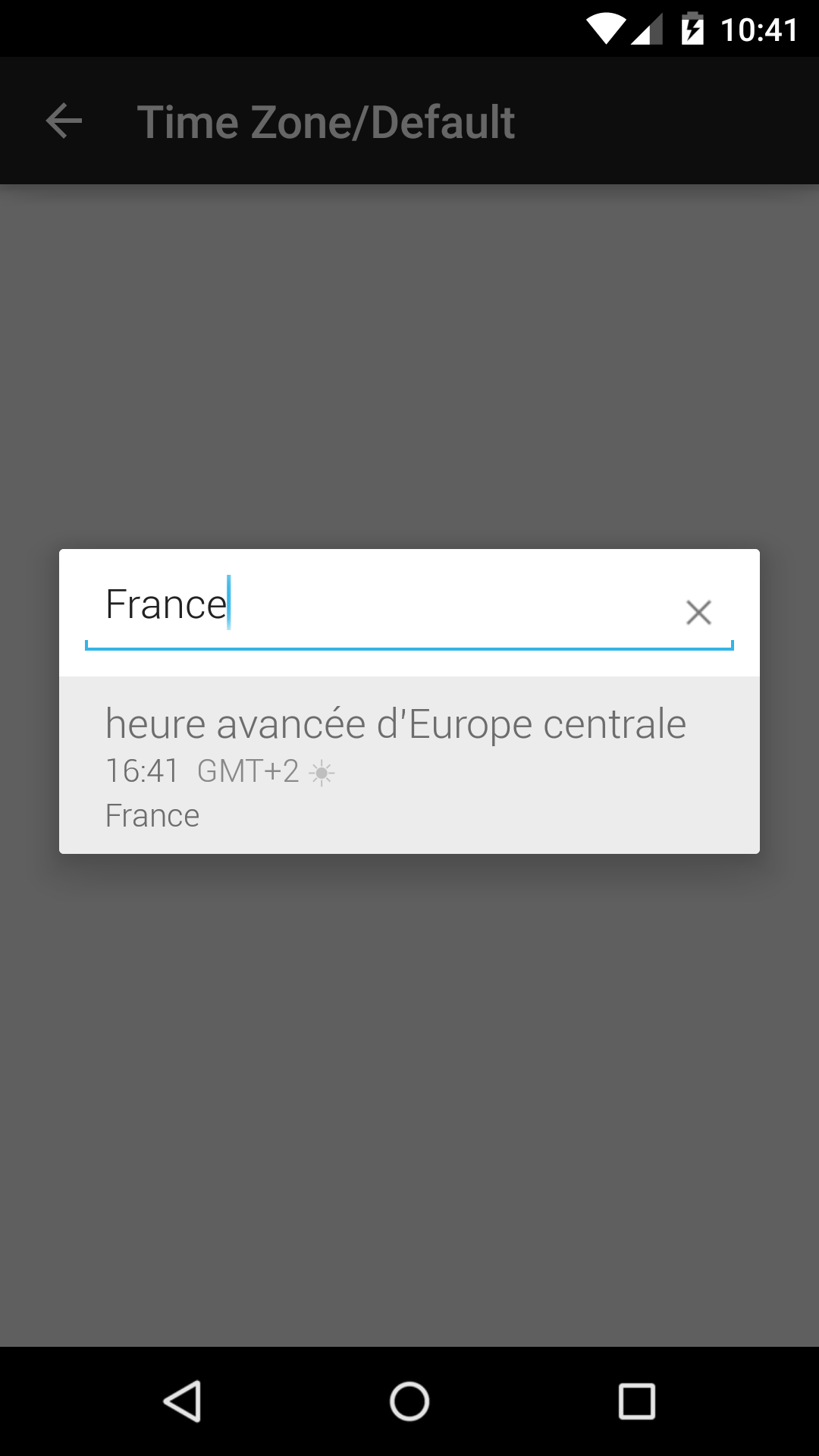
Timezone Picker
button.setOnClickListener(new View.OnClickListener() {
    @Override
    public void onClick(View v) {
        FragmentManager fm = getSupportFragmentManager();
        Bundle bundle = new Bundle();
        Time time = new Time();
        time.setToNow();
        bundle.putLong(TimeZonePickerDialogFragment.BUNDLE_START_TIME_MILLIS, time.toMillis(false));
        bundle.putString(TimeZonePickerDialogFragment.BUNDLE_TIME_ZONE, time.timezone);
        bundle.putString(RecurrencePickerDialogFragment.BUNDLE_RRULE, mRrule);

        TimeZonePickerDialogFragment tzpd = new TimeZonePickerDialogFragment();
        tzpd.setArguments(bundle);
        tzpd.setOnTimeZoneSetListener(SampleTimeZoneBasicUsage.this);
        tzpd.show(fm, FRAG_TAG_TIME_ZONE_PICKER);
    }
});
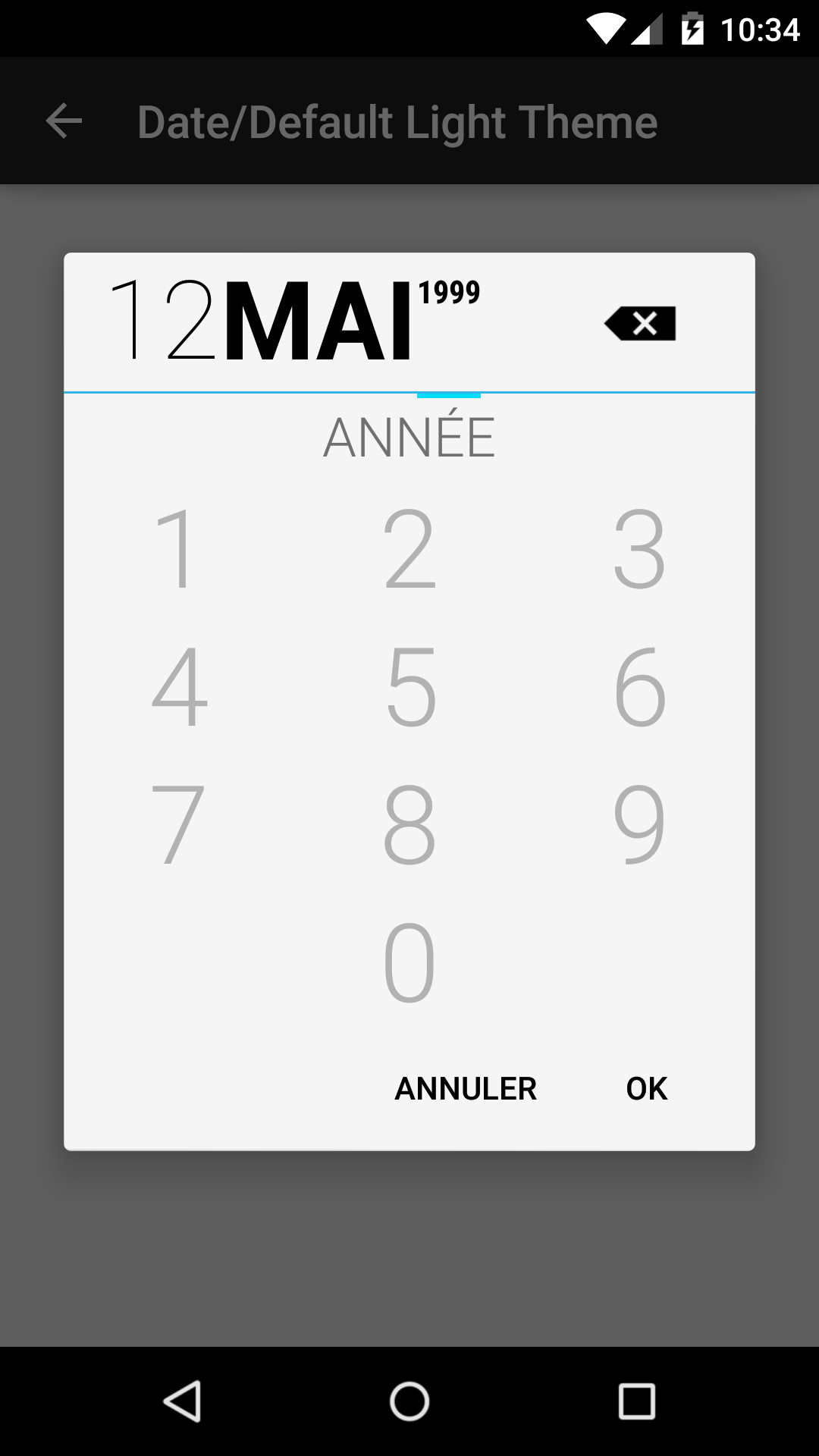
Date Picker
button.setOnClickListener(new View.OnClickListener() {
    @Override
    public void onClick(View v) {
        DatePickerBuilder dpb = new DatePickerBuilder()
                .setFragmentManager(getSupportFragmentManager())
                .setStyleResId(R.style.BetterPickersDialogFragment)
                .setYearOptional(true);
        dpb.show();
    }
});
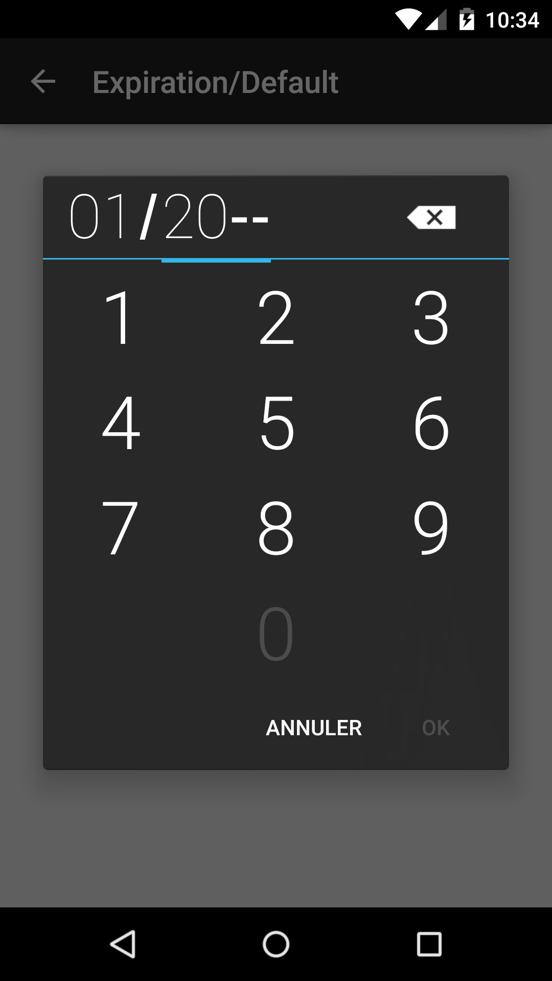
Expiration Picker
button.setOnClickListener(new View.OnClickListener() {
    @Override
    public void onClick(View v) {
        ExpirationPickerBuilder epb = new ExpirationPickerBuilder()
                  .setFragmentManager(getSupportFragmentManager())
                  .setStyleResId(R.style.BetterPickersDialogFragment)
                  .setMinYear(2000);
        epb.show();
    }
});
HMS Picker
button.setOnClickListener(new View.OnClickListener() {
    @Override
    public void onClick(View v) {
        HmsPickerBuilder hpb = new HmsPickerBuilder()
                .setFragmentManager(getSupportFragmentManager())
                .setStyleResId(R.style.BetterPickersDialogFragment);
        hpb.show();
    }
});
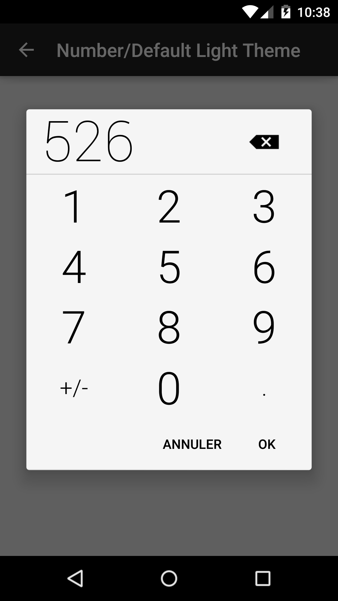
Number Picker
button.setOnClickListener(new View.OnClickListener() {
    @Override
    public void onClick(View v) {
        NumberPickerBuilder npb = new NumberPickerBuilder()
                .setFragmentManager(getSupportFragmentManager())
                .setStyleResId(R.style.BetterPickersDialogFragment)
                .setLabelText("LBS.");
        npb.show();
}
});
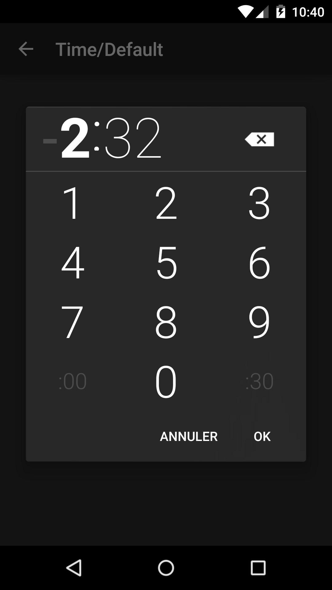
Time Picker
button.setOnClickListener(new View.OnClickListener() {
    @Override
    public void onClick(View v) {
        TimePickerBuilder tpb = new TimePickerBuilder()
                .setFragmentManager(getSupportFragmentManager())
                .setStyleResId(R.style.BetterPickersDialogFragment);
        tpb.show();
    }
});
Theming
For a demonstration of theming, see the sample/ folder.
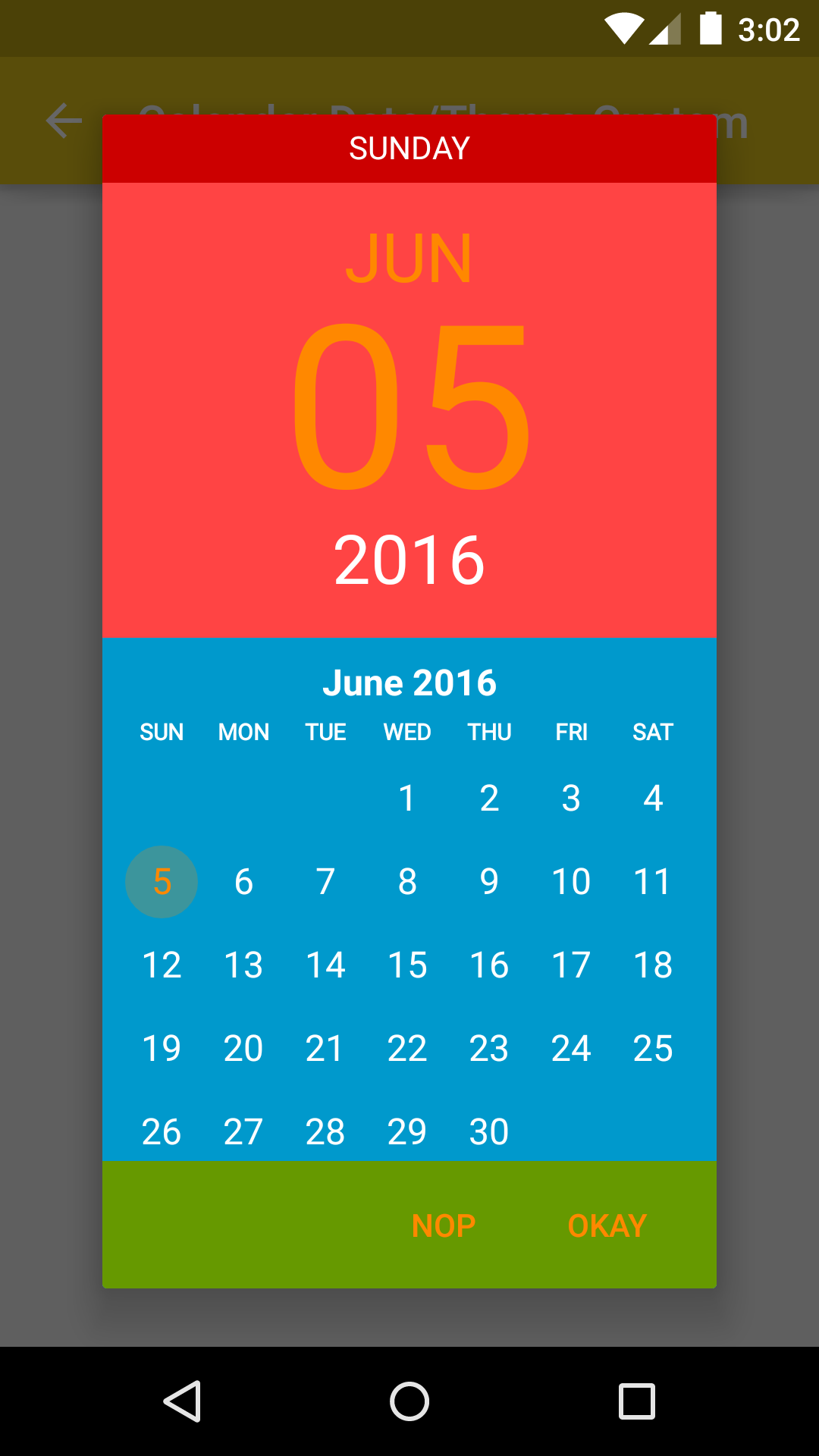
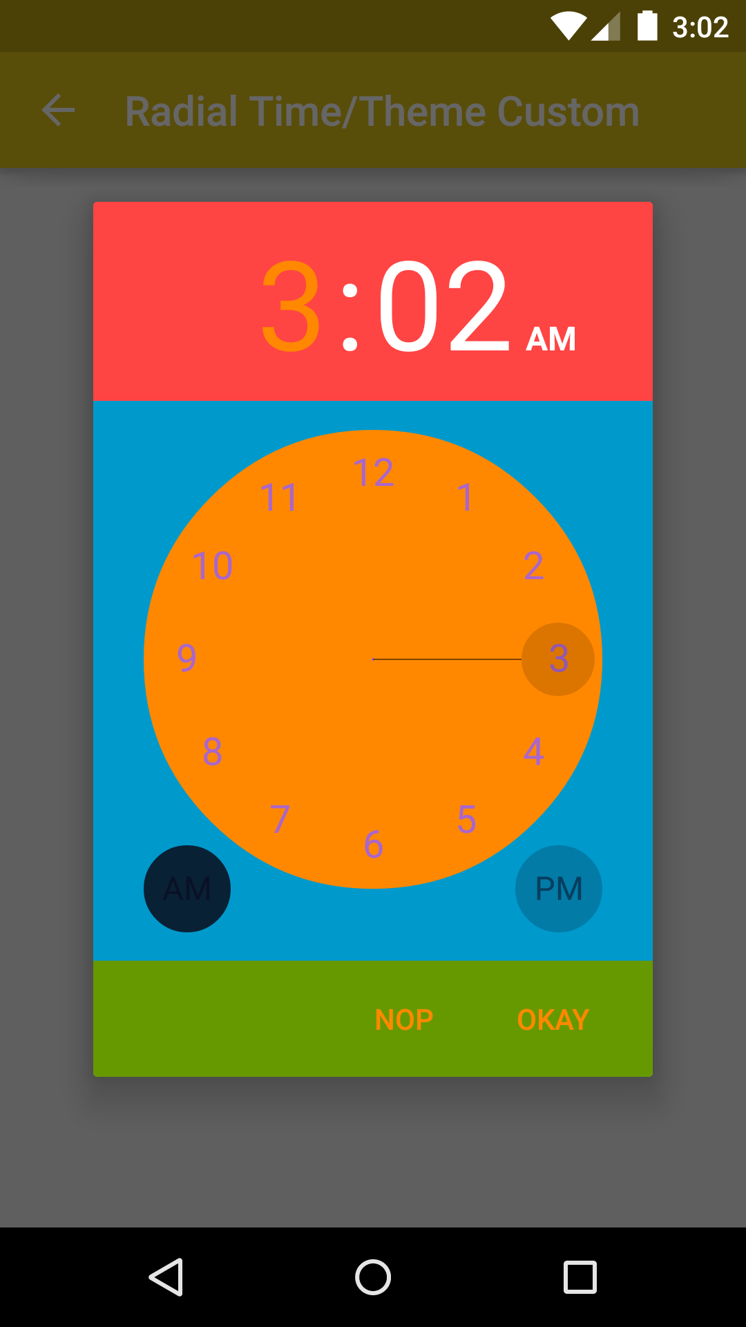
Calendar Date Picker / Radial Time Picker
-
Use attributes that allow you to customize pickers
bpHeaderBackgroundColor :: bpHeaderUnselectedTextColor :: bpHeaderSelectedTextColor :: bpBodyBackgroundColor :: bpBodySelectedTextColor :: bpBodyUnselectedTextColor :: bpButtonsBackgroundColor :: bpButtonsTextColor :: -- Calendar Date Picker bpPreHeaderBackgroundColor :: bpDisabledDayTextColor :: -- Radial Time Picker bpRadialBackgroundColor :: bpRadialTextColor :: bpRadialPointerColor :: bpAmPmCircleColor ::
-
Create your own custom theme in
styles.xml:
```xml
<style name="MyCustomBetterPickersDialogs" parent="BetterPickersRadialTimePickerDialog.PrimaryColor">
    <item name="bpPreHeaderBackgroundColor">@color/holo_red_dark</item>
    <item name="bpHeaderBackgroundColor">@color/holo_red_light</item>
    <item name="bpHeaderSelectedTextColor">@color/holo_orange_dark</item>
    <item name="bpHeaderUnselectedTextColor">@android:color/white</item>

    <item name="bpBodyBackgroundColor">@color/holo_blue_dark</item>
    <item name="bpBodySelectedTextColor">@color/holo_orange_dark</item>
    <item name="bpBodyUnselectedTextColor">@android:color/white</item>

    <item name="bpRadialBackgroundColor">@color/holo_orange_dark</item>
    <item name="bpRadialTextColor">@color/holo_purple</item>
    <item name="bpRadialPointerColor">@android:color/black</item>

    <item name="bpButtonsBackgroundColor">@color/holo_green_dark</item>
    <item name="bpButtonsTextColor">@color/holo_orange_dark</item>
</style>
```
3. Instantiate your DialogFragment using your custom theme:
RadialTimePickerDialogFragment rtpd = new RadialTimePickerDialogFragment()
       .setOnTimeSetListener(SampleRadialTimeThemeCustom.this)
       .setThemeCustom(R.style.MyCustomBetterPickersDialogs);
rtpd.show(getSupportFragmentManager(), FRAG_TAG_TIME_PICKER);
- Result
Date Picker / Expiration Picker / HMS Picker / Number Picker / Time Picker
-
You can use your own themes if you'd like to change certain attributes. BetterPickers currently allows for customization of the following attributes:
bpDialogBackground :: the drawable (preferably a 9-patch) used as a window background for the DialogFragment bpTextColor :: the color (optionally state list) for all text in the DialogFragment bpDeleteIcon :: the drawable (optionally state list) for the delete button bpCheckIcon :: the drawable (optionally state list) for the check button in the DateDialogPicker bpKeyBackground :: the drawable (optionally state list) for the keyboard buttons bpButtonBackground :: the drawable (optionally state list) for the Set, Cancel, and Delete buttons bpDividerColor :: the color used for the DialogFragment dividers bpKeyboardIndicatorColor :: the color used for the ViewPagerIndicator on the DateDialogPicker
-
Create your own custom theme in
styles.xml:
<style name="MyCustomBetterPickerTheme">
    <item name="bpDialogBackground">@drawable/custom_dialog_background</item>
    <item name="bpTextColor">@color/custom_text_color</item>
    <item name="bpDeleteIcon">@drawable/ic_backspace_custom</item>
    <item name="bpCheckIcon">@drawable/ic_check_custom</item>
    <item name="bpKeyBackground">@drawable/key_background_custom</item>
    <item name="bpButtonBackground">@drawable/button_background_custom</item>
    <item name="bpDividerColor">@color/custom_divider_color</item>
    <item name="bpKeyboardIndicatorColor">@color/custom_keyboard_indicator_color</item>
</style>
- Instantiate your
DialogFragmentusing your custom theme:
DatePickerBuilder dpb = new DatePickerBuilder()
    .setFragmentManager(getSupportFragmentManager())
    .setStyleResId(R.style.MyCustomBetterPickerTheme);
dpb.show();
Actionbarsherlock compatibility
If you use actionbarsherlock which is not compatible with appcompat-v7 you can use the latest version of the library on the 1.x.x branch.
You can view the readme here
ChangeLog
Change log file is available here
Contribution
Pull requests are welcome!
Feel free to contribute to BetterPickers.
If you've fixed a bug or have a feature you've added, just create a pull request.
If you've found a bug, want a new feature, or have other questions, file an issue. We will try to answer as soon as possible.
Applications using BetterPickers
Please send a pull request if you would like to be added here.
| Icon | Application |
|---|---|
 | Trello |
 | Navig'Tours |
 | Sleep Well |
 | Dayon Alarm |
 | Driving Timer |
 | TVShow Time |
Credits
Thanks to Derek Brameyer for the initial version.
Thanks to JakeWharton for his work on ViewPagerIndicator.
Thanks to OAK and WillowTree Apps for Maven assistance and possible future improvements.
Thanks to all contributors !
License
Copyright 2013 Derek Brameyer, Code-Troopers

Licensed under the Apache License, Version 2.0 (the "License");
you may not use this file except in compliance with the License.
You may obtain a copy of the License at

   http://www.apache.org/licenses/LICENSE-2.0

Unless required by applicable law or agreed to in writing, software
distributed under the License is distributed on an "AS IS" BASIS,
WITHOUT WARRANTIES OR CONDITIONS OF ANY KIND, either express or implied.
See the License for the specific language governing permissions and
limitations under the License.
Top Related Projects
Pick a date or time on Android in style
😍 A beautiful, fluid, and extensible dialogs API for Kotlin & Android.
An adaptation of the JSR-310 backport for Android.
Useful and powerful date picker for android
You can now select a date and a time with only one widget !
A highly customizable calendar view and compose library for Android and Kotlin Multiplatform.
Convert designs to code with AI
Introducing Visual Copilot: A new AI model to turn Figma designs to high quality code using your components.
Try Visual Copilot