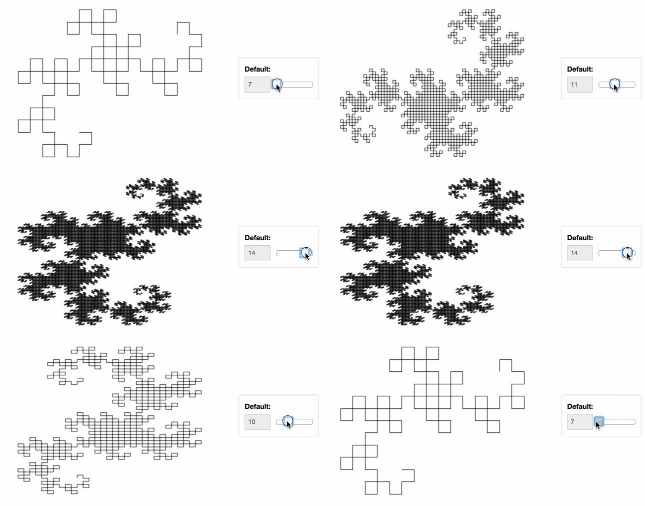
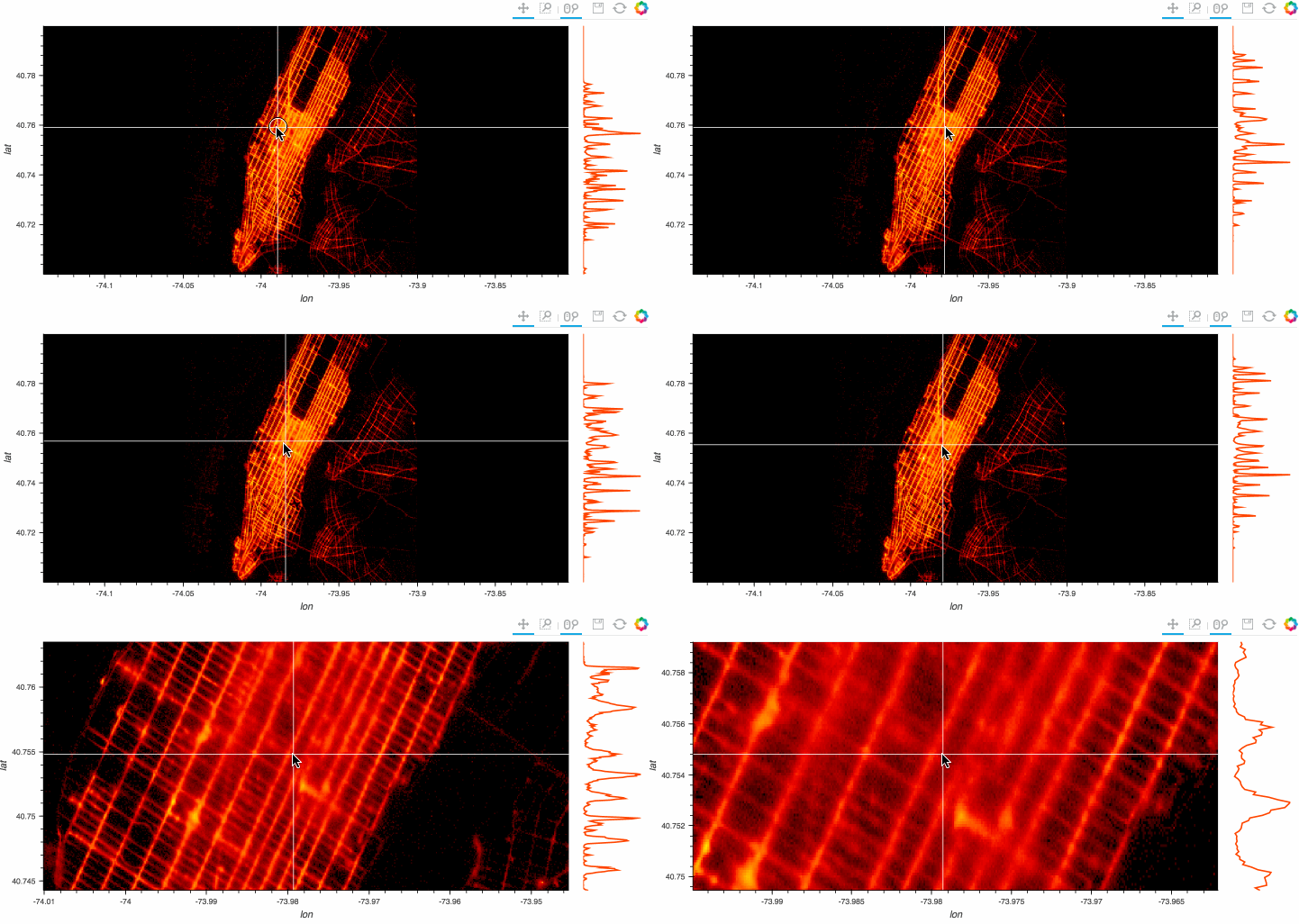
Top Related Projects
Interactive Data Visualization in the browser, from Python
The interactive graphing library for Python :sparkles:
Statistical data visualization in Python
Declarative visualization library for Python
matplotlib: plotting with Python
Quick Overview
HoloViews is a Python library for building complex visualizations easily. It provides a declarative approach to plotting, allowing users to focus on their data rather than the intricacies of plotting libraries. HoloViews works seamlessly with popular data analysis and visualization tools like Pandas, Matplotlib, and Bokeh.
Pros
- Simplifies the creation of complex, interactive visualizations
- Integrates well with other data science libraries in the Python ecosystem
- Supports a wide range of plot types and data formats
- Enables easy customization and extension of plots
Cons
- Steeper learning curve compared to some simpler plotting libraries
- Documentation can be overwhelming for beginners
- Performance may be slower for very large datasets
- Some advanced customizations may require diving into underlying libraries
Code Examples
- Creating a simple scatter plot:
import holoviews as hv
import numpy as np

hv.extension('bokeh')

x = np.random.rand(100)
y = np.random.rand(100)
scatter = hv.Scatter((x, y))
scatter
- Creating a dynamic map with a slider:
import holoviews as hv
import numpy as np

hv.extension('bokeh')

def sine_curve(phase):
    xs = np.linspace(0, np.pi*2, 100)
    return hv.Curve((xs, np.sin(xs+phase)))

dmap = hv.DynamicMap(sine_curve, kdims=['phase']).redim.range(phase=(-np.pi, np.pi))
dmap
- Creating a layout with multiple plots:
import holoviews as hv
import numpy as np

hv.extension('bokeh')

curve = hv.Curve(np.random.rand(100))
scatter = hv.Scatter(np.random.rand(100, 2))
image = hv.Image(np.random.rand(10, 10))

layout = curve + scatter + image
layout
Getting Started
To get started with HoloViews, follow these steps:
-
Install HoloViews and its dependencies:
pip install holoviews pandas numpy -
Import HoloViews and set up the extension:
import holoviews as hv hv.extension('bokeh') -
Create a simple plot:
import numpy as np
curve = hv.Curve(np.random.rand(100))
curve
This will display an interactive plot in your Jupyter notebook or can be saved as an HTML file.
Competitor Comparisons
Interactive Data Visualization in the browser, from Python
Pros of Bokeh
- Lower-level API offering more fine-grained control over plot elements
- Extensive built-in widget library for interactive visualizations
- Native support for server-side rendering and streaming data
Cons of Bokeh
- Steeper learning curve for beginners
- Requires more code to create complex visualizations
- Less seamless integration with other plotting libraries
Code Comparison
HoloViews:
import holoviews as hv
import numpy as np

xs = np.linspace(0, 10, 100)
curve = hv.Curve((xs, np.sin(xs)))
hv.render(curve)
Bokeh:
from bokeh.plotting import figure, show
import numpy as np

x = np.linspace(0, 10, 100)
y = np.sin(x)
p = figure()
p.line(x, y)
show(p)
Key Differences
HoloViews provides a higher-level, more declarative API for creating visualizations, while Bokeh offers a lower-level approach with more direct control over plot elements. HoloViews excels at quickly creating complex visualizations with less code, whereas Bokeh shines in scenarios requiring detailed customization and interactive features.
HoloViews builds on top of Bokeh (and other backends), offering a more user-friendly interface for common plotting tasks. However, for advanced use cases or specific customizations, Bokeh's lower-level API may be more suitable.
The interactive graphing library for Python :sparkles:
Pros of Plotly
- More extensive and diverse chart types, including 3D plots and statistical charts
- Better support for interactive and animated visualizations
- Larger community and more comprehensive documentation
Cons of Plotly
- Steeper learning curve, especially for complex visualizations
- Slower rendering for large datasets compared to HoloViews
Code Comparison
HoloViews:
import holoviews as hv
import numpy as np

xs = np.linspace(0, 10, 100)
curve = hv.Curve((xs, np.sin(xs)))
hv.render(curve)
Plotly:
import plotly.graph_objects as go
import numpy as np

xs = np.linspace(0, 10, 100)
fig = go.Figure(data=go.Scatter(x=xs, y=np.sin(xs)))
fig.show()
Both libraries offer powerful data visualization capabilities, but they cater to different use cases. HoloViews excels in simplicity and integration with other PyData libraries, while Plotly provides more advanced interactive features and a wider range of chart types. The choice between them depends on the specific requirements of your project and your familiarity with each library's syntax and ecosystem.
Statistical data visualization in Python
Pros of Seaborn
- Simpler API for common statistical visualizations
- Built-in themes and color palettes for aesthetically pleasing plots
- Tighter integration with pandas DataFrames
Cons of Seaborn
- Less flexibility for complex, interactive visualizations
- Limited support for large datasets and streaming data
- Fewer options for customizing plot layouts
Code Comparison
Seaborn:
import seaborn as sns
import pandas as pd

df = pd.DataFrame({'x': [1, 2, 3], 'y': [4, 5, 6]})
sns.scatterplot(data=df, x='x', y='y')
HoloViews:
import holoviews as hv
import pandas as pd

df = pd.DataFrame({'x': [1, 2, 3], 'y': [4, 5, 6]})
hv.Points(df, kdims=['x'], vdims=['y'])
Summary
Seaborn excels in creating statistical visualizations with minimal code, offering built-in themes and easy integration with pandas. It's ideal for quick data exploration and presentation-ready plots. HoloViews, on the other hand, provides more flexibility for complex, interactive visualizations and better handles large datasets. While Seaborn has a simpler API for common plots, HoloViews offers more customization options and supports a wider range of data sources and plot types.
Declarative visualization library for Python
Pros of Altair
- Declarative API based on Vega-Lite, allowing for concise and expressive chart creation
- Strong integration with Pandas DataFrames, making data manipulation seamless
- Extensive documentation and examples, facilitating easier learning and adoption
Cons of Altair
- Limited support for interactive features compared to HoloViews
- Less flexibility for custom layouts and complex visualizations
- Steeper learning curve for users unfamiliar with the Grammar of Graphics concept
Code Comparison
HoloViews:
import holoviews as hv
import pandas as pd

df = pd.DataFrame({'x': range(10), 'y': range(10)})
curve = hv.Curve(df, 'x', 'y')
hv.render(curve)
Altair:
import altair as alt
import pandas as pd

df = pd.DataFrame({'x': range(10), 'y': range(10)})
chart = alt.Chart(df).mark_line().encode(x='x', y='y')
chart.serve()
Both libraries offer concise ways to create visualizations, but Altair's declarative approach may be more intuitive for some users. HoloViews provides more flexibility for complex layouts and interactions, while Altair excels in its integration with Pandas and its declarative syntax based on the Grammar of Graphics.
matplotlib: plotting with Python
Pros of Matplotlib
- Extensive documentation and large community support
- Fine-grained control over plot elements
- Wide range of plot types and customization options
Cons of Matplotlib
- Steeper learning curve for beginners
- More verbose code for complex visualizations
- Less intuitive for interactive and dynamic plotting
Code Comparison
Matplotlib:
import matplotlib.pyplot as plt
import numpy as np

x = np.linspace(0, 10, 100)
y = np.sin(x)
plt.plot(x, y)
plt.show()
HoloViews:
import holoviews as hv
import numpy as np

x = np.linspace(0, 10, 100)
y = np.sin(x)
curve = hv.Curve((x, y))
hv.render(curve)
Key Differences
- HoloViews focuses on declarative, high-level plotting
- Matplotlib offers more low-level control
- HoloViews integrates better with data pipelines and interactive environments
- Matplotlib has a longer history and broader adoption in scientific computing
Both libraries have their strengths, and the choice depends on the specific use case and user preferences.
Convert  designs to code with AI
Introducing Visual Copilot: A new AI model to turn Figma designs to high quality code using your components.
Try Visual CopilotREADME
 HoloViews
Stop plotting your data - annotate your data and let it visualize itself.
| Downloads |  |
| Build Status | |
| Coverage | |
| Latest dev release |   |
| Latest release |      |
| Python |  |
| Docs |  |
| Binder |  |
| Support |  |
HoloViews is an open-source Python library designed to make data analysis and visualization seamless and simple. With HoloViews, you can usually express what you want to do in very few lines of code, letting you focus on what you are trying to explore and convey, not on the process of plotting.
Check out the HoloViews web site for extensive examples and documentation.
Installation
HoloViews works with Python on Linux, Windows, or Mac, and works seamlessly with Jupyter Notebook and JupyterLab.
You can install HoloViews either with conda or pip, for more information see the install guide.
conda install holoviews

pip install holoviews
Developer Guide
If you want to help develop HoloViews, you can checkout the developer guide, this guide will help you get set-up. Making it easy to contribute.
Support & Feedback
If you find any bugs or have any feature suggestions please file a GitHub issue.
If you have any usage questions, please ask them on HoloViz Discourse,
For general discussion, we have a Discord channel.
Top Related Projects
Interactive Data Visualization in the browser, from Python
The interactive graphing library for Python :sparkles:
Statistical data visualization in Python
Declarative visualization library for Python
matplotlib: plotting with Python
Convert  designs to code with AI

Introducing Visual Copilot: A new AI model to turn Figma designs to high quality code using your components.
Try Visual Copilot