
Top Related Projects

The interactive graphing library for Python :sparkles:

Interactive Data Visualization in the browser, from Python

Statistical data visualization in Python

matplotlib: plotting with Python

With Holoviews, your data visualizes itself.
Quick Overview
Altair is a declarative statistical visualization library for Python, based on Vega and Vega-Lite. It provides a powerful and flexible API for creating a wide range of statistical charts and plots with a concise, intuitive syntax. Altair leverages the strengths of Pandas DataFrames and JSON-based grammar of graphics to create beautiful, interactive visualizations.
Pros
- Intuitive and concise API for creating complex visualizations
- Built on top of Vega and Vega-Lite, providing a robust foundation
- Excellent integration with Pandas DataFrames
- Supports interactive and layered visualizations
Cons
- Performance can be slower for large datasets compared to some other libraries
- Limited support for 3D visualizations
- Steeper learning curve for users unfamiliar with the grammar of graphics concept
Code Examples
- Creating a simple scatter plot:
import altair as alt
import pandas as pd

data = pd.DataFrame({
    'x': [1, 2, 3, 4, 5],
    'y': [2, 5, 3, 8, 6]
})

chart = alt.Chart(data).mark_circle().encode(
    x='x',
    y='y'
)

chart.show()
- Creating a bar chart with color encoding:
import altair as alt
from vega_datasets import data

source = data.cars()

chart = alt.Chart(source).mark_bar().encode(
    x='Horsepower:Q',
    y='count()',
    color='Origin:N'
)

chart.show()
- Creating an interactive multi-line chart:
import altair as alt
from vega_datasets import data

source = data.stocks()

chart = alt.Chart(source).mark_line().encode(
    x='date:T',
    y='price:Q',
    color='symbol:N'
).interactive()

chart.show()
Getting Started
To get started with Altair, follow these steps:
- Install Altair and its dependencies:
pip install altair vega_datasets
- Import the library and create a simple chart:
import altair as alt
from vega_datasets import data

source = data.cars()
chart = alt.Chart(source).mark_point().encode(
    x='Horsepower',
    y='Miles_per_Gallon',
    color='Origin'
)

chart.save('my_chart.html')
This will create an interactive scatter plot and save it as an HTML file. You can then open the file in your web browser to view the visualization.
Competitor Comparisons
The interactive graphing library for Python :sparkles:
Pros of Plotly
- More interactive and customizable visualizations out-of-the-box
- Supports a wider range of chart types and 3D plotting
- Better suited for creating dashboards and web applications
Cons of Plotly
- Steeper learning curve due to more complex API
- Larger file sizes and slower rendering for complex plots
- Less integration with statistical and machine learning libraries
Code Comparison
Altair:
import altair as alt
from vega_datasets import data

chart = alt.Chart(data.cars()).mark_point().encode(
    x='Horsepower',
    y='Miles_per_Gallon',
    color='Origin'
)
Plotly:
import plotly.express as px
from plotly.data import cars

fig = px.scatter(cars, x="horsepower", y="mpg", color="origin")
fig.show()
Both libraries offer declarative APIs for creating visualizations, but Altair's syntax is generally more concise and follows the grammar of graphics more closely. Plotly provides more direct control over plot elements and styling, which can be beneficial for complex customizations but may require more code for simple plots.
Interactive Data Visualization in the browser, from Python
Pros of Bokeh
- More flexible and customizable for complex, interactive visualizations
- Better suited for creating dashboards and web applications
- Supports streaming data and real-time updates
Cons of Bokeh
- Steeper learning curve, especially for beginners
- Larger file sizes and slower rendering for complex plots
- Less integration with pandas DataFrames compared to Altair
Code Comparison
Bokeh:
from bokeh.plotting import figure, show

p = figure(title="Simple Line Plot")
p.line([1, 2, 3, 4, 5], [6, 7, 2, 4, 5])
show(p)
Altair:
import altair as alt
import pandas as pd

data = pd.DataFrame({'x': [1, 2, 3, 4, 5], 'y': [6, 7, 2, 4, 5]})
chart = alt.Chart(data).mark_line().encode(x='x', y='y')
chart.show()
Both libraries offer powerful visualization capabilities, but Bokeh excels in creating interactive, web-based plots and applications, while Altair provides a more concise, declarative approach to creating static charts. Bokeh's flexibility comes at the cost of a steeper learning curve, while Altair's simplicity may limit advanced customization options.
Statistical data visualization in Python
Pros of Seaborn
- More mature and established library with a larger user base
- Extensive built-in statistical functions and plot types
- Seamless integration with pandas DataFrames
Cons of Seaborn
- Less flexible for creating custom, interactive visualizations
- Steeper learning curve for advanced customization
- Limited support for web-based and interactive plots
Code Comparison
Seaborn:
import seaborn as sns
import matplotlib.pyplot as plt

sns.scatterplot(x="x", y="y", data=df)
plt.show()
Altair:
import altair as alt

chart = alt.Chart(df).mark_point().encode(
    x='x',
    y='y'
)
chart.show()
Key Differences
- Seaborn is built on Matplotlib, while Altair is based on Vega and Vega-Lite
- Altair uses a declarative approach, making it easier to create complex visualizations with less code
- Seaborn focuses on statistical visualizations, while Altair is more versatile for various chart types
- Altair produces interactive, web-friendly visualizations by default, whereas Seaborn primarily generates static plots
matplotlib: plotting with Python
Pros of Matplotlib
- More mature and established library with extensive documentation
- Offers fine-grained control over plot elements
- Supports a wide range of plot types and customizations
Cons of Matplotlib
- Steeper learning curve for beginners
- Requires more code to create basic visualizations
- Less intuitive for interactive and web-based visualizations
Code Comparison
Matplotlib:
import matplotlib.pyplot as plt

x = [1, 2, 3, 4, 5]
y = [2, 4, 6, 8, 10]

plt.plot(x, y)
plt.xlabel('X-axis')
plt.ylabel('Y-axis')
plt.show()
Altair:
import altair as alt
import pandas as pd

data = pd.DataFrame({'x': [1, 2, 3, 4, 5], 'y': [2, 4, 6, 8, 10]})

alt.Chart(data).mark_line().encode(
    x='x',
    y='y'
).properties(
    title='Simple Line Chart'
)
Matplotlib offers more control but requires more code, while Altair provides a more concise and declarative approach to creating visualizations. Altair is better suited for interactive and web-based plots, whereas Matplotlib excels in creating publication-quality static figures with precise customization.
With Holoviews, your data visualizes itself.
Pros of HoloViews
- More flexible and powerful for complex, multi-dimensional data
- Supports a wider range of plot types and customizations
- Better integration with other HoloViz tools for data analysis
Cons of HoloViews
- Steeper learning curve due to more complex API
- Less focus on declarative grammar of graphics
- Potentially slower rendering for large datasets
Code Comparison
HoloViews:
import holoviews as hv
import pandas as pd

df = pd.read_csv('data.csv')
scatter = hv.Scatter(df, 'x', 'y')
hv.render(scatter)
Altair:
import altair as alt
import pandas as pd

df = pd.read_csv('data.csv')
chart = alt.Chart(df).mark_point().encode(x='x', y='y')
chart.show()
Both libraries offer powerful data visualization capabilities, but HoloViews provides more flexibility for complex data structures and integrates well with other HoloViz tools. Altair, on the other hand, offers a more streamlined, declarative approach to creating charts, which can be easier for beginners to grasp. The choice between the two depends on the specific requirements of your project and your familiarity with different visualization paradigms.
Convert  designs to code with AI

Introducing Visual Copilot: A new AI model to turn Figma designs to high quality code using your components.
Try Visual CopilotREADME
Vega-Altair 
![]()
![]()


Vega-Altair is a declarative statistical visualization library for Python. With Vega-Altair, you can spend more time understanding your data and its meaning. Vega-Altair's API is simple, friendly and consistent and built on top of the powerful Vega-Lite JSON specification. This elegant simplicity produces beautiful and effective visualizations with a minimal amount of code.
Vega-Altair was originally developed by Jake Vanderplas and Brian Granger in close collaboration with the UW Interactive Data Lab. The Vega-Altair open source project is not affiliated with Altair Engineering, Inc.
Documentation
See Vega-Altair's Documentation Site as well as the Tutorial Notebooks. You can run the notebooks directly in your browser by clicking on one of the following badges:
![]()
![]()
Example
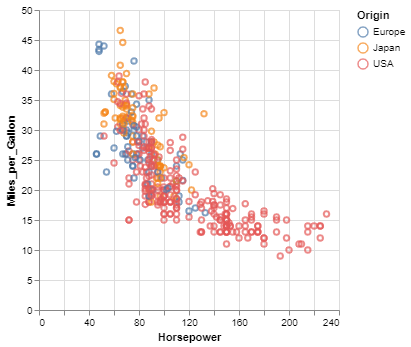
Here is an example using Vega-Altair to quickly visualize and display a dataset with the native Vega-Lite renderer in the JupyterLab:
import altair as alt

# load a simple dataset as a pandas DataFrame
from vega_datasets import data
cars = data.cars()

alt.Chart(cars).mark_point().encode(
    x='Horsepower',
    y='Miles_per_Gallon',
    color='Origin',
)
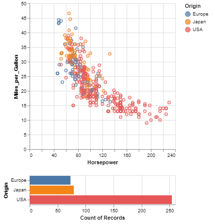
One of the unique features of Vega-Altair, inherited from Vega-Lite, is a declarative grammar of not just visualization, but interaction. With a few modifications to the example above we can create a linked histogram that is filtered based on a selection of the scatter plot.
import altair as alt
from vega_datasets import data

source = data.cars()

brush = alt.selection_interval()

points = alt.Chart(source).mark_point().encode(
    x='Horsepower',
    y='Miles_per_Gallon',
    color=alt.when(brush).then("Origin").otherwise(alt.value("lightgray"))
).add_params(
    brush
)

bars = alt.Chart(source).mark_bar().encode(
    y='Origin',
    color='Origin',
    x='count(Origin)'
).transform_filter(
    brush
)

points & bars
Features
- Carefully-designed, declarative Python API.
- Auto-generated internal Python API that guarantees visualizations are type-checked and in full conformance with the Vega-Lite specification.
- Display visualizations in JupyterLab, Jupyter Notebook, Visual Studio Code, on GitHub and nbviewer, and many more.
- Export visualizations to various formats such as PNG/SVG images, stand-alone HTML pages and the Online Vega-Lite Editor.
- Serialize visualizations as JSON files.
Installation
Vega-Altair can be installed with:
pip install altair
If you are using the conda package manager, the equivalent is:
conda install altair -c conda-forge
For full installation instructions, please see the documentation.
Getting Help
If you have a question that is not addressed in the documentation,
you can post it on StackOverflow using the altair tag.
For bugs and feature requests, please open a Github Issue.
Development
For information on how to contribute your developments back to the Vega-Altair repository, see
CONTRIBUTING.md
Citing Vega-Altair
If you use Vega-Altair in academic work, please consider citing https://joss.theoj.org/papers/10.21105/joss.01057 as
@article{VanderPlas2018,
    doi = {10.21105/joss.01057},
    url = {https://doi.org/10.21105/joss.01057},
    year = {2018},
    publisher = {The Open Journal},
    volume = {3},
    number = {32},
    pages = {1057},
    author = {Jacob VanderPlas and Brian Granger and Jeffrey Heer and Dominik Moritz and Kanit Wongsuphasawat and Arvind Satyanarayan and Eitan Lees and Ilia Timofeev and Ben Welsh and Scott Sievert},
    title = {Altair: Interactive Statistical Visualizations for Python},
    journal = {Journal of Open Source Software}
}
Please additionally consider citing the Vega-Lite project, which Vega-Altair is based on: https://dl.acm.org/doi/10.1109/TVCG.2016.2599030
@article{Satyanarayan2017,
    author={Satyanarayan, Arvind and Moritz, Dominik and Wongsuphasawat, Kanit and Heer, Jeffrey},
    title={Vega-Lite: A Grammar of Interactive Graphics},
    journal={IEEE transactions on visualization and computer graphics},
    year={2017},
    volume={23},
    number={1},
    pages={341-350},
    publisher={IEEE}
}
Top Related Projects
The interactive graphing library for Python :sparkles:
Interactive Data Visualization in the browser, from Python
Statistical data visualization in Python
matplotlib: plotting with Python
With Holoviews, your data visualizes itself.
Convert designs to code with AI
Introducing Visual Copilot: A new AI model to turn Figma designs to high quality code using your components.
Try Visual Copilot