 plotly.py
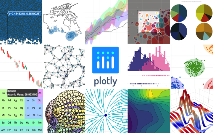
The interactive graphing library for Python :sparkles: This project now includes Plotly Express!
Top Related Projects

Interactive Data Visualization in the browser, from Python

Statistical data visualization in Python

matplotlib: plotting with Python

Declarative statistical visualization library for Python

With Holoviews, your data visualizes itself.
Quick Overview
Plotly's Python graphing library (plotly.py) is an open-source, interactive data visualization tool for Python. It allows users to create a wide variety of charts and graphs, from basic line plots to complex 3D visualizations, with a focus on interactivity and web-based output.
Pros
- Highly interactive and customizable plots
- Supports a wide range of chart types and visualizations
- Produces web-ready, shareable outputs
- Integrates well with other data science libraries like Pandas and NumPy
Cons
- Steeper learning curve compared to some other plotting libraries
- Can be slower for rendering large datasets compared to static plotting libraries
- Requires an internet connection for some features (e.g., loading JavaScript libraries)
- Documentation can be overwhelming due to the library's extensive capabilities
Code Examples
- Creating a basic line plot:
import plotly.graph_objects as go

fig = go.Figure(data=go.Scatter(x=[1, 2, 3, 4], y=[10, 11, 12, 13]))
fig.show()
- Making a bar chart with Pandas integration:
import plotly.express as px
import pandas as pd

df = pd.DataFrame({'Category': ['A', 'B', 'C'], 'Values': [3, 2, 1]})
fig = px.bar(df, x='Category', y='Values')
fig.show()
- Creating an interactive 3D surface plot:
import plotly.graph_objects as go
import numpy as np

x = np.outer(np.linspace(-2, 2, 30), np.ones(30))
y = x.copy().T
z = np.cos(x ** 2 + y ** 2)

fig = go.Figure(data=[go.Surface(z=z, x=x, y=y)])
fig.update_layout(title='3D Surface Plot', autosize=False,
                  width=500, height=500,
                  margin=dict(l=65, r=50, b=65, t=90))
fig.show()
Getting Started
To get started with plotly.py, follow these steps:
-
Install the library:
pip install plotly -
Import the library in your Python script:
import plotly.graph_objects as go # or import plotly.express as px -
Create a simple plot:
import plotly.express as px

df = px.data.gapminder().query("year == 2007")
fig = px.scatter(df, x="gdpPercap", y="lifeExp", color="continent",
                 size="pop", hover_name="country", log_x=True, size_max=60)
fig.show()
This will create an interactive scatter plot of life expectancy vs. GDP per capita, with continents represented by colors and population by bubble size.
Competitor Comparisons
Interactive Data Visualization in the browser, from Python
Pros of Bokeh
- More lightweight and faster rendering for large datasets
- Better integration with Python data science ecosystem (NumPy, Pandas)
- Easier to create custom interactive visualizations
Cons of Bokeh
- Steeper learning curve for beginners
- Less extensive gallery of pre-built chart types
- More limited support for 3D plotting
Code Comparison
Bokeh:
from bokeh.plotting import figure, show

p = figure(title="Simple Line Plot")
p.line([1, 2, 3, 4, 5], [6, 7, 2, 4, 5])
show(p)
Plotly:
import plotly.graph_objects as go

fig = go.Figure(data=go.Scatter(x=[1, 2, 3, 4, 5], y=[6, 7, 2, 4, 5]))
fig.show()
Both libraries offer powerful data visualization capabilities, but they cater to slightly different use cases. Bokeh excels in creating custom, interactive visualizations for web applications, while Plotly provides a wider range of pre-built chart types and is generally easier for beginners to use. The choice between the two often depends on the specific project requirements and the developer's familiarity with each library.
Statistical data visualization in Python
Pros of Seaborn
- Simpler API and easier to use for statistical visualizations
- Tightly integrated with pandas and numpy for seamless data handling
- Aesthetically pleasing default styles and color palettes
Cons of Seaborn
- Limited interactivity compared to Plotly's dynamic charts
- Fewer chart types and customization options
- Slower rendering for large datasets
Code Comparison
Seaborn:
import seaborn as sns
import matplotlib.pyplot as plt

sns.scatterplot(x="sepal_length", y="sepal_width", data=iris)
plt.show()
Plotly:
import plotly.express as px

fig = px.scatter(iris, x="sepal_length", y="sepal_width")
fig.show()
Both libraries offer concise ways to create scatter plots, but Plotly's output is interactive by default, while Seaborn requires additional steps for interactivity. Seaborn's integration with matplotlib allows for further customization, while Plotly's Express API provides a quick way to create interactive plots with minimal code.
matplotlib: plotting with Python
Pros of Matplotlib
- More mature and established library with extensive documentation
- Better suited for publication-quality static plots
- Highly customizable with fine-grained control over plot elements
Cons of Matplotlib
- Steeper learning curve for beginners
- Less interactive and dynamic plotting capabilities out-of-the-box
- Slower rendering for large datasets compared to Plotly
Code Comparison
Matplotlib:
import matplotlib.pyplot as plt

plt.plot([1, 2, 3, 4], [1, 4, 2, 3])
plt.title("Simple Line Plot")
plt.xlabel("X-axis")
plt.ylabel("Y-axis")
plt.show()
Plotly:
import plotly.graph_objects as go

fig = go.Figure(data=go.Scatter(x=[1, 2, 3, 4], y=[1, 4, 2, 3]))
fig.update_layout(title="Simple Line Plot", xaxis_title="X-axis", yaxis_title="Y-axis")
fig.show()
Both libraries offer powerful plotting capabilities, but Matplotlib excels in static, publication-ready plots with extensive customization options. Plotly, on the other hand, provides more interactive and web-friendly visualizations out-of-the-box. The choice between the two depends on the specific requirements of your project and the desired level of interactivity in your plots.
Declarative statistical visualization library for Python
Pros of Altair
- Declarative approach, making it easier to create complex visualizations with less code
- Tight integration with Pandas DataFrames, simplifying data manipulation
- Based on Vega and Vega-Lite, allowing for easy conversion to web-based visualizations
Cons of Altair
- More limited set of chart types compared to Plotly
- Less interactive features out-of-the-box
- Steeper learning curve for users not familiar with the grammar of graphics concept
Code Comparison
Altair:
import altair as alt
import pandas as pd

data = pd.DataFrame({'x': [1, 2, 3], 'y': [4, 5, 6]})
chart = alt.Chart(data).mark_line().encode(x='x', y='y')
Plotly:
import plotly.graph_objects as go
import pandas as pd

data = pd.DataFrame({'x': [1, 2, 3], 'y': [4, 5, 6]})
fig = go.Figure(data=go.Scatter(x=data['x'], y=data['y'], mode='lines'))
Both libraries offer powerful data visualization capabilities, but Altair's declarative approach can lead to more concise code for complex visualizations, while Plotly provides a wider range of chart types and more built-in interactivity.
With Holoviews, your data visualizes itself.
Pros of HoloViews
- More flexible and composable API for creating complex visualizations
- Better integration with other PyViz tools like Bokeh and Panel
- Supports a wider range of data formats and structures
Cons of HoloViews
- Steeper learning curve for beginners
- Smaller community and fewer resources compared to Plotly
- Less extensive documentation and examples
Code Comparison
HoloViews:
import holoviews as hv
import numpy as np

xs = np.linspace(0, 10, 100)
curve = hv.Curve((xs, np.sin(xs)))
hv.render(curve)
Plotly:
import plotly.graph_objects as go
import numpy as np

xs = np.linspace(0, 10, 100)
fig = go.Figure(data=go.Scatter(x=xs, y=np.sin(xs)))
fig.show()
Both libraries offer powerful visualization capabilities, but HoloViews provides a more declarative approach to creating plots, while Plotly offers a more imperative style. HoloViews excels in composability and integration with other PyViz tools, whereas Plotly has a larger community and more extensive documentation.
Convert  designs to code with AI

Introducing Visual Copilot: A new AI model to turn Figma designs to high quality code using your components.
Try Visual CopilotREADME
plotly.py
| Latest Release |
|
| User forum |
|
| PyPI Downloads |
|
| License |
|

Quickstart
pip install plotly==5.24.0
Inside Jupyter (installable with pip install "jupyterlab>=3" "ipywidgets>=7.6"):
import plotly.express as px
fig = px.bar(x=["a", "b", "c"], y=[1, 3, 2])
fig.show()
See the Python documentation for more examples.
Overview
plotly.py is an interactive, open-source, and browser-based graphing library for Python :sparkles:
Built on top of plotly.js, plotly.py is a high-level, declarative charting library. plotly.js ships with over 30 chart types, including scientific charts, 3D graphs, statistical charts, SVG maps, financial charts, and more.
plotly.py is MIT Licensed. Plotly graphs can be viewed in Jupyter notebooks, standalone HTML files, or integrated into Dash applications.
Contact us for consulting, dashboard development, application integration, and feature additions.
- Online Documentation
- Contributing to plotly
- Changelog
- Code of Conduct
- Version 4 Migration Guide
- New! Announcing Dash 1.0
- Community forum
Installation
plotly.py may be installed using pip...
pip install plotly==5.24.0
or conda.
conda install -c plotly plotly=5.24.0
JupyterLab Support
For use in JupyterLab, install the jupyterlab and ipywidgets
packages using pip:
pip install "jupyterlab>=3" "ipywidgets>=7.6"
or conda:
conda install "jupyterlab>=3" "ipywidgets>=7.6"
The instructions above apply to JupyterLab 3.x. For JupyterLab 2 or earlier, run the following commands to install the required JupyterLab extensions (note that this will require node to be installed):
# JupyterLab 2.x renderer support
jupyter labextension install jupyterlab-plotly@5.24.0 @jupyter-widgets/jupyterlab-manager
Please check out our Troubleshooting guide if you run into any problems with JupyterLab.
Jupyter Notebook Support
For use in the Jupyter Notebook, install the notebook and ipywidgets
packages using pip:
pip install "notebook>=5.3" "ipywidgets>=7.5"
or conda:
conda install "notebook>=5.3" "ipywidgets>=7.5"
Static Image Export
plotly.py supports static image export,
using either the kaleido
package (recommended, supported as of plotly version 4.9) or the orca
command line utility (legacy as of plotly version 4.9).
Kaleido
The kaleido package has no dependencies and can be installed
using pip...
pip install -U kaleido
or conda.
conda install -c conda-forge python-kaleido
Orca
While Kaleido is now the recommended image export approach because it is easier to install
and more widely compatible, static image export
can also be supported
by the legacy orca command line utility and the
psutil Python package.
These dependencies can both be installed using conda:
conda install -c plotly plotly-orca==1.3.1 psutil
Or, psutil can be installed using pip...
pip install psutil
and orca can be installed according to the instructions in the orca README.
Extended Geo Support
Some plotly.py features rely on fairly large geographic shape files. The county
choropleth figure factory is one such example. These shape files are distributed as a
separate plotly-geo package. This package can be installed using pip...
pip install plotly-geo==1.0.0
or conda
conda install -c plotly plotly-geo=1.0.0
Migration
If you're migrating from plotly.py v3 to v4, please check out the Version 4 migration guide
If you're migrating from plotly.py v2 to v3, please check out the Version 3 migration guide
Copyright and Licenses
Code and documentation copyright 2019 Plotly, Inc.
Code released under the MIT license.
Docs released under the Creative Commons license.
Top Related Projects
Interactive Data Visualization in the browser, from Python
Statistical data visualization in Python
matplotlib: plotting with Python
Declarative statistical visualization library for Python
With Holoviews, your data visualizes itself.
Convert designs to code with AI
Introducing Visual Copilot: A new AI model to turn Figma designs to high quality code using your components.
Try Visual Copilot