 hvplot
A high-level plotting API for pandas, dask, xarray, and networkx built on HoloViews
Top Related Projects
Interactive Data Visualization in the browser, from Python
The interactive graphing library for Python :sparkles:
Statistical data visualization in Python
matplotlib: plotting with Python
Declarative visualization library for Python
Quick Overview
HvPlot is a high-level plotting API built on HoloViews that provides a familiar and concise interface for creating interactive plots from various data sources. It seamlessly integrates with pandas, xarray, and other data structures, allowing users to create complex visualizations with minimal code.
Pros
- Easy-to-use API that is similar to pandas plotting interface
- Supports a wide range of plot types and data sources
- Generates interactive plots by default
- Integrates well with Jupyter notebooks and dashboards
Cons
- Learning curve for advanced customization
- Documentation can be overwhelming for beginners
- Performance may be slower compared to lower-level plotting libraries
- Limited control over fine-grained details of plots
Code Examples
Creating a simple line plot:
import hvplot.pandas
import pandas as pd

df = pd.DataFrame({'x': range(10), 'y': range(10)})
df.hvplot.line(x='x', y='y', title='Simple Line Plot')
Creating a scatter plot with hover information:
import hvplot.pandas
import pandas as pd
import numpy as np

df = pd.DataFrame({
    'x': np.random.rand(100),
    'y': np.random.rand(100),
    'category': np.random.choice(['A', 'B', 'C'], 100)
})
df.hvplot.scatter(x='x', y='y', by='category', hover_cols=['x', 'y', 'category'])
Creating a heatmap from a 2D numpy array:
import hvplot.numpy
import numpy as np

data = np.random.rand(20, 20)
hvplot.heatmap(data, cmap='viridis', title='2D Heatmap')
Getting Started
To get started with HvPlot, first install it using pip:
pip install hvplot
Then, import it in your Python script or Jupyter notebook:
import hvplot.pandas  # For pandas integration
import hvplot.xarray  # For xarray integration
import hvplot.numpy   # For numpy integration

# Create a simple plot
import pandas as pd
df = pd.DataFrame({'x': range(10), 'y': range(10)})
plot = df.hvplot(x='x', y='y')
plot
This will create a basic interactive line plot. Explore the documentation for more advanced usage and customization options.
Competitor Comparisons
Interactive Data Visualization in the browser, from Python
Pros of Bokeh
- More flexible and customizable for complex interactive visualizations
- Supports server-side rendering for large datasets
- Extensive documentation and community support
Cons of Bokeh
- Steeper learning curve for beginners
- Requires more code for basic plots
- Less integration with pandas DataFrames
Code Comparison
HvPlot:
import hvplot.pandas
df.hvplot.scatter('x', 'y')
Bokeh:
from bokeh.plotting import figure, show
p = figure()
p.scatter(df['x'], df['y'])
show(p)
Key Differences
- HvPlot provides a high-level API for quick and easy plotting, especially with pandas DataFrames
- Bokeh offers more low-level control and customization options
- HvPlot builds on top of Bokeh, providing a simpler interface for common use cases
- Bokeh is better suited for complex, interactive dashboards and applications
- HvPlot integrates well with the HoloViews ecosystem for declarative data visualization
Both libraries have their strengths and are suitable for different use cases. HvPlot is ideal for rapid data exploration and simple interactive plots, while Bokeh excels in creating sophisticated, customized visualizations and dashboards.
The interactive graphing library for Python :sparkles:
Pros of plotly.py
- More extensive and customizable charting options
- Supports both static and interactive visualizations
- Large community and extensive documentation
Cons of plotly.py
- Steeper learning curve for beginners
- Can be slower for large datasets compared to hvplot
- Requires more code for basic plots
Code Comparison
hvplot:
import hvplot.pandas
df.hvplot.scatter(x='column1', y='column2')
plotly.py:
import plotly.express as px
fig = px.scatter(df, x='column1', y='column2')
fig.show()
Key Differences
- hvplot provides a more concise API for quick plotting
- plotly.py offers more fine-grained control over plot elements
- hvplot integrates well with HoloViews ecosystem
- plotly.py has broader language support (JavaScript, R, etc.)
Use Cases
- hvplot: Rapid data exploration and simple interactive plots
- plotly.py: Complex, highly customized visualizations and dashboards
Both libraries are powerful tools for data visualization, with hvplot focusing on simplicity and integration with the HoloViews ecosystem, while plotly.py offers more extensive customization options and broader language support.
Statistical data visualization in Python
Pros of Seaborn
- More established and widely used in the data science community
- Extensive statistical plotting capabilities built on top of Matplotlib
- Excellent documentation and tutorials available
Cons of Seaborn
- Less interactive and dynamic compared to HvPlot
- Limited support for real-time data streaming and updates
- Steeper learning curve for complex visualizations
Code Comparison
Seaborn:
import seaborn as sns
import matplotlib.pyplot as plt

sns.scatterplot(x='x', y='y', data=df)
plt.show()
HvPlot:
import hvplot.pandas

df.hvplot.scatter(x='x', y='y')
Key Differences
- HvPlot offers more interactive and customizable plots out of the box
- Seaborn focuses on statistical visualizations, while HvPlot is more general-purpose
- HvPlot integrates well with other HoloViz tools for complex data exploration
- Seaborn has a larger community and more extensive documentation
Both libraries have their strengths, and the choice between them depends on specific project requirements, interactivity needs, and personal preferences.
matplotlib: plotting with Python
Pros of matplotlib
- Extensive documentation and large community support
- Fine-grained control over plot elements
- Wide range of plot types and customization options
Cons of matplotlib
- Steeper learning curve for beginners
- More verbose code for simple plots
- Less interactive features out-of-the-box
Code Comparison
matplotlib:
import matplotlib.pyplot as plt
import numpy as np

x = np.linspace(0, 10, 100)
plt.plot(x, np.sin(x))
plt.show()
hvplot:
import hvplot.pandas
import pandas as pd
import numpy as np

df = pd.DataFrame({'x': np.linspace(0, 10, 100), 'y': np.sin(np.linspace(0, 10, 100))})
df.hvplot.line(x='x', y='y')
Key Differences
- hvplot provides a higher-level API, making it easier to create interactive plots quickly
- matplotlib offers more low-level control, allowing for highly customized visualizations
- hvplot integrates well with data structures like pandas DataFrames, while matplotlib requires more manual data handling
- matplotlib is more suitable for static, publication-quality figures, while hvplot excels in interactive, exploratory data analysis
Declarative visualization library for Python
Pros of Altair
- More flexible and expressive grammar of graphics
- Better support for interactive visualizations
- Stronger integration with Jupyter notebooks
Cons of Altair
- Steeper learning curve for beginners
- Less seamless integration with pandas DataFrames
- More verbose code for simple plots
Code Comparison
Altair:
import altair as alt
import pandas as pd

df = pd.DataFrame({'x': [1, 2, 3], 'y': [4, 5, 6]})
chart = alt.Chart(df).mark_line().encode(x='x', y='y')
hvplot:
import hvplot.pandas

df = pd.DataFrame({'x': [1, 2, 3], 'y': [4, 5, 6]})
plot = df.hvplot.line(x='x', y='y')
Summary
Altair offers more flexibility and interactivity but requires more code and has a steeper learning curve. hvplot provides a simpler API, especially for pandas users, but may be less expressive for complex visualizations. Choose Altair for advanced, interactive plots, and hvplot for quick, straightforward visualizations directly from pandas DataFrames.
Convert  designs to code with AI

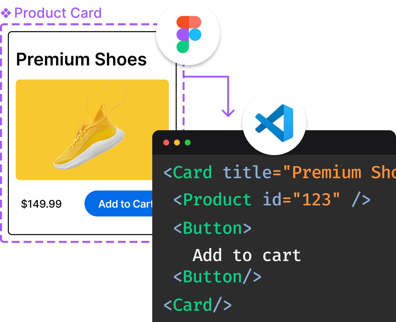
Introducing Visual Copilot: A new AI model to turn Figma designs to high quality code using your components.
Try Visual CopilotREADME
hvPlot makes data analysis and visualization simple
| Downloads |  |
| Build Status | |
| Coverage | |
| Latest dev release |   |
| Latest release |      |
| Python |  |
| Docs |   |
| Binder |  |
| Support |  |
Home | Installation instructions | Getting Started Guide | Gallery | Reference | Examples | License | Support
hvPlot provides a familiar, high-level API for visualization
The API is based on the familiar Pandas .plot API and the innovative .interactive API.

hvPlot works with the tools you know and love
hvPlot
- supports a wide range of data sources including Pandas, Polars, XArray, Dask, Streamz, Intake, GeoPandas and NetworkX.
- supports the plotting backends Bokeh, Matplotlib and Plotly.
- exposes the powerful tools from the HoloViz ecosystem in a familiar and convenient API.
hvPlot is the simplest way to benefit from the HoloViz ecosystem for data exploration.
hvPlot can be used for exploration, reporting and data apps
Check out this blog post to see how easy it is to create an interactive dashboard with hvPlot and Panel.
Mini getting-started
Head over to the getting started guide for more!
Install
hvPlot can be installed on Linux, Windows, or Mac with conda:
conda install hvplot
or with pip:
pip install hvplot
Plotting data
Work with your data source:
import numpy as np
import pandas as pd

idx = pd.date_range('1/1/2000', periods=1000)
df  = pd.DataFrame(np.random.randn(1000, 4), index=idx, columns=list('ABCD')).cumsum()
Import the hvPlot extension for your data source and optionally set the plotting backend:
import hvplot.pandas
# Optional: hvplot.extension('matplotlib') or hvplot.extension('plotly')
Use the .hvplot API as you would use the Pandas or Xarray .plot API:
df.hvplot()
Interactive data apps
Just add .interactive and replace your normal arguments with Panel widgets or Ipywidgets.
import panel as pn
pn.extension()

df.interactive(width=600).head(n=pn.widgets.IntSlider(start=1, end=5, value=3))
How to find documentation from your notebook or editor
To see the available arguments for a specific kind of plot run
hvplot.help(kind='scatter')
In a notebook or ipython environment the usual
helpand?will provide you with documentation.TABandSHIFT+TABcompletion will help you navigate.
License
hvPlot is completely free and open-source. It is licensed under the BSD 3-Clause License.
Support & Feedback
- Usage questions and showcases -> HoloViz Community
- Bug reports and feature requests -> Github
- Developer discussions -> Discord
For more detail check out the HoloViz Community Guide.
Contributions
We would love to work with you no matter whether you want to contribute to issue management, PRs, documentation, blog posts, community support or social media communication.
To get started with the code or docs check out the Developer Guide.
Top Related Projects
Interactive Data Visualization in the browser, from Python
The interactive graphing library for Python :sparkles:
Statistical data visualization in Python
matplotlib: plotting with Python
Declarative visualization library for Python
Convert  designs to code with AI

Introducing Visual Copilot: A new AI model to turn Figma designs to high quality code using your components.
Try Visual Copilot


