
Top Related Projects

This Library helps users to use Bottom Navigation Bar (A new pattern from google) with ease and allows ton of customizations

Navigation tab bar with colorful interactions.

:octocat: RAMAnimatedTabBarController is a Swift UI module library for adding animation to iOS tabbar items and icons. iOS library made by @Ramotion

A library to reproduce the behavior of the Bottom Navigation guidelines from Material Design.
Quick Overview
The iammert/ReadableBottomBar is a customizable and readable bottom navigation bar for Android applications. It provides a visually appealing and user-friendly way to navigate between different sections of an app.
Pros
- Customizable Appearance: The library allows for extensive customization of the bottom bar's appearance, including the ability to change colors, icons, and text styles.
- Readable Labels: The bottom bar labels are designed to be easily readable, even on small screens, improving the overall user experience.
- Smooth Animations: The library includes smooth animations when switching between different tabs, creating a polished and responsive interface.
- Lightweight and Efficient: The library is lightweight and efficient, with a small footprint and minimal impact on app performance.
Cons
- Limited Platform Support: The library is designed specifically for Android and may not be suitable for cross-platform development.
- Dependency on External Libraries: The library relies on several external dependencies, which may increase the overall complexity of the project.
- Potential Learning Curve: Developers who are new to the library may need to spend some time familiarizing themselves with its API and customization options.
- Lack of Comprehensive Documentation: While the library has some documentation, it may not be as extensive or detailed as some developers would prefer.
Code Examples
Here are a few examples of how to use the ReadableBottomBar library in your Android project:
- Basic Setup:
val readableBottomBar = ReadableBottomBar(context)
readableBottomBar.addItem(BottomBarItem("Home", R.drawable.ic_home))
readableBottomBar.addItem(BottomBarItem("Search", R.drawable.ic_search))
readableBottomBar.addItem(BottomBarItem("Profile", R.drawable.ic_profile))
- Customizing the Appearance:
readableBottomBar.setSelectedItemColor(Color.BLUE)
readableBottomBar.setUnselectedItemColor(Color.GRAY)
readableBottomBar.setTextSize(16f)
readableBottomBar.setIconSize(24f)
- Handling Tab Selection:
readableBottomBar.setOnItemSelectedListener { index ->
    // Handle tab selection
}
- Integrating with a ViewPager:
val viewPager = findViewById<ViewPager2>(R.id.viewPager)
readableBottomBar.setupWithViewPager(viewPager)
Getting Started
To use the ReadableBottomBar library in your Android project, follow these steps:
- Add the library to your project's
build.gradlefile:
dependencies {
    implementation 'com.github.iammert:ReadableBottomBar:1.0.2'
}
- In your layout XML file, add the
ReadableBottomBarview:
<com.iammert.library.ui.readablebottombar.ReadableBottomBar
    android:id="@+id/readableBottomBar"
    android:layout_width="match_parent"
    android:layout_height="wrap_content"
    app:rbb_backgroundColor="@color/white"
    app:rbb_iconSize="24dp"
    app:rbb_selectedItemColor="@color/blue"
    app:rbb_textSize="14sp"
    app:rbb_unselectedItemColor="@color/gray" />
- In your activity or fragment, set up the
ReadableBottomBar:
val readableBottomBar = findViewById<ReadableBottomBar>(R.id.readableBottomBar)
readableBottomBar.addItem(BottomBarItem("Home", R.drawable.ic_home))
readableBottomBar.addItem(BottomBarItem("Search", R.drawable.ic_search))
readableBottomBar.addItem(BottomBarItem("Profile", R.drawable.ic_profile))

readableBottomBar.setOnItemSelectedListener { index ->
    // Handle tab selection
}
Competitor Comparisons
This Library helps users to use Bottom Navigation Bar (A new pattern from google) with ease and allows ton of customizations
Pros of BottomNavigation
- Provides a simple and lightweight implementation of a bottom navigation bar.
- Supports both fixed and shifting modes, allowing for customization.
- Includes support for badges and notification indicators.
Cons of BottomNavigation
- Lacks some of the advanced features and customization options available in ReadableBottomBar.
- May not be as visually appealing or polished as some other bottom navigation libraries.
- Limited documentation and community support compared to more popular libraries.
Code Comparison
ReadableBottomBar:
bottomBar.addItem(BottomBarItem(
    "Home",
    R.drawable.ic_home,
    R.color.colorPrimary,
    R.color.colorAccent
))
BottomNavigation:
BottomNavigationView bottomNavigationView = findViewById(R.id.bottom_navigation);
bottomNavigationView.setOnNavigationItemSelectedListener(this);
Navigation tab bar with colorful interactions.
Pros of NavigationTabBar
- Provides a visually appealing and customizable tab bar interface with various animation effects.
- Supports both icon and text-based tabs, allowing for a more flexible design.
- Includes a range of built-in animation styles, such as scaling, translation, and rotation.
Cons of NavigationTabBar
- May have a steeper learning curve compared to ReadableBottomBar, as it offers more advanced customization options.
- The library is larger in size, which could impact the overall app size and performance.
- Requires more boilerplate code to set up and configure the tab bar.
Code Comparison
ReadableBottomBar:
val readableBottomBar = ReadableBottomBar(
    context,
    items = listOf(
        ReadableBottomBarItem(
            title = "Home",
            drawable = R.drawable.ic_home
        ),
        ReadableBottomBarItem(
            title = "Search",
            drawable = R.drawable.ic_search
        )
    )
)
NavigationTabBar:
val navigationTabBar = NavigationTabBar(
    context,
    items = arrayListOf(
        NavigationTabBarItem(
            icon = ContextCompat.getDrawable(context, R.drawable.ic_home),
            title = "Home"
        ),
        NavigationTabBarItem(
            icon = ContextCompat.getDrawable(context, R.drawable.ic_search),
            title = "Search"
        )
    )
)
:octocat: RAMAnimatedTabBarController is a Swift UI module library for adding animation to iOS tabbar items and icons. iOS library made by @Ramotion
Pros of Animated Tab Bar
- Provides a variety of pre-built animation styles for the tab bar, allowing for more visually appealing and dynamic user interfaces.
- Includes support for both iOS and Android platforms, making it a cross-platform solution.
- Offers customization options for the tab bar, such as changing the color, size, and position of the icons.
Cons of Animated Tab Bar
- May have a larger file size and dependency footprint compared to a more lightweight solution like Readable Bottom Bar.
- The animation styles may not fit the design aesthetic of all applications, requiring more customization.
- Requires additional setup and configuration compared to a simpler tab bar implementation.
Code Comparison
Readable Bottom Bar (iammert/ReadableBottomBar):
val readableBottomBar = ReadableBottomBar(context)
readableBottomBar.addItem(BottomBarItem("Home", R.drawable.ic_home))
readableBottomBar.addItem(BottomBarItem("Search", R.drawable.ic_search))
readableBottomBar.addItem(BottomBarItem("Profile", R.drawable.ic_profile))
readableBottomBar.setOnItemSelectedListener { position, item -> /* handle item selection */ }
Animated Tab Bar (Ramotion/animated-tab-bar):
let tabBarController = AnimatedTabBarController()
tabBarController.viewControllers = [homeViewController, searchViewController, profileViewController]
tabBarController.tabBar.tintColor = .white
tabBarController.tabBar.barTintColor = .black
tabBarController.tabBar.items?.first?.image = UIImage(named: "home_icon")
tabBarController.tabBar.items?.last?.image = UIImage(named: "profile_icon")
A library to reproduce the behavior of the Bottom Navigation guidelines from Material Design.
Pros of AhBottomNavigation
- Supports custom icons and text for each navigation item
- Provides a smooth animation when switching between navigation items
- Allows for easy customization of the bottom navigation bar's appearance
Cons of AhBottomNavigation
- May have a larger footprint in your app due to the additional dependencies
- Requires more setup and configuration compared to ReadableBottomBar
- May not be as lightweight as some other bottom navigation solutions
Code Comparison
ReadableBottomBar:
val bottomBar = ReadableBottomBar(
    context,
    listOf(
        ReadableBottomBarItem("Home", R.drawable.ic_home),
        ReadableBottomBarItem("Search", R.drawable.ic_search),
        ReadableBottomBarItem("Profile", R.drawable.ic_profile)
    )
)
AhBottomNavigation:
val bottomNavigation = AHBottomNavigation(context)
bottomNavigation.addItem(AHBottomNavigationItem("Home", R.drawable.ic_home))
bottomNavigation.addItem(AHBottomNavigationItem("Search", R.drawable.ic_search))
bottomNavigation.addItem(AHBottomNavigationItem("Profile", R.drawable.ic_profile))
Convert  designs to code with AI

Introducing Visual Copilot: A new AI model to turn Figma designs to high quality code using your components.
Try Visual CopilotREADME
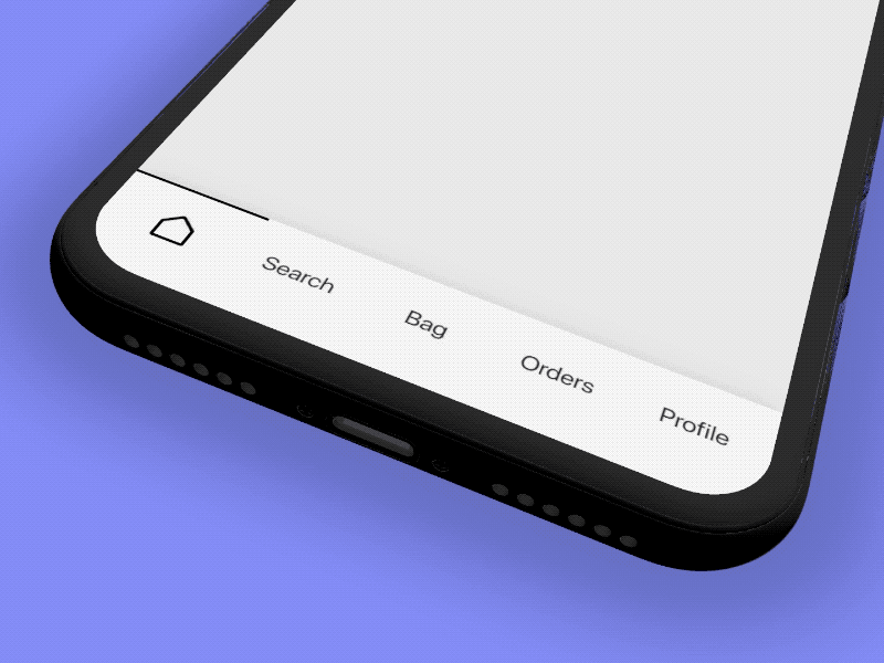
ReadableBottomBar
Yet another material bottom bar library for Android
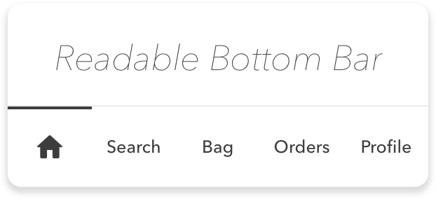
GIF
Design Credits
All design and inspiration credits goes to Ranjit.
Usage
- Create your tabs.xml under your res/xml/ folder
<?xml version="1.0" encoding="utf-8"?>
<tabs>
    <tab
        drawable="@drawable/ic_home_black_24dp"
        text="@string/home" />

    <tab
        drawable="@drawable/ic_search_black_24dp"
        text="@string/search" />

    <tab
        drawable="@drawable/ic_shopping_basket_black_24dp"
        text="@string/bag" />

    <tab
        drawable="@drawable/ic_favorite_black_24dp"
        text="@string/favorite" />

    <tab
        drawable="@drawable/ic_account_circle_black_24dp"
        text="@string/profile" />
</tabs>
- Add bottom bar to your layout
<com.iammert.library.readablebottombar.ReadableBottomBar
    android:layout_width="match_parent"
    android:layout_height="56dp"
    app:rbb_tabs="@xml/tabs"/>
- Add listener
bottomBar.setOnItemSelectListener( object :ReadableBottomBar.ItemSelectListener{
    override fun onItemSelected(index: Int) {
    }
})
- Set index at runtime
bottomBar.selectItem(index)
- Customize if you need
<com.iammert.library.readablebottombar.ReadableBottomBar
    android:layout_width="match_parent"
    android:layout_height="56dp"
    app:rbb_tabs="@xml/tabs"
    app:rbb_textColor=""
    app:rbb_indicatorHeight=""
    app:rbb_indicatorColor=""
    app:rbb_initialIndex=""
    app:rbb_backgroundColor=""
    app:rbb_textSize=""
    app:rbb_activeItemType="text or icon"/>
Setup
allprojects {
    repositories {
        ...
        maven { url 'https://jitpack.io' }
    }
}

dependencies {
    implementation 'com.github.iammert:ReadableBottomBar:0.2'
}
License
Copyright 2019 Mert ÅimÅek
Licensed under the Apache License, Version 2.0 (the "License");
you may not use this file except in compliance with the License.
You may obtain a copy of the License at
http://www.apache.org/licenses/LICENSE-2.0
Unless required by applicable law or agreed to in writing, software
distributed under the License is distributed on an "AS IS" BASIS,
WITHOUT WARRANTIES OR CONDITIONS OF ANY KIND, either express or implied.
See the License for the specific language governing permissions and
limitations under the License.
Top Related Projects
This Library helps users to use Bottom Navigation Bar (A new pattern from google) with ease and allows ton of customizations
Navigation tab bar with colorful interactions.
:octocat: RAMAnimatedTabBarController is a Swift UI module library for adding animation to iOS tabbar items and icons. iOS library made by @Ramotion
A library to reproduce the behavior of the Bottom Navigation guidelines from Material Design.
Convert designs to code with AI
Introducing Visual Copilot: A new AI model to turn Figma designs to high quality code using your components.
Try Visual Copilot