 ahbottomnavigation
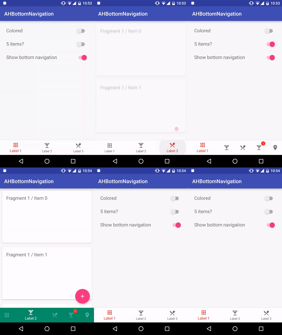
A library to reproduce the behavior of the Bottom Navigation guidelines from Material Design.
Top Related Projects
(Deprecated) A custom view component that mimics the new Material Design Bottom Navigation pattern.
An android lib for enhancing BottomNavigationView. 一个增强BottomNavigationView的安卓库。
This Library helps users to use Bottom Navigation Bar (A new pattern from google) with ease and allows ton of customizations
An bottom navigation bar for Android
Bottom Navigation widget component inspired by the Google Material Design Guidelines at https://www.google.com/design/spec/components/bottom-navigation.html
Yet another material bottom bar library for Android
Quick Overview
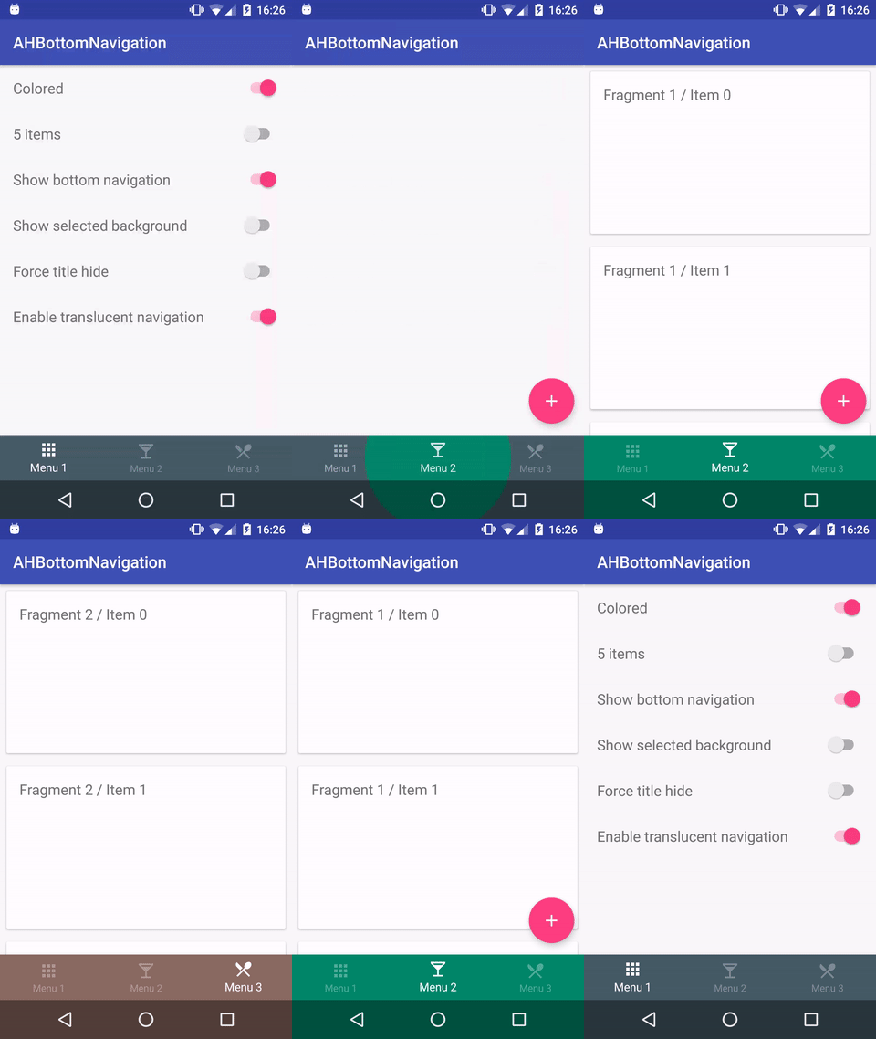
AHBottomNavigation is an Android library that implements the Bottom Navigation component from Material Design. It provides a customizable bottom navigation bar with smooth animations, badges, and various styling options. This library aims to make it easy for developers to add a bottom navigation bar to their Android applications while adhering to Material Design guidelines.
Pros
- Easy to implement and customize
- Supports badges and notifications
- Smooth animations and transitions
- Follows Material Design guidelines
Cons
- Limited to bottom navigation use cases
- May require additional setup for complex layouts
- Not frequently updated (last update was in 2019)
- Some reported issues with newer Android versions
Code Examples
- Basic setup of AHBottomNavigation:
val bottomNavigation: AHBottomNavigation = findViewById(R.id.bottom_navigation)

// Create items
val item1 = AHBottomNavigationItem("Item 1", R.drawable.ic_item1)
val item2 = AHBottomNavigationItem("Item 2", R.drawable.ic_item2)
val item3 = AHBottomNavigationItem("Item 3", R.drawable.ic_item3)

// Add items
bottomNavigation.addItems(listOf(item1, item2, item3))
- Customizing the appearance:
bottomNavigation.defaultBackgroundColor = Color.WHITE
bottomNavigation.accentColor = Color.parseColor("#F63D2B")
bottomNavigation.inactiveColor = Color.parseColor("#747474")
bottomNavigation.isBehaviorTranslationEnabled = true
bottomNavigation.titleState = AHBottomNavigation.TitleState.SHOW_WHEN_ACTIVE
- Adding a badge to an item:
bottomNavigation.setNotificationBackgroundColor(Color.parseColor("#F63D2B"))
bottomNavigation.setNotification("1", 1)
- Handling item selection:
bottomNavigation.setOnTabSelectedListener { position, wasSelected ->
    // Handle item selection
    when (position) {
        0 -> // Handle first item
        1 -> // Handle second item
        2 -> // Handle third item
    }
    true
}
Getting Started
To use AHBottomNavigation in your Android project:
- Add the JitPack repository to your project's
build.gradle:
allprojects {
    repositories {
        ...
        maven { url 'https://jitpack.io' }
    }
}
- Add the dependency to your app's
build.gradle:
dependencies {
    implementation 'com.github.aurelhubert:ahbottomnavigation:2.3.4'
}
- Sync your project, and you're ready to use AHBottomNavigation in your layouts and activities.
Competitor Comparisons
(Deprecated) A custom view component that mimics the new Material Design Bottom Navigation pattern.
Pros of BottomBar
- More customizable with additional features like shifting mode and badges
- Supports tablets and landscape mode out of the box
- Easier to implement with a simpler API
Cons of BottomBar
- Larger library size compared to ahbottomnavigation
- Less active maintenance and updates
- May have some performance issues with complex layouts
Code Comparison
BottomBar implementation:
val bottomBar = BottomBar.attach(this, savedInstanceState)
bottomBar.setItems(
    BottomBarTab(R.drawable.ic_home, "Home"),
    BottomBarTab(R.drawable.ic_search, "Search"),
    BottomBarTab(R.drawable.ic_profile, "Profile")
)
ahbottomnavigation implementation:
val bottomNavigation = findViewById<AHBottomNavigation>(R.id.bottom_navigation)
val item1 = AHBottomNavigationItem("Home", R.drawable.ic_home, R.color.color_tab_1)
val item2 = AHBottomNavigationItem("Search", R.drawable.ic_search, R.color.color_tab_2)
val item3 = AHBottomNavigationItem("Profile", R.drawable.ic_profile, R.color.color_tab_3)
bottomNavigation.addItems(listOf(item1, item2, item3))
Both libraries offer similar functionality for implementing bottom navigation in Android apps. BottomBar provides more customization options and easier implementation, while ahbottomnavigation has a smaller footprint and more active maintenance. The choice between the two depends on specific project requirements and preferences.
An android lib for enhancing BottomNavigationView. 一个增强BottomNavigationView的安卓库。
Pros of BottomNavigationViewEx
- Built on top of the official Android BottomNavigationView, providing extended functionality
- Supports more than 5 menu items
- Offers additional customization options, such as setting badge and text size
Cons of BottomNavigationViewEx
- May require more setup and configuration compared to AHBottomNavigation
- Less extensive documentation and examples
Code Comparison
AHBottomNavigation:
AHBottomNavigation bottomNavigation = findViewById(R.id.bottom_navigation);
AHBottomNavigationItem item1 = new AHBottomNavigationItem("Label", R.drawable.ic_icon, R.color.color_tab);
bottomNavigation.addItem(item1);
bottomNavigation.setOnTabSelectedListener(new AHBottomNavigation.OnTabSelectedListener() {
    // Implement listener methods
});
BottomNavigationViewEx:
BottomNavigationViewEx bottomNavigation = findViewById(R.id.bottom_navigation);
bottomNavigation.enableAnimation(false);
bottomNavigation.enableShiftingMode(false);
bottomNavigation.enableItemShiftingMode(false);
bottomNavigation.setOnNavigationItemSelectedListener(new BottomNavigationView.OnNavigationItemSelectedListener() {
    // Implement listener methods
});
Both libraries offer easy-to-use APIs for implementing bottom navigation in Android apps. AHBottomNavigation provides a more custom implementation, while BottomNavigationViewEx extends the official Android component. The choice between them depends on specific project requirements and desired customization options.
This Library helps users to use Bottom Navigation Bar (A new pattern from google) with ease and allows ton of customizations
Pros of BottomNavigation
- More customization options for appearance and behavior
- Supports both fixed and shifting modes out of the box
- Includes a badge feature for notifications
Cons of BottomNavigation
- Less active maintenance (last updated in 2019)
- Slightly more complex implementation due to additional features
Code Comparison
BottomNavigation:
BottomNavigationBar bottomNavigationBar = (BottomNavigationBar) findViewById(R.id.bottom_navigation_bar);
bottomNavigationBar
    .addItem(new BottomNavigationItem(R.drawable.ic_home, "Home"))
    .addItem(new BottomNavigationItem(R.drawable.ic_search, "Search"))
    .addItem(new BottomNavigationItem(R.drawable.ic_profile, "Profile"))
    .initialise();
ahbottomnavigation:
AHBottomNavigation bottomNavigation = (AHBottomNavigation) findViewById(R.id.bottom_navigation);
AHBottomNavigationItem item1 = new AHBottomNavigationItem("Home", R.drawable.ic_home);
AHBottomNavigationItem item2 = new AHBottomNavigationItem("Search", R.drawable.ic_search);
AHBottomNavigationItem item3 = new AHBottomNavigationItem("Profile", R.drawable.ic_profile);
bottomNavigation.addItems(Arrays.asList(item1, item2, item3));
Both libraries offer similar functionality for implementing bottom navigation in Android apps. BottomNavigation provides more built-in customization options and features like badges, while ahbottomnavigation has a simpler API and more recent updates. The choice between the two depends on specific project requirements and desired level of customization.
An bottom navigation bar for Android
Pros of PagerBottomTabStrip
- More customizable appearance with various built-in styles and animations
- Supports vertical layout for tabs
- Easier integration with ViewPager for swipeable content
Cons of PagerBottomTabStrip
- Less actively maintained (last update in 2019)
- Fewer stars and forks on GitHub, indicating potentially less community support
- Limited documentation and examples compared to AHBottomNavigation
Code Comparison
PagerBottomTabStrip:
BottomTabLayout bottomTabLayout = findViewById(R.id.bottomTabLayout);
bottomTabLayout.setTabItems(
    new TabItem(this, R.drawable.ic_home, R.string.home, R.color.colorPrimary),
    new TabItem(this, R.drawable.ic_search, R.string.search, R.color.colorPrimary),
    new TabItem(this, R.drawable.ic_notifications, R.string.notifications, R.color.colorPrimary)
);
AHBottomNavigation:
AHBottomNavigation bottomNavigation = findViewById(R.id.bottom_navigation);
AHBottomNavigationItem item1 = new AHBottomNavigationItem(R.string.tab_1, R.drawable.ic_home, R.color.color_tab_1);
AHBottomNavigationItem item2 = new AHBottomNavigationItem(R.string.tab_2, R.drawable.ic_search, R.color.color_tab_2);
AHBottomNavigationItem item3 = new AHBottomNavigationItem(R.string.tab_3, R.drawable.ic_notifications, R.color.color_tab_3);
bottomNavigation.addItems(Arrays.asList(item1, item2, item3));
Both libraries offer similar functionality for creating bottom navigation bars in Android applications. PagerBottomTabStrip provides more customization options and easier ViewPager integration, while AHBottomNavigation has better maintenance and community support.
Bottom Navigation widget component inspired by the Google Material Design Guidelines at https://www.google.com/design/spec/components/bottom-navigation.html
Pros of Material-BottomNavigation
- More customizable appearance with additional styling options
- Supports badges and notifications out of the box
- Better integration with Material Design guidelines
Cons of Material-BottomNavigation
- Less frequently updated and maintained
- Slightly more complex implementation
- Fewer stars and forks on GitHub, indicating potentially less community support
Code Comparison
Material-BottomNavigation:
BottomNavigation bottomNavigation = findViewById(R.id.bottom_navigation);
bottomNavigation.setOnMenuItemClickListener(new BottomNavigation.OnMenuItemSelectionListener() {
    @Override
    public void onMenuItemSelect(int itemId, int position, boolean fromUser) {
        // Handle item selection
    }
});
AHBottomNavigation:
AHBottomNavigation bottomNavigation = findViewById(R.id.bottom_navigation);
bottomNavigation.setOnTabSelectedListener(new AHBottomNavigation.OnTabSelectedListener() {
    @Override
    public boolean onTabSelected(int position, boolean wasSelected) {
        // Handle tab selection
        return true;
    }
});
Both libraries offer similar functionality for implementing bottom navigation in Android apps. Material-BottomNavigation provides more customization options and better adherence to Material Design guidelines, while AHBottomNavigation has more active maintenance and community support. The code implementation is slightly different, with Material-BottomNavigation using a menu-based approach and AHBottomNavigation using a tab-based approach.
Yet another material bottom bar library for Android
Pros of ReadableBottomBar
- Simpler implementation with fewer customization options, making it easier to use for basic bottom navigation needs
- Lightweight library with minimal dependencies
- Supports text-only items, which can be useful for certain design requirements
Cons of ReadableBottomBar
- Limited customization options compared to AHBottomNavigation
- Lacks advanced features like badge support and programmatic item selection
- Less active development and community support
Code Comparison
ReadableBottomBar:
val bottomBar = findViewById<ReadableBottomBar>(R.id.bottomBar)
bottomBar.setOnItemSelectListener { index ->
    // Handle item selection
}
AHBottomNavigation:
val bottomNavigation = findViewById<AHBottomNavigation>(R.id.bottom_navigation)
bottomNavigation.setOnTabSelectedListener { position, wasSelected ->
    // Handle tab selection
}
Both libraries offer simple implementation, but AHBottomNavigation provides more extensive customization options and features. ReadableBottomBar is a good choice for projects requiring a basic, lightweight bottom navigation solution, while AHBottomNavigation is better suited for applications needing advanced functionality and greater flexibility in design.
Convert  designs to code with AI

Introducing Visual Copilot: A new AI model to turn Figma designs to high quality code using your components.
Try Visual CopilotREADME
AHBottomNavigation
Library to implement the Bottom Navigation component from Material Design guidelines (minSdkVersion=14).
Warning: For >= 2.3.0, you need to use AndroidX in your project
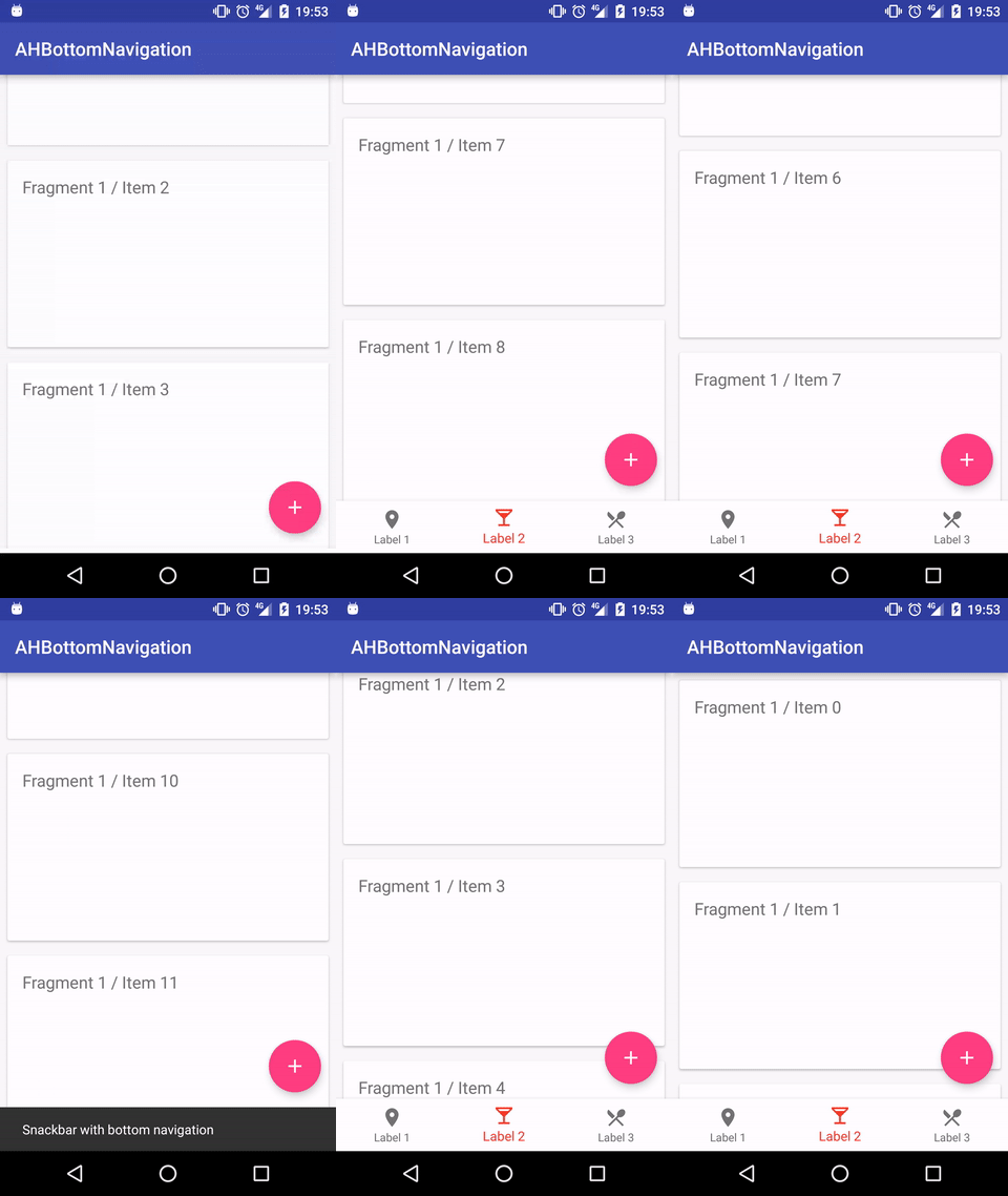
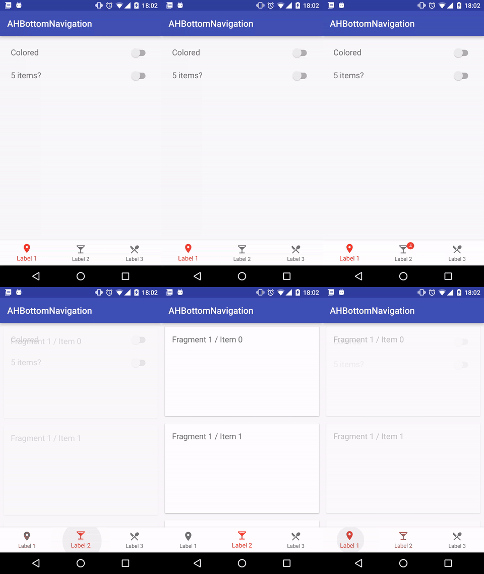
Demo


What's new (2.3.4) - Changelog
- Fix a bug with the disappearing animation for the notification
Features
- Follow the bottom navigation guidelines (https://www.google.com/design/spec/components/bottom-navigation.html)
- Add 3 to 5 items (with title, icon & color)
- Choose your style: Classic or colored navigation
- Add a OnTabSelectedListener to detect tab selection
- Support icon font color with "setForceTint(true)"
- Manage notififcations for each item
- Enable/disable tab state
How to?
Gradle
dependencies {
    compile 'com.aurelhubert:ahbottomnavigation:2.3.4'
}
XML
<com.aurelhubert.ahbottomnavigation.AHBottomNavigation
        android:id="@+id/bottom_navigation"
        android:layout_width="match_parent"
        android:layout_height="wrap_content"/>
OR
<androidx.coordinatorlayout.widget.CoordinatorLayout
    xmlns:android="http://schemas.android.com/apk/res/android"
    android:layout_width="match_parent"
    android:layout_height="match_parent">

    ...

    <com.aurelhubert.ahbottomnavigation.AHBottomNavigation
        android:id="@+id/bottom_navigation"
        android:layout_width="match_parent"
        android:layout_height="wrap_content"
        android:layout_gravity="bottom" />

</androidx.coordinatorlayout.widget.CoordinatorLayout>
Activity/Fragment
AHBottomNavigation bottomNavigation = (AHBottomNavigation) findViewById(R.id.bottom_navigation);

// Create items
AHBottomNavigationItem item1 = new AHBottomNavigationItem(R.string.tab_1, R.drawable.ic_maps_place, R.color.color_tab_1);
AHBottomNavigationItem item2 = new AHBottomNavigationItem(R.string.tab_2, R.drawable.ic_maps_local_bar, R.color.color_tab_2);
AHBottomNavigationItem item3 = new AHBottomNavigationItem(R.string.tab_3, R.drawable.ic_maps_local_restaurant, R.color.color_tab_3);

// Add items
bottomNavigation.addItem(item1);
bottomNavigation.addItem(item2);
bottomNavigation.addItem(item3);

// Set background color
bottomNavigation.setDefaultBackgroundColor(Color.parseColor("#FEFEFE"));

// Disable the translation inside the CoordinatorLayout
bottomNavigation.setBehaviorTranslationEnabled(false);

// Enable the translation of the FloatingActionButton
bottomNavigation.manageFloatingActionButtonBehavior(floatingActionButton);

// Change colors
bottomNavigation.setAccentColor(Color.parseColor("#F63D2B"));
bottomNavigation.setInactiveColor(Color.parseColor("#747474"));

// Force to tint the drawable (useful for font with icon for example)
bottomNavigation.setForceTint(true);

// Display color under navigation bar (API 21+)
// Don't forget these lines in your style-v21
// <item name="android:windowTranslucentNavigation">true</item>
// <item name="android:fitsSystemWindows">true</item>
bottomNavigation.setTranslucentNavigationEnabled(true);

// Manage titles
bottomNavigation.setTitleState(AHBottomNavigation.TitleState.SHOW_WHEN_ACTIVE);
bottomNavigation.setTitleState(AHBottomNavigation.TitleState.ALWAYS_SHOW);
bottomNavigation.setTitleState(AHBottomNavigation.TitleState.ALWAYS_HIDE);

// Use colored navigation with circle reveal effect
bottomNavigation.setColored(true);

// Set current item programmatically
bottomNavigation.setCurrentItem(1);

// Customize notification (title, background, typeface)
bottomNavigation.setNotificationBackgroundColor(Color.parseColor("#F63D2B"));

// Add or remove notification for each item
bottomNavigation.setNotification("1", 3);
// OR
AHNotification notification = new AHNotification.Builder()
    .setText("1")
    .setBackgroundColor(ContextCompat.getColor(DemoActivity.this, R.color.color_notification_back))
    .setTextColor(ContextCompat.getColor(DemoActivity.this, R.color.color_notification_text))
     .build();
bottomNavigation.setNotification(notification, 1);

// Enable / disable item & set disable color
bottomNavigation.enableItemAtPosition(2);
bottomNavigation.disableItemAtPosition(2);
bottomNavigation.setItemDisableColor(Color.parseColor("#3A000000"));

// Set listeners
bottomNavigation.setOnTabSelectedListener(new AHBottomNavigation.OnTabSelectedListener() {
	@Override
	public boolean onTabSelected(int position, boolean wasSelected) {
		// Do something cool here...
        return true;
	}
});
bottomNavigation.setOnNavigationPositionListener(new AHBottomNavigation.OnNavigationPositionListener() {
	@Override public void onPositionChange(int y) {
		// Manage the new y position
	}
});
With XML menu
int[] tabColors = getApplicationContext().getResources().getIntArray(R.array.tab_colors);
AHBottomNavigation bottomNavigation = (AHBottomNavigation) findViewById(R.id.bottom_navigation);
AHBottomNavigationAdapter navigationAdapter = new AHBottomNavigationAdapter(this, R.menu.bottom_navigation_menu_3);
navigationAdapter.setupWithBottomNavigation(bottomNavigation, tabColors);
TODO
- Manage tablet
Contributions
Feel free to create issues / pull requests.
License
AHBottomNavigation library for Android
Copyright (c) 2018 Aurelien Hubert (http://github.com/aurelhubert).

Licensed under the Apache License, Version 2.0 (the "License");
you may not use this file except in compliance with the License.
You may obtain a copy of the License at

http://www.apache.org/licenses/LICENSE-2.0

Unless required by applicable law or agreed to in writing, software
distributed under the License is distributed on an "AS IS" BASIS,
WITHOUT WARRANTIES OR CONDITIONS OF ANY KIND, either express or implied.
See the License for the specific language governing permissions and
limitations under the License.
Top Related Projects
(Deprecated) A custom view component that mimics the new Material Design Bottom Navigation pattern.
An android lib for enhancing BottomNavigationView. 一个增强BottomNavigationView的安卓库。
This Library helps users to use Bottom Navigation Bar (A new pattern from google) with ease and allows ton of customizations
An bottom navigation bar for Android
Bottom Navigation widget component inspired by the Google Material Design Guidelines at https://www.google.com/design/spec/components/bottom-navigation.html
Yet another material bottom bar library for Android
Convert  designs to code with AI

Introducing Visual Copilot: A new AI model to turn Figma designs to high quality code using your components.
Try Visual Copilot