 Material-BottomNavigation
Bottom Navigation widget component inspired by the Google Material Design Guidelines at https://www.google.com/design/spec/components/bottom-navigation.html
Top Related Projects

Material Design icons by Google (Material Symbols)

The flexible, easy to use, all in one drawer library for your Android project. Now brand new with material 2 design.

😍 A beautiful, fluid, and extensible dialogs API for Kotlin & Android.

A library to bring fully animated Material Design components to pre-Lolipop Android.

ZXing ("Zebra Crossing") barcode scanning library for Java, Android
Quick Overview
The Material-BottomNavigation project is a customizable and feature-rich bottom navigation bar implementation for Android, following the Material Design guidelines. It provides a flexible and easy-to-use solution for adding a bottom navigation bar to your Android app.
Pros
- Customizable Appearance: The library allows you to customize the appearance of the bottom navigation bar, including the color, size, and style of the icons and text.
- Smooth Animations: The library provides smooth animations when switching between navigation items, creating a polished and responsive user experience.
- Flexible Configuration: The library offers a wide range of configuration options, allowing you to tailor the bottom navigation bar to your app's specific needs.
- Material Design Compliant: The library is designed to follow the Material Design guidelines, ensuring a consistent and visually appealing user interface.
Cons
- Dependency on External Library: The project relies on the Android Support Library, which may increase the overall size of your app.
- Limited Compatibility: The library may not be compatible with the latest versions of Android, as it is not actively maintained.
- Potential Performance Issues: Depending on the complexity of your app and the number of navigation items, the bottom navigation bar may have a negative impact on performance.
- Lack of Documentation: The project's documentation could be more comprehensive, making it more challenging for new users to get started.
Code Examples
// Creating a bottom navigation bar
val bottomNavigation = BottomNavigation(context)
bottomNavigation.addItem(BottomNavigationItem(R.drawable.ic_home, "Home"))
bottomNavigation.addItem(BottomNavigationItem(R.drawable.ic_search, "Search"))
bottomNavigation.addItem(BottomNavigationItem(R.drawable.ic_settings, "Settings"))
bottomNavigation.setOnItemSelectedListener { position ->
    // Handle navigation item selection
}
// Customizing the bottom navigation bar
bottomNavigation.setBackgroundColor(Color.WHITE)
bottomNavigation.setItemIconTint(ColorStateList.valueOf(Color.GRAY))
bottomNavigation.setItemTextColor(ColorStateList.valueOf(Color.GRAY))
bottomNavigation.setSelectedItemIconTint(ColorStateList.valueOf(Color.BLUE))
bottomNavigation.setSelectedItemTextColor(ColorStateList.valueOf(Color.BLUE))
// Handling navigation item selection
bottomNavigation.setOnItemSelectedListener { position ->
    when (position) {
        0 -> {
            // Navigate to home screen
        }
        1 -> {
            // Navigate to search screen
        }
        2 -> {
            // Navigate to settings screen
        }
    }
}
// Updating the selected item
bottomNavigation.setSelectedIndex(1, true)
Getting Started
To use the Material-BottomNavigation library in your Android project, follow these steps:
- Add the library to your project's
build.gradlefile:
dependencies {
    implementation 'com.sephiroth.android.library.bottomnavigation:bottom-navigation:3.0.2'
}
- Create a
BottomNavigationinstance in your layout file or in your code:
<com.sephiroth.android.library.bottomnavigation.BottomNavigation
    android:id="@+id/bottom_navigation"
    android:layout_width="match_parent"
    android:layout_height="wrap_content"
    android:layout_gravity="bottom" />
- Add navigation items to the bottom navigation bar:
val bottomNavigation = findViewById<BottomNavigation>(R.id.bottom_navigation)
bottomNavigation.addItem(BottomNavigationItem(R.drawable.ic_home, "Home"))
bottomNavigation.addItem(BottomNavigationItem(R.drawable.ic_search, "Search"))
bottomNavigation.addItem(BottomNavigationItem(R.drawable.ic_settings, "Settings"))
- Set a listener to handle navigation item selection:
bottomNavigation.setOnItemSelectedListener { position ->
    // Handle navigation item selection
Competitor Comparisons
Material Design icons by Google (Material Symbols)
Pros of Material Design Icons
- Comprehensive collection of high-quality, open-source icons
- Consistent design and adherence to Material Design guidelines
- Wide range of icon categories and styles to choose from
Cons of Material Design Icons
- Limited customization options for individual icons
- Requires additional setup and integration into a project
- May not always align perfectly with a project's specific design needs
Code Comparison
Material Design Icons:
<i class="material-icons">home</i>
Material-BottomNavigation:
BottomNavigation(
    selectedItemColor = Color.White,
    unselectedItemColor = Color.Gray,
    backgroundColor = Color.DarkGray
) {
    BottomNavigationItem(
        icon = Icons.Default.Home,
        label = "Home",
        selected = currentIndex == 0,
        onClick = { onItemSelected(0) }
    )
}
The flexible, easy to use, all in one drawer library for your Android project. Now brand new with material 2 design.
Pros of MaterialDrawer
- Provides a highly customizable and feature-rich navigation drawer implementation, allowing for easy integration into Android apps.
- Supports various drawer styles, including the classic hamburger menu, mini drawer, and more.
- Offers a wide range of customization options, such as header and footer views, badge support, and custom item layouts.
Cons of MaterialDrawer
- The library may be overkill for simple navigation drawer requirements, as it provides a more comprehensive set of features.
- The learning curve for customizing the drawer can be steeper compared to a more basic implementation.
- The library's size and dependencies may be a concern for projects with strict size constraints.
Code Comparison
MaterialDrawer:
PrimaryDrawerItem item = new PrimaryDrawerItem()
    .withIdentifier(1)
    .withName("Home")
    .withIcon(GoogleMaterial.Icon.gmd_home);

new DrawerBuilder()
    .withActivity(this)
    .addDrawerItems(
        item,
        new DividerDrawerItem(),
        new SecondaryDrawerItem().withName("Settings")
    )
    .build();
Material-BottomNavigation:
BottomNavigationView bottomNavigationView = findViewById(R.id.bottom_navigation);
bottomNavigationView.setOnNavigationItemSelectedListener(item -> {
    switch (item.getItemId()) {
        case R.id.action_home:
            // Handle home action
            return true;
        case R.id.action_search:
            // Handle search action
            return true;
        // Add more cases for other menu items
    }
    return false;
});
😍 A beautiful, fluid, and extensible dialogs API for Kotlin & Android.
Pros of Material Dialogs
- Extensive customization options: Material Dialogs provides a wide range of customization options, allowing developers to create highly tailored dialog experiences.
- Comprehensive feature set: The library includes a variety of dialog types, such as input dialogs, progress dialogs, and list dialogs, catering to diverse UI requirements.
- Active development and community support: Material Dialogs has an active development team and a large community of contributors, ensuring ongoing improvements and bug fixes.
Cons of Material Dialogs
- Larger library size: Material Dialogs is a more comprehensive library, which may result in a larger overall application size compared to a more focused library like Material-BottomNavigation.
- Potential learning curve: The extensive customization options and feature set of Material Dialogs may require more time and effort to fully understand and utilize.
Code Comparison
Material-BottomNavigation:
bottomNavigation.setOnNavigationItemSelectedListener { item ->
    when (item.itemId) {
        R.id.action_home -> {
            // Handle home action
            true
        }
        R.id.action_search -> {
            // Handle search action
            true
        }
        // Add more cases for other menu items
        else -> false
    }
}
Material Dialogs:
MaterialDialog(this)
    .title(text = "Choose an option")
    .listItems(items = listOf("Option 1", "Option 2", "Option 3")) { dialog, index, text ->
        // Handle item selection
    }
    .show()
A library to bring fully animated Material Design components to pre-Lolipop Android.
Pros of Material
- Extensive Customization: Material provides a wide range of customization options, allowing developers to tailor the UI to their specific needs.
- Comprehensive Documentation: The project's documentation is well-organized and covers a wide range of features and use cases.
- Active Development: The Material project is actively maintained, with regular updates and bug fixes.
Cons of Material
- Larger Codebase: Material has a larger codebase compared to Material-BottomNavigation, which may result in a larger app size.
- Steeper Learning Curve: The extensive customization options and feature set of Material may require more time and effort to learn and implement.
Code Comparison
Material-BottomNavigation:
bottomNavigation.setOnItemSelectedListener { item ->
    when (item.itemId) {
        R.id.action_home -> {
            // Handle home action
            true
        }
        R.id.action_search -> {
            // Handle search action
            true
        }
        // Add more cases for other menu items
        else -> false
    }
}
Material:
bottomNavigationView.setOnItemSelectedListener { item ->
    when (item.itemId) {
        R.id.home -> {
            // Handle home action
            true
        }
        R.id.search -> {
            // Handle search action
            true
        }
        // Add more cases for other menu items
        else -> false
    }
}
ZXing ("Zebra Crossing") barcode scanning library for Java, Android
Pros of zxing/zxing
- Comprehensive library for barcode scanning and generation, supporting a wide range of barcode formats.
- Active community with regular updates and bug fixes.
- Extensive documentation and examples, making it easy to integrate into various projects.
Cons of zxing/zxing
- Larger codebase and dependencies compared to Material-BottomNavigation, which may be overkill for simple barcode-related tasks.
- Potential performance overhead for applications that only require basic barcode functionality.
Code Comparison
Material-BottomNavigation:
BottomNavigationView bottomNavigationView = findViewById(R.id.bottom_navigation);
bottomNavigationView.setOnNavigationItemSelectedListener(item -> {
    // Handle navigation item selection
    return true;
});
zxing/zxing:
IntentIntegrator integrator = new IntentIntegrator(this);
integrator.setDesiredBarcodeFormats(IntentIntegrator.QR_CODE);
integrator.setPrompt("Scan a barcode");
integrator.setCameraId(0);
integrator.setBeepEnabled(false);
integrator.setBarcodeImageEnabled(true);
integrator.initiateScan();
Convert  designs to code with AI

Introducing Visual Copilot: A new AI model to turn Figma designs to high quality code using your components.
Try Visual CopilotREADME
Material Bottom Navigation Library

Lightweight Bottom Navigation library component inspired by the Google Material Design Guidelines at https://www.google.com/design/spec/components/bottom-navigation.html
This project is also inspired by https://github.com/roughike/BottomBar

Table of contents
Installation
In your project's build.gradle file add the following line to the dependencies group:
compile 'it.sephiroth.android.library.bottomnavigation:bottom-navigation:3.0.0'
Usage
Usage of the BottomNavigation widget is very easy. Just place it in your layout.xml like this:
<?xml version="1.0" encoding="utf-8"?>
<androidx.coordinatorlayout.widget.CoordinatorLayout android:id="@+id/CoordinatorLayout01"
	xmlns:android="http://schemas.android.com/apk/res/android"
    xmlns:app="http://schemas.android.com/apk/res-auto"
    android:layout_width="match_parent"
	android:layout_height="match_parent"
    android:fitsSystemWindows="true">

	...your content...

    <it.sephiroth.android.library.bottomnavigation.BottomNavigation
	    android:id="@+id/BottomNavigation"
        android:layout_width="match_parent"
	    android:layout_height="wrap_content"
        android:layout_gravity="bottom"
	    app:bbn_entries="@menu/bottombar_menu_4items"
        app:bbn_scrollEnabled="true"
        app:bbn_badgeProvider="@string/bbn_badgeProvider"
	    app:layout_behavior="@string/bbn_phone_view_behavior" />
</androidx.coordinatorlayout.widget.CoordinatorLayout>
All the menu main configurations are defined within the xml menu resource itself. Here's an example of a menu with 4 items:
<?xml version="1.0" encoding="utf-8"?>
<menu xmlns:android="http://schemas.android.com/apk/res/android"
	xmlns:app="http://schemas.android.com/apk/res-auto"
    android:background="@android:color/black"
    app:bbn_badgeColor="#FFFF0000"
	app:bbn_rippleColor="#33ffffff">
    <item
	    android:id="@+id/bbn_item1"
    	android:color="@color/colorPrimary"
        android:icon="@drawable/ic_cloud_off_white_24dp"
	    android:title="Cloud Sync" />
    <item
	    android:id="@+id/bbn_item2"
        android:color="@android:color/holo_green_dark"
	    android:icon="@drawable/ic_cast_connected_white_24dp"
        android:title="Chromecast" />
	<item
        android:id="@+id/bbn_item3"
	    android:color="@android:color/holo_orange_dark"
        android:icon="@drawable/ic_mail_white_24dp"
	    android:title="Mail" />
    <item
	    android:id="@+id/action4"
    	android:color="#FF5252"
        android:icon="@drawable/ic_format_list_numbered_white_24dp"
	    android:title="List" />
</menu>
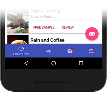
Examples
| 4 shifting items menu | 3 fixed items menu |
|---|---|
 |  |
| 4 items no background | Tablet mode |
|---|---|
| 4 items without changing background. Menu show/hide feature is also disabled | Menu can be easily setup for (left or right) tablet support. |
 |  |
Sizing
Dimensions and paddings follow the Google giudelines

Tablets
The View supports tablet mode too (Left or Right). In order to enable tablet mode this is the configuration that should be used:
<it.sephiroth.android.library.bottomnavigation.BottomNavigation
    android:id="@+id/BottomNavigation"
    android:layout_width="match_parent"
    android:layout_height="wrap_content"
    android:layout_gravity="start"
    app:bbn_entries="@menu/bottombar_menu_3items"
    app:bbn_badgeProvider="@string/bbn_badgeProvider"
    app:layout_behavior="@string/bbn_tablet_view_behavior" />
Styling
The xml menu supports the following attributes in the <menu> tag:
<declare-styleable name="BottomNavigationMenu">
    <!-- menu default background color -->
    <attr name="android:background" />

    <!-- default badge color -->
    <attr name="bbn_badgeColor" format="color" />

    <!-- animation duration for the menu items -->
    <attr name="bbn_itemAnimationDuration" format="integer" />

    <!-- ripple selector color -->
    <attr name="bbn_rippleColor" format="color" />

    <!-- menu item active color -->
    <attr name="bbn_itemColorActive" format="color" />

    <!-- menu item inactive color -->
    <attr name="bbn_itemColorInactive" format="color" />

    <!-- menu item disabled color -->
    <attr name="bbn_itemColorDisabled" format="color" />

    <!-- force fixed behavior and always display item labels -->
    <!-- default implementation is false and the labels are -->
    <!-- shown only if there are less than 4 items in the menu -->
    <attr name="bbn_alwaysShowLabels" format="boolean" />
</declare-styleable>
Note: By default when there are 4 or 5 elements, only the selected item will display the label. In order to force all the items to always show their label, use
bbn_alwaysShowLabelsin the menu xml.
Badges
There's a basic support for badges using the default implementation. In order to display a badge in the current BottomNavigation view, all you have to do is:
    final BadgeProvider provider = bottomNavigationView.getBadgeProvider();
    provider.show(R.id.bbn_item3);
This code will show a little circle badge on the menu item with the id "bbn_item3".
You can define the default badge color inside the menu xml itself:
<menu xmlns:android="http://schemas.android.com/apk/res/android"
    xmlns:app="http://schemas.android.com/apk/res-auto"
    app:bbn_badgeColor="#FFFF0000">

    <item
        android:id="@+id/bbn_item1"
        android:color="@color/colorPrimary"
        android:icon="@drawable/ic_cloud_off_white_24dp"
        android:title="Cloud Sync" />

    ...
</menu>
Then you can hide the badge using:
bottomNavigation.getBadgeProvider().remove(R.id.bbn_item3);
Badges Customization
You can use your own Drawable by extending the BadgeProvider class.
Once you've setup your new class you can tell the BottomNavigation view to use your class by specifying it in the "bbn_badgeProvider" attribute of your xml file.
For instance:
<it.sephiroth.android.library.bottomnavigation.BottomNavigation
    android:id="@id/BottomNavigation"
    android:layout_width="match_parent"
    android:layout_height="match_parent"
    android:layout_gravity="bottom"
    app:bbn_badgeProvider="my.custom.BadgeProviderCustom"
    app:bbn_entries="@menu/bottombar_menu_4items"
    app:layout_behavior="@string/bbn_phone_view_behavior" />
This will make your my.custom.BadgeProviderCustom the default BadgeProvider.
License
The MIT License (MIT)
Copyright (c) 2016 Alessandro Crugnola
Permission is hereby granted, free of charge, to any person obtaining a copy of this software and associated documentation files (the "Software"), to deal in the Software without restriction, including without limitation the rights to use, copy, modify, merge, publish, distribute, sublicense, and/or sell copies of the Software, and to permit persons to whom the Software is furnished to do so, subject to the following conditions:
The above copyright notice and this permission notice shall be included in all copies or substantial portions of the Software.
THE SOFTWARE IS PROVIDED "AS IS", WITHOUT WARRANTY OF ANY KIND, EXPRESS OR IMPLIED, INCLUDING BUT NOT LIMITED TO THE WARRANTIES OF MERCHANTABILITY, FITNESS FOR A PARTICULAR PURPOSE AND NONINFRINGEMENT. IN NO EVENT SHALL THE AUTHORS OR COPYRIGHT HOLDERS BE LIABLE FOR ANY CLAIM, DAMAGES OR OTHER LIABILITY, WHETHER IN AN ACTION OF CONTRACT, TORT OR OTHERWISE, ARISING FROM, OUT OF OR IN CONNECTION WITH THE SOFTWARE OR THE USE OR OTHER DEALINGS IN THE SOFTWARE.
Top Related Projects
Material Design icons by Google (Material Symbols)
The flexible, easy to use, all in one drawer library for your Android project. Now brand new with material 2 design.
😍 A beautiful, fluid, and extensible dialogs API for Kotlin & Android.
A library to bring fully animated Material Design components to pre-Lolipop Android.
ZXing ("Zebra Crossing") barcode scanning library for Java, Android
Convert designs to code with AI
Introducing Visual Copilot: A new AI model to turn Figma designs to high quality code using your components.
Try Visual Copilot