 BottomBar
(Deprecated) A custom view component that mimics the new Material Design Bottom Navigation pattern.
Top Related Projects

An android lib for enhancing BottomNavigationView. 一个增强BottomNavigationView的安卓库。

A library to reproduce the behavior of the Bottom Navigation guidelines from Material Design.

An bottom navigation bar for Android

This Library helps users to use Bottom Navigation Bar (A new pattern from google) with ease and allows ton of customizations

Bottom Navigation widget component inspired by the Google Material Design Guidelines at https://www.google.com/design/spec/components/bottom-navigation.html

Yet another material bottom bar library for Android
Quick Overview
BottomBar is an Android library that provides an easy-to-use implementation of the Material Design Bottom Navigation pattern. It allows developers to create a customizable bottom navigation bar with smooth animations and various styling options, enhancing the user experience in Android applications.
Pros
- Easy integration with minimal setup required
- Customizable appearance and behavior to match app design
- Supports badges and notifications on navigation items
- Smooth animations and transitions between selected items
Cons
- Limited to bottom navigation use cases
- May require additional configuration for complex layouts
- Not actively maintained (last update was in 2018)
- Some reported issues with newer Android versions and Material Design updates
Code Examples
- Basic BottomBar setup:
val bottomBar = findViewById<BottomBar>(R.id.bottomBar)
bottomBar.setOnTabSelectListener { tabId ->
    when (tabId) {
        R.id.tab_favorites -> // Handle favorites tab selection
        R.id.tab_nearby -> // Handle nearby tab selection
        R.id.tab_friends -> // Handle friends tab selection
    }
}
- Adding badges to BottomBar items:
val bottomBar = findViewById<BottomBar>(R.id.bottomBar)
bottomBar.getTabWithId(R.id.tab_favorites).setBadgeCount(5)
bottomBar.getTabWithId(R.id.tab_nearby).setBadgeCount(0)
- Customizing BottomBar appearance:
val bottomBar = findViewById<BottomBar>(R.id.bottomBar)
bottomBar.setActiveTabColor(Color.RED)
bottomBar.setInActiveTabColor(Color.GRAY)
bottomBar.setBarBackgroundColor(Color.WHITE)
Getting Started
- Add the dependency to your
build.gradlefile:
dependencies {
    implementation 'com.roughike:bottom-bar:2.3.1'
}
- Add BottomBar to your layout XML:
<com.roughike.bottombar.BottomBar
    android:id="@+id/bottomBar"
    android:layout_width="match_parent"
    android:layout_height="60dp"
    android:layout_alignParentBottom="true"
    app:bb_tabXmlResource="@xml/bottombar_tabs" />
- Create a
bottombar_tabs.xmlfile in theres/xmlfolder:
<tabs>
    <tab
        id="@+id/tab_favorites"
        icon="@drawable/ic_favorites"
        title="Favorites" />
    <tab
        id="@+id/tab_nearby"
        icon="@drawable/ic_nearby"
        title="Nearby" />
    <tab
        id="@+id/tab_friends"
        icon="@drawable/ic_friends"
        title="Friends" />
</tabs>
- Initialize BottomBar in your activity or fragment:
val bottomBar = findViewById<BottomBar>(R.id.bottomBar)
bottomBar.setOnTabSelectListener { tabId ->
    // Handle tab selection
}
Competitor Comparisons
An android lib for enhancing BottomNavigationView. 一个增强BottomNavigationView的安卓库。
Pros of BottomNavigationViewEx
- Built on top of the official Android BottomNavigationView, providing better compatibility and easier integration
- Offers more customization options, including badge support and custom item views
- Actively maintained with regular updates and bug fixes
Cons of BottomNavigationViewEx
- Slightly more complex setup compared to BottomBar
- May require additional configuration to achieve certain visual styles
- Limited animation options compared to BottomBar's extensive animation support
Code Comparison
BottomBar:
val bottomBar = findViewById<BottomBar>(R.id.bottomBar)
bottomBar.setOnTabSelectListener { tabId ->
    // Handle tab selection
}
BottomNavigationViewEx:
val bottomNavigation = findViewById<BottomNavigationViewEx>(R.id.bottomNavigation)
bottomNavigation.setOnNavigationItemSelectedListener { item ->
    // Handle item selection
    true
}
Both libraries offer similar functionality for implementing bottom navigation in Android apps. BottomBar provides a more customizable and animation-rich solution, while BottomNavigationViewEx builds upon the official Android component, offering better compatibility and integration with the Android ecosystem. The choice between the two depends on specific project requirements, desired customization level, and preference for either a third-party or official-based solution.
A library to reproduce the behavior of the Bottom Navigation guidelines from Material Design.
Pros of ahbottomnavigation
- More customization options for colors, animations, and behavior
- Supports badges and notifications out of the box
- Smaller library size and potentially better performance
Cons of ahbottomnavigation
- Less extensive documentation compared to BottomBar
- Fewer pre-built styles and themes
- May require more manual configuration for complex layouts
Code Comparison
BottomBar implementation:
BottomBar bottomBar = BottomBar.attach(this, savedInstanceState);
bottomBar.setItems(R.menu.bottombar_menu);
bottomBar.setOnMenuTabClickListener(new OnMenuTabClickListener() {
    // Handle tab selection
});
ahbottomnavigation implementation:
AHBottomNavigation bottomNavigation = findViewById(R.id.bottom_navigation);
AHBottomNavigationItem item1 = new AHBottomNavigationItem("Label", R.drawable.ic_icon, R.color.color);
bottomNavigation.addItem(item1);
bottomNavigation.setOnTabSelectedListener(new AHBottomNavigation.OnTabSelectedListener() {
    // Handle tab selection
});
Both libraries offer similar functionality for implementing bottom navigation bars in Android applications. BottomBar provides a more straightforward setup with pre-defined styles, while ahbottomnavigation offers greater flexibility and customization options. The choice between the two depends on the specific requirements of your project and personal preferences.
An bottom navigation bar for Android
Pros of PagerBottomTabStrip
- More customizable appearance with various built-in styles
- Supports ViewPager integration out of the box
- Smaller library size, potentially reducing app bloat
Cons of PagerBottomTabStrip
- Less active maintenance and community support
- Fewer animation options compared to BottomBar
- Limited documentation and examples available
Code Comparison
BottomBar implementation:
BottomBar bottomBar = BottomBar.attach(this, savedInstanceState);
bottomBar.setItems(R.menu.bottombar_menu);
bottomBar.setOnMenuTabClickListener(new OnMenuTabClickListener() {
    @Override
    public void onMenuTabSelected(@IdRes int menuItemId) {
        // Handle tab selection
    }
});
PagerBottomTabStrip implementation:
BottomTabLayout bottomTabLayout = findViewById(R.id.tab_layout);
bottomTabLayout.setTabItems(tabItems);
bottomTabLayout.setOnTabItemSelectListener(new OnTabItemSelectListener() {
    @Override
    public void onTabItemSelect(int index) {
        // Handle tab selection
    }
});
Both libraries offer similar functionality for creating bottom navigation bars in Android applications. BottomBar provides more extensive documentation and community support, while PagerBottomTabStrip offers greater customization options and built-in ViewPager integration. The choice between the two depends on specific project requirements and preferences.
This Library helps users to use Bottom Navigation Bar (A new pattern from google) with ease and allows ton of customizations
Pros of BottomNavigation
- More customization options for appearance and behavior
- Better support for landscape mode and tablets
- Includes built-in badge functionality for menu items
Cons of BottomNavigation
- Slightly more complex implementation compared to BottomBar
- Less frequent updates and maintenance
- May require more code to achieve basic functionality
Code Comparison
BottomNavigation:
BottomNavigationBar bottomNavigationBar = (BottomNavigationBar) findViewById(R.id.bottom_navigation_bar);
bottomNavigationBar
    .addItem(new BottomNavigationItem(R.drawable.ic_home, "Home"))
    .addItem(new BottomNavigationItem(R.drawable.ic_search, "Search"))
    .addItem(new BottomNavigationItem(R.drawable.ic_profile, "Profile"))
    .initialise();
BottomBar:
BottomBar bottomBar = BottomBar.attach(this, savedInstanceState);
bottomBar.setItems(R.menu.bottombar_menu);
bottomBar.setOnMenuTabClickListener(new OnMenuTabClickListener() {
    // Implement click listener
});
Both libraries provide similar functionality for creating bottom navigation bars in Android applications. BottomNavigation offers more customization options and built-in features, while BottomBar has a simpler implementation and more active maintenance. The choice between the two depends on specific project requirements and preferences.
Bottom Navigation widget component inspired by the Google Material Design Guidelines at https://www.google.com/design/spec/components/bottom-navigation.html
Pros of Material-BottomNavigation
- Follows Material Design guidelines more closely
- Supports both fixed and shifting modes out of the box
- Offers more customization options for appearance and behavior
Cons of Material-BottomNavigation
- Less active development and community support
- May require more setup and configuration
- Limited documentation compared to BottomBar
Code Comparison
BottomBar implementation:
val bottomBar = BottomBar.attach(this, savedInstanceState)
bottomBar.setItems(
    BottomBarTab(R.drawable.ic_home, "Home"),
    BottomBarTab(R.drawable.ic_search, "Search"),
    BottomBarTab(R.drawable.ic_profile, "Profile")
)
Material-BottomNavigation implementation:
val bottomNavigation = findViewById<BottomNavigation>(R.id.bottom_navigation)
bottomNavigation.setDefaultSelectedIndex(0)
bottomNavigation.setOnMenuItemClickListener { item ->
    when (item.id) {
        R.id.home -> // Handle home click
        R.id.search -> // Handle search click
        R.id.profile -> // Handle profile click
    }
}
Both libraries provide easy-to-use APIs for implementing bottom navigation in Android apps. BottomBar offers a more straightforward setup, while Material-BottomNavigation provides more customization options at the cost of slightly more complex implementation.
Yet another material bottom bar library for Android
Pros of ReadableBottomBar
- Simpler API and easier to implement
- More customizable text appearance and animations
- Lightweight with minimal dependencies
Cons of ReadableBottomBar
- Fewer built-in features compared to BottomBar
- Less extensive documentation and community support
- Limited icon customization options
Code Comparison
ReadableBottomBar:
val bottomBar = findViewById<ReadableBottomBar>(R.id.bottomBar)
bottomBar.setOnItemSelectListener { index ->
    when (index) {
        0 -> // Handle first item selection
        1 -> // Handle second item selection
    }
}
BottomBar:
val bottomBar = findViewById<BottomBar>(R.id.bottomBar)
bottomBar.setOnTabSelectListener { tabId ->
    when (tabId) {
        R.id.tab_favorites -> // Handle favorites tab selection
        R.id.tab_nearby -> // Handle nearby tab selection
    }
}
Both libraries offer straightforward implementation, but ReadableBottomBar uses a simpler index-based approach, while BottomBar relies on tab IDs. ReadableBottomBar's API is more concise, but BottomBar provides more flexibility in tab identification and management.
Convert  designs to code with AI

Introducing Visual Copilot: A new AI model to turn Figma designs to high quality code using your components.
Try Visual CopilotREADME
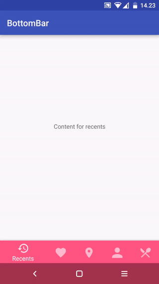
BottomBar (Deprecated)
I don't have time to maintain this anymore. I basically wrote the whole library in a rush, without tests, while being a serious expert beginner at the time. As a result, there's a lot of unpredictable moving parts and the tests probably aren't that great either. Don't really know, since I haven't touched this in ages.
I'd recommend you to use the official BottomNavigationView from Google and urge them to implement the features you need. Or use another 3rd party library.


Version 2.0 released!
The latest version before that can be found in the v1 branch
- Cleaner code and better APIs
- No more unnecessary stuff or spaghetti mess
- Now the look, feel and behavior is defined in XML, as it should be
- No more nasty regressions, thanks to the automated tests
- Everything is a little different compared to earlier, but it's for the greater good!
What?
A custom view component that mimics the new Material Design Bottom Navigation pattern.
Does it work on my Grandpa Gary's HTC Dream?
Nope. The minSDK version is API level 11 (Honeycomb).
Gimme that Gradle sweetness, pls?
compile 'com.roughike:bottom-bar:2.3.1'
Maven:
<dependency>
  <groupId>com.roughike</groupId>
  <artifactId>bottom-bar</artifactId>
  <version>2.3.1</version>
  <type>pom</type>
</dependency>
How?
You can add items by writing a XML resource file.
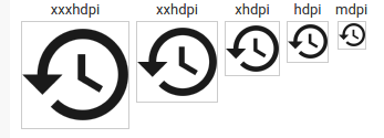
Creating the icons
The icons must be fully opaque, solid black color, 24dp and with no padding. For example, with Android Asset Studio Generic Icon generator, select "TRIM" and make sure the padding is 0dp. Here's what your icons should look like:
Adding items from XML resource
Define your tabs in an XML resource file.
res/xml/bottombar_tabs.xml:
<tabs>
    <tab
        id="@+id/tab_favorites"
        icon="@drawable/ic_favorites"
        title="Favorites" />
    <tab
        id="@+id/tab_nearby"
        icon="@drawable/ic_nearby"
        title="Nearby" />
    <tab
        id="@+id/tab_friends"
        icon="@drawable/ic_friends"
        title="Friends" />
</tabs>
Then, add the BottomBar to your layout and give it a resource id for your tabs xml file.
layout/activity_main.xml
<RelativeLayout xmlns:android="http://schemas.android.com/apk/res/android"
    android:layout_width="match_parent"
    android:layout_height="match_parent"
    xmlns:app="http://schemas.android.com/apk/res-auto">

    <!-- This could be your fragment container, or something -->
    <FrameLayout
        android:id="@+id/contentContainer"
        android:layout_width="match_parent"
        android:layout_height="match_parent"
        android:layout_above="@+id/bottomBar" />

    <com.roughike.bottombar.BottomBar
        android:id="@+id/bottomBar"
        android:layout_width="match_parent"
        android:layout_height="60dp"
        android:layout_alignParentBottom="true"
        app:bb_tabXmlResource="@xml/bottombar_tabs" />

</RelativeLayout>
Setting up listeners
By default, the tabs don't do anything unless you listen for selection events and do something when the tabs are selected.
MainActivity.java:
public class MainActivity extends Activity {
    @Override
    protected void onCreate(@Nullable Bundle savedInstanceState) {
        super.onCreate(savedInstanceState);
        setContentView(R.layout.activity_main);

        BottomBar bottomBar = (BottomBar) findViewById(R.id.bottomBar);
        bottomBar.setOnTabSelectListener(new OnTabSelectListener() {
            @Override
            public void onTabSelected(@IdRes int tabId) {
                if (tabId == R.id.tab_favorites) {
                    // The tab with id R.id.tab_favorites was selected,
                    // change your content accordingly.
                }
            }
        });
    }
}
If you want to listen for reselection events, here's how you do it:
bottomBar.setOnTabReselectListener(new OnTabReselectListener() {
    @Override
    public void onTabReSelected(@IdRes int tabId) {
        if (tabId == R.id.tab_favorites) {
            // The tab with id R.id.tab_favorites was reselected,
            // change your content accordingly.
        }
    }
});
Intercepting tab selections
If you want to conditionally cancel selection of any tab, you absolutely can. Just assign a TabSelectionInterceptor to the BottomBar, and return true from the shouldInterceptTabSelection() method.
bottomBar.setTabSelectionInterceptor(new TabSelectionInterceptor() {
    @Override
    public boolean shouldInterceptTabSelection(@IdRes int oldTabId, @IdRes int newTabId) {
        if (newTabId == R.id.tab_pro_feature && !userHasProVersion()) {
          startProVersionPurchaseFlow();
          return true;
        }

        return false;
    }
});
Changing icons based on selection state
If you want to have different icon when a specific tab is selected, just use state list drawables.
res/drawable/my_tab_icon.xml
<selector xmlns:android="http://schemas.android.com/apk/res/android">
    <item android:drawable="@drawable/ic_myicon_selected" android:state_selected="true" />
    <item android:drawable="@drawable/ic_myicon_default" android:state_selected="false" />
</selector>
res/xml/bottombar_tabs.xml
...
<tab
    id="@+id/tab_favorites"
    icon="@drawable/my_tab_icon"
    title="Favorites" />
<!-- You can use @color resources too! -->
...
Those color changing tabs look dope. Howdoidodat?
Just add barColorWhenSelected to each tab. When that tab is selected, the whole BottomBar background color is changed with a nice animation.
res/xml/bottombar_tabs.xml
<tabs>
    <tab
        id="@+id/tab_favorites"
        icon="@drawable/ic_favorites"
        title="Favorites"
        barColorWhenSelected="#5D4037" />
    <!-- You can use @color resources too! -->
</tabs>
How do I draw it under the navbar?
First, define a style that is a child of your main application theme:
res/values-v21/styles.xml
<style name="AppTheme.TransNav" parent="AppTheme">
    <item name="android:navigationBarColor">@android:color/transparent</item>
    <item name="android:windowTranslucentNavigation">true</item>
    <item name="android:windowDrawsSystemBarBackgrounds">true</item>
</style>
You'll also have to make a stub version of the same theme to avoid crashes in previous API levels than Lollipop:
res/values/styles.xml
<style name="AppTheme.TransNav" parent="AppTheme" />
Also include the same stub in your values-land-v21.xml to avoid transparent navbar and weird behavior on landscape.
res/values-land-v21.xml:
<style name="AppTheme.TransNav" parent="AppTheme" />
Apply the theme in AndroidManifest.xml for your Activity.
AndroidManifest.xml:
<activity android:name=".MyAwesomeActivity" android:theme="@style/AppTheme.TransNav" />
Finally, set bb_behavior to include the underNavbar flag and you're good to go!
activity_my_awesome.xml:
<com.roughike.bottombar.BottomBar
    android:id="@+id/bottomBar"
    android:layout_width="match_parent"
    android:layout_height="56dp"
    android:layout_alignParentBottom="true"
    app:bb_tabXmlResource="@xml/my_awesome_bottombar_tabs"
    app:bb_behavior="underNavbar" />
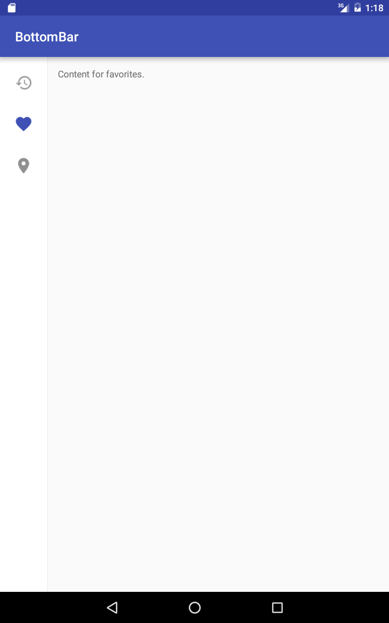
What about Tablets?
Specify a different layout for your activity in res/layout-sw600dp folder and set bb_tabletMode to true.
res/layout-sw600dp/activity_main.xml:
<RelativeLayout
    xmlns:android="http://schemas.android.com/apk/res/android"
    xmlns:app="http://schemas.android.com/apk/res-auto"
    android:layout_width="match_parent"
    android:layout_height="match_parent">

    <com.roughike.bottombar.BottomBar
        android:id="@+id/bottomBar"
        android:layout_width="wrap_content"
        android:layout_height="match_parent"
        android:layout_alignParentLeft="true"
        app:bb_tabXmlResource="@xml/bottombar_tabs_three"
        app:bb_tabletMode="true" />

    <!-- This could be your fragment container, or something -->
    <FrameLayout
        android:id="@+id/contentContainer"
        android:layout_width="match_parent"
        android:layout_height="match_parent"
        android:layout_toRightOf="@+id/bottomBar" />

</RelativeLayout>
How do I hide it automatically on scroll?
Easy-peasy!
activity_main.xml:
<android.support.design.widget.CoordinatorLayout xmlns:android="http://schemas.android.com/apk/res/android"
    xmlns:app="http://schemas.android.com/apk/res-auto"
    android:layout_width="match_parent"
    android:layout_height="match_parent">

    <android.support.v4.widget.NestedScrollView
        android:id="@+id/myScrollingContent"
        android:layout_width="match_parent"
        android:layout_height="match_parent">

        <!-- Your loooooong scrolling content here. -->

    </android.support.v4.widget.NestedScrollView>

    <com.roughike.bottombar.BottomBar
        android:id="@+id/bottomBar"
        android:layout_width="match_parent"
        android:layout_height="60dp"
        android:layout_gravity="bottom"
        app:bb_tabXmlResource="@xml/bottombar_tabs_three"
        app:bb_behavior="shy"/>

</android.support.design.widget.CoordinatorLayout>
Badges
You can easily add badges for showing an unread message count or new items / whatever you like.
BottomBarTab nearby = bottomBar.getTabWithId(R.id.tab_nearby);
nearby.setBadgeCount(5);

// Remove the badge when you're done with it.
nearby.removeBadge/();
All customization options
For the BottomBar
<com.roughike.bottombar.BottomBar
    android:id="@+id/bottomBar"
    android:layout_width="match_parent"
    android:layout_height="60dp"
    android:layout_alignParentBottom="true"
    app:bb_tabXmlResource="@xml/bottombar_tabs_three"
    app:bb_tabletMode="true"
    app:bb_behavior="shifting|shy|underNavbar"
    app:bb_inActiveTabAlpha="0.6"
    app:bb_activeTabAlpha="1"
    app:bb_inActiveTabColor="#222222"
    app:bb_activeTabColor="@color/colorPrimary"
    app:bb_badgesHideWhenActive="true"
    app:bb_titleTextAppearance="@style/MyTextAppearance"
    app:bb_titleTypeFace="fonts/MySuperDuperFont.ttf"
    app:bb_showShadow="true" />
- bb_tabXmlResource
- the XML Resource id for your tabs, that reside in
values/xml/ - bb_tabletMode
- if you want the BottomBar to behave differently for tablets. There's an example of this in the sample project!
- bb_behavior
shifting: the selected tab is wider than the rest.shy: put the BottomBar inside a CoordinatorLayout and it'll automatically hide on scroll!underNavbar: draw the BottomBar under the navBar!- bb_inActiveTabAlpha
- the alpha value for inactive tabs, that's used in the tab icons and titles.
- bb_activeTabAlpha
- the alpha value for active tabs, that's used in the tab icons and titles.
- bb_inActiveTabColor
- the color for inactive tabs, that's used in the tab icons and titles.
- bb_activeTabColor
- the color for active tabs, that's used in the tab icons and titles.
- bb_badgeBackgroundColor
- the background color for any Badges in this BottomBar.
- bb_badgesHideWhenActive
- whether badges should be hidden for active tabs, defaults to true.
- bb_titleTextAppearance
- custom textAppearance for the titles
- bb_titleTypeFace
- path for your custom font file, such as
fonts/MySuperDuperFont.ttf. In that case your font path would look likesrc/main/assets/fonts/MySuperDuperFont.ttf, but you only need to providefonts/MySuperDuperFont.ttf, as the asset folder will be auto-filled for you. - bb_showShadow
- controls whether the shadow is shown or hidden, defaults to true.
For the tabs
<tab
    id="@+id/tab_recents"
    title="Recents"
    icon="@drawable/empty_icon"
    inActiveColor="#00FF00"
    activeColor="#FF0000"
    barColorWhenSelected="#FF0000"
    badgeBackgroundColor="#FF0000"
    badgeHidesWhenActive="true" />
- inActiveColor
- the color for inactive tabs, that's used in the tab icons and titles.
- activeColor
- the color for active tabs, that's used in the tab icons and titles.
- barColorWhenSelected
- the color that the whole BottomBar should be when selected this tab.
- badgeBackgroundColor
- the background color for any Badges in this tab.
- badgeHidesWhenActive
- whether or not the badge should be hidden when this tab is selected, defaults to true.
Apps using BottomBar
- Nearby : A location-based social networking app with over 5 million users.
- FragNav : An Android Library for managing multiple stacks of Fragments. BottomBar is used in the sample app.
- BottomNavigationBar : BottomBar ported to C# for Xamarin developers
- KyudoScoreBookTeam : BottomBar is used in the KyudoScoreBookTeam app.
- memeham : BottomBar is used in the memeham app.
- NewsCatchr : A newsreader app, which uses this BottomBar library.
- GitSkarios : A Github android App, to visit your repositories, gists and more!
Send me a pull request with modified README.md to get a shoutout!
Contributions
Feel free to create issues and pull requests.
When creating pull requests, more is more: I'd like to see ten small pull requests separated by feature rather than all those combined into a huge one.
License
BottomBar library for Android
Copyright (c) 2016 Iiro Krankka (http://github.com/roughike).

Licensed under the Apache License, Version 2.0 (the "License");
you may not use this file except in compliance with the License.
You may obtain a copy of the License at

http://www.apache.org/licenses/LICENSE-2.0

Unless required by applicable law or agreed to in writing, software
distributed under the License is distributed on an "AS IS" BASIS,
WITHOUT WARRANTIES OR CONDITIONS OF ANY KIND, either express or implied.
See the License for the specific language governing permissions and
limitations under the License.
Top Related Projects
An android lib for enhancing BottomNavigationView. 一个增强BottomNavigationView的安卓库。
A library to reproduce the behavior of the Bottom Navigation guidelines from Material Design.
An bottom navigation bar for Android
This Library helps users to use Bottom Navigation Bar (A new pattern from google) with ease and allows ton of customizations
Bottom Navigation widget component inspired by the Google Material Design Guidelines at https://www.google.com/design/spec/components/bottom-navigation.html
Yet another material bottom bar library for Android
Convert designs to code with AI
Introducing Visual Copilot: A new AI model to turn Figma designs to high quality code using your components.
Try Visual Copilot