
Top Related Projects

Component infrastructure and Material Design components for Angular

🐉 Vue Component Framework

Quasar Framework - Build high-performance VueJS user interfaces in record time

🎉 A Vue.js 3 UI Library made by Element team

An enterprise-class UI design language and React UI library

Material UI: Comprehensive React component library that implements Google's Material Design. Free forever.
Quick Overview
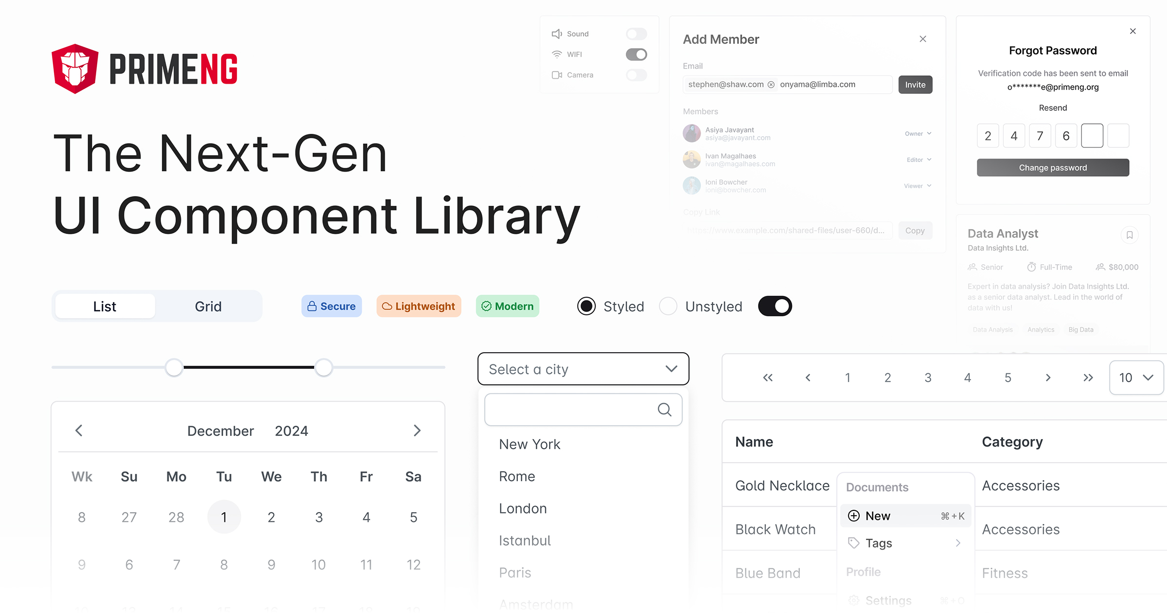
PrimeNG is a comprehensive UI component library for Angular applications. It offers a wide range of customizable and feature-rich components, from basic input elements to complex data visualization tools, all designed to enhance the development of modern web applications.
Pros
- Extensive collection of over 80 UI components
- Consistent and customizable theming system
- Regular updates and active community support
- Excellent documentation and demos
Cons
- Large bundle size if using many components
- Learning curve for advanced features and customizations
- Some components may require additional setup or configuration
- Performance can be impacted if not optimized properly
Code Examples
- Basic Button Component:
import { ButtonModule } from 'primeng/button';

@Component({
  selector: 'app-example',
  template: '<p-button label="Click me"></p-button>'
})
export class ExampleComponent { }
- Data Table with Sorting and Filtering:
import { TableModule } from 'primeng/table';

@Component({
  selector: 'app-example',
  template: `
    <p-table [value]="products" [paginator]="true" [rows]="10">
      <ng-template pTemplate="header">
        <tr>
          <th pSortableColumn="name">Name <p-sortIcon field="name"></p-sortIcon></th>
          <th pSortableColumn="price">Price <p-sortIcon field="price"></p-sortIcon></th>
        </tr>
      </ng-template>
      <ng-template pTemplate="body" let-product>
        <tr>
          <td>{{product.name}}</td>
          <td>{{product.price | currency}}</td>
        </tr>
      </ng-template>
    </p-table>
  `
})
export class ExampleComponent {
  products: any[];
}
- Dialog Component:
import { DialogModule } from 'primeng/dialog';

@Component({
  selector: 'app-example',
  template: `
    <p-dialog header="Dialog Header" [(visible)]="displayDialog">
      Content goes here
    </p-dialog>
    <button (click)="showDialog()">Show Dialog</button>
  `
})
export class ExampleComponent {
  displayDialog: boolean = false;

  showDialog() {
    this.displayDialog = true;
  }
}
Getting Started
-
Install PrimeNG and PrimeIcons:
npm install primeng primeicons -
Import the desired modules in your
app.module.ts:import { ButtonModule } from 'primeng/button'; import { TableModule } from 'primeng/table'; @NgModule({ imports: [ ButtonModule, TableModule ] }) export class AppModule { } -
Add PrimeNG styles to your
angular.json:"styles": [ "node_modules/primeng/resources/themes/lara-light-blue/theme.css", "node_modules/primeng/resources/primeng.min.css", "node_modules/primeicons/primeicons.css" ] -
Use PrimeNG components in your templates as shown in the code examples above.
Competitor Comparisons
Component infrastructure and Material Design components for Angular
Pros of Angular Components
- Developed and maintained by the Angular team, ensuring tight integration with the framework
- Extensive documentation and community support
- Follows Material Design principles, providing a consistent look and feel
Cons of Angular Components
- Limited set of components compared to PrimeNG
- Customization can be more challenging for complex use cases
- Steeper learning curve for developers new to Material Design
Code Comparison
Angular Components:
import { MatButtonModule } from '@angular/material/button';

@NgModule({
  imports: [MatButtonModule],
})
export class AppModule { }
PrimeNG:
import { ButtonModule } from 'primeng/button';

@NgModule({
  imports: [ButtonModule],
})
export class AppModule { }
Both libraries offer modular imports, but Angular Components typically use the Mat prefix for their modules. PrimeNG uses more straightforward naming conventions for its modules.
While both libraries provide similar functionality, PrimeNG offers a wider range of components out-of-the-box. Angular Components, being part of the official Angular ecosystem, may have better long-term support and integration with the framework.
Ultimately, the choice between these libraries depends on project requirements, design preferences, and team expertise.
🐉 Vue Component Framework
Pros of Vuetify
- More comprehensive Material Design implementation
- Larger community and ecosystem
- Better documentation and learning resources
Cons of Vuetify
- Steeper learning curve for beginners
- Less flexibility in customizing component styles
- Larger bundle size
Code Comparison
Vuetify component example:
<v-card>
  <v-card-title>Card Title</v-card-title>
  <v-card-text>Card content goes here</v-card-text>
  <v-card-actions>
    <v-btn color="primary">Action</v-btn>
  </v-card-actions>
</v-card>
PrimeNG component example:
<p-card>
  <ng-template pTemplate="header">Card Title</ng-template>
  Card content goes here
  <ng-template pTemplate="footer">
    <p-button label="Action" styleClass="p-button-primary"></p-button>
  </ng-template>
</p-card>
Both PrimeNG and Vuetify are popular UI component libraries, but they cater to different frameworks (Angular and Vue.js, respectively). Vuetify offers a more comprehensive Material Design implementation and has a larger community, while PrimeNG provides more flexibility in customization. The code examples showcase the slight differences in syntax and structure between the two libraries when creating similar components.
Quasar Framework - Build high-performance VueJS user interfaces in record time
Pros of Quasar
- Comprehensive framework with built-in components for web, mobile, and desktop
- Offers a CLI for rapid project setup and development
- Supports Vue 3 and TypeScript out of the box
Cons of Quasar
- Steeper learning curve due to its all-in-one nature
- Less flexibility for integrating with other libraries or frameworks
- Smaller community compared to PrimeNG
Code Comparison
PrimeNG (Angular):
import { ButtonModule } from 'primeng/button';

@NgModule({
  imports: [ButtonModule],
  // ...
})
export class AppModule { }
Quasar (Vue):
import { Quasar } from 'quasar'
import { Button } from 'quasar'

app.use(Quasar, {
  components: { Button }
})
Summary
PrimeNG is a UI component library for Angular, offering a wide range of customizable components. It's more focused on providing UI elements rather than a complete framework solution.
Quasar, on the other hand, is a full-fledged framework for Vue.js that enables developers to build applications for multiple platforms using a single codebase. It includes UI components, but also provides additional features like a CLI, build tools, and cross-platform support.
The choice between these two largely depends on the specific project requirements, the preferred JavaScript framework (Angular vs Vue), and whether a complete framework solution or just a UI component library is needed.
🎉 A Vue.js 3 UI Library made by Element team
Pros of Element Plus
- Built specifically for Vue 3, offering better integration and performance
- Extensive component library with a modern, clean design aesthetic
- Strong TypeScript support and comprehensive documentation
Cons of Element Plus
- Smaller community compared to PrimeNG, potentially leading to fewer third-party resources
- Less flexible theming options, with a focus on pre-designed themes
- Newer project, which may result in more frequent breaking changes
Code Comparison
Element Plus (Vue 3):
<template>
  <el-button type="primary" @click="handleClick">Click me</el-button>
</template>

<script setup>
const handleClick = () => {
  console.log('Button clicked')
}
</script>
PrimeNG (Angular):
import { Component } from '@angular/core';

@Component({
  selector: 'app-button',
  template: '<p-button label="Click me" (onClick)="handleClick()"></p-button>'
})
export class ButtonComponent {
  handleClick() {
    console.log('Button clicked');
  }
}
Both libraries offer similar functionality, but Element Plus leverages Vue 3's composition API for a more concise setup, while PrimeNG follows Angular's component structure. Element Plus uses native HTML elements with custom attributes, whereas PrimeNG employs custom components.
An enterprise-class UI design language and React UI library
Pros of Ant Design
- Larger community and more frequent updates
- Comprehensive design system with a cohesive look and feel
- Better documentation and examples
Cons of Ant Design
- Steeper learning curve due to its extensive feature set
- Less flexibility in customization compared to PrimeNG
- Larger bundle size, which may impact performance
Code Comparison
Ant Design (React):
import { Button } from 'antd';

const MyComponent = () => (
  <Button type="primary">Click me</Button>
);
PrimeNG (Angular):
import { ButtonModule } from 'primeng/button';

@Component({
  template: '<p-button label="Click me"></p-button>'
})
export class MyComponent { }
Both libraries offer a wide range of UI components, but their implementation differs based on the framework they're designed for. Ant Design focuses on React, while PrimeNG is tailored for Angular applications.
Ant Design provides a more opinionated design system, which can lead to faster development but may limit customization options. PrimeNG, on the other hand, offers more flexibility in styling and theming, allowing developers to create unique designs more easily.
In terms of performance, PrimeNG generally has a smaller footprint, which can be beneficial for applications where load times are critical. However, Ant Design's larger community and more frequent updates may lead to better long-term support and feature additions.
Material UI: Comprehensive React component library that implements Google's Material Design. Free forever.
Pros of Material-UI
- Larger community and ecosystem, with more third-party components and resources
- More comprehensive documentation and examples
- Better TypeScript support and type definitions
Cons of Material-UI
- Steeper learning curve, especially for complex customizations
- Larger bundle size, which may impact initial load times
- More opinionated design, which can be limiting for custom styles
Code Comparison
Material-UI:
import Button from '@mui/material/Button';

function App() {
  return <Button variant="contained">Hello World</Button>;
}
PrimeNG:
import { ButtonModule } from 'primeng/button';

@Component({
  template: '<p-button label="Hello World"></p-button>'
})
export class AppComponent {}
Both libraries offer component-based UI solutions, but Material-UI uses React while PrimeNG is built for Angular. Material-UI's approach is more React-centric, using JSX syntax, while PrimeNG follows Angular's template-based structure.
Material-UI provides a more extensive set of pre-built components and utilities, making it easier to create complex UIs quickly. However, PrimeNG offers a more straightforward API and may be easier to pick up for developers already familiar with Angular.
Ultimately, the choice between these libraries often depends on the project's framework (React vs. Angular) and specific design requirements.
Convert  designs to code with AI

Introducing Visual Copilot: A new AI model to turn Figma designs to high quality code using your components.
Try Visual CopilotREADME


PrimeNG Website
PrimeNG is a rich set of open source UI Components for Angular. Visit the PrimeNG website for interactive demos, comprehensive documentation and additional resources.
Top Related Projects
Component infrastructure and Material Design components for Angular
🐉 Vue Component Framework
Quasar Framework - Build high-performance VueJS user interfaces in record time
🎉 A Vue.js 3 UI Library made by Element team
An enterprise-class UI design language and React UI library
Material UI: Comprehensive React component library that implements Google's Material Design. Free forever.
Convert designs to code with AI
Introducing Visual Copilot: A new AI model to turn Figma designs to high quality code using your components.
Try Visual Copilot