
Top Related Projects

An enterprise-class UI design language and React UI library

An easily internationalizable, mobile-friendly datepicker library for the web

Ultimate calendar for your React app.

Full-sized drag & drop event calendar in JavaScript

gcal/outlook like calendar component

An elegant calendar and datepicker plugin for Vue.
Quick Overview
React-component/calendar is a flexible and customizable calendar component for React applications. It provides a range of features for displaying and interacting with dates, including support for various date formats, localization, and custom rendering of date cells.
Pros
- Highly customizable with support for custom rendering of date cells and headers
- Supports multiple date selection modes (single, multiple, range)
- Offers localization support for different languages and date formats
- Lightweight and performant, with minimal dependencies
Cons
- Documentation could be more comprehensive, especially for advanced use cases
- Limited built-in styling options, requiring additional CSS for more complex designs
- Some users report occasional issues with TypeScript definitions
- May require additional configuration for more complex calendar scenarios
Code Examples
- Basic calendar usage:
import React from 'react';
import Calendar from 'rc-calendar';

const MyCalendar = () => (
  <Calendar />
);
- Calendar with custom date cell rendering:
import React from 'react';
import Calendar from 'rc-calendar';

const MyCalendar = () => (
  <Calendar
    dateRender={(current, value) => (
      <div className="custom-date-cell">
        {current.date()}
        {current.isSame(value, 'day') && <span className="selected-indicator" />}
      </div>
    )}
  />
);
- Calendar with range selection:
import React, { useState } from 'react';
import RangeCalendar from 'rc-calendar/lib/RangeCalendar';

const MyRangeCalendar = () => {
  const [range, setRange] = useState([]);

  return (
    <RangeCalendar
      onChange={(dates) => setRange(dates)}
      value={range}
    />
  );
};
Getting Started
To use react-component/calendar in your project:
-
Install the package:
npm install rc-calendar --save -
Import and use the Calendar component in your React application:
import React from 'react';
import Calendar from 'rc-calendar';
import 'rc-calendar/assets/index.css';

const MyComponent = () => (
  <div>
    <h1>My Calendar</h1>
    <Calendar />
  </div>
);

export default MyComponent;
Remember to import the CSS file to apply the default styles. You can customize the appearance further by overriding these styles or using the component's props for more advanced configurations.
Competitor Comparisons
An enterprise-class UI design language and React UI library
Pros of ant-design
- Comprehensive UI component library with a wide range of components beyond just calendars
- Extensive documentation and community support
- Consistent design language and theming capabilities
Cons of ant-design
- Larger bundle size due to its comprehensive nature
- Steeper learning curve for developers new to the library
- Less flexibility for customizing individual components
Code Comparison
ant-design:
import { Calendar } from 'antd';

const App = () => (
  <Calendar onSelect={(date) => console.log(date)} />
);
react-component/calendar:
import Calendar from 'rc-calendar';

const App = () => (
  <Calendar onSelect={(date) => console.log(date)} />
);
Summary
ant-design offers a more comprehensive solution with a consistent design language and extensive documentation. However, it comes with a larger bundle size and potentially less flexibility for customizing individual components. react-component/calendar is more focused and lightweight, providing a simpler calendar component with greater customization options, but lacks the broader ecosystem and design consistency of ant-design.
The code usage is similar for both libraries, with minor differences in import statements and available props. Developers should consider their project requirements, design needs, and performance constraints when choosing between these options.
An easily internationalizable, mobile-friendly datepicker library for the web
Pros of react-dates
- More comprehensive date-picking functionality, including range selection
- Highly customizable appearance with extensive theming options
- Better accessibility features and keyboard navigation support
Cons of react-dates
- Larger bundle size due to more features and dependencies
- Steeper learning curve for basic implementations
- Less frequent updates and maintenance compared to react-component/calendar
Code Comparison
react-dates:
import { DateRangePicker } from 'react-dates';

<DateRangePicker
  startDate={this.state.startDate}
  endDate={this.state.endDate}
  onDatesChange={({ startDate, endDate }) => this.setState({ startDate, endDate })}
  focusedInput={this.state.focusedInput}
  onFocusChange={focusedInput => this.setState({ focusedInput })}
/>
react-component/calendar:
import Calendar from 'rc-calendar';

<Calendar
  onSelect={this.onSelect}
  defaultValue={moment()}
/>
react-dates offers more built-in functionality for complex date selection scenarios, while react-component/calendar provides a simpler, more lightweight solution for basic calendar needs. The choice between the two depends on the specific requirements of your project, considering factors such as feature set, customization needs, and performance considerations.
Ultimate calendar for your React app.
Pros of react-calendar
- More actively maintained with frequent updates
- Better TypeScript support and type definitions
- Extensive documentation and examples
Cons of react-calendar
- Larger bundle size
- Less customizable styling options out-of-the-box
Code Comparison
react-component/calendar:
import Calendar from 'rc-calendar';

<Calendar
  showToday={false}
  showWeekNumber
  dateInputPlaceholder="please input"
  format="YYYY-MM-DD"
  defaultValue={now}
  showOk={false}
/>
wojtekmaj/react-calendar:
import Calendar from 'react-calendar';

<Calendar
  onChange={onChange}
  value={date}
  minDate={new Date()}
  maxDate={new Date(2025, 11, 31)}
  minDetail="decade"
/>
The code comparison shows that react-calendar has a simpler API with fewer props required for basic functionality. However, calendar offers more granular control over the calendar's appearance and behavior through its extensive prop options.
Both libraries provide similar core functionality, but react-calendar is more modern and actively maintained. It offers better TypeScript support and documentation, making it easier for developers to integrate and use. On the other hand, calendar provides more flexibility in terms of styling and customization, which may be preferable for projects requiring a highly tailored calendar component.
Full-sized drag & drop event calendar in JavaScript
Pros of FullCalendar
- More comprehensive feature set, including support for various calendar views (month, week, day, etc.)
- Better documentation and extensive API
- Larger community and more frequent updates
Cons of FullCalendar
- Steeper learning curve due to its extensive features
- Larger file size, which may impact performance for simpler use cases
- Requires additional setup for React integration
Code Comparison
FullCalendar (React):
import FullCalendar from '@fullcalendar/react'
import dayGridPlugin from '@fullcalendar/daygrid'

<FullCalendar
  plugins={[dayGridPlugin]}
  initialView="dayGridMonth"
  events={[
    { title: 'Event 1', date: '2023-04-01' },
    { title: 'Event 2', date: '2023-04-15' }
  ]}
/>
Calendar:
import Calendar from 'rc-calendar'

<Calendar
  onSelect={date => console.log(date)}
  defaultValue={new Date()}
/>
The Calendar component from react-component/calendar is more lightweight and easier to set up for basic use cases. It's better suited for simple date picking scenarios. FullCalendar, on the other hand, offers a more robust solution for complex calendar applications with multiple views and advanced event handling capabilities.
gcal/outlook like calendar component
Pros of react-big-calendar
- More comprehensive feature set, including drag-and-drop functionality and various view modes (month, week, day, agenda)
- Better documentation and examples, making it easier for developers to implement and customize
- Larger community and more frequent updates, ensuring better long-term support and bug fixes
Cons of react-big-calendar
- Larger bundle size due to its extensive feature set, which may impact performance for simpler applications
- Steeper learning curve compared to the simpler react-component/calendar
- Less flexibility in terms of styling and customization of individual calendar cells
Code Comparison
react-big-calendar:
import { Calendar, momentLocalizer } from 'react-big-calendar'
import moment from 'moment'

const localizer = momentLocalizer(moment)

<Calendar
  localizer={localizer}
  events={myEventsList}
  startAccessor="start"
  endAccessor="end"
  style={{ height: 500 }}
/>
calendar:
import Calendar from 'rc-calendar'

<Calendar
  showWeekNumber
  locale={enUS}
  defaultValue={now}
  showToday
  showOk
/>
The code comparison shows that react-big-calendar requires a localizer and event data, while calendar focuses on date selection and locale settings. react-big-calendar offers more built-in functionality for handling events, while calendar provides a simpler interface for basic calendar needs.
An elegant calendar and datepicker plugin for Vue.
Pros of v-calendar
- Built specifically for Vue.js, offering seamless integration with Vue applications
- Provides a wide range of customization options and features, including date pickers, date ranges, and popover calendars
- Offers responsive design and mobile-friendly touch support out of the box
Cons of v-calendar
- Limited to Vue.js ecosystem, not suitable for React or other frameworks
- May have a steeper learning curve due to its extensive feature set and customization options
- Potentially larger bundle size due to comprehensive functionality
Code Comparison
v-calendar:
<template>
  <v-calendar :attributes="attrs" />
</template>

<script>
export default {
  data() {
    return {
      attrs: [
        {
          key: 'today',
          highlight: true,
          dates: new Date(),
        },
      ],
    };
  },
};
</script>
calendar:
import Calendar from 'rc-calendar';

const MyCalendar = () => (
  <Calendar
    defaultValue={new Date()}
    onSelect={(date) => console.log(date)}
  />
);
The code comparison shows that v-calendar uses Vue.js syntax and offers more declarative attribute configuration, while calendar uses React syntax and relies on props for configuration. v-calendar's approach may be more intuitive for Vue developers, while calendar's implementation is simpler and more familiar to React developers.
Convert  designs to code with AI

Introducing Visual Copilot: A new AI model to turn Figma designs to high quality code using your components.
Try Visual CopilotREADME
rc-calendar
React Calendar


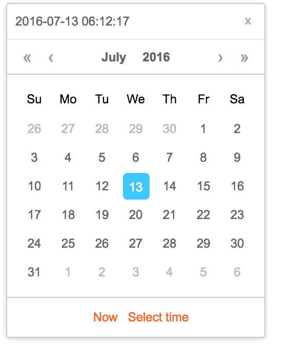
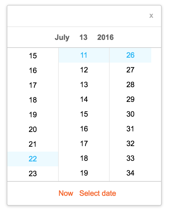
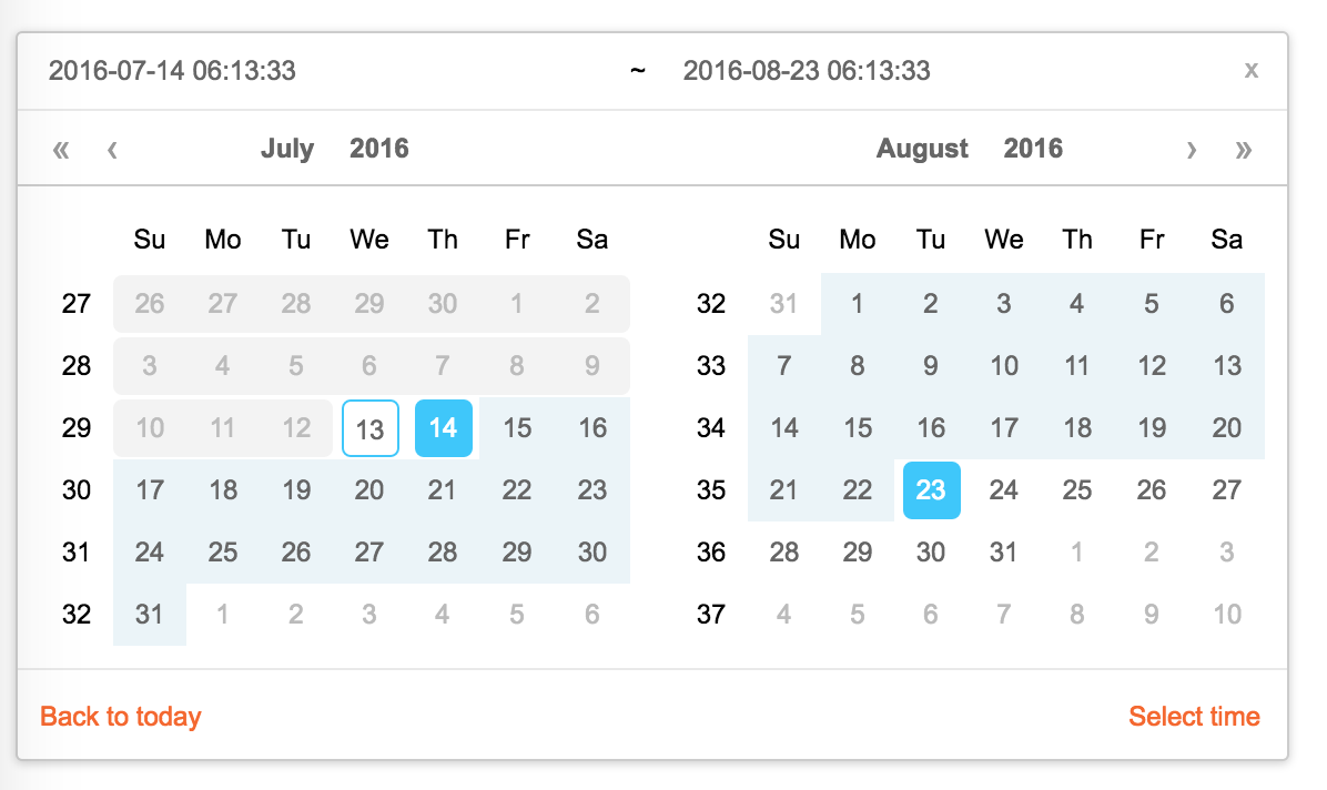
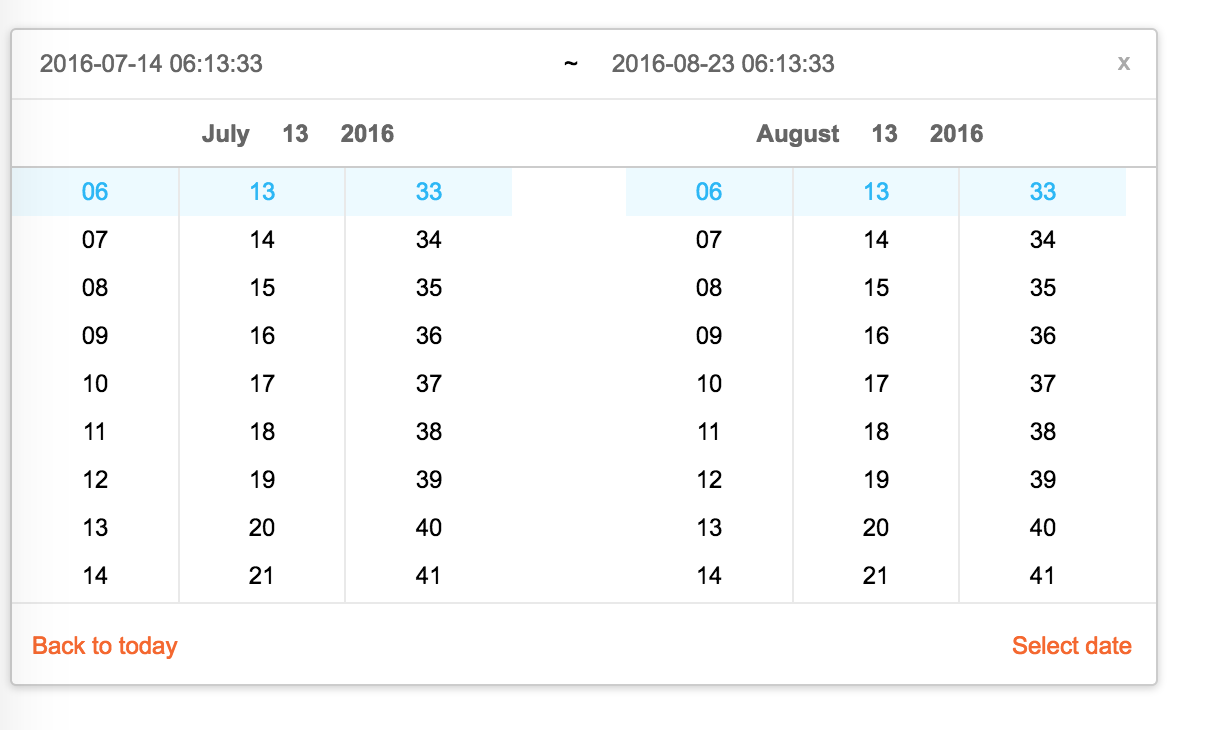
Screenshots
Feature
- support ie9,ie9+,chrome,firefox,safari
- support date, month, year, decade select panel
- support week number
- support en_US and zh_CN locale(UI), use moment.utcOffset to set timezone
- support aria and keyboard accessibility
Keyboard
- Previous month (PageUp)
- Next month (PageDown)
- tab into hour input: Last hour(Up), Next hour(Down)
- tab into hour input: Last minute(Up), Next minute(Down)
- tab into hour input: Last second(Up), Next second(Down)
- Last year (Control + left)
- Next year (Control + right)
install

Usage
import Calendar from 'rc-calendar';
import React from 'react';
import ReactDOM from 'react-dom';
ReactDOM.render(<Calendar />, container);
Development
npm install
npm start
Example
http://localhost:8002/examples/
online example:
http://react-component.github.io/calendar/examples/index.html
API
rc-calendar props
| name | type | default | description |
|---|---|---|---|
| prefixCls | String | prefixCls of this component | |
| className | String | additional css class of root dom node | |
| style | Object | additional style of root dom node | |
| dateRender | (current, value) => React.Node | date cell | |
| renderSidebar | () => React.Node | side bar | |
| renderFooter | (mode) => React.Node | extra footer | |
| value | moment | current value like input's value | |
| defaultValue | moment | defaultValue like input's defaultValue | |
| locale | Object | import from 'rc-calendar/lib/locale/en_US' | calendar locale |
| format | String | String[] | depends on whether you set timePicker and your locale | use to format/parse date(without time) value to/from input. When an array is provided, all values are used for parsing and first value for display. |
| disabledDate | Function(current:moment):Boolean | whether to disable select of current date | |
| disabledTime | Function(current:moment):Object | a function which return a object with member of disabledHours/disabledMinutes/disabledSeconds according to rc-time-picker | |
| showDateInput | Boolean | true | whether to show input on top of calendar panel |
| showWeekNumber | Boolean | false | whether to show week number of year |
| showToday | Boolean | true | whether to show today button |
| showOk | Boolean | auto | whether has ok button in footer |
| timePicker | React Element | rc-timer-picker/lib/module/panel element | |
| onSelect | Function(date: moment) | called when a date is selected from calendar | |
| onClear | Function() | called when a date is cleared from calendar | |
| onChange | Function(date: moment) | called when a date is changed inside calendar (next year/next month/keyboard) | |
| onOk | Function(date: moment) | called when ok button is pressed, only if it's visible | |
| dateInputPlaceholder | String | date input's placeholder | |
| mode | enum('time', 'date', 'month', 'year', 'decade') | 'date' | control which kind of panel should be shown |
| onPanelChange | Function(date: moment, mode) | called when panel changed | |
| clearIcon | ReactNode | specific the clear icon. | |
| inputMode | string | text | Change the keyboard in mobile device |
rc-calendar/lib/RangeCalendar props
| name | type | default | description |
|---|---|---|---|
| prefixCls | String | prefixCls of this component | |
| className | String | additional css class of root dom node | |
| style | Object | additional style of root dom node | |
| renderSidebar | () => React.Node | side bar | |
| renderFooter | () => React.Node | extra footer | |
| selectedValue | moment[] | current selected value range. with two elements. | |
| defaultSelectedValue | moment[] | default selected value range | |
| locale | Object | import from 'rc-calendar/lib/locale/en_US' | calendar locale |
| format | String | depends on whether you set timePicker and your locale | use to format/parse date(without time) value to/from input |
| disabledDate | Function(current:moment):Boolean | whether to disable select of current date | |
| showWeekNumber | Boolean | false | whether to show week number of year |
| showToday | Boolean | true | whether to show today button |
| showOk | Boolean | auto | whether has ok button in footer |
| showClear | Boolean | false | whether has clear button in header |
| timePicker | React Element | rc-timer-picker/lib/module/panel element | |
| onSelect | Function(date: moment[]) | called when a date range is selected from calendar | |
| onInputSelect | Function(date: moment[]) | called when a valid date entered in input | |
| onClear | Function() | called when a date range is cleared from calendar | |
| onChange | Function(date: moment[]) | called when a date range is changed inside calendar (next year/next month/keyboard) | |
| onOk | Function(date: moment) | called when ok button is pressed, only if it's visible | |
| dateInputPlaceholder | String[] | range date input's placeholders | |
| disabledTime | Function(current: moment[], type:'start'|'end'):Object | a function which return a object with member of disabledHours/disabledMinutes/disabledSeconds according to rc-time-picker | |
| showDateInput | Boolean | true | whether to show date inputs on top of calendar panels |
| type | enum('both','start', 'end') | both | whether fix start or end selected value. check start-end-range example |
| mode | enum('date', 'month', 'year', 'decade')[] | ['date', 'date'] | control which kind of panels should be shown |
| onPanelChange | Function(date: moment[], mode) | called when panels changed | |
| hoverValue | moment[] | control hover value | |
| onHoverChange | Function(hoverValue: moment[]) | called when hover value change | |
| clearIcon | ReactNode | specific the clear icon. |
rc-calendar/lib/MonthCalendar props
| name | type | default | description |
|---|---|---|---|
| prefixCls | String | prefixCls of this component | |
| className | String | additional css class of root dom node | |
| style | Object | additional style of root dom node | |
| value | moment | current value like input's value | |
| defaultValue | moment | defaultValue like input's defaultValue | |
| locale | Object | import from 'rc-calendar/lib/locale/en_US' | calendar locale |
| disabledDate | Function(current:moment):Boolean | whether to disable select of current month | |
| onSelect | Function(date: moment) | called when a date is selected from calendar | |
| monthCellRender | function | Custom month cell render method | |
| monthCellContentRender | function | Custom month cell content render method,the content will be appended to the cell. | |
| onChange | Function(date: moment) | called when a date is changed inside calendar (next year/next month/keyboard) | |
| renderFooter | () => React.Node | extra footer |
rc-calendar/lib/Picker props
| name | type | default | description |
|---|---|---|---|
| prefixCls | String | prefixCls of this component | |
| calendar | Calendar React Element | ||
| disabled | Boolean | whether picker is disabled | |
| placement | String|Object | one of ['left','right','top','bottom', 'topLeft', 'topRight', 'bottomLeft', 'bottomRight'] | |
| align | Object: alignConfig of [dom-align](https://github.com/yiminghe/dom-align) | value will be merged into placement's align config. | |
| animation | String | index.css support 'slide-up' | |
| transitionName | String | css class for animation | |
| value | moment|moment[] | current value like input's value | |
| defaultValue | moment|moment[] | defaultValue like input's defaultValue | |
| onChange | Function | called when select a different value | |
| onOpenChange | (open:boolean) => void | called when open/close picker | |
| open | Boolean | current open state of picker. controlled prop | |
| getCalendarContainer | () => HTMLElement | () => {return document.body;} | dom node where calendar to be rendered into |
| dropdownClassName | string | additional className applied to dropdown |
rc-calendar/lib/FullCalendar props
| name | type | default | description |
|---|---|---|---|
| prefixCls | String | prefixCls of this component | |
| Select | React Component Class | rc-select Component Class | |
| value | moment | current value like input's value | |
| defaultValue | moment | defaultValue like input's defaultValue | |
| defaultType | string | date | default panel type: date/month |
| type | string | panel type: date/month | |
| onTypeChange | function(type) | called when panel type change | |
| fullscreen | bool | false | |
| monthCellRender | function | Custom month cell render method | |
| dateCellRender | function | Custom date cell render method | |
| monthCellContentRender | function | Custom month cell content render method,the content will be appended to the cell. | |
| dateCellContentRender | function | Custom date cell content render method,the content will be appended to the cell. | |
| onSelect | Function(date: moment) | called when a date is selected from calendar |
Test Case
npm test
Coverage
npm run coverage
open coverage/ dir
License
rc-calendar is released under the MIT license.
Top Related Projects
An enterprise-class UI design language and React UI library
An easily internationalizable, mobile-friendly datepicker library for the web
Ultimate calendar for your React app.
Full-sized drag & drop event calendar in JavaScript
gcal/outlook like calendar component
An elegant calendar and datepicker plugin for Vue.
Convert designs to code with AI
Introducing Visual Copilot: A new AI model to turn Figma designs to high quality code using your components.
Try Visual Copilot