
Top Related Projects

Full-sized drag & drop event calendar in JavaScript

An easily internationalizable, mobile-friendly datepicker library for the web

React Calendar

gcal/outlook like calendar component

React Native Calendar Components 🗓️ 📆
Quick Overview
React-Calendar is a flexible and customizable calendar component for React applications. It provides a simple way to render calendars, select dates, and manage date-related interactions in React projects.
Pros
- Highly customizable with various props and styling options
- Supports multiple calendar views (month, year, decade, century)
- Lightweight and easy to integrate into existing React projects
- Actively maintained with regular updates and bug fixes
Cons
- Limited built-in internationalization support
- Styling can be complex for advanced customizations
- Lacks some advanced features like event management out of the box
- Documentation could be more comprehensive for complex use cases
Code Examples
- Basic calendar rendering:
import React from 'react';
import Calendar from 'react-calendar';

function MyApp() {
  return (
    <div>
      <Calendar />
    </div>
  );
}
- Calendar with date selection:
import React, { useState } from 'react';
import Calendar from 'react-calendar';

function MyApp() {
  const [date, setDate] = useState(new Date());

  return (
    <div>
      <Calendar onChange={setDate} value={date} />
      <p>Selected date: {date.toDateString()}</p>
    </div>
  );
}
- Custom styling example:
import React from 'react';
import Calendar from 'react-calendar';

function MyApp() {
  return (
    <div>
      <Calendar
        tileClassName={({ date, view }) =>
          view === 'month' && date.getDay() === 0 ? 'sunday' : null
        }
      />
    </div>
  );
}
Getting Started
-
Install the package:
npm install react-calendar -
Import and use the Calendar component in your React application:
import React from 'react'; import Calendar from 'react-calendar'; import 'react-calendar/dist/Calendar.css'; function MyApp() { return ( <div> <h1>My Calendar App</h1> <Calendar /> </div> ); } export default MyApp; -
Customize the calendar as needed using props and styling options.
Competitor Comparisons
Full-sized drag & drop event calendar in JavaScript
Pros of FullCalendar
- More feature-rich with advanced functionality like drag-and-drop events, recurring events, and multiple views (month, week, day)
- Supports various data sources and integrations (Google Calendar, JSON feeds)
- Extensive documentation and community support
Cons of FullCalendar
- Steeper learning curve due to its complexity
- Larger bundle size, which may impact performance for simpler use cases
- Requires a commercial license for certain features and use cases
Code Comparison
React-Calendar basic usage:
import Calendar from 'react-calendar';

function MyApp() {
  return <Calendar />;
}
FullCalendar basic usage:
import FullCalendar from '@fullcalendar/react';
import dayGridPlugin from '@fullcalendar/daygrid';

function MyCalendar() {
  return <FullCalendar plugins={[dayGridPlugin]} initialView="dayGridMonth" />;
}
React-Calendar is simpler to implement for basic calendar needs, while FullCalendar requires more setup but offers greater customization and features out of the box.
An easily internationalizable, mobile-friendly datepicker library for the web
Pros of react-dates
- More comprehensive date range selection functionality
- Extensive customization options for appearance and behavior
- Better support for internationalization and localization
Cons of react-dates
- Larger bundle size and more dependencies
- Steeper learning curve due to more complex API
- Less frequent updates and maintenance
Code Comparison
react-dates:
import { DateRangePicker } from 'react-dates';

<DateRangePicker
  startDate={this.state.startDate}
  startDateId="start_date_id"
  endDate={this.state.endDate}
  endDateId="end_date_id"
  onDatesChange={({ startDate, endDate }) => this.setState({ startDate, endDate })}
  focusedInput={this.state.focusedInput}
  onFocusChange={focusedInput => this.setState({ focusedInput })}
/>
react-calendar:
import Calendar from 'react-calendar';

<Calendar
  onChange={this.onChange}
  value={this.state.date}
/>
react-calendar offers a simpler API and lighter weight solution for basic calendar functionality, while react-dates provides more advanced features for date range selection and customization. react-calendar is easier to implement for simple use cases, but react-dates offers more flexibility for complex date-picking requirements.
React Calendar
Pros of react-component/calendar
- More customizable with extensive API and theming options
- Supports range selection and multiple date selection
- Offers additional features like time picker and decade panel
Cons of react-component/calendar
- Steeper learning curve due to more complex API
- Larger bundle size due to additional features
- Less frequent updates and maintenance
Code Comparison
react-component/calendar:
import Calendar from 'rc-calendar';

<Calendar
  showWeekNumber
  locale={enUS}
  defaultValue={now}
  showToday
  showOk
/>
react-calendar:
import Calendar from 'react-calendar';

<Calendar
  onChange={onChange}
  value={date}
/>
react-component/calendar offers more configuration options out of the box, while react-calendar provides a simpler API for basic use cases. The former allows for more customization but requires more setup, while the latter is easier to implement quickly.
react-component/calendar is better suited for complex applications requiring advanced calendar functionality, whereas react-calendar is ideal for simpler implementations and projects prioritizing ease of use and smaller bundle size.
Both libraries have their strengths, and the choice between them depends on the specific requirements of your project, such as customization needs, performance considerations, and desired features.
gcal/outlook like calendar component
Pros of react-big-calendar
- More feature-rich, offering advanced functionalities like drag-and-drop event handling and customizable views (day, week, month, agenda)
- Better suited for complex calendar applications with multiple events and interactions
- Extensive documentation and examples for various use cases
Cons of react-big-calendar
- Steeper learning curve due to its complexity and numerous configuration options
- Larger bundle size, which may impact performance for simpler calendar needs
- Less frequent updates and maintenance compared to react-calendar
Code Comparison
react-big-calendar:
import { Calendar, momentLocalizer } from 'react-big-calendar'
import moment from 'moment'

const localizer = momentLocalizer(moment)

<Calendar
  localizer={localizer}
  events={myEventsList}
  startAccessor="start"
  endAccessor="end"
  style={{ height: 500 }}
/>
react-calendar:
import Calendar from 'react-calendar'

<Calendar
  onChange={onChange}
  value={date}
/>
react-big-calendar offers more customization and event handling out of the box, while react-calendar provides a simpler API for basic calendar functionality. The choice between the two depends on the specific requirements of your project, with react-big-calendar being more suitable for complex applications and react-calendar for simpler use cases.
React Native Calendar Components 🗓️ 📆
Pros of react-native-calendars
- Specifically designed for React Native, ensuring better compatibility with mobile apps
- Offers a wider range of customizable calendar components, including agenda and timeline views
- Provides more extensive theming options and styling flexibility
Cons of react-native-calendars
- Larger package size and potentially higher memory usage due to additional features
- Steeper learning curve for developers new to React Native or complex calendar implementations
- May require more setup and configuration for basic use cases
Code Comparison
react-native-calendars:
import {Calendar} from 'react-native-calendars';

<Calendar
  markedDates={{
    '2023-05-16': {selected: true, marked: true, selectedColor: 'blue'},
    '2023-05-17': {marked: true},
    '2023-05-18': {marked: true, dotColor: 'red', activeOpacity: 0}
  }}
/>
react-calendar:
import Calendar from 'react-calendar';

<Calendar
  onChange={onChange}
  value={date}
  tileClassName={({ date, view }) => {
    if (markedDates.find(x => x === date.toDateString())) {
      return 'highlight'
    }
  }}
/>
The code examples demonstrate the different approaches to marking dates and customizing appearance in each library. react-native-calendars uses a more declarative style with a markedDates prop, while react-calendar relies on callback functions for customization.
Convert  designs to code with AI

Introducing Visual Copilot: A new AI model to turn Figma designs to high quality code using your components.
Try Visual CopilotREADME


react-calendar
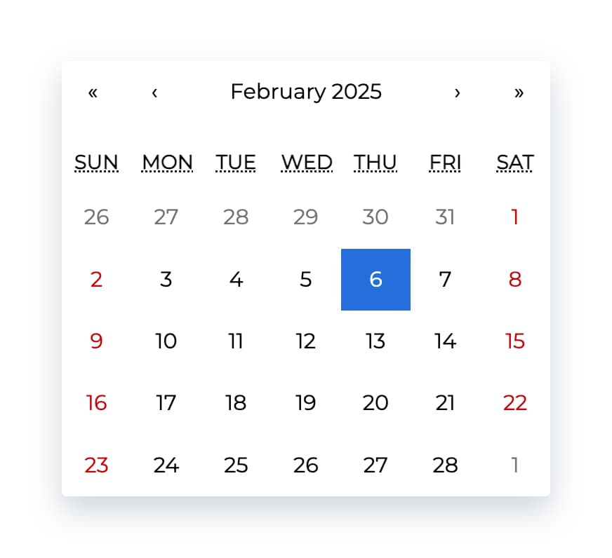
Ultimate calendar for your React app.
- Pick days, months, years, or even decades
- Supports range selection
- Supports virtually any language
- No moment.js needed
tl;dr
- Install by executing
npm install react-calendaroryarn add react-calendar. - Import by adding
import Calendar from 'react-calendar'. - Use by adding
<Calendar />. UseonChangeprop for getting new values.
Demo
A minimal demo page can be found in sample directory.
Online demo is also available!
Before you continue
react-calendar is under constant development. This documentation is written for react-calendar 4.x branch. If you want to see documentation for other versions of react-calendar, use dropdown on top of GitHub page to switch to an appropriate tag. Here are quick links to the newest docs from each branch:
Getting started
Compatibility
Your project needs to use React 16.8 or later.
react-calendar uses modern web technologies. That's why it's so fast, lightweight and easy to style. This, however, comes at a cost of supporting only modern browsers.
My locale isn't supported! What can I do?
If your locale isn't supported, you can use Intl.js or another Intl polyfill along with react-calendar.
Installation
Add react-calendar to your project by executing npm install react-calendar or yarn add react-calendar.
Usage
Here's an example of basic usage:
import { useState } from 'react';
import Calendar from 'react-calendar';

type ValuePiece = Date | null;

type Value = ValuePiece | [ValuePiece, ValuePiece];

function MyApp() {
  const [value, onChange] = useState<Value>(new Date());

  return (
    <div>
      <Calendar onChange={onChange} value={value} />
    </div>
  );
}
Check the sample directory in this repository for a full working example. For more examples and more advanced use cases, check Recipes in react-calendar Wiki.
Custom styling
If you want to use default react-calendar styling to build upon it, you can import react-calendar's styles by using:
import 'react-calendar/dist/Calendar.css';
User guide
Calendar
Displays a complete, interactive calendar.
Props
| Prop name | Description | Default value | Example values |
|---|---|---|---|
| activeStartDate | The beginning of a period that shall be displayed. If you wish to use react-calendar in an uncontrolled way, use defaultActiveStartDate instead. | (today) | new Date(2017, 0, 1) |
| allowPartialRange | Whether to call onChange with only partial result given selectRange prop. | false | true |
| calendarType | Type of calendar that should be used. Can be 'gregory, 'hebrew', 'islamic', 'iso8601'. Setting to "gregory" or "hebrew" will change the first day of the week to Sunday. Setting to "islamic" will change the first day of the week to Saturday. Setting to "islamic" or "hebrew" will make weekends appear on Friday to Saturday. | Type of calendar most commonly used in a given locale | 'iso8601' |
| className | Class name(s) that will be added along with "react-calendar" to the main react-calendar <div> element. | n/a |
|
| defaultActiveStartDate | The beginning of a period that shall be displayed by default. If you wish to use react-calendar in a controlled way, use activeStartDate instead. | (today) | new Date(2017, 0, 1) |
| defaultValue | Calendar value that shall be selected initially. Can be either one value or an array of two values. If you wish to use react-calendar in a controlled way, use value instead. | n/a |
|
| defaultView | Determines which calendar view shall be opened initially. Does not disable navigation. Can be "month", "year", "decade" or "century". If you wish to use react-calendar in a controlled way, use view instead. | The most detailed view allowed | "year" |
| formatDay | Function called to override default formatting of day tile labels. Can be used to use your own formatting function. | (default formatter) | (locale, date) => formatDate(date, 'd') |
| formatLongDate | Function called to override default formatting of day tile abbr labels. Can be used to use your own formatting function. | (default formatter) | (locale, date) => formatDate(date, 'dd MMM YYYY') |
| formatMonth | Function called to override default formatting of month names. Can be used to use your own formatting function. | (default formatter) | (locale, date) => formatDate(date, 'MMM') |
| formatMonthYear | Function called to override default formatting of months and years. Can be used to use your own formatting function. | (default formatter) | (locale, date) => formatDate(date, 'MMMM YYYY') |
| formatShortWeekday | Function called to override default formatting of weekday names (shortened). Can be used to use your own formatting function. | (default formatter) | (locale, date) => formatDate(date, 'dd') |
| formatWeekday | Function called to override default formatting of weekday names. Can be used to use your own formatting function. | (default formatter) | (locale, date) => formatDate(date, 'dd') |
| formatYear | Function called to override default formatting of year in the top navigation section. Can be used to use your own formatting function. | (default formatter) | (locale, date) => formatDate(date, 'YYYY') |
| goToRangeStartOnSelect | Whether to go to the beginning of the range when selecting the end of the range. | true | false |
| inputRef | A prop that behaves like ref, but it's passed to main <div> rendered by <Calendar> component. | n/a |
|
| locale | Locale that should be used by the calendar. Can be any IETF language tag. Note: When using SSR, setting this prop may help resolving hydration errors caused by locale mismatch between server and client. | Server locale/User's browser settings | "hu-HU" |
| maxDate | Maximum date that the user can select. Periods partially overlapped by maxDate will also be selectable, although react-calendar will ensure that no later date is selected. | n/a | Date: new Date() |
| maxDetail | The most detailed view that the user shall see. View defined here also becomes the one on which clicking an item will select a date and pass it to onChange. Can be "month", "year", "decade" or "century". | "month" | "year" |
| minDate | Minimum date that the user can select. Periods partially overlapped by minDate will also be selectable, although react-calendar will ensure that no earlier date is selected. | n/a | Date: new Date() |
| minDetail | The least detailed view that the user shall see. Can be "month", "year", "decade" or "century". | "century" | "decade" |
| navigationAriaLabel | aria-label attribute of a label rendered on calendar navigation bar. | n/a | "Go up" |
| navigationAriaLive | aria-live attribute of a label rendered on calendar navigation bar. | undefined | "polite" |
| navigationLabel | Content of a label rendered on calendar navigation bar. | (default label) | ({ date, label, locale, view }) => alert(`Current view: ${view}, date: ${date.toLocaleDateString(locale)}`) |
| next2AriaLabel | aria-label attribute of the "next on higher level" button on the navigation pane. | n/a | "Jump forwards" |
| next2Label | Content of the "next on higher level" button on the navigation pane. Setting the value explicitly to null will hide the icon. | "»" |
|
| nextAriaLabel | aria-label attribute of the "next" button on the navigation pane. | n/a | "Next" |
| nextLabel | Content of the "next" button on the navigation pane. Setting the value explicitly to null will hide the icon. | "âº" |
|
| onActiveStartDateChange | Function called when the user navigates from one view to another using previous/next button. Note that this function will not be called when e.g. drilling up from January 2021 to 2021 or drilling down the other way around.action signifies the reason for active start date change and can be one of the following values: "prev", "prev2", "next", "next2", "drillUp", "drillDown", "onChange". | n/a | ({ action, activeStartDate, value, view }) => alert('Changed view to: ', activeStartDate, view) |
| onChange | Function called when the user clicks an item (day on month view, month on year view and so on) on the most detailed view available. | n/a | (value, event) => alert('New date is: ', value) |
| onClickDay | Function called when the user clicks a day. | n/a | (value, event) => alert('Clicked day: ', value) |
| onClickDecade | Function called when the user clicks a decade. | n/a | (value, event) => alert('Clicked decade: ', value) |
| onClickMonth | Function called when the user clicks a month. | n/a | (value, event) => alert('Clicked month: ', value) |
| onClickWeekNumber | Function called when the user clicks a week number. | n/a | (weekNumber, date, event) => alert('Clicked week: ', weekNumber, 'that starts on: ', date) |
| onClickYear | Function called when the user clicks a year. | n/a | (value, event) => alert('Clicked year: ', value) |
| onDrillDown | Function called when the user drills down by clicking a tile. | n/a | ({ activeStartDate, view }) => alert('Drilled down to: ', activeStartDate, view) |
| onDrillUp | Function called when the user drills up by clicking drill up button. | n/a | ({ activeStartDate, view }) => alert('Drilled up to: ', activeStartDate, view) |
| onViewChange | Function called when the user navigates from one view to another using drill up button or by clicking a tile.action signifies the reason for view change and can be one of the following values: "prev", "prev2", "next", "next2", "drillUp", "drillDown", "onChange". | n/a | ({ action, activeStartDate, value, view }) => alert('New view is: ', view) |
| prev2AriaLabel | aria-label attribute of the "previous on higher level" button on the navigation pane. | n/a | "Jump backwards" |
| prev2Label | Content of the "previous on higher level" button on the navigation pane. Setting the value explicitly to null will hide the icon. | "«" |
|
| prevAriaLabel | aria-label attribute of the "previous" button on the navigation pane. | n/a | "Previous" |
| prevLabel | Content of the "previous" button on the navigation pane. Setting the value explicitly to null will hide the icon. | "â¹" |
|
| returnValue | Which dates shall be passed by the calendar to the onChange function and onClick{Period} functions. Can be "start", "end" or "range". The latter will cause an array with start and end values to be passed. | "start" | "range" |
| selectRange | Whether the user shall select two dates forming a range instead of just one. Note: This feature will make react-calendar return array with two dates regardless of returnValue setting. | false | true |
| showDoubleView | Whether to show two months/years/⦠at a time instead of one. Defaults showFixedNumberOfWeeks prop to be true. | false | true |
| showFixedNumberOfWeeks | Whether to always show fixed number of weeks (6). Forces showNeighboringMonth prop to be true. | false | true |
| showNavigation | Whether a navigation bar with arrows and title shall be rendered. | true | false |
| showNeighboringCentury | Whether decades from next century shall be rendered to fill the entire last row in. | false | true |
| showNeighboringDecade | Whether years from next decade shall be rendered to fill the entire last row in. | false | true |
| showNeighboringMonth | Whether days from previous or next month shall be rendered if the month doesn't start on the first day of the week or doesn't end on the last day of the week, respectively. | true | false |
| showWeekNumbers | Whether week numbers shall be shown at the left of MonthView or not. | false | true |
| tileClassName | Class name(s) that will be applied to a given calendar item (day on month view, month on year view and so on). | n/a |
|
| tileContent | Allows to render custom content within a given calendar item (day on month view, month on year view and so on). | n/a |
|
| tileDisabled | Pass a function to determine if a certain day should be displayed as disabled. | n/a | ({ activeStartDate, date, view }) => date.getDay() === 0 |
| value | Calendar value. Can be either one value or an array of two values. If you wish to use react-calendar in an uncontrolled way, use defaultValue instead. | n/a |
|
| view | Determines which calendar view shall be opened. Does not disable navigation. Can be "month", "year", "decade" or "century". If you wish to use react-calendar in an uncontrolled way, use defaultView instead. | The most detailed view allowed | "year" |
MonthView, YearView, DecadeView, CenturyView
Displays a given month, year, decade and a century, respectively.
Props
| Prop name | Description | Default value | Example values |
|---|---|---|---|
| activeStartDate | The beginning of a period that shall be displayed. | n/a | new Date(2017, 0, 1) |
| hover | The date over which the user is hovering. Used only when selectRange is enabled, to render a âWIPâ range when the user is selecting range. | n/a | new Date(2017, 0, 1) |
| maxDate | Maximum date that the user can select. Periods partially overlapped by maxDate will also be selectable, although react-calendar will ensure that no later date is selected. | n/a | Date: new Date() |
| minDate | Minimum date that the user can select. Periods partially overlapped by minDate will also be selectable, although react-calendar will ensure that no earlier date is selected. | n/a | Date: new Date() |
| onClick | Function called when the user clicks an item (day on month view, month on year view and so on). | n/a | (value) => alert('New date is: ', value) |
| tileClassName | Class name(s) that will be applied to a given calendar item (day on month view, month on year view and so on). | n/a |
|
| tileContent | Allows to render custom content within a given item (day on month view, month on year view and so on). Note: For tiles with custom content you might want to set fixed height of react-calendar__tile to ensure consistent layout. | n/a | ({ date, view }) => view === 'month' && date.getDay() === 0 ? <p>It's Sunday!</p> : null |
| value | Calendar value. Can be either one value or an array of two values. | n/a |
|
Useful links
License
The MIT License.
Author

|
Wojciech Maj |
Thank you
Sponsors
Thank you to all our sponsors! Become a sponsor and get your image on our README on GitHub.

Backers
Thank you to all our backers! Become a backer and get your image on our README on GitHub.

Top Contributors
Thank you to all our contributors that helped on this project!

Top Related Projects
Full-sized drag & drop event calendar in JavaScript
An easily internationalizable, mobile-friendly datepicker library for the web
React Calendar
gcal/outlook like calendar component
React Native Calendar Components 🗓️ 📆
Convert designs to code with AI
Introducing Visual Copilot: A new AI model to turn Figma designs to high quality code using your components.
Try Visual Copilot