 react-native-datepicker
react native datePicker component for both Android and IOS, useing DatePikcerAndroid, TimePickerAndroid and DatePickerIOS
Top Related Projects

React Native Date Picker is datetime picker for Android and iOS. It includes date, time and datetime picker modes. The datepicker is customizable and is supporting different languages. It's written with native code to achieve the best possible look, feel and performance.

React Native date & time picker component for iOS, Android and Windows

A React-Native datetime-picker for Android and iOS

React Native Calendar Components 🗓️ 📆
Quick Overview
The react-native-datepicker is a date picker component for React Native applications. It provides a customizable and feature-rich date picker UI that can be easily integrated into React Native projects.
Pros
- Customizable Appearance: The component allows for extensive customization of the date picker's appearance, including the color scheme, font styles, and layout.
- Cross-Platform Compatibility: The date picker works seamlessly on both iOS and Android platforms, ensuring a consistent user experience across different devices.
- Flexible Date Formats: The component supports a wide range of date formats, allowing developers to display dates in the desired format.
- Event Handling: The component provides various event handlers, such as
onDateChangeandonCloseModal, enabling developers to respond to user interactions with the date picker.
Cons
- Limited Localization: The component may have limited support for localization, which could be a concern for applications targeting a diverse user base.
- Dependency on Third-Party Libraries: The component relies on the
moment.jslibrary for date manipulation, which adds an additional dependency to the project. - Potential Performance Issues: Depending on the complexity of the application and the frequency of date picker usage, the component may have performance implications, especially on older or less powerful devices.
- Lack of Advanced Features: The component may not provide advanced features, such as date range selection or recurring event scheduling, which could be required for more complex date-related functionality.
Code Examples
Importing the DatePicker Component
import DatePicker from 'react-native-datepicker';
Basic Usage
<DatePicker
  date={this.state.date}
  mode="date"
  placeholder="select date"
  format="YYYY-MM-DD"
  minDate="2016-05-01"
  maxDate="2030-06-01"
  confirmBtnText="Confirm"
  cancelBtnText="Cancel"
  customStyles={{
    dateIcon: {
      position: 'absolute',
      left: 0,
      top: 4,
      marginLeft: 0
    },
    dateInput: {
      marginLeft: 36
    }
  }}
  onDateChange={(date) => {this.setState({date: date})}}
/>
Handling Date Format
<DatePicker
  date={this.state.date}
  mode="date"
  format="DD-MM-YYYY"
  confirmBtnText="Confirm"
  cancelBtnText="Cancel"
  onDateChange={(date) => {this.setState({date: date})}}
/>
Customizing the Date Picker Appearance
<DatePicker
  style={{width: 200}}
  date={this.state.date}
  mode="date"
  placeholder="select date"
  format="YYYY-MM-DD"
  minDate="2016-05-01"
  maxDate="2030-06-01"
  confirmBtnText="Confirm"
  cancelBtnText="Cancel"
  customStyles={{
    dateIcon: {
      position: 'absolute',
      left: 0,
      top: 4,
      marginLeft: 0
    },
    dateInput: {
      marginLeft: 36
    },
    placeholderText: {
      fontSize: 18,
      color: '#000'
    },
    dateText: {
      fontSize: 18
    }
  }}
  onDateChange={(date) => {this.setState({date: date})}}
/>
Getting Started
To use the react-native-datepicker component in your React Native project, follow these steps:
-
Install the package using npm or yarn:
npm install react-native-datepickeror
yarn add react-native-datepicker -
Import the
DatePickercomponent in your React Native file:import DatePicker from 'react-native-datepicker'; -
Use the
DatePickercomponent in your JSX code, passing in the necessary props:
Competitor Comparisons
React Native Date Picker is datetime picker for Android and iOS. It includes date, time and datetime picker modes. The datepicker is customizable and is supporting different languages. It's written with native code to achieve the best possible look, feel and performance.
Pros of react-native-date-picker
- Supports both iOS and Android platforms
- Provides a wide range of customization options for the date picker
- Includes support for localization and internationalization
Cons of react-native-date-picker
- May have a larger bundle size due to the number of features and customization options
- Requires more configuration and setup compared to a simpler date picker library
- May have a steeper learning curve for developers who are new to the library
Code Comparison
react-native-datepicker
<DatePicker
  style={{ width: 200 }}
  date={this.state.date}
  mode="date"
  placeholder="select date"
  format="YYYY-MM-DD"
  minDate="2016-05-01"
  maxDate="2016-06-01"
  confirmBtnText="Confirm"
  cancelBtnText="Cancel"
  customStyles={{
    dateIcon: {
      position: 'absolute',
      left: 0,
      top: 4,
      marginLeft: 0
    },
    dateInput: {
      marginLeft: 36
    }
  }}
  onDateChange={(date) => { this.setState({ date: date }); }}
/>
react-native-date-picker
<DatePicker
  date={this.state.date}
  onDateChange={(date) => this.setState({ date })}
  mode="date"
  minimumDate={new Date(2016, 0, 1)}
  maximumDate={new Date(2016, 5, 1)}
  locale="en"
  timeZoneOffsetInMinutes={0}
/>
React Native date & time picker component for iOS, Android and Windows
Pros of datetimepicker
- Native implementation for both iOS and Android, providing a more consistent and platform-specific user experience
- Actively maintained with regular updates and bug fixes
- Supports both date and time picking in a single component
Cons of datetimepicker
- Less customizable appearance compared to react-native-datepicker
- Requires additional setup for Android, including linking native modules
- Limited styling options for the picker interface
Code Comparison
react-native-datepicker:
<DatePicker
  style={{width: 200}}
  date={this.state.date}
  mode="date"
  placeholder="Select date"
  format="YYYY-MM-DD"
  minDate="2000-01-01"
  maxDate="2025-12-31"
  confirmBtnText="Confirm"
  cancelBtnText="Cancel"
  onDateChange={(date) => {this.setState({date: date})}}
/>
datetimepicker:
<DateTimePicker
  testID="dateTimePicker"
  value={date}
  mode="date"
  is24Hour={true}
  display="default"
  onChange={onChange}
/>
The code comparison shows that datetimepicker has a simpler API with fewer props, while react-native-datepicker offers more customization options out of the box. datetimepicker relies more on platform-specific implementations, which can lead to a more native feel but potentially less control over the appearance.
A React-Native datetime-picker for Android and iOS
Pros of react-native-modal-datetime-picker
- More modern and actively maintained
- Supports both iOS and Android with a consistent UI
- Offers a modal presentation, which is often preferred for better UX
Cons of react-native-modal-datetime-picker
- Requires additional setup for Android (need to link @react-native-community/datetimepicker)
- Less customizable in terms of appearance compared to react-native-datepicker
Code Comparison
react-native-modal-datetime-picker:
import DateTimePickerModal from "react-native-modal-datetime-picker";

<DateTimePickerModal
  isVisible={isDatePickerVisible}
  mode="date"
  onConfirm={handleConfirm}
  onCancel={hideDatePicker}
/>
react-native-datepicker:
import DatePicker from 'react-native-datepicker';

<DatePicker
  date={this.state.date}
  mode="date"
  placeholder="Select date"
  format="YYYY-MM-DD"
  onDateChange={(date) => {this.setState({date: date})}}
/>
The main difference in usage is that react-native-modal-datetime-picker uses a modal approach, while react-native-datepicker renders inline. react-native-modal-datetime-picker also separates the visibility control from the component itself, allowing for more flexible integration into your app's state management.
React Native Calendar Components 🗓️ 📆
Pros of react-native-calendars
- More comprehensive calendar functionality, including agenda views and multi-day selection
- Highly customizable with various themes and styling options
- Active development and maintenance with frequent updates
Cons of react-native-calendars
- Larger package size due to more features, potentially impacting app performance
- Steeper learning curve for basic date picking functionality
- May require more setup and configuration for simple use cases
Code Comparison
react-native-datepicker:
<DatePicker
  style={{width: 200}}
  date={this.state.date}
  mode="date"
  placeholder="Select date"
  format="YYYY-MM-DD"
  minDate="2000-01-01"
  maxDate="2030-12-31"
  confirmBtnText="Confirm"
  cancelBtnText="Cancel"
  onDateChange={(date) => {this.setState({date: date})}}
/>
react-native-calendars:
<Calendar
  onDayPress={(day) => {console.log('selected day', day)}}
  markedDates={{
    '2023-05-16': {selected: true, marked: true, selectedColor: 'blue'},
    '2023-05-17': {marked: true},
    '2023-05-18': {marked: true, dotColor: 'red', activeOpacity: 0}
  }}
/>
The code comparison shows that react-native-datepicker offers a simpler API for basic date picking, while react-native-calendars provides more advanced features like marking specific dates and customizing their appearance.
Convert  designs to code with AI

Introducing Visual Copilot: A new AI model to turn Figma designs to high quality code using your components.
Try Visual CopilotREADME
react-native-datepicker 


React Native DatePicker component for both Android and iOS, using DatePickerAndroid, TimePickerAndroid and DatePickerIOS
Install
npm install react-native-datepicker --save
Or using react-native-ui-xg, our react-naitve ui kit.
npm install react-native-ui-xg --save
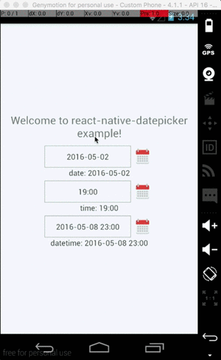
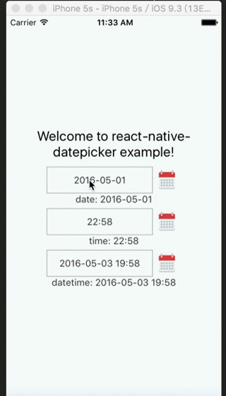
Example
Check index.android.js in the Example.
Usage
import React, { Component } from 'react'
import DatePicker from 'react-native-datepicker'

export default class MyDatePicker extends Component {
  constructor(props){
    super(props)
    this.state = {date:"2016-05-15"}
  }

  render(){
    return (
      <DatePicker
        style={{width: 200}}
        date={this.state.date}
        mode="date"
        placeholder="select date"
        format="YYYY-MM-DD"
        minDate="2016-05-01"
        maxDate="2016-06-01"
        confirmBtnText="Confirm"
        cancelBtnText="Cancel"
        customStyles={{
          dateIcon: {
            position: 'absolute',
            left: 0,
            top: 4,
            marginLeft: 0
          },
          dateInput: {
            marginLeft: 36
          }
          // ... You can check the source to find the other keys.
        }}
        onDateChange={(date) => {this.setState({date: date})}}
      />
    )
  }
}
You can check index.js in the Example for detail.
Properties
| Prop | Default | Type | Description |
|---|---|---|---|
| style | - | object | Specify the style of the DatePicker, eg. width, height... |
| date | - | string | date | Moment instance | Specify the display date of DatePicker. string type value must match the specified format |
| mode | 'date' | enum | The enum of date, datetime and time |
| androidMode | 'default' | enum | The enum of default, calendar and spinner (only Android) |
| format | 'YYYY-MM-DD' | string | Specify the display format of the date, which using moment.js. The default value change according to the mode. |
| confirmBtnText | 'ç¡®å®' | string | Specify the text of confirm btn in ios. |
| cancelBtnText | 'åæ¶' | string | Specify the text of cancel btn in ios. |
| iconSource | - | {uri: string} | number | Specify the icon. Same as the source of Image, always using require() |
| minDate | - | string | date | Restricts the range of possible date values. |
| maxDate | - | string | date | Restricts the range of possible date values. |
| duration | 300 | number | Specify the animation duration of datepicker. |
| customStyles | - | object | The hook of customize datepicker style, same as the native style. dateTouchBody, dateInput... |
| showIcon | true | boolean | Controller whether or not show the icon |
| hideText | false | boolean | Controller whether or not show the dateText |
| iconComponent | - | element | Set the custom icon |
| disabled | false | boolean | Controller whether or not disable the picker |
| is24Hour | - | boolean | Set the TimePicker is24Hour flag. The default value depend on format. Only work in Android |
| allowFontScaling | true | boolean | Set to false to disable font scaling for every text component |
| placeholder | '' | string | The placeholder show when this.props.date is falsy |
| onDateChange | - | function | This is called when the user confirm the picked date or time in the UI. The first and only argument is a date or time string representing the new date and time formatted by moment.js with the given format property. |
| onOpenModal | - | function | This is called when the DatePicker Modal open. |
| onCloseModal | - | function | This is called when the DatePicker Modal close |
| onPressMask | - | function | This is called when clicking the ios modal mask |
| modalOnResponderTerminationRequest | - | function | Set the callback for React Native's Gesture Responder System's call to onResponderTerminationRequest. By default this will reject a termination request, but can be overidden in case the View under the Modal is implementing custom gesture responders, and you wish for those to be overidden in certain cases. |
| TouchableComponent | TouchableHighlight | Component | Replace the TouchableHighlight with a custom Component. For example : TouchableOpacity |
| getDateStr | - | Function | A function to override how to format the date into a String for display, receives a Date instance |
Property customStyles available keys
- appearance:
dateInput,disabled,dateTouchBody,dateIcon,placeholderText,dateText - ios select panel:
datePickerCon,datePicker,btnConfirm,btnTextConfirm,btnCancel,btnTextCancel
Instance Methods
| Method | Params | Description |
|---|---|---|
| onPressDate | - | Manually open the date picker panel |
| onPressCancel | - | Manually close the date picker panel like, similarly pressing cancel btn |
Top Related Projects
React Native Date Picker is datetime picker for Android and iOS. It includes date, time and datetime picker modes. The datepicker is customizable and is supporting different languages. It's written with native code to achieve the best possible look, feel and performance.
React Native date & time picker component for iOS, Android and Windows
A React-Native datetime-picker for Android and iOS
React Native Calendar Components 🗓️ 📆
Convert designs to code with AI
Introducing Visual Copilot: A new AI model to turn Figma designs to high quality code using your components.
Try Visual Copilot