 CircularImageView
Custom view for circular images in Android while maintaining the best draw performance
Top Related Projects

A circular ImageView for Android

Custom shaped android imageview components

Create circular ImageView in Android in the simplest way possible

A library for supporting custom shaped ImageView(s) using SVGs and paint shapes

A fast ImageView that supports rounded corners, ovals, and circles.

Give a custom shape to any android view, Material Design 2 ready
Quick Overview
CircularImageView is an Android library that provides a custom ImageView for displaying circular images. It offers a simple and efficient way to create circular image views with optional border and shadow effects, making it easy to implement rounded profile pictures or circular image thumbnails in Android applications.
Pros
- Easy to implement and integrate into existing Android projects
- Supports various image loading libraries like Picasso and Glide
- Offers customizable border and shadow effects
- Efficient rendering with minimal impact on performance
Cons
- Limited to circular shape only, not suitable for other custom shapes
- May require additional configuration for optimal performance with large images
- Not actively maintained, with the last update being several years ago
- Lacks some advanced features found in newer image view libraries
Code Examples
- Basic usage:
<com.pkmmte.view.CircularImageView
    android:layout_width="250dp"
    android:layout_height="250dp"
    android:src="@drawable/profile_picture"
    app:border="true"
    app:border_color="#EEEEEE"
    app:border_width="4dp"
    app:shadow="true" />
- Programmatically setting properties:
CircularImageView circularImageView = findViewById(R.id.profile_image);
circularImageView.setBorderColor(getResources().getColor(R.color.border_color));
circularImageView.setBorderWidth(4);
circularImageView.setShadowRadius(10);
- Loading image with Picasso:
Picasso.get()
    .load("https://example.com/profile.jpg")
    .into(circularImageView);
Getting Started
- Add the dependency to your
build.gradlefile:
dependencies {
    implementation 'com.pkmmte.view:circularimageview:1.1'
}
- Add the CircularImageView to your layout XML:
<com.pkmmte.view.CircularImageView
    android:id="@+id/profile_image"
    android:layout_width="200dp"
    android:layout_height="200dp"
    android:src="@drawable/default_profile"
    app:border="true"
    app:border_color="#FFFFFF"
    app:border_width="2dp"
    app:shadow="true" />
- Use the CircularImageView in your Activity or Fragment:
CircularImageView profileImage = findViewById(R.id.profile_image);
profileImage.setImageResource(R.drawable.user_profile);
Competitor Comparisons
A circular ImageView for Android
Pros of CircleImageView
- More actively maintained with frequent updates
- Better performance, especially for large images
- Supports hardware acceleration
Cons of CircleImageView
- Lacks some advanced customization options
- Doesn't support oval shapes, only perfect circles
Code Comparison
CircleImageView:
<de.hdodenhof.circleimageview.CircleImageView
    android:layout_width="96dp"
    android:layout_height="96dp"
    android:src="@drawable/profile"
    app:civ_border_width="2dp"
    app:civ_border_color="#FF000000"/>
CircularImageView:
<com.pkmmte.view.CircularImageView
    android:layout_width="96dp"
    android:layout_height="96dp"
    android:src="@drawable/profile"
    app:border="true"
    app:border_color="#EEEEEE"
    app:border_width="4dp"
    app:shadow="true"/>
Both libraries provide similar functionality for creating circular image views in Android applications. CircleImageView is more actively maintained and offers better performance, especially for larger images. It also supports hardware acceleration, which can improve rendering speed.
On the other hand, CircularImageView provides more customization options, such as shadow effects and the ability to create oval shapes. However, it lacks some of the performance optimizations found in CircleImageView.
When choosing between the two, consider your specific requirements for customization and performance. If you need a simple, efficient circular image view, CircleImageView might be the better choice. For more advanced customization options, CircularImageView could be more suitable.
Custom shaped android imageview components
Pros of android-shape-imageview
- Supports multiple shape types (circle, rounded rectangle, etc.)
- Allows for custom shapes using SVG path strings
- Provides border and selector state functionality
Cons of android-shape-imageview
- Less actively maintained (last update in 2015)
- May have compatibility issues with newer Android versions
- Limited documentation and examples
Code Comparison
CircularImageView:
<com.pkmmte.view.CircularImageView
    android:layout_width="250dp"
    android:layout_height="250dp"
    android:src="@drawable/image"
    app:border="true"
    app:border_color="#EEEEEE"
    app:border_width="4dp"
    app:shadow="true" />
android-shape-imageview:
<com.github.siyamed.shapeimageview.CircularImageView
    android:layout_width="250dp"
    android:layout_height="250dp"
    android:src="@drawable/image"
    app:siBorderWidth="4dp"
    app:siBorderColor="#EEEEEE" />
Both libraries offer similar functionality for creating circular image views, but android-shape-imageview provides more shape options. CircularImageView has better maintenance and documentation, while android-shape-imageview offers more flexibility in shape customization. The code usage is similar, with minor differences in attribute naming conventions.
Create circular ImageView in Android in the simplest way possible
Pros of CircularImageView (lopspower)
- More recent and actively maintained (last update in 2023)
- Supports Kotlin and has better integration with modern Android development practices
- Offers additional features like border and shadow customization
Cons of CircularImageView (lopspower)
- Slightly larger library size compared to Pkmmte's version
- May have a steeper learning curve due to more customization options
Code Comparison
CircularImageView (Pkmmte):
<com.pkmmte.view.CircularImageView
    android:layout_width="250dp"
    android:layout_height="250dp"
    android:src="@drawable/image"
    app:border="true"
    app:border_color="#EEEEEE"
    app:border_width="4dp" />
CircularImageView (lopspower):
<com.mikhaellopez.circularimageview.CircularImageView
    android:layout_width="250dp"
    android:layout_height="250dp"
    android:src="@drawable/image"
    app:civ_border_color="#EEEEEE"
    app:civ_border_width="4dp"
    app:civ_shadow="true"
    app:civ_shadow_radius="10" />
The lopspower version offers additional attributes for customization, such as shadow properties, while maintaining a similar basic structure to the Pkmmte version.
A library for supporting custom shaped ImageView(s) using SVGs and paint shapes
Pros of CustomShapeImageView
- Supports multiple shape options (circle, rounded rectangle, star, etc.) beyond just circular images
- Allows for custom shape definitions using SVG path data
- Provides more flexibility in image presentation and design
Cons of CustomShapeImageView
- May have slightly higher performance overhead due to custom shape rendering
- Less focused on circular images specifically, which could mean less optimization for that use case
- Potentially more complex to use for simple circular image requirements
Code Comparison
CircularImageView:
<com.pkmmte.view.CircularImageView
    android:layout_width="250dp"
    android:layout_height="250dp"
    android:src="@drawable/image"
    app:border="true"
    app:border_color="#EEEEEE"
    app:border_width="4dp"
    app:shadow="true" />
CustomShapeImageView:
<com.meg7.widget.CustomShapeImageView
    android:layout_width="250dp"
    android:layout_height="250dp"
    android:src="@drawable/image"
    app:shape="circle"
    app:svg_raw_resource="@raw/custom_shape" />
Both libraries offer easy-to-use XML implementations for their respective image views. CircularImageView focuses on circular images with border and shadow options, while CustomShapeImageView provides more shape flexibility, including custom SVG shapes.
A fast ImageView that supports rounded corners, ovals, and circles.
Pros of RoundedImageView
- More flexible shape options, including rounded rectangles and ovals
- Supports border color and width customization
- Better performance due to optimized rendering techniques
Cons of RoundedImageView
- Slightly more complex API compared to CircularImageView
- May require more setup for simple circular images
Code Comparison
CircularImageView:
<com.pkmmte.view.CircularImageView
    android:layout_width="250dp"
    android:layout_height="250dp"
    android:src="@drawable/image"
    app:border="true"
    app:border_color="#EEEEEE"
    app:border_width="4dp" />
RoundedImageView:
<com.makeramen.roundedimageview.RoundedImageView
    android:layout_width="250dp"
    android:layout_height="250dp"
    android:src="@drawable/image"
    app:riv_corner_radius="125dp"
    app:riv_border_width="4dp"
    app:riv_border_color="#EEEEEE"
    app:riv_oval="true" />
Both libraries offer similar functionality for creating circular images, but RoundedImageView provides more shape options and customization. CircularImageView has a simpler API for basic circular images. The code comparison shows that RoundedImageView requires slightly more attributes to achieve the same circular effect as CircularImageView.
Give a custom shape to any android view, Material Design 2 ready
Pros of ShapeOfView
- Offers a wider variety of shape options beyond just circular images
- Supports custom shapes through path definitions
- Can be applied to any View, not limited to ImageView
Cons of ShapeOfView
- May have a higher performance overhead due to its flexibility
- Requires more complex setup for simple circular images
- Less specialized for image-specific optimizations
Code Comparison
ShapeOfView:
<com.github.florent37.shapeofview.shapes.CircleView
    android:layout_width="150dp"
    android:layout_height="150dp">
    <ImageView
        android:layout_width="match_parent"
        android:layout_height="match_parent"
        android:src="@drawable/your_image"/>
</com.github.florent37.shapeofview.shapes.CircleView>
CircularImageView:
<com.pkmmte.view.CircularImageView
    android:layout_width="150dp"
    android:layout_height="150dp"
    android:src="@drawable/your_image"
    app:border="true"
    app:border_color="#EEEEEE"
    app:border_width="4dp"
    app:shadow="true" />
The code comparison shows that CircularImageView provides a more straightforward implementation for circular images with built-in border and shadow options, while ShapeOfView requires nesting views but offers more flexibility for various shapes.
Convert  designs to code with AI

Introducing Visual Copilot: A new AI model to turn Figma designs to high quality code using your components.
Try Visual CopilotREADME
CircularImageView
Custom view for circular images in Android while maintaining the best draw performance
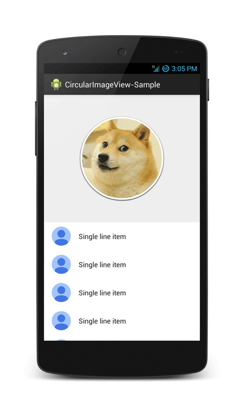
Usage
To make a circular ImageView, add this CircularImageView library to your project and add CircularImageView in your layout XML. You can also grab it via Gradle:
compile 'com.pkmmte.view:circularimageview:1.1'
or Maven:
<dependency>
		<groupId>com.pkmmte.view</groupId>
		<artifactId>circularimageview</artifactId>
		<version>1.1</version>
</dependency>
###XML
    <com.pkmmte.view.CircularImageView
        android:layout_width="250dp"
        android:layout_height="250dp"
        android:src="@drawable/image"
        app:border="true"
        app:border_color="#EEEEEE"
        app:border_width="4dp"
        app:shadow="true" />
You may use the following properties in your XML to customize your CircularImageView.
#####Properties:
app:border(boolean) -> default falseapp:border_color(color) -> default WHITEapp:border_width(dimension) -> default 2dpapp:selector(boolean) -> default falseapp:selector_color(color) -> default TRANSPARENTapp:selector_stroke_color(color) -> default BLUEapp:selector_stroke_width(dimension) -> default 2dpapp:shadow(boolean) -> default false
###JAVA
    CircularImageView circularImageView = (CircularImageView)findViewById(R.id.yourCircularImageView);
    circularImageView.setBorderColor(getResources().getColor(R.color.GrayLight));
    circularImageView.setBorderWidth(10);
    circularImageView.setSelectorColor(getResources().getColor(R.color.BlueLightTransparent));
    circularImageView.setSelectorStrokeColor(getResources().getColor(R.color.BlueDark));
    circularImageView.setSelectorStrokeWidth(10);
    circularImageView.addShadow();
Developed By
Pkmmte Xeleon - www.pkmmte.com
License
The MIT License (MIT)

Copyright (c) 2014 Pkmmte Xeleon

Permission is hereby granted, free of charge, to any person obtaining a copy
of this software and associated documentation files (the "Software"), to deal
in the Software without restriction, including without limitation the rights
to use, copy, modify, merge, publish, distribute, sublicense, and/or sell
copies of the Software, and to permit persons to whom the Software is
furnished to do so, subject to the following conditions:

The above copyright notice and this permission notice shall be included in
all copies or substantial portions of the Software.

THE SOFTWARE IS PROVIDED "AS IS", WITHOUT WARRANTY OF ANY KIND, EXPRESS OR
IMPLIED, INCLUDING BUT NOT LIMITED TO THE WARRANTIES OF MERCHANTABILITY,
FITNESS FOR A PARTICULAR PURPOSE AND NONINFRINGEMENT. IN NO EVENT SHALL THE
AUTHORS OR COPYRIGHT HOLDERS BE LIABLE FOR ANY CLAIM, DAMAGES OR OTHER
LIABILITY, WHETHER IN AN ACTION OF CONTRACT, TORT OR OTHERWISE, ARISING FROM,
OUT OF OR IN CONNECTION WITH THE SOFTWARE OR THE USE OR OTHER DEALINGS IN
THE SOFTWARE.
Based on a work at https://github.com/lopspower/CircularImageView.
Top Related Projects
A circular ImageView for Android
Custom shaped android imageview components
Create circular ImageView in Android in the simplest way possible
A library for supporting custom shaped ImageView(s) using SVGs and paint shapes
A fast ImageView that supports rounded corners, ovals, and circles.
Give a custom shape to any android view, Material Design 2 ready
Convert designs to code with AI
Introducing Visual Copilot: A new AI model to turn Figma designs to high quality code using your components.
Try Visual Copilot