
Top Related Projects

This is a library with components of Android L to you use in android 2.2

Implementation of Ripple effect from Material Design for Android API 9+

A library to bring fully animated Material Design components to pre-Lolipop Android.

Lollipop ViewAnimationUtils.createCircularReveal for everyone 4.0+

Android UI library.

😍 A beautiful, fluid, and extensible dialogs API for Kotlin & Android.
Quick Overview
Material Ripple is an Android library that provides a custom implementation of the Material Design ripple effect. It allows developers to add touch feedback animations to views in their Android applications, enhancing the user interface with smooth and responsive interactions.
Pros
- Easy integration with existing Android projects
- Customizable ripple effects (color, duration, fade-out)
- Supports both bounded and unbounded ripple animations
- Compatible with a wide range of Android versions
Cons
- May require additional performance optimization for complex layouts
- Limited documentation and examples
- Not actively maintained (last update was in 2018)
- Potential conflicts with native Android ripple implementations in newer versions
Code Examples
- Adding a ripple effect to a view:
val rippleView = MaterialRippleLayout(context)
rippleView.addView(yourView)
- Customizing ripple properties:
MaterialRippleLayout.on(yourView)
    .rippleColor(Color.parseColor("#FF0000"))
    .rippleAlpha(0.2f)
    .rippleDuration(350)
    .create()
- Creating an unbounded ripple effect:
MaterialRippleLayout.on(yourView)
    .rippleOverlay(true)
    .rippleHover(true)
    .rippleDelayClick(true)
    .create()
Getting Started
- Add the dependency to your
build.gradlefile:
dependencies {
    implementation 'com.balysv:material-ripple:1.0.2'
}
- Wrap your view with
MaterialRippleLayoutin XML:
<com.balysv.materialripple.MaterialRippleLayout
    android:layout_width="wrap_content"
    android:layout_height="wrap_content">

    <Button
        android:layout_width="wrap_content"
        android:layout_height="wrap_content"
        android:text="Click me" />

</com.balysv.materialripple.MaterialRippleLayout>
- Or create it programmatically in your Activity or Fragment:
val button = Button(this)
button.text = "Click me"

val rippleView = MaterialRippleLayout(this)
rippleView.addView(button)

layout.addView(rippleView)
Competitor Comparisons
This is a library with components of Android L to you use in android 2.2
Pros of MaterialDesignLibrary
- More comprehensive library with a wider range of Material Design components
- Includes custom views and widgets beyond just ripple effects
- Offers more customization options for various UI elements
Cons of MaterialDesignLibrary
- Larger library size, potentially increasing app size and complexity
- May have a steeper learning curve due to more features and options
- Less focused on specific ripple effects compared to material-ripple
Code Comparison
material-ripple:
RippleView rippleView = new RippleView(this);
rippleView.setRippleColor(Color.parseColor("#ff0000"));
rippleView.setRippleDuration(300);
MaterialDesignLibrary:
ButtonFlat buttonFlat = new ButtonFlat(this);
buttonFlat.setText("Flat Button");
buttonFlat.setBackgroundColor(Color.parseColor("#1E88E5"));
The code comparison shows that material-ripple focuses specifically on ripple effects, while MaterialDesignLibrary provides pre-built Material Design components with more built-in functionality.
MaterialDesignLibrary offers a broader range of UI elements and customization options, making it suitable for projects requiring extensive Material Design implementation. However, this comes at the cost of increased complexity and library size. material-ripple, on the other hand, is more lightweight and focused, making it ideal for projects that only need ripple effects without additional Material Design components.
Implementation of Ripple effect from Material Design for Android API 9+
Pros of RippleEffect
- More customization options for ripple color, duration, and fade-out effect
- Supports circular and rectangular ripple shapes
- Includes a demo app with various examples
Cons of RippleEffect
- Less actively maintained (last update in 2015)
- Requires more setup code for each view
- Limited compatibility with newer Android versions
Code Comparison
RippleEffect:
RippleView rippleView = (RippleView) findViewById(R.id.ripple);
rippleView.setRippleColor(Color.parseColor("#ff0000"));
rippleView.setRippleDuration(1000);
rippleView.setRippleAlpha(0.2f);
material-ripple:
View view = findViewById(R.id.view);
MaterialRippleLayout.on(view)
    .rippleColor(Color.parseColor("#ff0000"))
    .create();
Summary
RippleEffect offers more customization options and a variety of ripple shapes, but it's less maintained and requires more setup code. material-ripple provides a simpler implementation with better compatibility for newer Android versions, though it has fewer customization options. The choice between the two depends on the specific project requirements and the desired level of control over the ripple effect.
A library to bring fully animated Material Design components to pre-Lolipop Android.
Pros of Material
- More comprehensive library with a wider range of Material Design components
- Actively maintained with regular updates and bug fixes
- Extensive documentation and examples for easier implementation
Cons of Material
- Larger library size, potentially increasing app size and load times
- Steeper learning curve due to more complex API and features
- May require more setup and configuration for basic usage
Code Comparison
Material-Ripple:
RippleFrameLayout rippleView = new RippleFrameLayout(this);
rippleView.setRippleColor(Color.parseColor("#ff0000"));
rippleView.setRippleOverlay(true);
Material:
MaterialRippleLayout.on(view)
    .rippleColor(Color.parseColor("#ff0000"))
    .rippleAlpha(0.2f)
    .rippleHover(true)
    .create();
Both libraries provide ripple effects, but Material offers more customization options and a fluent API. Material-Ripple focuses solely on ripple effects, while Material provides a broader set of Material Design components and utilities.
Lollipop ViewAnimationUtils.createCircularReveal for everyone 4.0+
Pros of CircularReveal
- Focuses specifically on circular reveal animations, providing a more specialized and polished effect
- Offers compatibility with older Android versions (API 14+) through a custom implementation
- Includes additional features like circular hide animations and customizable durations
Cons of CircularReveal
- Limited to circular reveal animations, whereas Material Ripple offers a broader range of ripple effects
- May require more setup and configuration compared to the simpler implementation of Material Ripple
- Less actively maintained, with fewer recent updates and contributions
Code Comparison
CircularReveal:
ViewAnimationUtils.createCircularReveal(view, centerX, centerY, startRadius, endRadius)
    .setDuration(duration)
    .start();
Material Ripple:
RippleDrawable rippleDrawable = new RippleDrawable(ColorStateList.valueOf(Color.WHITE), null, null);
view.setBackground(rippleDrawable);
view.setOnTouchListener(new RippleOnTouchListener());
Both libraries offer unique approaches to material design animations. CircularReveal excels in creating polished circular reveal effects, while Material Ripple provides a more versatile solution for ripple animations across various UI elements. The choice between the two depends on the specific animation requirements and the desired level of customization for your Android application.
Android UI library.
Pros of android-ui
- Offers a wider range of UI components beyond just ripple effects
- Includes animations and transitions for a more comprehensive UI toolkit
- Provides custom views for enhanced user interface design
Cons of android-ui
- Less focused on material design ripple effects specifically
- May have a steeper learning curve due to its broader scope
- Potentially larger library size, which could impact app performance
Code Comparison
material-ripple:
RippleView rippleView = (RippleView) findViewById(R.id.ripple);
rippleView.setRippleColor(Color.parseColor("#ff0000"));
rippleView.setRippleDuration(1000);
android-ui:
RevealFrameLayout revealLayout = (RevealFrameLayout) findViewById(R.id.reveal_layout);
CircularRevealWidget revealWidget = new CircularRevealWidget(this);
revealLayout.addView(revealWidget);
revealWidget.reveal(centerX, centerY, startRadius, endRadius, duration);
Both libraries offer ways to enhance Android UI elements, but material-ripple focuses specifically on ripple effects, while android-ui provides a broader set of UI components and animations. The code examples show how material-ripple is more straightforward for implementing ripple effects, while android-ui offers more complex UI manipulations like reveal animations.
😍 A beautiful, fluid, and extensible dialogs API for Kotlin & Android.
Pros of material-dialogs
- More comprehensive library with a wider range of dialog types and customization options
- Active development and frequent updates
- Extensive documentation and community support
Cons of material-dialogs
- Larger library size, which may impact app size and performance
- Steeper learning curve due to more complex API
Code Comparison
material-ripple:
val rippleBackground = RippleBackground(context)
rippleBackground.startRippleAnimation()
material-dialogs:
MaterialDialog(this).show {
    title(R.string.dialog_title)
    message(R.string.dialog_message)
    positiveButton(R.string.agree)
    negativeButton(R.string.disagree)
}
Summary
material-dialogs offers a more comprehensive solution for implementing Material Design dialogs in Android applications, with a wide range of customization options and active development. However, it comes with a larger library size and potentially more complex implementation. material-ripple, on the other hand, focuses specifically on ripple animations, providing a simpler and more lightweight solution for this particular effect. The choice between the two depends on the specific needs of the project and the desired balance between functionality and simplicity.
Convert  designs to code with AI

Introducing Visual Copilot: A new AI model to turn Figma designs to high quality code using your components.
Try Visual CopilotREADME
â ï¸ The project is deprecated â ï¸
Any issues or pull requests will not be addressed. Please consider forking your own version if changes are needed.
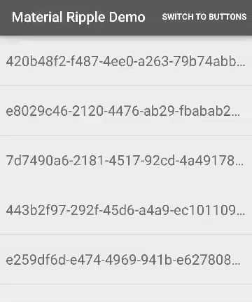
Material Ripple Layout
Ripple effect wrapper for Android Views
Including in your project
compile 'com.balysv:material-ripple:1.0.2'
Check for latest version number on the widget below or visit Releases
Usage
Use static initializer on your View (see xml attributes below for customization)
MaterialRippleLayout.on(view)
           .rippleColor(Color.BLACK)
           .create();
Or wrap your View with MaterialRippleLayout in your layout file:
<com.balysv.materialripple.MaterialRippleLayout
    android:id="@+id/ripple"
    android:layout_width="match_parent"
    android:layout_height="wrap_content">

    <Button
        android:layout_width="match_parent"
        android:layout_height="wrap_content"
        android:layout_gravity="center"
        android:text="Button inside a ripple"/>

</com.balysv.materialripple.MaterialRippleLayout>
If using in an AdapterView you must set rippleInAdapter to true
Configure using xml attributes or setters in code:
app:mrl_rippleOverlay="true"              // if true, ripple is drawn in foreground; false - background
app:mrl_rippleColor="#ff0000"             // color of ripple
app:mrl_rippleAlpha="0.1"                 // alpha of ripple
app:mrl_rippleDimension="10dp"            // radius of hover and starting ripple
app:mrl_rippleHover="true"                // if true, a hover effect is drawn when view is touched
app:mrl_rippleRoundedCorners="10dp"       // radius of corners of ripples. Note: it uses software rendering pipeline for API 17 and below
app:mrl_rippleInAdapter="true"            // if true, MaterialRippleLayout will optimize for use in AdapterViews
app:mrl_rippleDuration="350"              // duration of ripple animation
app:mrl_rippleFadeDuration="75"           // duration of fade out effect on ripple
app:mrl_rippleDelayClick="true"           // if true, delays calls to OnClickListeners until ripple effect ends
app:mrl_rippleBackground="#FFFFFF"        // background under ripple drawable; used with rippleOverlay="false"
app:mrl_ripplePersistent="true"           // if true, ripple background color persists after animation, until setRadius(0) is called
Set an OnClickListener to MaterialRippleLayout:
findViewById(R.id.ripple).setOnClickListener(new View.OnClickListener() {
    @Override public void onClick(View v) {
        // handle me
    }
});
Or if using in an AdapterView, simply use OnItemClickListener
Support for Android api versions < 14
For those unlucky developers that need to support older versions than 14, there's a way to do it.
You can use this library in addition with Jake Wharton's animation backport (http://nineoldandroids.com/) changing the imports from import android.animation.*; to: import com.nineoldandroids.animation.*; ,
import android.util.Property; to import com.nineoldandroids.util.Property; and in MaterialRippleLayout.java file, calling function shouldDelayChildPressedState() only if you're using api greater than 14.
Developed By
Balys Valentukevicius
License
Copyright 2015 Balys Valentukevicius

Licensed under the Apache License, Version 2.0 (the "License");
you may not use this file except in compliance with the License.
You may obtain a copy of the License at

   http://www.apache.org/licenses/LICENSE-2.0

Unless required by applicable law or agreed to in writing, software
distributed under the License is distributed on an "AS IS" BASIS,
WITHOUT WARRANTIES OR CONDITIONS OF ANY KIND, either express or implied.
See the License for the specific language governing permissions and
limitations under the License.
Top Related Projects
This is a library with components of Android L to you use in android 2.2
Implementation of Ripple effect from Material Design for Android API 9+
A library to bring fully animated Material Design components to pre-Lolipop Android.
Lollipop ViewAnimationUtils.createCircularReveal for everyone 4.0+
Android UI library.
😍 A beautiful, fluid, and extensible dialogs API for Kotlin & Android.
Convert designs to code with AI
Introducing Visual Copilot: A new AI model to turn Figma designs to high quality code using your components.
Try Visual Copilot