
Top Related Projects

A curated list of awesome Android UI/UX libraries

A Material Design ViewPager easy to use library

Implementation of Ripple effect from Material Design for Android API 9+

This is a library with components of Android L to you use in android 2.2

😍 A beautiful, fluid, and extensible dialogs API for Kotlin & Android.

You can easily add awesome animated context menu to your app.
Quick Overview
The markushi/android-ui repository is a collection of custom Android UI components and animations. It provides developers with ready-to-use, visually appealing UI elements that can enhance the user experience in Android applications. The project focuses on creating smooth, interactive, and customizable UI components.
Pros
- Offers unique and visually appealing UI components
- Provides smooth animations and transitions
- Easy to integrate into existing Android projects
- Customizable to fit various app designs and themes
Cons
- Limited documentation and usage examples
- Not actively maintained (last update was several years ago)
- May require additional effort to ensure compatibility with newer Android versions
- Limited number of components compared to more comprehensive UI libraries
Code Examples
- Adding a RevealColorView to your layout:
<com.github.markushi.ui.RevealColorView
    android:id="@+id/reveal"
    android:layout_width="match_parent"
    android:layout_height="match_parent" />
- Using the RevealColorView in your Activity:
RevealColorView revealColorView = findViewById(R.id.reveal);
revealColorView.reveal(centerX, centerY, color, startRadius, endRadius, duration);
- Implementing an ActionView:
ActionView actionView = findViewById(R.id.action);
actionView.setOnClickListener(new View.OnClickListener() {
    @Override
    public void onClick(View v) {
        actionView.setAction(ActionView.Action.BACK, true);
    }
});
Getting Started
To use the markushi/android-ui library in your Android project:
- Add the JitPack repository to your root build.gradle file:
allprojects {
    repositories {
        ...
        maven { url 'https://jitpack.io' }
    }
}
- Add the dependency to your app's build.gradle file:
dependencies {
    implementation 'com.github.markushi:android-ui:1.2'
}
- Sync your project with Gradle files, and you're ready to use the UI components in your layouts and activities.
Competitor Comparisons
A curated list of awesome Android UI/UX libraries
Pros of awesome-android-ui
- Comprehensive collection of UI libraries and components
- Regularly updated with new contributions from the community
- Categorized for easy navigation and discovery
Cons of awesome-android-ui
- Not a standalone library, requires additional implementation
- May include outdated or deprecated libraries
Code comparison
android-ui:
RevealFrameLayout revealFrameLayout = new RevealFrameLayout(this);
CircularRevealWidget revealWidget = new CircularRevealWidget(this);
revealFrameLayout.addView(revealWidget);
awesome-android-ui: (No direct code comparison available as it's a curated list, not a library)
Summary
android-ui is a specific UI library focusing on reveal animations, while awesome-android-ui is a curated list of various Android UI libraries and components. android-ui provides a more focused set of tools for specific animations, whereas awesome-android-ui offers a broader range of UI resources but requires additional implementation effort. The choice between the two depends on whether you need a specific animation library or want to explore a variety of UI options for your Android project.
A Material Design ViewPager easy to use library
Pros of MaterialViewPager
- Offers a more comprehensive Material Design implementation with ViewPager integration
- Provides smooth parallax effects and header animations out of the box
- Includes built-in support for multiple view types (RecyclerView, ScrollView, WebView)
Cons of MaterialViewPager
- May have a steeper learning curve due to its more complex implementation
- Could be considered "heavier" in terms of resource usage compared to android-ui
- Less flexibility for customizing individual UI components
Code Comparison
MaterialViewPager:
<com.github.florent37.materialviewpager.MaterialViewPager
    android:id="@+id/materialViewPager"
    android:layout_width="match_parent"
    android:layout_height="match_parent"
    app:viewpager_logo="@layout/header_logo"
    app:viewpager_logoMarginTop="100dp"
    app:viewpager_color="@color/colorPrimary"
    app:viewpager_headerHeight="200dp"
    app:viewpager_headerAlpha="1.0"
    app:viewpager_hideLogoWithFade="false"
    app:viewpager_hideToolbarAndTitle="true"
    app:viewpager_enableToolbarElevation="true"
    app:viewpager_parallaxHeaderFactor="1.5"
    app:viewpager_headerAdditionalHeight="20dp"
    app:viewpager_displayToolbarWhenSwipe="true"
    app:viewpager_transparentToolbar="true"
    app:viewpager_animatedHeaderImage="true"
    app:viewpager_disableToolbar="false"/>
android-ui:
<com.markushi.ui.CircleButton
    android:layout_width="64dip"
    android:layout_height="64dip"
    android:src="@drawable/ic_action_new"
    app:cb_color="#99CC00"
    app:cb_pressedRingWidth="8dip" />
Implementation of Ripple effect from Material Design for Android API 9+
Pros of RippleEffect
- Offers more customization options for ripple effects
- Supports a wider range of Android versions (API 9+)
- Provides smoother animations and better performance
Cons of RippleEffect
- Less actively maintained (last update in 2015)
- Limited to ripple effects, while android-ui offers more UI components
- May require more setup and configuration
Code Comparison
RippleEffect:
RippleView rippleView = (RippleView) findViewById(R.id.ripple);
rippleView.setRippleColor(Color.parseColor("#ff0000"));
rippleView.setRippleDuration(1000);
rippleView.setRippleAlpha(0.2f);
android-ui:
RevealColorView revealColorView = (RevealColorView) findViewById(R.id.reveal);
revealColorView.reveal(centerX, centerY, color, radius, duration);
Both libraries aim to enhance Android UI elements, but RippleEffect focuses specifically on ripple animations, while android-ui provides a broader set of UI components and effects. RippleEffect offers more customization for ripples, but android-ui is more actively maintained and provides a wider range of UI enhancements.
This is a library with components of Android L to you use in android 2.2
Pros of MaterialDesignLibrary
- More comprehensive set of Material Design components
- Includes custom views like FloatingActionButton and SnackBar
- Better documentation and usage examples
Cons of MaterialDesignLibrary
- Less actively maintained (last update was several years ago)
- May not be fully compatible with the latest Android versions
- Larger library size, potentially increasing app size
Code Comparison
MaterialDesignLibrary:
<com.gc.materialdesign.views.ButtonRectangle
    android:id="@+id/button"
    android:layout_width="wrap_content"
    android:layout_height="wrap_content"
    android:background="#1E88E5"
    android:text="Button" />
android-ui:
<com.markushi.ui.ActionView
    android:id="@+id/action"
    android:layout_width="56dp"
    android:layout_height="56dp"
    app:av_color="@android:color/white"
    app:av_action="drawer" />
MaterialDesignLibrary offers a wider range of pre-built Material Design components, making it easier to implement complex UI elements. However, android-ui focuses on specific UI components and animations, providing a more lightweight solution for developers who need only certain features.
While MaterialDesignLibrary hasn't been updated recently, android-ui has also seen limited activity. Developers should consider their specific needs and the potential trade-offs between feature set and maintenance when choosing between these libraries.
😍 A beautiful, fluid, and extensible dialogs API for Kotlin & Android.
Pros of material-dialogs
- More comprehensive and feature-rich library for creating Material Design dialogs
- Actively maintained with frequent updates and bug fixes
- Extensive documentation and community support
Cons of material-dialogs
- Larger library size, potentially increasing app size
- Steeper learning curve due to more complex API
Code Comparison
material-dialogs:
MaterialDialog(this).show {
    title(R.string.dialog_title)
    message(R.string.dialog_message)
    positiveButton(R.string.agree)
    negativeButton(R.string.disagree)
}
android-ui:
new AlertDialog.Builder(this)
    .setTitle(R.string.dialog_title)
    .setMessage(R.string.dialog_message)
    .setPositiveButton(R.string.agree, null)
    .setNegativeButton(R.string.disagree, null)
    .show();
Summary
material-dialogs offers a more comprehensive solution for creating Material Design dialogs in Android applications, with active maintenance and extensive features. However, it comes with a larger library size and potentially more complex API. android-ui, while simpler, may lack some advanced features and recent updates. The choice between the two depends on the specific project requirements and the developer's preference for simplicity versus feature richness.
You can easily add awesome animated context menu to your app.
Pros of Context-Menu.Android
- More focused on a specific UI component (context menu)
- Provides a visually appealing and animated context menu implementation
- Actively maintained with recent updates
Cons of Context-Menu.Android
- Limited to context menu functionality
- May require more setup and customization for specific use cases
Code Comparison
Context-Menu.Android:
MenuObject close = new MenuObject();
close.setResource(R.drawable.icn_close);
menuObjects.add(close);

MenuParams menuParams = new MenuParams();
menuParams.setActionBarSize((int) getResources().getDimension(R.dimen.tool_bar_height));
menuParams.setMenuObjects(menuObjects);
menuParams.setClosableOutside(false);
android-ui:
RevealFrameLayout revealFrameLayout = new RevealFrameLayout(this);
CircularRevealWidget revealWidget = new CircularRevealWidget(this);
revealFrameLayout.addView(revealWidget);
Additional Considerations
- android-ui offers a broader range of UI components and animations
- Context-Menu.Android provides a more polished and ready-to-use context menu solution
- android-ui may be better suited for developers looking for general-purpose UI utilities
- Context-Menu.Android is ideal for projects specifically requiring an enhanced context menu
Both libraries have their merits, and the choice between them depends on the specific requirements of your Android project.
Convert  designs to code with AI

Introducing Visual Copilot: A new AI model to turn Figma designs to high quality code using your components.
Try Visual CopilotREADME
Deprecated
This library is deprecated and no further development is taking place.
android-ui
Android library for UI components.
Gradle integration:
repositories {
    mavenCentral()
}

dependencies {
    compile 'com.github.markushi:android-ui:1.2'
}
Requires API level 14+
Download example apk
Components
ActionView

A widget which can dynamically animate between defined Actions.
<at.markushi.ui.ActionView
	android:id="@+id/action"
	android:layout_width="56dip"
	android:layout_height="56dip"
	android:padding="16dip"
	app:av_color="@android:color/white"
	app:av_action="drawer"/>
You can dynamically change the action with:
actionView.setAction(new BackAction(), ActionView.ROTATE_COUNTER_CLOCKWISE);
The following Actions are built in:
- DrawerAction
- BackAction
- CloseAction
- PlusAction
Please note: ActionView is still under development. The API might change at any time.
RevealColorView
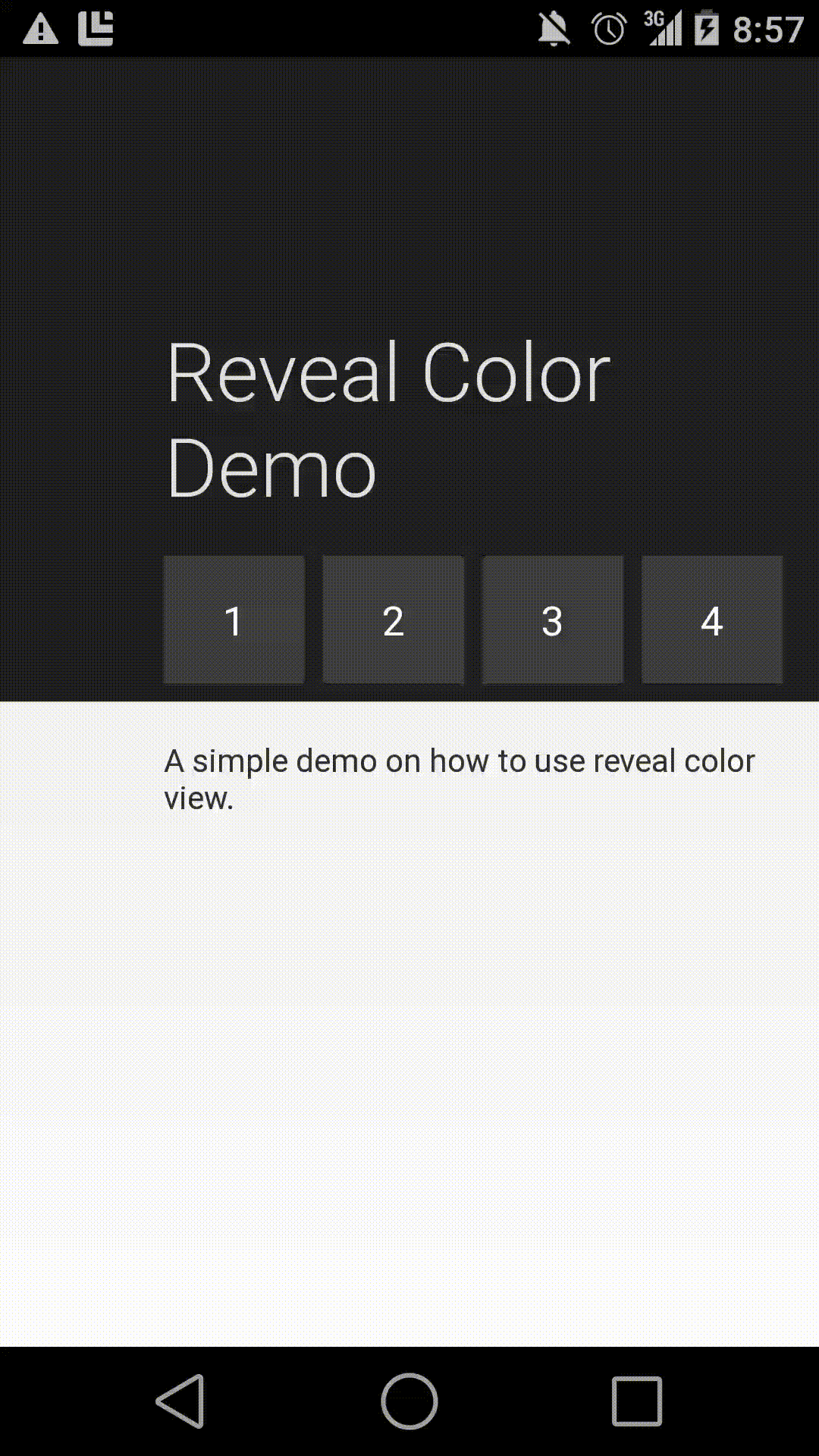
A component which mimics parts of the circular reveal/hide animation introduced in the Android-L preview.
Note: This is not a backport of the original reveal/hide effect.
See this example gist on how to use it.
Top Related Projects
A curated list of awesome Android UI/UX libraries
A Material Design ViewPager easy to use library
Implementation of Ripple effect from Material Design for Android API 9+
This is a library with components of Android L to you use in android 2.2
😍 A beautiful, fluid, and extensible dialogs API for Kotlin & Android.
You can easily add awesome animated context menu to your app.
Convert designs to code with AI
Introducing Visual Copilot: A new AI model to turn Figma designs to high quality code using your components.
Try Visual Copilot