 material-intro
A simple material design app intro with cool animations and a fluent API.
Top Related Projects

😍 A beautiful, fluid, and extensible dialogs API for Kotlin & Android.

A library to bring fully animated Material Design components to pre-Lolipop Android.

[deprecated] Animations for Android L drawer, back, dismiss and check icons

This is a library with components of Android L to you use in android 2.2

The flexible, easy to use, all in one drawer library for your Android project. Now brand new with material 2 design.
Quick Overview
The janheinrichmerker/material-intro repository is a simple and lightweight library for creating Material Design-inspired introductory screens for your Android applications. It provides a set of customizable UI components and animations to help you quickly and easily integrate an engaging onboarding experience into your app.
Pros
- Lightweight and Efficient: The library is designed to be lightweight and efficient, with a small footprint and minimal impact on your app's performance.
- Customizable UI: The library offers a range of customization options, allowing you to easily adjust the appearance and behavior of the introductory screens to match your app's branding and design.
- Smooth Animations: The library includes smooth and visually appealing animations to create a polished and engaging onboarding experience for your users.
- Easy Integration: The library is easy to integrate into your existing Android project, with clear documentation and sample code to help you get started quickly.
Cons
- Limited Functionality: While the library provides a solid foundation for creating introductory screens, it may not offer the full range of features and customization options that some developers might require for more complex onboarding experiences.
- Dependency on Material Design: The library is heavily focused on Material Design, which may not be the preferred design language for all Android apps.
- Potential Compatibility Issues: As with any third-party library, there is a risk of compatibility issues with certain Android versions or device configurations, which could require additional development effort to resolve.
- Lack of Active Maintenance: The repository appears to have limited recent activity, which could indicate a lack of ongoing maintenance and support for the library.
Code Examples
Since this is a UI library, there are no significant code examples to provide. The library is primarily used by integrating its UI components and configuring them within your Android app's layout and logic.
Getting Started
To get started with the janheinrichmerker/material-intro library, follow these steps:
- Add the library to your project's
build.gradlefile:
dependencies {
    implementation 'com.github.janheinrichmerker:material-intro:1.6.0'
}
- In your activity's layout file, add the
MaterialIntroViewcomponent:
<com.github.janheinrichmerker.materialintro.view.MaterialIntroView
    android:id="@+id/material_intro_view"
    android:layout_width="match_parent"
    android:layout_height="match_parent" />
- In your activity's Java/Kotlin code, configure and show the introductory screens:
val materialIntroView = findViewById<MaterialIntroView>(R.id.material_intro_view)
materialIntroView.setFullscreen(true)
materialIntroView.addSlide(SlideFragmentBuilder()
    .backgroundColor(R.color.colorPrimary)
    .buttonsColor(R.color.colorAccent)
    .image(R.drawable.your_image)
    .title("Welcome to your app!")
    .description("This is the first introductory screen.")
    .build())
materialIntroView.show()
This example demonstrates how to add a single introductory slide to the MaterialIntroView. You can add more slides and customize the appearance and behavior of the introductory screens using the provided API.
Competitor Comparisons
😍 A beautiful, fluid, and extensible dialogs API for Kotlin & Android.
Pros of material-dialogs
- Provides a wide range of customizable dialog types, including alert, progress, and input dialogs.
- Supports Material Design guidelines and provides a consistent user interface.
- Offers a simple and intuitive API for integrating dialogs into your Android app.
Cons of material-dialogs
- May have a larger footprint in your app due to the extensive feature set.
- Requires more configuration and setup compared to a simpler dialog library like material-intro.
- May not be the best choice for simple, one-off dialog use cases.
Code Comparison
material-intro:
MaterialIntroView.Builder(this)
    .enableDotAnimation(true)
    .enableIcon(false)
    .setFocusGravity(FocusGravity.CENTER)
    .setInfoText("This is an example of Material Intro.")
    .setTarget(view)
    .setUsageId("intro_card") // THIS SHOULD BE UNIQUE ID
    .show()
material-dialogs:
MaterialDialog(this)
    .title(text = "Hello, World!")
    .message(text = "This is a simple material dialog.")
    .positiveButton(text = "OK")
    .show()
A library to bring fully animated Material Design components to pre-Lolipop Android.
Pros of Material
- Larger Community: Material has a larger community and more contributors, which can lead to faster development and better support.
- More Features: Material offers a wider range of components and features compared to Material-Intro, providing more flexibility and options for developers.
- Active Development: Material appears to have more recent commits and a more active development team, suggesting ongoing improvements and bug fixes.
Cons of Material
- Steeper Learning Curve: The larger feature set and more complex codebase of Material may make it more challenging for beginners to get started, compared to the simpler and more focused Material-Intro.
- Potential Performance Impact: The additional features and complexity of Material may result in a larger bundle size and potential performance impact, which could be a concern for some projects.
- Compatibility: Material may have more dependencies and compatibility requirements, which could make it more difficult to integrate into certain projects or environments.
Code Comparison
Material-Intro:
import React from 'react';
import { View, Text, StyleSheet } from 'react-native';

const MaterialIntro = () => {
  return (
    <View style={styles.container}>
      <Text style={styles.title}>Material-Intro</Text>
    </View>
  );
};

const styles = StyleSheet.create({
  container: {
    flex: 1,
    justifyContent: 'center',
    alignItems: 'center',
  },
  title: {
    fontSize: 24,
    fontWeight: 'bold',
  },
});

export default MaterialIntro;
Material:
import React from 'react';
import { View, Text, StyleSheet } from 'react-native';
import { Button, Card, Divider } from 'react-native-material-ui';

const MaterialExample = () => {
  return (
    <View style={styles.container}>
      <Card style={styles.card}>
        <Text style={styles.title}>Material Example</Text>
        <Divider />
        <Button primary text="Click me" />
      </Card>
    </View>
  );
};

const styles = StyleSheet.create({
  container: {
    flex: 1,
    justifyContent: 'center',
    alignItems: 'center',
  },
  card: {
    padding: 16,
  },
  title: {
    fontSize: 18,
    fontWeight: 'bold',
    marginBottom: 8,
  },
});

export default MaterialExample;
[deprecated] Animations for Android L drawer, back, dismiss and check icons
Pros of Material Menu
- Customizable Animations: Material Menu provides a variety of animation options, allowing you to create unique and visually appealing menu interactions.
- Responsive Design: The library is designed to be responsive, ensuring a consistent user experience across different screen sizes and devices.
- Lightweight: Material Menu is a lightweight library, adding minimal overhead to your project's file size and performance.
Cons of Material Menu
- Limited Functionality: Compared to Material Intro, Material Menu has a more focused scope, providing only menu-related functionality. This may be a limitation if you require a more comprehensive set of UI components.
- Fewer Contributors: Material Menu has a smaller community and fewer contributors compared to Material Intro, which may impact the availability of support and updates.
Code Comparison
Material Intro:
MaterialIntroView materialIntroView = new MaterialIntroView(this)
    .setFadeAnimation()
    .setPageNavigationOptions(PageNavigationOptions.Companion.withoutIndicator())
    .addSlide(new SlideFragmentBuilder()
        .backgroundColor(R.color.colorPrimary)
        .buttonsColor(R.color.colorAccent)
        .image(R.drawable.ic_android)
        .title("Welcome to Material Intro")
        .description("This is a sample slide")
        .build());
Material Menu:
MaterialMenu materialMenu = new MaterialMenu.Builder(this)
    .addMenuItem(new MaterialMenuItem.Builder()
        .setIcon(R.drawable.ic_home)
        .setTitle("Home")
        .setOnClickListener(v -> {
            // Handle home menu item click
        })
        .build())
    .build();
This is a library with components of Android L to you use in android 2.2
Pros of MaterialDesignLibrary
- Provides a wider range of Material Design components and widgets, including buttons, cards, dialogs, and more.
- Includes support for Android 4.0 and above, making it compatible with a broader range of devices.
- Offers more customization options for the Material Design elements.
Cons of MaterialDesignLibrary
- The project appears to be less actively maintained, with the last commit being over a year ago.
- The documentation and examples may not be as comprehensive as those provided by material-intro.
- The library may have a larger footprint in terms of file size and dependencies.
Code Comparison
material-intro
SplashActivity.java
public class SplashActivity extends AppCompatActivity {

    @Override
    protected void onCreate(Bundle savedInstanceState) {
        super.onCreate(savedInstanceState);
        setContentView(R.layout.activity_splash);
    }
}
MaterialDesignLibrary
RippleView.java
public class RippleView extends FrameLayout {

    private int rippleColor = Color.parseColor("#FFFFFF");
    private int rippleDuration = 400;
    private int rippleAlpha = 255;
    private int rippleScale = 6;

    public RippleView(Context context) {
        super(context);
    }
}
The flexible, easy to use, all in one drawer library for your Android project. Now brand new with material 2 design.
Pros of MaterialDrawer
- Extensive documentation and examples, making it easier to integrate and customize.
- Supports a wide range of features, including nested drawers, badges, and custom header layouts.
- Actively maintained with regular updates and bug fixes.
Cons of MaterialDrawer
- Larger codebase and dependency footprint compared to material-intro.
- May have a steeper learning curve for simple use cases.
- Potential performance impact for larger or more complex drawer implementations.
Code Comparison
material-intro:
MaterialIntroView.Builder(this)
    .enableDotAnimation(true)
    .enableIcon(false)
    .setFocusGravity(FocusGravity.CENTER)
    .setInfoText("This is an example of Material Intro.")
    .setTarget(view)
    .setUsageId("intro_card") // THIS SHOULD BE UNIQUE ID
    .show();
MaterialDrawer:
new DrawerBuilder()
    .withActivity(this)
    .withToolbar(toolbar)
    .addDrawerItems(
        new PrimaryDrawerItem().withName("Home"),
        new PrimaryDrawerItem().withName("Settings")
    )
    .build();
Convert  designs to code with AI

Introducing Visual Copilot: A new AI model to turn Figma designs to high quality code using your components.
Try Visual CopilotREADME

material-intro


A simple material design app intro with cool animations and a fluent API.
Very inspired by Google's app intros.
Demo:
A demo app is available on Google Play:
Screenshots:
| Simple slide | Custom slide | Fade effect | Permission request |
|---|---|---|---|
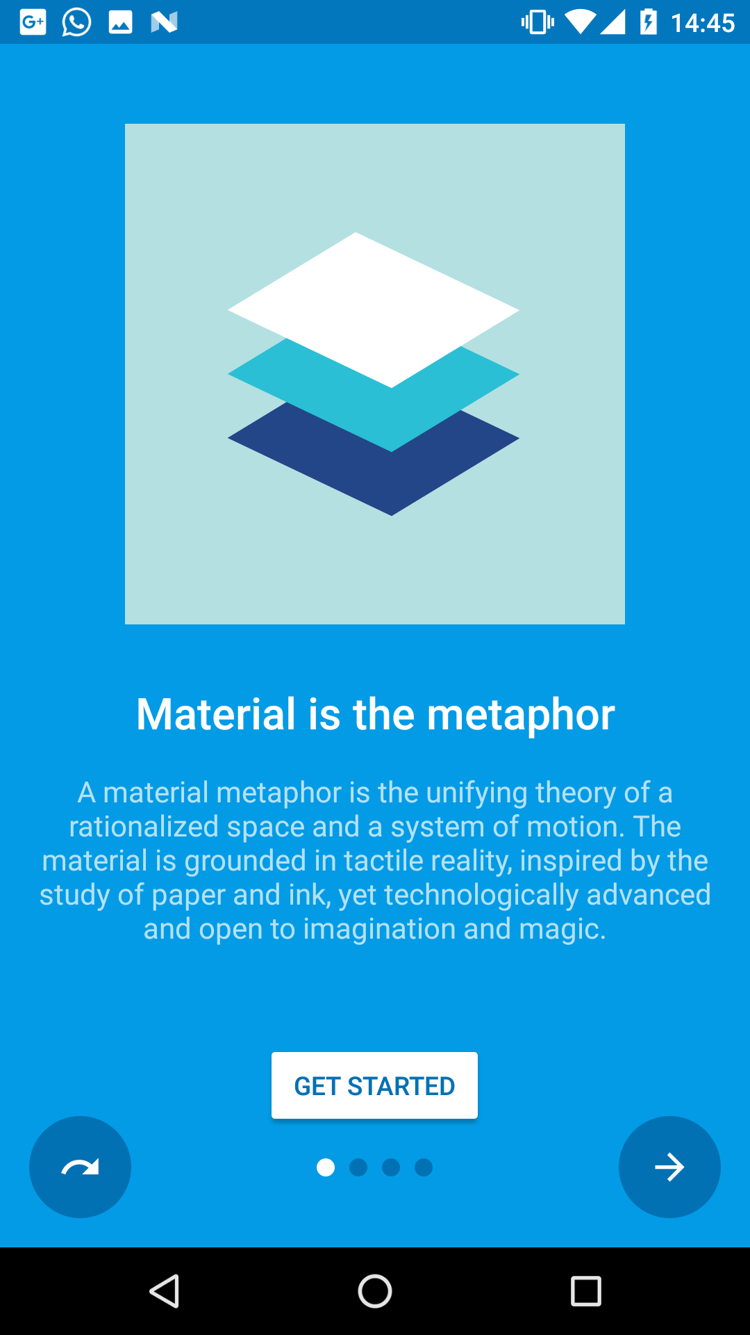 |  |  |  |
SimpleSlide.java | FragmentSlide.java | IntroActivity.java | SimpleSlide.java |
Features:
- Material design (check the docs)
- Easy customization
- Predefined slide layouts
- Custom slides
- Autoplay
- Parallax slides
- Fluent API
Table of Contents
- Setup
- Slides
- Customization
- Navigation
- Tips & Tricks
- Apps using this library
- Changes
- Open-source libraries
- License
Setup:
Gradle Dependency:
material-intro is available on jitpack.io.
Add this in your root build.gradle file (not your module build.gradle file):
allprojects {
    repositories {
        maven { url 'https://jitpack.io' }
    }
}
Add this in your module build.gradle file:

dependencies {
    implementation 'com.heinrichreimersoftware:material-intro:x.y.z'
}
Requirements:
The activity must extend IntroActivity and have a theme extending @style/Theme.Intro:
public class MainIntroActivity extends IntroActivity {
    @Override
    protected void onCreate(Bundle savedInstanceState) {
        super.onCreate(savedInstanceState);
	    // Add slides, edit configuration...
    }
}
<manifest ...>
    <application ...>
        <activity
            android:name=".MainIntroActivity"
            android:theme="@style/Theme.Intro"/>
    </application>
</manifest>
(Unless mentioned otherwise, all of the following method calls should go in the Activity's onCreate().)
Slides:
material-intro has fluent style builders for both a simple text/image slide, as seen in Google's apps, and for slides featuring a custom Fragment or layout resource.
Feel free to submit an issue or pull request if you think any slide types are missing.
Standard slide (SimpleSlide):
Standard slide featuring a title, short description and image like Google's intros.
addSlide(new SimpleSlide.Builder()
        .title(R.string.title_1)
        .description(R.string.description_1)
        .image(R.drawable.image_1)
        .background(R.color.background_1)
        .backgroundDark(R.color.background_dark_1)
        .scrollable(false)
        .permission(Manifest.permission.CAMERA)
        .build());
Fragment slide (FragmentSlide):
Custom slide containing a Fragment or a layout resource.
addSlide(new FragmentSlide.Builder()
        .background(R.color.background_2)
        .backgroundDark(R.color.background_dark_2)
        .fragment(R.layout.fragment_2, R.style.FragmentTheme)
        .build());
(When using FragmentSlide with a Fragment, you should extend SlideFragment to proxy navigation calls to the intro activity.)
Custom slide (Slide):
Base slide. If you want to modify what's shown in your slide this is the way to go.
Customization:
Left ("back") button:
Control left button behavior or hide/show it.
/* Show/hide button */
setButtonBackVisible(true);
/* Use skip button behavior */
setButtonBackFunction(BUTTON_BACK_FUNCTION_SKIP);
/* Use back button behavior */
setButtonBackFunction(BUTTON_BACK_FUNCTION_BACK);
Right ("next") button:
Control right button behavior or hide/show it.
/* Show/hide button */
setButtonNextVisible(true);
/* Use next and finish button behavior */
setButtonNextFunction(BUTTON_NEXT_FUNCTION_NEXT_FINISH);
/* Use next button behavior */
setButtonNextFunction(BUTTON_NEXT_FUNCTION_NEXT);
CTA button:
Change the appearance of the "call to action" button:
/* Show/hide button */
setButtonCtaVisible(getStartedEnabled);
/* Tint button text */
setButtonCtaTintMode(BUTTON_CTA_TINT_MODE_TEXT);
/* Tint button background */
setButtonCtaTintMode(BUTTON_CTA_TINT_MODE_BACKGROUND);
/* Set custom CTA label */
setButtonCtaLabel(R.string.start)
/**/
setButtonCtaClickListener(new View.OnClickListener() {

});
Fullscreen:
Display the intro activity at fullscreen. This hides the status bar.
public class MainIntroActivity extends IntroActivity{
    @Override protected void onCreate(Bundle savedInstanceState){
        setFullscreen(true);
        super.onCreate(savedInstanceState);
	...
    }
}
Make sure to call setFullscreen() before calling super.onCreate()
Scroll duration:
Adjust how long a single slide scroll takes.
setPageScrollDuration(500);
(The page scroll duration is dynamically adapted when scrolling more than one position to reflect dynamic durations from the Material design docs.
The exact formula for calculating the scroll duration is duration * (distance + sqrt(distance)) / 2.)
Navigation:
Block navigation:
There are three ways to block navigation for a slide:
- In a
SlideFragment(using aFragmentSlide) by overridingcanGoForward()/canGoBackward()methods. - For a
SimpleSlideby settingSimpleSlide.Builder#canGoForward(boolean)/SimpleSlide.Builder#canGoBackward(boolean). (If at least one permission is set to theSimpleSlide, navigation is automatically blocked until every permission is granted.) - From your
IntroActivityby setting aNavigationPolicy:setNavigationPolicy(new NavigationPolicy() { @Override public boolean canGoForward(int position) { return true; } @Override public boolean canGoBackward(int position) { return false; } });
Navigate to slides
Navigate through the intro manually using one of the following methods e.g. from a listeners callback. Each of them will respect blocked navigation settings.
/* Scroll to any position */
goToSlide(5);

/* Scroll to the next slide in the intro */
nextSlide();

/* Scroll to the previous slide in the intro */
previousSlide();

/* Scroll to the last slide of the intro */
goToLastSlide();

/* Scroll to the first slide of the intro */
goToFirstSlide();
Autoplay
Automatically scroll through the intro until user interacts with the intro.
/* Start an auto slideshow with 2500ms delay between scrolls and infinite repeats */
autoplay(2500, INFINITE);
/* Start an auto slideshow with default configuration  */
autoplay();
/* Cancel the slideshow */
cancelAutoplay()
Callbacks
If any of the above returns false when a user tries to navigate to a slide, a OnNavigationBlockedListener callback is fired that you can use to display a message. Additionally you can add plain-old ViewPager.OnPageChangeListeners to listen for page scrolls:
addOnNavigationBlockedListener(new OnNavigationBlockedListener() {
    @Override public void onNavigationBlocked(int position, int direction) { ... }
});

addOnPageChangeListener(new ViewPager.OnPageChangeListener(){
    @Override public void onPageScrolled(int position, float positionOffset, int positionOffsetPixels) { ... }
    @Override public void onPageSelected(int position) { ... }
    @Override public void onPageScrollStateChanged(int state) { ... }
});
Tips & Tricks:
Activity result:
You can check if the user canceled the intro (by pressing back) or finished it including all slides.
Just call up the activity using startActivityForResult(intent, REQUEST_CODE_INTRO); and then listen for the result:
@Override
protected void onActivityResult(int requestCode, int resultCode, Intent data) {
    super.onActivityResult(requestCode, resultCode, data);
    if (requestCode == REQUEST_CODE_INTRO) {
        if (resultCode == RESULT_OK) {
            // Finished the intro
        } else {
            // Cancelled the intro. You can then e.g. finish this activity too.
            finish();
	}
    }
}
Parallax slides:
You can easily achieve a nice looking parallax effect for any slide by using either ParallaxFrameLayout.java, ParallaxLinearLayout.java or ParallaxRelativeLayout.java and defining layout_parallaxFactor for its direct childrens.
A higher factor means a stronger parallax effect, 0 means no parallax effect at all.
<com.heinrichreimersoftware.materialintro.view.parallax.ParallaxLinearLayout
    android:layout_width="match_parent"
    android:layout_height="match_parent"
    ... >

    <TextView
        android:layout_width="match_parent"
        android:layout_height="wrap_content"
        app:layout_parallaxFactor="0"
        ... />

    <ImageView
        android:layout_width="match_parent"
        android:layout_height="wrap_content"
        app:layout_parallaxFactor="1.25"
        ... />

</com.heinrichreimersoftware.materialintro.view.parallax.ParallaxLinearLayout>
Check the "Canteen"-demo for a layout example.
Splash screens:
If you want to show the intro only at the first app start you can use onActivityResult() to store a shared preference when the user finished the intro.
See the demo app for a sample splash screen implementation:
- SplashActivity.java: A fake splash screen
- SplashIntroActivity.java: The intro started from FinishActivity
- FinishActivity.java: The activity started after the splash screen
Apps using this library:
- Simply Unroot by @pinpong
- Prodigal Music Player by @SpongeBobSun
- Puff Password Utility by @SpongeBobSun
- QualityGate by @FrontEndART
- Monitor by @daniel-stoneuk
- Contact Lenses Time by @ste23droid
- Antidote Danmark by @AntidoteDanmark
- Speed Boost Lite by @tjmille2
- Root Checker by @joeykrim
Changes:
See the releases section for changelogs.
Open-source libraries:
material-intro uses the following open-source files:
- CheatSheet.java by @Roman Nurik (Apache License 2.0)
- AnimUtils.java by @Nick Butcher (Apache License 2.0), modified version
- InkPageIndicator.java by @Nick Butcher (Apache License 2.0)
License:
MIT License

Copyright (c) 2017 Jan Heinrich Reimer

Permission is hereby granted, free of charge, to any person obtaining a copy
of this software and associated documentation files (the "Software"), to deal
in the Software without restriction, including without limitation the rights
to use, copy, modify, merge, publish, distribute, sublicense, and/or sell
copies of the Software, and to permit persons to whom the Software is
furnished to do so, subject to the following conditions:

The above copyright notice and this permission notice shall be included in all
copies or substantial portions of the Software.

THE SOFTWARE IS PROVIDED "AS IS", WITHOUT WARRANTY OF ANY KIND, EXPRESS OR
IMPLIED, INCLUDING BUT NOT LIMITED TO THE WARRANTIES OF MERCHANTABILITY,
FITNESS FOR A PARTICULAR PURPOSE AND NONINFRINGEMENT. IN NO EVENT SHALL THE
AUTHORS OR COPYRIGHT HOLDERS BE LIABLE FOR ANY CLAIM, DAMAGES OR OTHER
LIABILITY, WHETHER IN AN ACTION OF CONTRACT, TORT OR OTHERWISE, ARISING FROM,
OUT OF OR IN CONNECTION WITH THE SOFTWARE OR THE USE OR OTHER DEALINGS IN THE
SOFTWARE.
Top Related Projects
😍 A beautiful, fluid, and extensible dialogs API for Kotlin & Android.
A library to bring fully animated Material Design components to pre-Lolipop Android.
[deprecated] Animations for Android L drawer, back, dismiss and check icons
This is a library with components of Android L to you use in android 2.2
The flexible, easy to use, all in one drawer library for your Android project. Now brand new with material 2 design.
Convert designs to code with AI
Introducing Visual Copilot: A new AI model to turn Figma designs to high quality code using your components.
Try Visual Copilot