
Top Related Projects

A simple library to add carousel view in android app.

:octocat: 📃 FoldingCell is an expanding content cell with animation made by @Ramotion
:octocat: PaperOnboarding is a material design UI slider. Swift UI library by @Ramotion
:octocat: PreviewTransition is a simple preview gallery UI controller with animated tranisitions. Swift UI library made by @Ramotion
:octocat: ExpandingCollection is an animated material design UI card peek/pop controller. iOS library made by @Ramotion
Quick Overview
The ViewPagerCards project is a custom Android ViewPager implementation that allows for the creation of card-like layouts within a ViewPager. It provides a flexible and customizable way to display a collection of cards in a swipeable, carousel-like interface.
Pros
- Flexible Layout: The project allows for the creation of custom card layouts, enabling developers to tailor the appearance and behavior of the cards to their specific needs.
- Smooth Swiping: The ViewPager implementation provides a smooth and responsive swiping experience, making it easy for users to navigate through the collection of cards.
- Customizable Behavior: The project offers various configuration options, such as the ability to set the card elevation, spacing, and other visual properties, allowing developers to fine-tune the appearance and behavior of the cards.
- Lightweight: The project is relatively lightweight and does not introduce a significant overhead to the application, making it suitable for a wide range of use cases.
Cons
- Limited Documentation: The project's documentation could be more comprehensive, which may make it challenging for new users to get started and understand the full capabilities of the library.
- Dependency on ViewPager: The project is tightly coupled with the Android ViewPager, which may limit its flexibility in certain scenarios where a different paging mechanism is preferred.
- Potential Performance Issues: Depending on the complexity of the card layouts and the number of cards displayed, the project may encounter performance issues, especially on older or less powerful devices.
- Lack of Active Maintenance: The project appears to have limited active maintenance, with the last commit being over a year old at the time of this review. This may raise concerns about the long-term viability and support for the library.
Code Examples
// Create a ViewPagerCards instance
val viewPagerCards = ViewPagerCards(context)

// Set the adapter for the ViewPagerCards
viewPagerCards.adapter = MyCardAdapter()

// Configure the ViewPagerCards
viewPagerCards.setCardElevation(8f)
viewPagerCards.setCardSpacing(16)
viewPagerCards.setCardWidth(300)
This code demonstrates how to create a ViewPagerCards instance, set the adapter, and configure various properties of the cards, such as the elevation, spacing, and width.
// Implement a custom card adapter
class MyCardAdapter : ViewPagerCardsAdapter<MyCardViewHolder>() {
    override fun onCreateViewHolder(parent: ViewGroup, viewType: Int): MyCardViewHolder {
        val view = LayoutInflater.from(parent.context).inflate(R.layout.item_card, parent, false)
        return MyCardViewHolder(view)
    }

    override fun onBindViewHolder(holder: MyCardViewHolder, position: Int) {
        // Bind data to the card view
        holder.bind(data[position])
    }

    override fun getItemCount(): Int {
        return data.size
    }
}
This code demonstrates how to implement a custom ViewPagerCardsAdapter by creating a MyCardAdapter class. The adapter is responsible for creating and binding the card views to the data.
// Implement a custom card view holder
class MyCardViewHolder(itemView: View) : ViewPagerCardsViewHolder(itemView) {
    private val titleTextView: TextView = itemView.findViewById(R.id.title_text_view)
    private val descriptionTextView: TextView = itemView.findViewById(R.id.description_text_view)

    fun bind(item: CardItem) {
        titleTextView.text = item.title
        descriptionTextView.text = item.description
    }
}
This code demonstrates how to implement a custom ViewPagerCardsViewHolder by creating a MyCardViewHolder class. The view holder is responsible for binding the data to the card view's UI elements.
Getting Started
To use the ViewPagerCards project in your Android application, follow these steps:
- Add the library to your project's
build.gradlefile:
dependencies {
    implementation 'com.github.rubensousa:ViewPagerCards:1.1.0'
}
- Create a
ViewPagerCardsinstance
Competitor Comparisons
A simple library to add carousel view in android app.
Pros of CarouselView
- Customizable Indicators: CarouselView provides a built-in indicator feature that can be easily customized to match the design of your app.
- Automatic Scrolling: CarouselView can automatically scroll through the items, making it easy to create a dynamic carousel effect.
- Swipe Gestures: CarouselView supports swipe gestures, allowing users to navigate through the items by swiping left or right.
Cons of CarouselView
- Limited Customization: Compared to ViewPagerCards, CarouselView may have fewer options for customizing the layout and appearance of the carousel.
- Dependency on External Library: CarouselView is an external library, which means you'll need to include an additional dependency in your project, whereas ViewPagerCards is a self-contained solution.
- Potential Performance Issues: Depending on the number of items and the complexity of the carousel, CarouselView may have some performance limitations compared to a custom implementation like ViewPagerCards.
Code Comparison
Here's a brief comparison of the code required to set up a basic carousel in both ViewPagerCards and CarouselView:
ViewPagerCards:
val viewPager = findViewById<ViewPagerCards>(R.id.viewPager)
viewPager.adapter = MyAdapter()
viewPager.setPageTransformer(ViewPagerCards.DefaultTransformer())
CarouselView:
val carouselView = findViewById<CarouselView>(R.id.carouselView)
carouselView.setPageCount(5)
carouselView.setViewListener { position ->
    // Inflate and return the view for the given position
}
As you can see, the setup for ViewPagerCards is more concise, as it doesn't require additional configuration for the carousel indicators or automatic scrolling, which are provided out-of-the-box in CarouselView.
:octocat: 📃 FoldingCell is an expanding content cell with animation made by @Ramotion
Pros of Folding Cell
- Folding Cell provides a unique and visually appealing UI element that can be used to display content in a compact and interactive way.
- The library is well-documented and includes several examples and customization options, making it easy to integrate into your project.
- Folding Cell is actively maintained and has a large community of contributors, ensuring ongoing support and improvements.
Cons of Folding Cell
- Folding Cell is a more specialized UI component compared to ViewPagerCards, which may limit its use cases to specific types of content or layouts.
- The library may have a steeper learning curve for developers who are not familiar with the folding cell concept or its implementation.
- Folding Cell may have a higher performance impact compared to simpler UI components, especially on older or less powerful devices.
Code Comparison
ViewPagerCards:
ViewPagerCards viewPagerCards = findViewById(R.id.viewPagerCards);
viewPagerCards.setAdapter(new CardPagerAdapter());
viewPagerCards.setPageTransformer(new CardTransformer());
Folding Cell:
let foldingCell = FoldingCell(frame: frame, isSelected: false)
foldingCell.delegate = self
foldingCell.contentView.backgroundColor = .white
foldingCell.contentView.layer.cornerRadius = 8
:octocat: PaperOnboarding is a material design UI slider. Swift UI library by @Ramotion
Pros of Paper Onboarding
- Provides a smooth and visually appealing onboarding experience with parallax effect and animations.
- Includes a built-in pagination indicator and ability to customize the content.
- Supports both portrait and landscape orientations.
Cons of Paper Onboarding
- Limited customization options compared to ViewPagerCards.
- Doesn't provide the same level of flexibility in terms of card layout and interactions.
- May not be suitable for complex onboarding flows with a large number of steps.
Code Comparison
ViewPagerCards
val viewPager = findViewById<ViewPagerCards>(R.id.viewPager)
viewPager.adapter = MyAdapter()
viewPager.setPageTransformer(ViewPagerCards.DefaultPageTransformer())
Paper Onboarding
let paperOnboarding = PaperOnboarding()
paperOnboarding.dataSource = self
paperOnboarding.delegate = self
view.addSubview(paperOnboarding)
:octocat: PreviewTransition is a simple preview gallery UI controller with animated tranisitions. Swift UI library made by @Ramotion
Pros of Preview Transition
- Provides a smooth and visually appealing transition between screens, which can enhance the user experience.
- Supports a variety of transition effects, including scale, fade, and slide, allowing for customization.
- Integrates well with Android's built-in navigation components, making it easy to implement in existing projects.
Cons of Preview Transition
- May require more setup and configuration compared to ViewPagerCards, as it relies on Android's navigation components.
- The transition effects may not be as flexible or customizable as those provided by ViewPagerCards.
Code Comparison
ViewPagerCards
val viewPager = findViewById<ViewPagerCards>(R.id.viewPager)
viewPager.adapter = MyAdapter()
viewPager.setPageTransformer(ViewPagerCards.DefaultPageTransformer())
Preview Transition
val navController = findNavController(R.id.nav_host_fragment)
val previewTransition = PreviewTransition(navController)
previewTransition.setTransitionType(PreviewTransition.TransitionType.SCALE)
previewTransition.setDuration(300L)
:octocat: ExpandingCollection is an animated material design UI card peek/pop controller. iOS library made by @Ramotion
Pros of Expanding Collection
- Expanding Collection provides a visually appealing and interactive UI for displaying content, with a focus on user experience.
- The library includes a variety of pre-built animations and transitions, making it easy to create dynamic and engaging interfaces.
- Expanding Collection is well-documented and actively maintained, with a responsive and helpful community.
Cons of Expanding Collection
- Expanding Collection may have a steeper learning curve compared to ViewPagerCards, as it introduces more complex UI elements and interactions.
- The library may have a larger footprint in terms of file size and dependencies, which could be a concern for some projects.
- The customization options in Expanding Collection may be more limited compared to ViewPagerCards, which offers more flexibility in terms of layout and behavior.
Code Comparison
ViewPagerCards:
ViewPagerCards viewPagerCards = findViewById(R.id.viewPagerCards);
viewPagerCards.setAdapter(new CardPagerAdapter());
viewPagerCards.setPageTransformer(new CardTransformer());
Expanding Collection:
let expandingCollection = ExpandingCollection(frame: view.bounds)
expandingCollection.dataSource = self
expandingCollection.delegate = self
view.addSubview(expandingCollection)
Convert  designs to code with AI

Introducing Visual Copilot: A new AI model to turn Figma designs to high quality code using your components.
Try Visual CopilotREADME
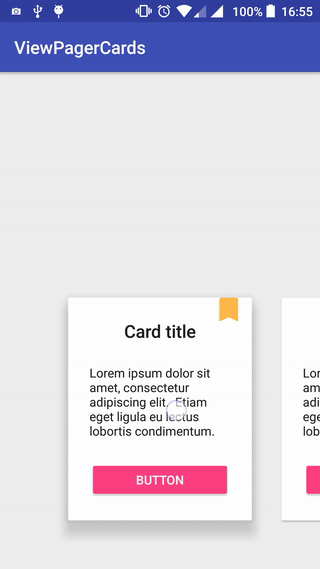
ViewPagerCards
ViewPager cards inspired by Duolingo
From my blog post: https://rubensousa.github.io/2016/08/viewpagercards
This is just a sample project.
There's support included for Fragments and normal Views. Check the CardPagerAdapter and CardFragmentPagerAdapter classes.
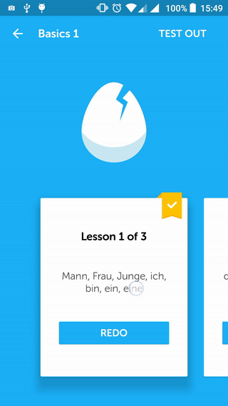
Left - Duolingo implementation
Right - This sample
What you could do with this:
- Showcasing premium features
- An app intro
- A small gallery of images
License
Copyright 2016 Rúben Sousa

Licensed under the Apache License, Version 2.0 (the "License");
you may not use this file except in compliance with the License.
You may obtain a copy of the License at

    http://www.apache.org/licenses/LICENSE-2.0

Unless required by applicable law or agreed to in writing, software
distributed under the License is distributed on an "AS IS" BASIS,
WITHOUT WARRANTIES OR CONDITIONS OF ANY KIND, either express or implied.
See the License for the specific language governing permissions and
limitations under the License.
Top Related Projects
A simple library to add carousel view in android app.
:octocat: 📃 FoldingCell is an expanding content cell with animation made by @Ramotion
:octocat: PaperOnboarding is a material design UI slider. Swift UI library by @Ramotion
:octocat: PreviewTransition is a simple preview gallery UI controller with animated tranisitions. Swift UI library made by @Ramotion
:octocat: ExpandingCollection is an animated material design UI card peek/pop controller. iOS library made by @Ramotion
Convert designs to code with AI
Introducing Visual Copilot: A new AI model to turn Figma designs to high quality code using your components.
Try Visual Copilot