
Top Related Projects

The interactive graphing library for Python :sparkles:

matplotlib: plotting with Python

Interactive Data Visualization in the browser, from Python

Declarative visualization library for Python

Statistical data visualization in Python

With Holoviews, your data visualizes itself.
Quick Overview
ggplot2 is a popular data visualization package for R, part of the tidyverse ecosystem. It implements the grammar of graphics, providing a powerful and flexible system for creating a wide range of static graphics. ggplot2 allows users to build plots layer by layer, making it easy to create complex visualizations with minimal code.
Pros
- Consistent and intuitive syntax based on the grammar of graphics
- Highly customizable with extensive theming options
- Excellent integration with other tidyverse packages
- Large community and extensive documentation
Cons
- Steeper learning curve compared to base R plotting
- Can be slower for very large datasets
- Limited built-in support for interactive graphics
- Some advanced customizations may require complex workarounds
Code Examples
Creating a basic scatter plot:
library(ggplot2)

ggplot(mtcars, aes(x = wt, y = mpg)) +
  geom_point() +
  labs(title = "Car Weight vs. MPG", x = "Weight", y = "Miles per Gallon")
Adding a smoothed trend line to a scatter plot:
ggplot(mtcars, aes(x = wt, y = mpg)) +
  geom_point() +
  geom_smooth(method = "lm", se = FALSE) +
  labs(title = "Car Weight vs. MPG with Trend Line")
Creating a faceted bar plot:
library(dplyr)

mtcars %>%
  mutate(cyl = as.factor(cyl)) %>%
  ggplot(aes(x = cyl, y = mpg)) +
  geom_bar(stat = "summary", fun = "mean") +
  facet_wrap(~am) +
  labs(title = "Average MPG by Cylinder Count and Transmission Type",
       x = "Cylinders", y = "Average MPG")
Getting Started
To start using ggplot2, first install and load the package:
install.packages("ggplot2")
library(ggplot2)

# Basic plot structure
ggplot(data = your_data, aes(x = x_variable, y = y_variable)) +
  geom_point()  # Add points to create a scatter plot

# Customize your plot
ggplot(data = your_data, aes(x = x_variable, y = y_variable)) +
  geom_point(color = "blue", size = 3) +
  theme_minimal() +
  labs(title = "Your Plot Title", x = "X-axis Label", y = "Y-axis Label")
Competitor Comparisons
The interactive graphing library for Python :sparkles:
Pros of plotly.py
- Interactive and dynamic visualizations with zooming, panning, and hover tooltips
- Supports both web-based and offline plotting
- Easier integration with web applications and dashboards
Cons of plotly.py
- Steeper learning curve compared to ggplot2
- Less extensive documentation and community support
- May require additional setup for certain features
Code Comparison
ggplot2 (R):
library(ggplot2)
ggplot(data, aes(x = x, y = y)) +
  geom_point() +
  theme_minimal()
plotly.py (Python):
import plotly.graph_objects as go
fig = go.Figure(data=go.Scatter(x=x, y=y, mode='markers'))
fig.update_layout(template='plotly_white')
fig.show()
Both libraries offer powerful data visualization capabilities, but ggplot2 is known for its elegant syntax and extensive customization options within the R ecosystem. plotly.py, on the other hand, excels in creating interactive plots that can be easily shared and embedded in web applications. The choice between the two often depends on the specific requirements of the project and the preferred programming language.
matplotlib: plotting with Python
Pros of matplotlib
- More flexible and customizable for complex visualizations
- Integrates well with NumPy and SciPy for scientific computing
- Supports a wide range of output formats (PNG, PDF, SVG, etc.)
Cons of matplotlib
- Steeper learning curve, especially for beginners
- Requires more code to create basic plots
- Less consistent syntax across different plot types
Code Comparison
matplotlib:
import matplotlib.pyplot as plt
import numpy as np

x = np.linspace(0, 10, 100)
plt.plot(x, np.sin(x))
plt.show()
ggplot2:
library(ggplot2)

ggplot(data.frame(x = seq(0, 10, length.out = 100)), aes(x)) +
  geom_line(aes(y = sin(x)))
Both libraries are powerful tools for data visualization, but they cater to different audiences and use cases. matplotlib is more suited for scientific computing and complex customizations, while ggplot2 excels in creating publication-quality graphics with a consistent and intuitive syntax. The choice between them often depends on the user's programming language preference (Python vs. R) and specific visualization needs.
Interactive Data Visualization in the browser, from Python
Pros of Bokeh
- Interactive visualizations: Bokeh excels at creating interactive plots and dashboards for web browsers
- Flexibility: Supports various output formats including HTML, notebooks, and server applications
- Large-scale data handling: Better suited for visualizing big datasets
Cons of Bokeh
- Steeper learning curve: Generally requires more code and setup compared to ggplot2
- Less extensive documentation and community support
- Fewer built-in statistical transformations and geoms
Code Comparison
ggplot2 (R):
library(ggplot2)
ggplot(mtcars, aes(x = mpg, y = wt)) +
  geom_point() +
  labs(title = "MPG vs Weight")
Bokeh (Python):
from bokeh.plotting import figure, show
p = figure(title="MPG vs Weight")
p.circle(mtcars['mpg'], mtcars['wt'])
show(p)
Both libraries offer powerful data visualization capabilities, but ggplot2 is often preferred for static plots and quick exploratory analysis, while Bokeh shines in creating interactive, web-based visualizations. The choice between them depends on the specific project requirements, target audience, and the developer's familiarity with R or Python ecosystems.
Declarative visualization library for Python
Pros of Altair
- Built on Vega and Vega-Lite, allowing for more interactive and web-friendly visualizations
- Declarative approach simplifies complex chart creation
- Seamless integration with Jupyter notebooks and web applications
Cons of Altair
- Smaller community and ecosystem compared to ggplot2
- Less extensive documentation and fewer learning resources
- Limited customization options for certain chart types
Code Comparison
Altair:
import altair as alt
from vega_datasets import data

chart = alt.Chart(data.cars()).mark_point().encode(
    x='Horsepower',
    y='Miles_per_Gallon',
    color='Origin'
)
ggplot2:
library(ggplot2)
library(dplyr)

ggplot(mtcars, aes(x = hp, y = mpg, color = factor(cyl))) +
  geom_point()
Both examples create a scatter plot with similar variables, demonstrating the syntax differences between Altair and ggplot2. Altair uses a more declarative approach, while ggplot2 employs the familiar "grammar of graphics" layering system.
Statistical data visualization in Python
Pros of seaborn
- Built on matplotlib, offering easier integration with other Python libraries
- Provides attractive default styles and color palettes out-of-the-box
- Simpler API for common statistical visualizations (e.g., regression plots)
Cons of seaborn
- Less flexible for creating highly customized plots
- Smaller community and ecosystem compared to ggplot2
- Limited support for interactive visualizations
Code Comparison
seaborn:
import seaborn as sns
import matplotlib.pyplot as plt

sns.scatterplot(x="sepal_length", y="sepal_width", hue="species", data=iris)
plt.show()
ggplot2:
library(ggplot2)

ggplot(iris, aes(x = Sepal.Length, y = Sepal.Width, color = Species)) +
  geom_point() +
  theme_minimal()
Both libraries offer concise ways to create scatter plots with color-coded groups. seaborn's API is more compact, while ggplot2 uses a layered approach that can be more intuitive for complex plots. ggplot2's syntax is generally more consistent across different plot types, whereas seaborn has specialized functions for various statistical visualizations.
With Holoviews, your data visualizes itself.
Pros of HoloViews
- More flexible for interactive visualizations and dashboards
- Supports a wider range of data types and plot types
- Better integration with other scientific Python libraries
Cons of HoloViews
- Steeper learning curve for users familiar with ggplot2 syntax
- Smaller community and fewer resources compared to ggplot2
- Less consistent API across different plot types
Code Comparison
ggplot2 (R):
library(ggplot2)
ggplot(mtcars, aes(x = mpg, y = wt)) +
  geom_point() +
  labs(title = "MPG vs Weight")
HoloViews (Python):
import holoviews as hv
hv.extension('bokeh')
dataset = hv.Dataset(mtcars)
scatter = hv.Scatter(dataset, 'mpg', 'wt')
scatter.opts(title="MPG vs Weight")
Both libraries offer powerful data visualization capabilities, but HoloViews excels in creating interactive and complex visualizations, while ggplot2 is known for its consistent grammar of graphics and extensive documentation. The choice between them often depends on the specific project requirements and the user's familiarity with R or Python ecosystems.
Convert  designs to code with AI

Introducing Visual Copilot: A new AI model to turn Figma designs to high quality code using your components.
Try Visual CopilotREADME
ggplot2 
![]()
![]()
Overview
ggplot2 is a system for declaratively creating graphics, based on The Grammar of Graphics. You provide the data, tell ggplot2 how to map variables to aesthetics, what graphical primitives to use, and it takes care of the details.
Installation
# The easiest way to get ggplot2 is to install the whole tidyverse:
install.packages("tidyverse")

# Alternatively, install just ggplot2:
install.packages("ggplot2")

# Or the development version from GitHub:
# install.packages("pak")
pak::pak("tidyverse/ggplot2")
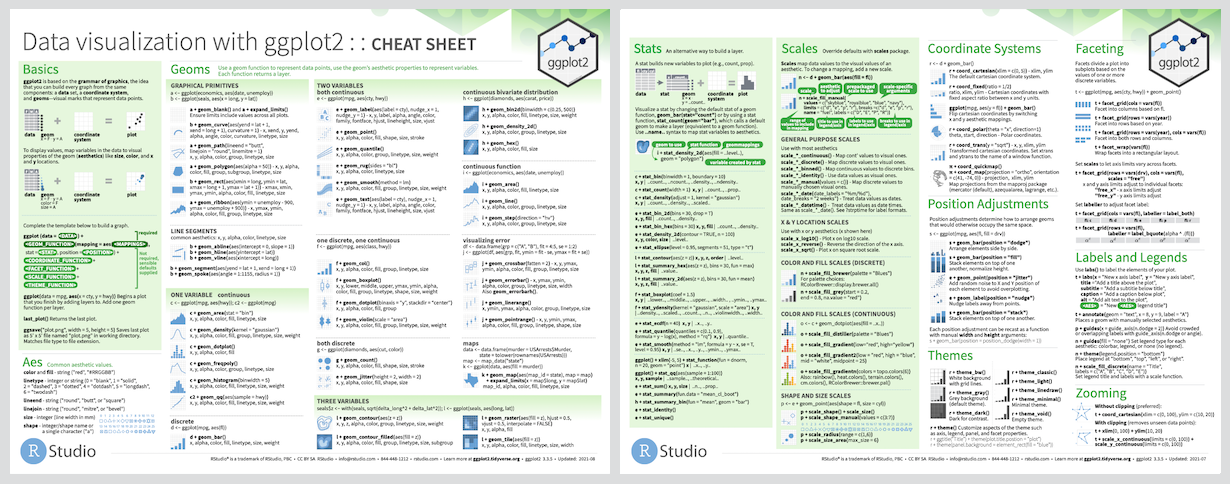
Cheatsheet
Usage
Itâs hard to succinctly describe how ggplot2 works because it embodies a
deep philosophy of visualisation. However, in most cases you start with
ggplot(), supply a dataset and aesthetic mapping (with aes()). You
then add on layers (like geom_point() or geom_histogram()), scales
(like scale_colour_brewer()), faceting specifications (like
facet_wrap()) and coordinate systems (like coord_flip()).
library(ggplot2)

ggplot(mpg, aes(displ, hwy, colour = class)) +
  geom_point()

Lifecycle
![]()
ggplot2 is now over 10 years old and is used by hundreds of thousands of people to make millions of plots. That means, by-and-large, ggplot2 itself changes relatively little. When we do make changes, they will be generally to add new functions or arguments rather than changing the behaviour of existing functions, and if we do make changes to existing behaviour we will do them for compelling reasons.
If you are looking for innovation, look to ggplot2âs rich ecosystem of extensions. See a community maintained list at https://exts.ggplot2.tidyverse.org/gallery/.
Learning ggplot2
If you are new to ggplot2 you are better off starting with a systematic introduction, rather than trying to learn from reading individual documentation pages. Currently, there are several good places to start:
-
The Data Visualization and Communication chapters in R for Data Science. R for Data Science is designed to give you a comprehensive introduction to the tidyverse, and these two chapters will get you up to speed with the essentials of ggplot2 as quickly as possible.
-
If youâd like to take an online course, try Data Visualization in R With ggplot2 by Kara Woo.
-
If youâd like to follow a webinar, try Plotting Anything with ggplot2 by Thomas Lin Pedersen.
-
If you want to dive into making common graphics as quickly as possible, I recommend The R Graphics Cookbook by Winston Chang. It provides a set of recipes to solve common graphics problems.
-
If youâve mastered the basics and want to learn more, read ggplot2: Elegant Graphics for Data Analysis. It describes the theoretical underpinnings of ggplot2 and shows you how all the pieces fit together. This book helps you understand the theory that underpins ggplot2, and will help you create new types of graphics specifically tailored to your needs.
-
For articles about announcements and deep-dives you can visit the tidyverse blog.
Getting help
There are two main places to get help with ggplot2:
-
The RStudio community is a friendly place to ask any questions about ggplot2.
-
Stack Overflow is a great source of answers to common ggplot2 questions. It is also a great place to get help, once you have created a reproducible example that illustrates your problem.
Top Related Projects
The interactive graphing library for Python :sparkles:
matplotlib: plotting with Python
Interactive Data Visualization in the browser, from Python
Declarative visualization library for Python
Statistical data visualization in Python
With Holoviews, your data visualizes itself.
Convert designs to code with AI
Introducing Visual Copilot: A new AI model to turn Figma designs to high quality code using your components.
Try Visual Copilot